IS428 2016-17 Term1 Assign3 Rachel Tay
Contents
Objectives
Following the mantra of "overview first, zoom and filter, then details-on-demand", this assignment aims to create a visualization that allows users a comprehensive view of the data, from which, identify typical patterns and issues of concern in all the datasets that are provided. This final visualization should be able to facilitate the exploratory analysis into the following 4 areas:
- Typical patterns and unusual events in the proximity card data
- Typical patterns and unusual events in the building data
- Typical patterns and unusual events in the hazium concentration data
- Relationships observed between proximity card and building data elements
Since this application is built in view of the 2014 kidnapping incident at Abila, Kronos, it ultimately aims to be capable of spotting the anomalies in the building and hazium data and afterwards, identify the individuals that may be affected. This identification process would allow for the efficient execution of escape plans and routes, etc.
Dataset Transformation and Rearrangement Process
Proximity Card Dataset
In the mobile proximity sensor data, the (X, Y) coordinates were provided while in the fixed proximity sensor data, only the zone information was provided. Hence, alignment between the 2 data tables were required. Given the fact that the application only requires that users be informed of the people affected by the anomalies in the building data, knowing the exact coordinates of the employees is not necessary. Rather, knowing the floor and the zones that they frequent would be sufficient. For this zone information to be reflected in the mobile proximity dataset, the following steps were performed.
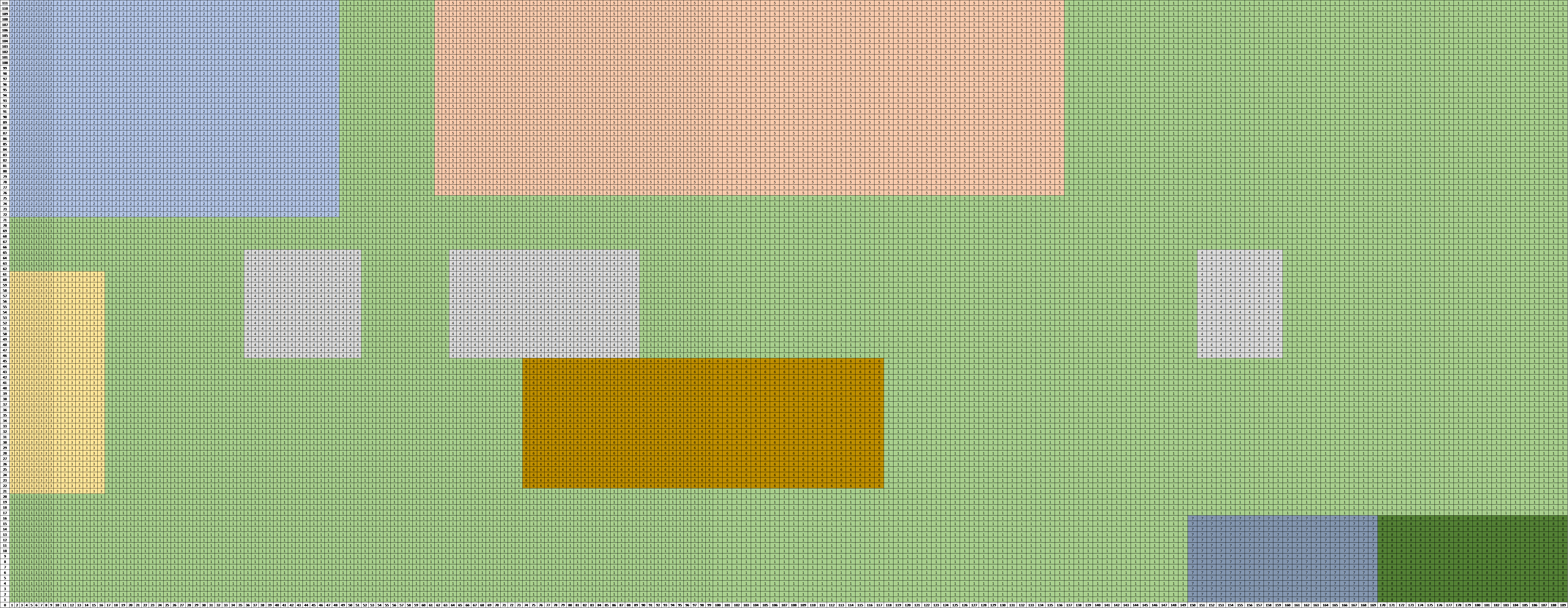
Firstly, I made a copy of each of the 3 proximity floor plans in Excel such that it looks like the one below. Each cell in the sheet was assumed to be 1 unit high and 1 unit wide. Following the dimensions given in the floor plan, the various zones for each floor level were plotted. The number in each cell represents the zone number that that particular cell lies in.
With this, an Excel formula was utilized in deriving the respective zone information for each of the (X, Y) coordinates by extracting the number in the cell which coincides with the coordinates. The excel formula utilized the INDIRECT(), ADDRESS(), MATCH() formulas. After this is done, the file was saved in the CSV format.
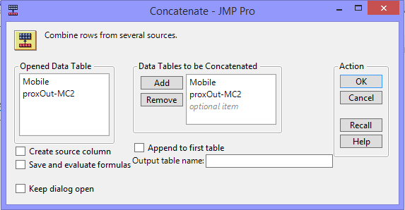
After obtaining the zone information for each of the coordinates provided in the mobile proximity dataset, both the mobile proximity card dataset and the fixed proximity card dataset have the zone informations. JMP Pro 13 software was then employed to join the 2 tables (i.e. proxMobileOut-MC2.csv with the updated respective zone information and proxOut-MC2.csv). Using the concatenate function, JMP was used to consolidate the data from the 2 CSV files into a single data table which lists the floor and zone location for each type of proximity data across the given time period. The following screenshot shows the respective inputs to the execution of the concatenation process.
The resultant data table from this process was used for building the final visualizations.
Building Dataset
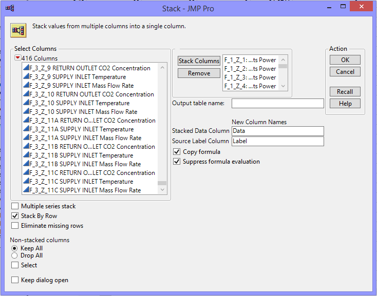
After obtaining the zone information for each of the coordinates provided in the mobile proximity dataset, JMP Pro 13 software was employed to restructure the data in a format that is usable for the visualizations. The floor-zone specific information was separated and stacked where the function was utilized with the following details as inputs.
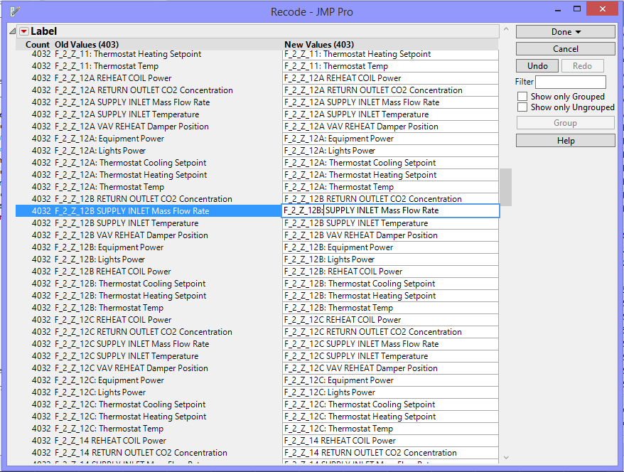
In the output data table, for the sake of clarity, the label column was separated into 3 new columns where it each represented floor, zone and category information respectively. For this to occur, the format of the data in the label column has to be standardized where it should follow the following format: “F_[Floor Number]_Z_[Zone Number]: [Category Name]”. The data were revised systematically using the recode function in JMP. An example of this process is shown in the screenshot below.
After this was done, the data in the label column was split using the WORD() formula into the 3 stipulated columns. With this, the final output data table was ready to be utilized to build the respective visualizations.
Hazium Dataset
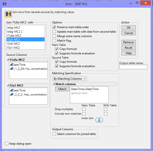
The data for the Hazium concentrations in the different floor-zone were saved in different CSV files and hence, it was required to be consolidated into a single file for consistency. All 4 CSV files were opened in JMP Pro 13 software and joined systematically using the join function available by matching the Date/Time column. As only 2 data tables can be joined at one time, this process was repeated 3 times. The inputs to the join function were as follows:
Since the “Date/Time” columns will be repeated, the common columns were deleted. The resultant data table will be used to build the final visualizations.
Building the Appropriate Visualizations
Control Chart Visualizations
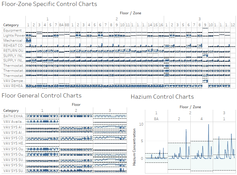
The visualization chart decided upon to display the building and hazium concentration data is the control chart which shows how a process changes over time in relative to the lower control limit, average and upper control limit. Points will be considered “out of control” if they fall outside of the control limits. To maintain the notion that the process should be stable over time, by identifying and investigating the points that fall outside of the control limits, it allows users to find out the source of errors and respective patterns for accurate implementation of appropriate actions in stabilizing the process. This method is commonly implemented in a manufacturing setting where the dimensions of the products produced are required to be within stipulated specification limits.
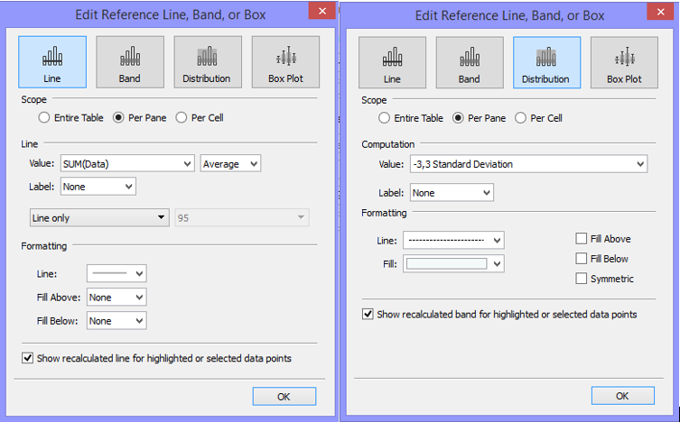
To build this visualization, after having plotting the category data over time into a line chart into a format seen below. Reference lines are added across each pane where the values are calculated to be the average of the data values. For the lower and upper control limits, assuming that the data follows a normal distribution, it was taken that the data should fall within 3 standard deviations of the mean. The inputs were as follows:
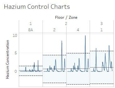
The final control charts developed look as such:
Heat Map Visualization
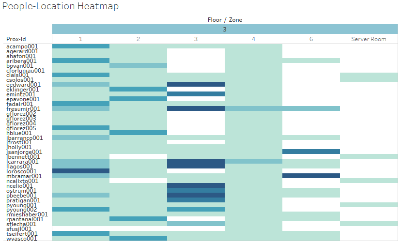
Heat map was chosen in this case to visualize the concentration of people in the respective floor-zones. With this visualization, the user can tell identify the floor-zones that employees frequent regularly. Ideally, the data will be represented using a choropleth map. However, knowledge in digitizing the floor plans and from there, creating the choropleth map was limited and hence hindered the decision in creating a choropleth map. Heat maps were the next best option where it displays the same information but in the structure of a matrix.
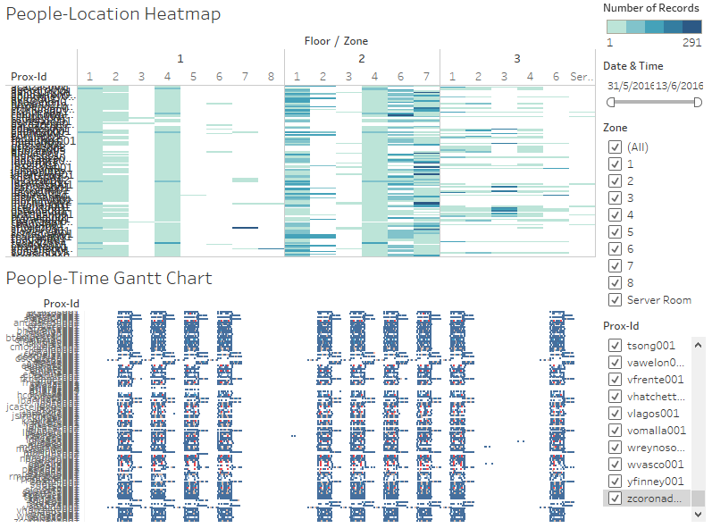
To build this visualization, the floor and zone information were set as the column headers and the prox-id information as the row headers. The number of records were then input as the values under rows. This was chosen to be represented in a heat map format where the intensity of the colours represented the number of records found in that specific slot. The colours were stepped at 5. The final visualization of this heat map created is as follows:
Gantt Chart Visualization
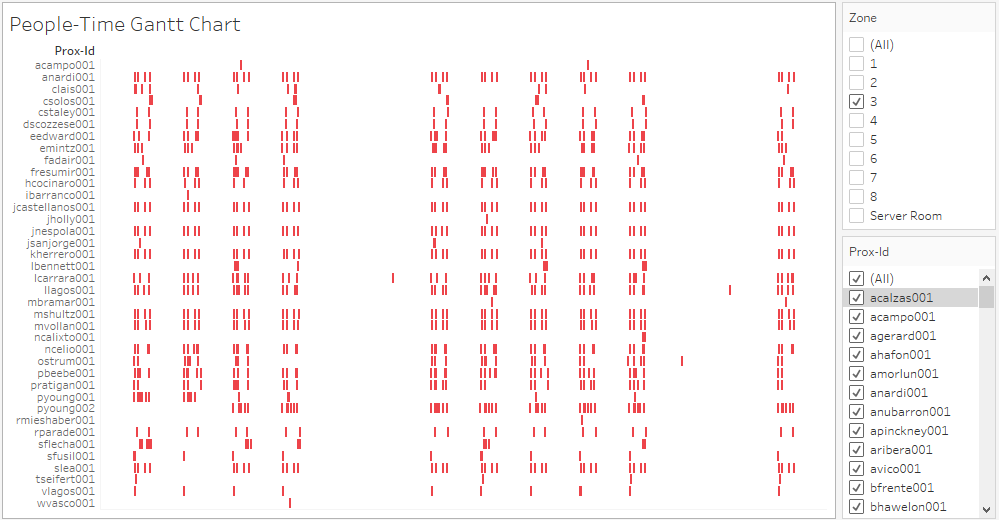
This chart can be used to reinforce the findings of the heat map but it is mostly expected to display the daily routines of the GAStech employees. The x-axis would depict the 2-week long timeline and the y-axis would have the prox-ids as inputs. The floors are differentiated by the colours of the bars. With this visualization, in a single line, users can identify the daily patterns of the individual and spot any abnormal work timings between the different individuals, if any. The final visualization when filtered to floor 3 zone 3 will look like that as follows:
The Final Visualization
An interactive online version of the visualization can be found in this link
Ultimately, the interface for the company should only include the 2 final dashboards at the end of the story. However, arranging the visualizations created into a story format allows readers to understand how the different visualizations can be used to achieve the respective observation stated in the story point.
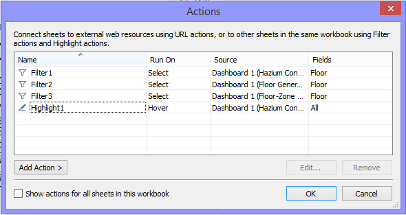
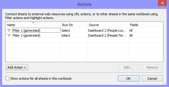
For the first dashboard (see above) which aims to visualize the building and hazium concentation datasets, the various actions applied to the dashboard is displayed in the screenshot below.
Given the large amounts of data, the user will have to click on the floor they want filtered. Otherwise, the dashboard will lag and functions really slowly as they have to filter the immense amount of data with every hover above a point. The hover function, however, was utilized when the user wants to highlight the floor or zone from the hazium control chart. The highlighting function would facilitate easy comparisons with the other building data elements. Filters were not explicitly displayed on the dashboards as it would take up space and zooming into a particular category for further analysis, albeit will take some time, can be done by double clicking the category name.
For the second dashboard (see above) which aims to visualize the proximity card dataset, the screenshot below lists the connecting actions between the different visualizations on the same dashboard. Filtering function was set up to run on select where all the relevant fields clicked on would then be filtered accordingly. The various actions applied to the dashboard is displayed in the screenshot below
For this dashboard, there are explicit filters for the users to tinker with. There is the date & time filter where users can adjust the range of the timeframe that they want to look at. In addition, they could filter the zones and employees that they want to analyse further. For these aspects, multiple checkbox options were used as the fields are not mutually exclusive.
Meeting the Objectives
Due to the possibility of overlaps and repetition in the points, the given questions were re-organised into the following structure where both the typical patterns and unusual events or anomalies observed in the proximity card, building and hazium concentration data will be analysed together before piecing the findings together to derive relationships between the datasets. The significance of the points will also be included in the discussion.
Typical Patterns and Unusual Events Observed in Datasets
Proximity Card Data
It is evident that there are 2 different work shifts: morning (8AM-5PM) and night (4PM-12AM). With the heat map, it can be seen that the employees frequent the 2nd floor more often. This could be due to the fact that there are more employees with offices on the 2nd floor. The floor-zones that the employees frequent often are usually office spaces. In addition, it was found that the meeting room on the 1st floor was not being utilized often and only 1 person (i.e. mbramar001) visits zone 5 on the 1st floor.
Also, there are employees suspected to either have lost their cards or were on leave as there were extended gaps in the timeline. This point is depicted in the 2nd point of the story where the employees listed have evident prolonged missing proximity data. Junger, Lalcazar and Tquiroz are the few employees lost their cards and got a replacement. However, Morlunv lost his card and obtained a replacement card which was used for a day before he reverted back to using the old one. It was assumed that he found his old card. Gflorez lost his card 3 times within 3 days. This is potentially suspicious, unless he is generally a careless person. Pyoung, on the other hand, might have had his card stolen. Despite having requested for a replacement card, his old card was still occasionally in use. The card was used to access zones 6 and 7 on the 2nd floor. This should be investigated as it could pose a security threat.
In addition, it can be observed that some employees came back to work at a timing outside of their work shifts. Examples of employees as such would be jsanjorge001, ostrum001, lcarrara001 and llagos001. This is suspicious given that they do not regularly report to work at that timing and hence should be investigated in case of suspicious activity.
Building Data
When zooming into the reheat coil power, it can be noted that there are multiple occasions where the return outlet CO2 concentration on most of floor-zones exceeded the upper control limits. This pattern was also observed in the category for the reheat coil power where the values peaked above the upper control limits at the exact same timing of 7.05AM on both 7th and 8th June. This point should be investigated as CO2 is known to be a significant indication of air quality and thus, has direct implications on the health and productivity levels of the employees.
Floor 3 Zone 9 (i.e. Server Room) uses exceptionally high equipment power on a regular basis. On average, the supply inlet mass flow rate is abnormally higher for floor 3 zone 9 as compared to the other floor-zones. As for the supply inlet temperature, thermostat cooling setpoint, thermostat heating setpoint and the thermostat temperature, the values, too, are generally higher on this floor-zone (floor 3 zone 9) than on the other floor-zones. For this floor-zone, the thermostat temperature exceeded control limits on 7th June 5.50PM and 8th June 12.00PM. At these exact timings were when the supply inlet temperature peaked. It could be that because of the sudden spike in the supply inlet temperature, the thermostat temperature increased. There was an occurrence during this timing that caused the anomaly points and hence should be looked into as it has a direct impact on energy usage.
The VAV SYS cooling coil power peaks on the 2nd floor regularly at 10.05PM on both 7th and 8th of June. The VAV SYS supply fan outlet temperature regularly exceed the upper control limits on the 1st and 2nd floor but only recently had spikes on the 3rd floor on the 7th and 8th of June. This, too, impacts energy usage level.
For all the anomalies stated above where the points lay outside the control limits, the company should look into investigating whether it is due to a common-cause or special-cause variation. Only then can users determine the appropriate actions to proceed on from there.
Hazium Data
The Hazium concentration levels were relatively stable and minimal across the 4 different floor-zones during the same period (i.e. 5th and 10th June). The patterns displayed by graphs across the floor-zones look relatively alike whereby it will suddenly peak and dip steeply within a short time period. In all 4 floor-zones, the Hazium concentration was observed to have peaked at 6.05PM on 11th June.
There are regular spikes in the Hazium concentration values on all floor-zones. Since Hazium is a recently discovered and possibly dangerous chemical, it would be expected that the concentration levels be kept within the control limits or minimised at all cost. Since the spikes start at different timings and are not exactly consistent throughout all 4 floor-zones, the spikes could be due to a multitude of rationales.
Relationship between the proximity card data and building data elements
Seeing that the Hazium concentration started its climb towards the peak in all 4 floor-zones at around 11AM on the 11th of June, this strange coincidence deserved some investigation. The 2nd dashboard was filtered to the desired timing, 11th to 12th of June and it was found that there were only 3 people present at the office during those dates (i.e. llagos001, mbramar001 and ostrum001). Llagos001 was not present when the Hazium concentration started its climb and hence is eliminated as the prime suspect. Given that the climb begun at around 11AM and that mbramar001 scanned his card indicating movement on his part, he currently tops the list of suspects as to the carrier of the Hazium gas. Ultimately, for a clearer and more in-depth and facilitated analysis, the Hazium control charts and the Gantt chart can be placed side-by-side for easy comparison.
It can be deduced that something happened on the 7th and 8th of June as many of the spikes and anomalies in the data occur during the both dates. At first, it was possible that it could be possible that company-wide events were happening during the 2 days. However, using the 2nd dashboard, it was found that only mbramar001 was present in those 2 days. This person, mbramar001, is definitely a suspicious character that would require further monitoring given that he is suspected of being a carrier of the Hazium chemical too.
Potential Improvements to Current Application
Due to time constraints and personal limitations, the outcome was not as ideal. Given the dense data and limited space constraints, the information was displayed in 2 dashboards. This information could very well be interlinked; having them in 2 separate dashboards makes the finding of relationships between the variables more tedious. A proposed improvement to this model would be that the information in the dashboard be displayed within a single interface and on top of that, allow the users to customise the screens that they want displayed. This could be on another page to allow the users to further investigate and explore the data. For example, should they want to specifically see the relationship between Hazium concentration and the people present at that time, they should be able to click and drag the charts onto the screen, side-by-side for easy comparison.
Another potential improvement to this model would be to incorporate the list of employees names instead of the proximity card ID. It would be more meaningful for the users to have the respective names then the ID names. This can be achieved through concatenating the first letter of the first name to the last name of the employees. The respective numbers at the end of the proximity card ID represents the number of cards that were given out to the individual. On top of the names, the department and respective office venues that ensues would allow for a deeper analysis.
Instead of a control chart, the horizon charts can be an alternative visualization. Horizon charts are especially useful when visualizations are required to be cramped within a small area. It could possibly be more effective in driving insights as users will have only to take note of the colour intensities.
