IS428 2016-17 Term1 Assign3 Ong Ming Hao
Contents
Understanding the problem
Introduction
Before I embark on this analysis. I’ve decided on properly understand the problem and plan on how I intend to visualise these data. I came a few steps in which I am able to better understand the problem. These are the steps:
- Understanding the problem
- Select appropriate Data Sources
- Select the appropriate visualisation tool
- Layout of the visualisation
By doing so, I was able gather better insights and visualisations since I am able to identify the root cause of the problem. The goal of this analysis is for me to try out various data cleaning software in order to also evaluate their effectiveness as well as improve my visualisation skills for Tableau.
Tools Used
For this assignment, I plan to use the following tools to analyse, identify patterns and gather insights from GAStech’s Abila. I’ve split it up into 2 main categories – Visual Analytics Tools and Data Cleaning Software. Visual Analytics Tool
- Tablueau 10.0.0
Data Cleaning Software
- Microsoft Excel
- JMP
- OpenRefine (Formally known as Google Refine)
Understanding Question 1
What are the typical patterns in the prox card data? What does a typical day look like for GAStech employees? To answer this question, we must look at the data which was provided to us. I’ve found out that we must use the following files so that we are able to gather an in-depth understanding of the data.
- Vast Prov Zone F1, F2, F3 – To understand where the various zones are.
- Employees List – To understand the GAStech employees, their job roles, etc.
- Data Format – To understand the data even greater detail
- ProxOut-MC2.csv – Raw Data of movement by X and Y Coordinates
- ProxMobileOut-MC2.csv – Raw Data of movement by zones
Upon initial inspection of the data, I realised some things. Firstly, in “proxOut-MC2.csv” and “proxMobileOut-MC2.csv”, we had to link the prox-id to the employee in the “Employee List.xlsx”. Next, we had to take note of the various employees with last names. Lastly, each prox-id has numbers trailing at the end. After much considerations and investigation, I assumed that these numbers can be removed without any implications. Which resulted in the following.
Understanding Question 2
Describe up to ten of the most interesting patterns that appear in the building data. Describe what is notable about the pattern and explain its possible significance. To answer these question, we must use the following files so that we are able to gather an in-depth understanding of the data.
- bldg-MC2.csv – The breakdown of the building datasets for temperature, energy consumption, etc.
- f1z8a-MC2.csv – The data of the Hazium Concentration for Floor 1 Zone 8A.
- f2z2-MC2.csv – The data of the Hazium Concentration for Floor 2 Zone 2.
- f2z4-MC2.csv – The data of the Hazium Concentration for Floor 2 Zone 4
- f3z1-MC2.csv – The data of the Hazium Concentration for Floor 3 Zone 1.
The data retrieved from “bldg-MC2.csv” is massive and it is hard to make much sense out of it. As such, we should break these csv file into 2, where it is more appropriate for analysis. The first csv file (Floor-Zones-Data.csv) would breakdown all the different values for the different floors and zones. The second csv file would give a general breakdown of everything not related to zones. (No-Floor-Zones-Data.csv)
Effectiveness of the various Data Cleaning Software
Cleaning the first set of data
Microsoft Excel
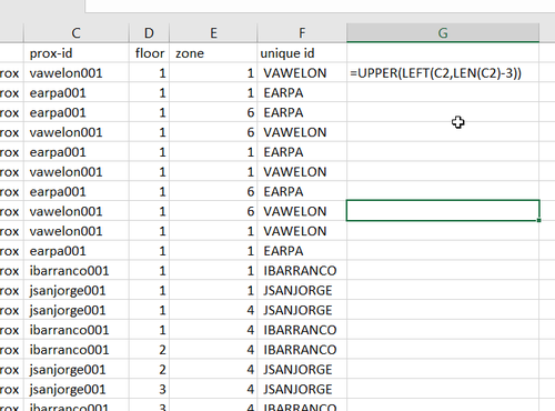
In order to clean both “proxOut-MC2.csv” and “proxMobileOut-MC2.csv”, it would be very simple with Microsoft Excel. I used the function “=UPPER(LEFT(C2,LEN(C2)-3))” in order to retrieve the final output.
However, the real issue comes when trying to clean employees list. I realised that some employees name would be inconsistent with the final output at the end due to the differences in their name. Although 95% of the employees has the right format (the first letter of their First Name followed by their whole last names). We had a few exceptions to this rule. This exceptions include
- Their last name include their spouse name (example: “Willem Vasco-Pais”)
- Their name had is made up of 2 words (example: “Sten Sanjorge Jr.”)
- Their the prox-id that was given to them had a typo (example: “Faraldo Raphale’s ID is RFARALSO”)
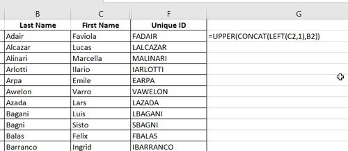
After I used the function, “=UPPER(CONCAT(LEFT(C2,1),B2))”, to extract the unique IDs for everyone, I had to manually track them the abnormalizes and manually change it.
OpenRefine
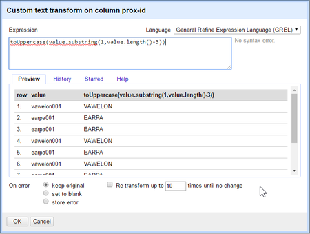
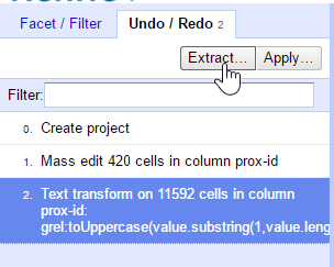
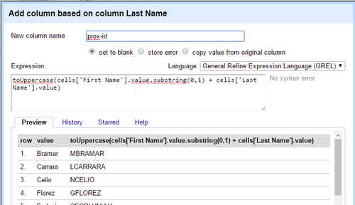
Similar to Microsoft Excel, it cleaned both “proxOut-MC2.csv” and “proxMobileOut-MC2.csv” at a surprising faster rate. After I used the specific function to retrieve the Unique ID, I could just extract all the changes that I did in the OpenRefine project and apply it directly to the other file.
While cleaning the employees list, I also had the same issue that I faced with some employee’s name being inconsistent with the final output. The difference between this and Microsoft Excel was that I was able to quickly find for inconsistencies using the “Text Facet” Function, allowing me for quick editing of wrong Unique IDs.
JMP
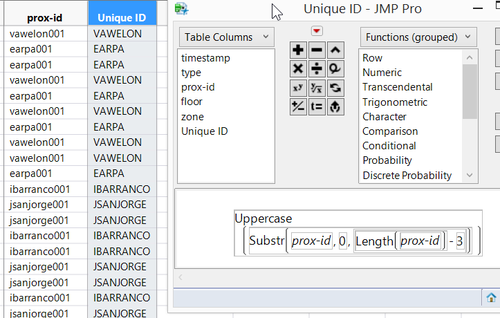
Similar to both OpenRefine and Microsoft Excel, it cleaned both “proxOut-MC2.csv” and “proxMobileOut-MC2.csv” with the same formula “Uppercase(SubStr(prox-id,0,Length(prox-id) – 3)))” However, for JMP’s case I could tell that it was slower to change the text due to the size of the data.
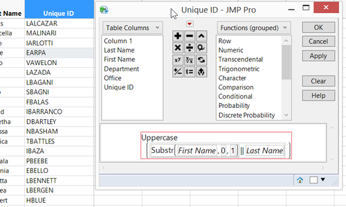
To clean the employees list, it is generally the same as OpenRefine. After implementing the formula “Uppercase(Substr(First Name,0,1)||LastName)”, I had to manually edit all the Unique IDs that had problems.
Cleaning the first set of data
Microsoft Excel & OpenRefine
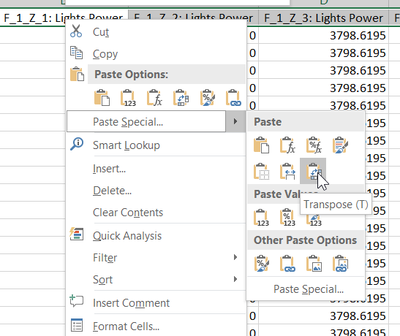
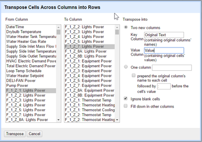
In order to achieve the separation of data into 2 excel files, we needed to transpose the columns into rows. Showing the information of each Floor-Zones as well as all the information that was found. Although both of them have the ability to transpose columns into rows. The amount of effort required to complete this task is too much, and it would be better off finding a much better solution instead.
JMP
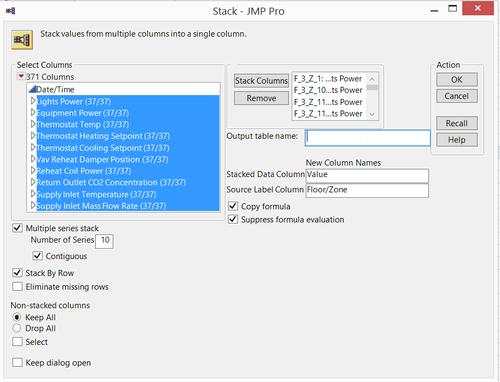
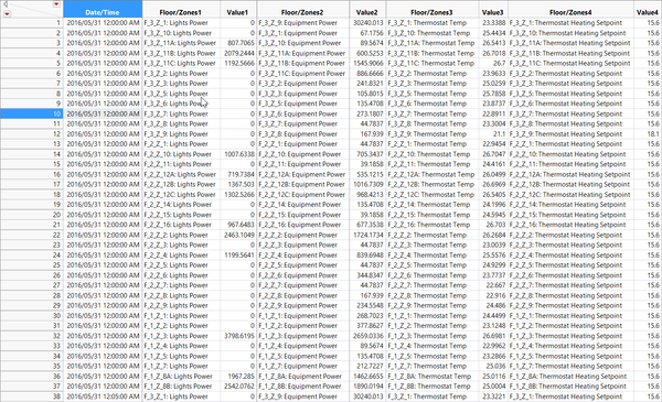
Luckily, I have found a way to transpose the data efficiently by using JMP. My first set of data was obtained by using JMP’s Stack function. This are the steps that I used in order to reach what I wanted.
- Removed all the unwanted values from Table
- Used the stack function with very specific configurations
- Clean up the data once more, removing all additional Floor/Zone Names
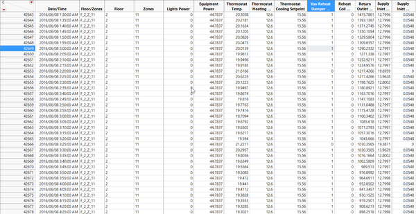
- Finally giving each row a Floor number and Zones from the Column "Floor/Zone"
For the formula that i used in order to retrieve the Floor - "SubStr(Floor/Zone,3,1)". Formula that i used to retrieve the Zones - "If (substr(Floor/Zones, Length(Floor/Zones)-1, 1) == "_") => Right(Floor/Zone,1) Else (Right (Floor/Zone,2).
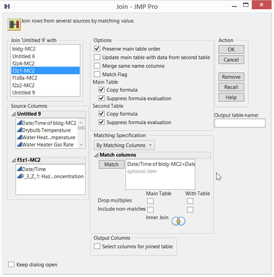
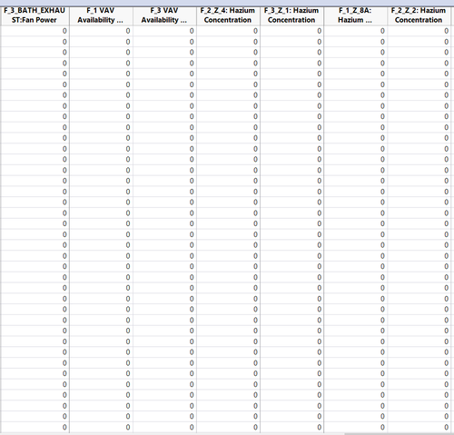
For the second set of data, I prepared the data with remaining data that I left out from the first datasets. Since I needed to join these data with “f1z8a-MC2.csv”, “f2z2-MC2.csv”, “f2z4-MC2.csv” and “f3z1-MC2.csv”, I used JMP’s join function to join all the data and did a final cleaning of the data. Below are a set of pictures which illustrate the steps which I took.
Summary and Findings
After using Microsoft Excel, OpenRefine and JMP, these are my conclusions.
For quick and simple data cleaning and transformation, we should OpenRefine to change a lot of text at the same time. It’s quick transformative power would make it a great tool since it is able to quickly transform large amount of data. Although it can transpose columns into rows, its great weakness comes at not allowing all data to be viewed, limited the rows to a maximum of 50 rows, making it very hard to check the validity of the data.
For more complicated functions, we should use JMP to transform data, it can conduct complex functions to transpose columns into rows and transform large amount of text. Its weakness comes at its requirement for large processing power. For laptops that have weaker processing power, it would occasionally lag and it would cause disruptions while doing data analysis.
Lastly, for Microsoft Excel, although it may not be as powerful as JMP or as efficient as OpenRefine, it is great for checking errors and validating the various values due to other functions that it has, such as the dynamic filtering, sorting, duplicate checking and conditional formatting. Without Microsoft Excel, I would not have spotted the typo errors found in the first set of Data.
DashBoard
The interactive visualization can be accessed here: https://public.tableau.com/profile/publish/Assignment_3_Home/Home#!/publish-confirm
Planning
Filters
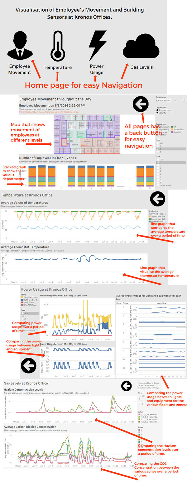
Although a lot of people did add tabs on their dashboard to navigate through the different dashboards. I’ve decided to go for a different approach. In which, I would link the dashboards together via a URL link. This is because I felt that it is better to visualize the data by comparing 2 worksheets side by side, as compared to having to keep on switching tabs.
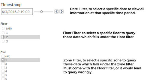
Thoughout the dashboard, I have also implemented filters so that information can be viewed much more detailed. Such as the Filter by date, Floor and the various zones so that it is easier to gain insights from it.
Dashboard Explanation
Insights and Discoveries
Question 1
What are the typical patterns in the prox card data? What does a typical day look like for GAStech employees?
- For the mobile prox card data, the robot, Rosie, does not move around on the weekends. This is because there is a high probablility that since there is almost no one in the office, there is no need for her to be activated.
- For the prox card data, some people are always in the same place for extended periods of time. It is highly likely that we can derive the person’s office just by looking at the prox card data.
- A typical day for GAStech employees is mostly in their office, their day usually starts at around 9am, and ends at 7pm for everyone except for a few facilities, engineering and information technology employees who would stay until 12midnight. Finally, there would always be 2 facilities members who would stay overnight.
We are also able to derive that GAStech is not a modern company, as it does not use the open office concept. As such, most employees work with people from the same department. We are able to derive where is each department located at.
| Floor | Zone | Department |
|---|---|---|
| 1 | 7 | Security |
| 1 | 8 | Security |
| 2 | 1 | Engineering |
| 2 | 2 | Engineering & Administration |
| 2 | 6 | Facilities & some engineering. |
| 2 | 7 | Information Technology & Facilities, some engineering. |
| 3 | Nil | The 3rd floor do not have close departments, but the whole floor is made up of administration, HR and Executives |
Question 2
Describe up to ten of the most interesting patterns that appear in the building data. Describe what is notable about the pattern and explain its possible significance.
| No. | Pattern | Significance |
|---|---|---|
| 1 | The temperature of the drybulb would constantly have bumps. This is because it would be turned on during work and turned off after work. Since there is a dip in temperature once most of the employees leave.
This is most likely an automated process since the temperature of the bulb increases everyday, including weekends. |
The company may set new automation rules for the drybulb to turn off on weekends. This would help GAStech reduce cost on electricity. |
| 2 | From the Supply Side Outlet Temperature and the Water Heater Tank Temperature, we can see that they both have a constant temperature throughout the 2 weeks. Going up and down and the exact same instance. | By knowing this, we can understand that there is a correlation between the water heater tank and the supply side outlet.
In the future, if there is a mismatch of correlation between the Supply Side Outlet Temperature and the Water Heater Tank temperature, we would know |
| 3 | There is a constant increase in power usage at 9am, 1pm, 5pm everyday. | By knowing this information, we can begin to understand why this huge flow of power happens at these timings and find ways to reduce the power spent. For example, purchasing power efficient light bulbs for offices that can save more money in the long run. |
| 4 | The power usage for equipment and lights would be very high during working hours and after 9pm, it would reduce significantly.
This should be due to the outflux of employees at 7pm. |
However, the significance of this is that we can now determine if the people working after 7pm are using energy efficiently, and if whether more should be done to make it more power efficient.
Studies could be done to see if the drop in power spent on equipment and lights and the drop in the number of employees working is cost-effective. |
| 5 | The power spent for Floor 3, Zone 5’s (Training Room) is always constant.
This tells us that the lights are always on in that room. |
Since that room’s light is turned on 24/7, it would be wise to buy energy efficient light bulbs in order to reduce costs on electricity.
In addition, we should also enquire why light must always be on 24/7 on that room, and if it is possible to switch it off. |
| 6 | The average thermostat temperature has been stagnant at around 24 degrees Celsius. | This would tell you if GAStech has been efficient in saving energy. Since the most optimal temperature for an office is at 25 degrees Celsius, we can conclude that GAStech should increase the temperature of the air condition units. |
Question 3
Describe up to ten notable anomalies or unusual events you see in the data. Prioritize those issues that are most likely to represent a danger or a serious issue for building operations.
| Priority | Anomalies | Explanation |
|---|---|---|
| 1 | On the 11th of June, Hazium Concentration for all 4 sensors were very high. | This is a clear indication that there was a serious issue with the ventilation or people has been purposely releasing Hazium into the environment.
Since Hazium is harm to humans and may cause brain damage, it would represent a great danger for building operations. |
| 2 | For 2 consecutive days (June 7th and June 8th), the CO2 concentration started to increase significantly at 7am.
In addition, the thermostat temperature has gone up between this period. The only fluctuation that occurred in this 2 weeks. |
This could be an indication that a fire has started at Floor 1, Zone 5.
Since fires are very dangerous to the company, since it may bring the company down and people may not be able to work, it tell us that it represent a great danger for building operations. |
| 3 | On both 7th and 8th of June, at 7am. There was high usage of power. | This unusual event is suspicious and more information should be find out about it. Was it due to a power overload, or was something causing it to overspend significant amounts of power.
Since It may cause overloading of the electrical systems, this should represent as a high danger. |
| 4 | For Floor 3, Zone 1, Hazium Concentration Levels continue to be higher than the average | Although Hazium would cause brain damage. More should be done to monitor and find out the root cause of higher Hazium at floor 3.
Since the amount of Hazium is still moderate, it would represent a minor danger, that should be taken care of. |
| 5 | Co2 Concentration for June 6 has gone very high for all zones, especially at zone 5 on the 1st floor. | This should be of low danger to the company. One of the reasons why this could be happening was due to the air purifier spoiling.
A simple replace or fix would do the job. Also, as seen on the graph, the problem did not persist again after that. |
| 6 | Average Power Usage for light is significantly higher than for the rest. In Floor3, Z7, 11A, 11C | Although it is an anomaly, we would not pay great attention to it, the electric systems should be able to handle it. |
Question 4
Describe up to five observed relationships between the proximity card data and building data elements. If you find a causal relationship (for example, a building event or condition leading to personnel behavior changes or personnel activity leading to building operations changes), describe your discovered cause and effect, the evidence you found to support it, and your level of confidence in your assessment of the relationship.
It can be observed that a large amount of Hazium has been released during 3rd June at around 1pm, at Floor 3, Zone 1. In addition, there has also been a large release of Hazium on all sensors at around 9th June, 7am. Since the event on 3rd June, was during office hours, it was hard to track down who were the culprits. However, since 9th June event was before office hours, we can see that there were only 2 employees at that time, Bertrand Ovan and Hobert Blue.
Checking back to the 3rd June event, we can also see that both Bertrand Ovan and Hobert Blue were around Floor 3, Zone 1. They could be trying releasing Hazium before finally releasing it in large quantities on the 11th June, which is was the most dangerous since it affected the whole office.
Although we do not have a clear picture of the movement between the office of everybody at all times. It both of them would be my suspect for high amount of Hazium releases, thus i have a moderate confidence that they are the culprit.
Conclusion
In conclusion, for data cleaning, each software has its own advantages. OpenRefine is able to transform large bulk of data quickly, JMP is able to support complicated functions and Microsoft Excel is able to detect the validity of the data. When data cleaning in the future, I would take note of these advantages of these software and would choose the appropriate one to clean my data.
With regards to the data, i believe that much more insights can be retrieved from the data, such as when using other visualisation tools such as Power BI or Quik Sense. However, due to the lack of time to pick up new skills. I was only able to try out a new Data cleaning software only. Much of my efforts has been spent on trying to visualise the employee movement. As a result, I've decided to focus all my efforts on Tableau to produce a better visualisation of the data instead. I intend to visualise such data in the future and with other visualisation tools to improve myself.

