IS428 2016-17 Term1 Assign3 Nguyen Duy Loc
Contents
Abstract
Recently, GAStech just moved into a new building and the new building still has some HVAC issues. Coupled with that is the worry over Hazium level in the building. To that concern, some of the sensors are deployed with the new office to monitor the hazium level. Besides, security measures have been implemented such that each employee will be carrying a proximity card with them. Sensors are scattered inside the building to record the movement of employees within the building. Last but not least, with these measures in place, a Rosie robot runs around the place frequently to scan the proximity on its path. Thus, the company is collecting a large amount of data that require interpretation and analysis.
Problem and Motivation
The data include: - A building layout for the GAStech offices, including the maps of the prox zones and the HVAC zones
- A current list of employees, roles, and office assignments
- A description of the data formats and fields provided
- Proximity sensor data for each of the prox zone regions
- Proximity sensor data from Rosie the mobile robot
- HVAC sensor readings and status information from each of the building’s HVAC zones
- Hazium readings from four sensors.
The purpose of this assignment is to answer questions such as:
- What are the typical patterns in the prox card data? What does a typical day look like for GAStech employees?
- Describe up to ten of the most interesting patterns that appear in the building data. Describe what is notable about the pattern and explain its possible significance.
- Describe up to ten notable anomalies or unusual events you see in the data. Prioritize those issues that are most likely to represent a danger or a serious issue for building operations.
- Describe up to five observed relationships between the proximity card data and building data elements. If you find a causal relationship (for example, a building event or condition leading to personnel behavior changes or personnel activity leading to building operations changes), describe your discovered cause and effect, the evidence you found to support it, and your level of confidence in your assessment of the relationship.
Analysis
What are the typical patterns in the prox card data? What does a typical day look like for GAStech employees?
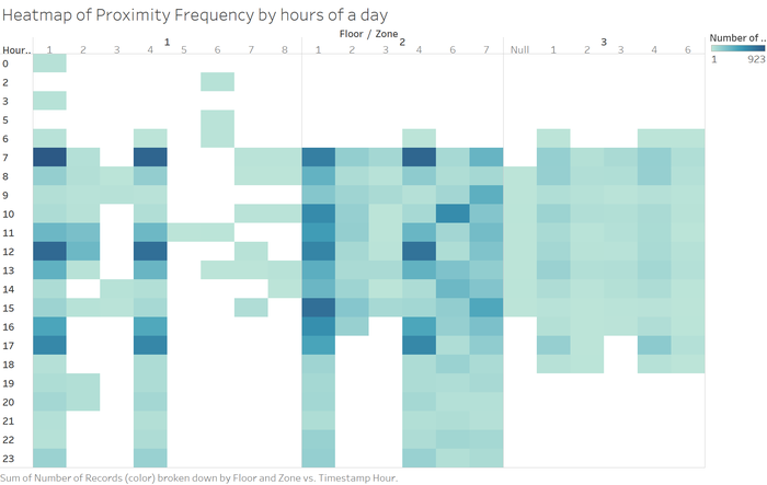
From the proximity data of fixed sensors, I generated a heatmap showing the distribution of readings during 24 hours of a typical day.
- We can easily observe that peak period are around 7AM and 12PM and 5PM. Clearly the majority of employees come to work at 7AM, go for lunch at 12pm and go home at around 4-5PM. The activities of arriving at office, going for lunch and leaving workplace are in decreasing order in term of strict adherence to timing.
- Zone 1 of floor 1 is has detected movement throughout the hours of a day. This is even at night. The reason might be the activities of the security staffs.
- In contradiction, floor 3 see lesser movement and strictly welcome people after 6am and close at 6pm.
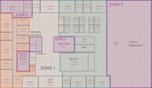
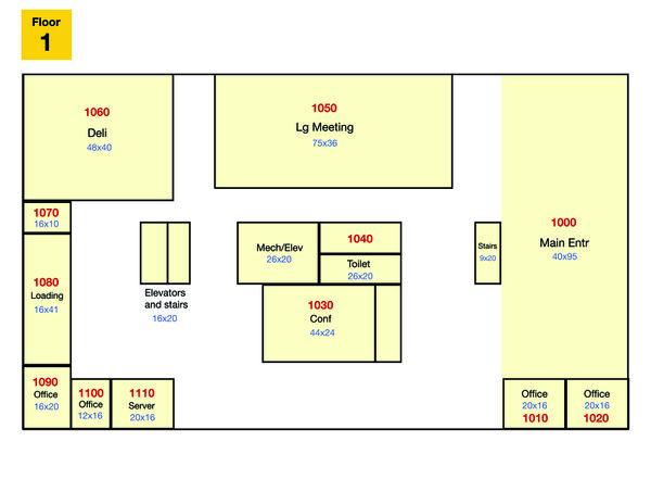
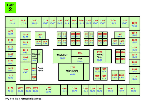
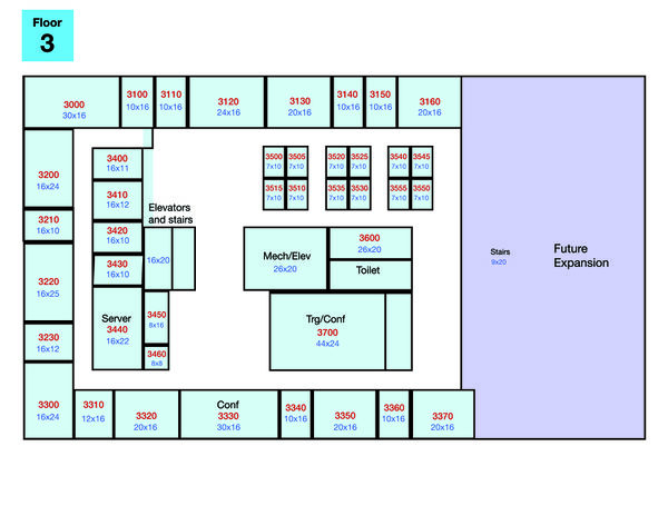
If we look at the floor 3 map, the reason can be because floor 3 consist of server room and executive rooms. Those rooms together with the space for future expansion require fewer staffs. Another inference can be that the number of executives/admins are smaller and they are very efficient. Thus they can finish work tasks within working hours and go home early.
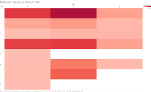
One question arises is how the employees' activities distribute among the zones?
From the heatmap above, we can see the most popular area is the break, followed by the stairs linking floor 1 and floor 2.
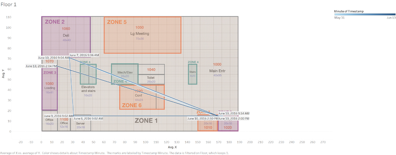
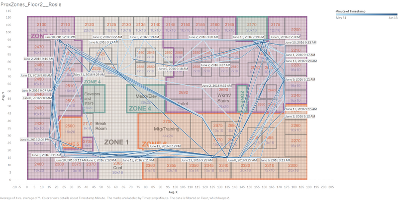
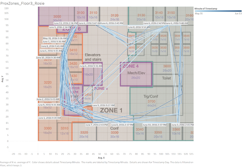
Now, from the proximity data generated by Rosie, I created line graph that keep track of the movement plotted on the floor maps.
Floor 1
Floor 2
Floor 3
One observation is that the proximity reading from Rosie are mainly along the corridor. This can be due to the travelling path of the robot.
I use JMP and imported the rosie's data to see the distribution more clearly. The contour graph function of JMP generates the followings. The depth field is generated using Excel by counting the similar reading among for each of the prox card id.
The conference room at floor 1 attracts more traffic according to Rosie's readings.
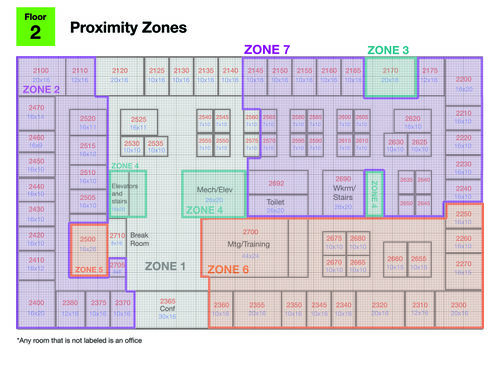
Whereas on floor 2, room 2300, 2400, 2620 are the hot spots. These belong to engineering department and facilities team. Engineers can move a lot.
Since on floor 3, executive number is lesser. Their movements mainly are to go to floor 2 by using the stairs in the middle of floor 3.
Describe up to ten of the most interesting patterns that appear in the building data. Describe what is notable about the pattern and explain its possible significance.
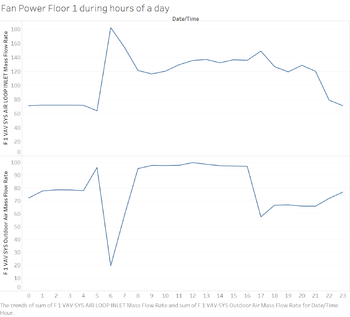
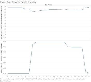
1. First, lets look at how the air flow inside the building throughout the hours of a day.
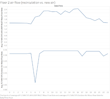
There is a strong contradiction in the trends here. The air flow re-circulated into the air conditioning from the zones is peaked at 6-7AM while the airflow from outdoor into the floor 1 plummeted to its lowest volume. In the sense, this affect the amount of oxygen the air is getting from outdoor. It's unhealthy for the system to reuse the air as the oxygen level might decrease. Especially in early morning, the level of oxygen is important to the mood of the employees at the start of the day. The same trend happens for floor 2. However, floor 3 sees a different pattern. The air flow is shut down at night and only starts in the morning at 6AM. This is a more serious problem because no air flow prevents the executives and employees of floor 3 to work after office hours to meet deadlines and such. It also puts a heavy burden on the air flow system every morning.
