IS428 2016-17 Term1 Assign3 Lim Lai Ho
Problem & Motivation
After the successful resolution of the 2014 kidnapping at GAStech’s Abila, Kronos office, GAStech officials determined that Abila offices needed a significant upgrade. At the end of 2015, the growing company moved into a new, state-of-the-art three-story building near their previous location. Even though the employee morale rose somewhat with the excitement of the new building, there are still a few disgruntled employees in the company.
The new office is built to the highest energy efficiency standard, but as with any new building, there are still several HVAC issues to work out. The building is divided into several HVAC (heating, ventilation, and air conditioning) zones. Each zone is instrumented with sensors that report building temperatures, heating and cooling system status values, and concentration levels of various chemicals such as carbon dioxide (abbreviated CO2) and hazium (abbreviated Haz), a recently discovered and possibly dangerous chemical. CEO Sten Sanjorge Jr. has read about hazium and requested that these sensors be included. However, they are very new and very expensive, so GAStech can afford only a small number of sensors.
This assignment aims to explore the following subjects:
- The movement of employees so that the security department can have better understanding.
- To understand the CO2 and Hazium concentration level by floor.
- The power consumption of the office.
Understanding The Data
Employees Movement Data
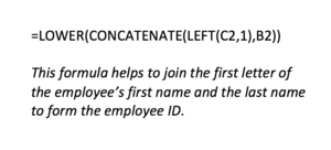
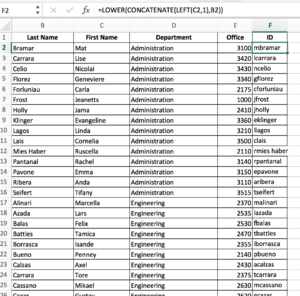
In order to explore the movement of the employees, I have to look into the employees' data records. From the proxMobileOut.csv and proxOut.csv files, I realised that the prox ID is constructed from the employee's name and the number of times she/he has obtained the pass.
Therefore, using the formula as shown above, I added a new column for the employee ID on each row.
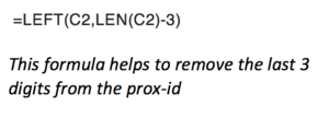
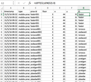
Based on proxMobileOut.csv file, in order to match the employee to each location record, I have to split the prox-id into another column. Then, I would use this column to match with the list of employees.
Then I used Tableau to merge these two files (proxMobileOut.csv & employee.csv) by using join based on the employee ID that I have created previously.
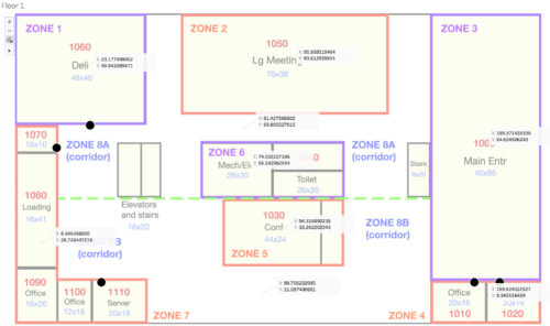
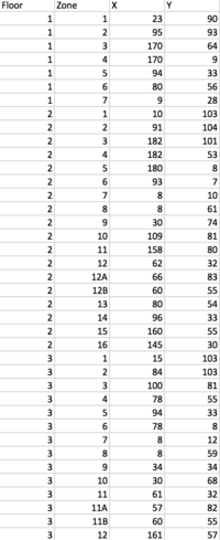
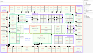
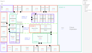
I realised that ProxOut.csv does not have the X/Y coordinates. Therefore, I plot the floormap image onto Tableau. Then, I annotate the center of each zone so that I could get the X/Y coordinate and recorded down. I did the same for all three floors. And then I merge the data from ProxOut.csv with ProxMobileOut.csv.
Building Data
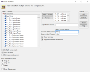
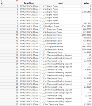
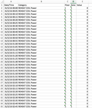
First, I cleaned the the data by removing those unwanted data. Then by using JMP, I have to stack the column to row based on the timestamp. The exported data from jmp would need further cleaning by split the label into floor and zone so that I could plot each row onto each location point on map later.
Using Microsoft Excel, I managed to split the column into two (Floor and Zone). Then I have to cleaned the label by converting them to category so that they can be filtered easily in the visualisation.
My Findings
Link to visualisation: https://public.tableau.com/shared/XNBWHN26M?:display_count=yes
Q1 What are the typical patterns in the prox card data? What does a typical day look like for GAStech employees?
- Floor 2 is occupied with the engineering, facilities and information technology department.
- Floor 3 is occupied mainly with the administration department.
- All employees do not work on the weekend.
Q2 Describe up to ten of the most interesting patterns that appear in the building data. Describe what is notable about the pattern and explain its possible significance.
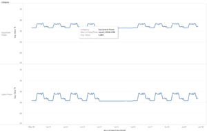
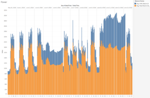
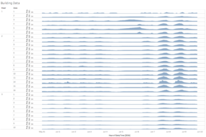
- There is a similar pattern between the light and equipment power usage. There will be a drop in power usage starting from 4pm every working and further dropped by 6pm. It seems that employees might be knocking off or powering down at 4pm everyday.
- The average total electric demand power is generally higher from 10 June to 12 June.
Q3 Describe up to ten notable anomalies or unusual events you see in the data. Prioritize those issues that are most likely to represent a danger or a serious issue for building operations.
- Floor 2 has a significantly higher CO2 concentration from 8 June to 9 June, whereas floor 3 has a lower CO2 concentration throughout the week.
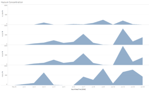
- Floor 2 and 3 has a higher hazium concentration throughout the week.
