IS428 2016-17 Term1 Assign3 Lee Wai Tong Arnold
Link: https://public.tableau.com/profile/arnold1293#!/vizhome/a3_0/Story1
Contents
- 1 Problem Overview
- 2 Objective
- 3 Data Transformation
- 4 Challenges and steps to overcome
- 5 Visualization
- 6 Observations and Answer to Questions
- 6.1 What are the typical patterns in the prox card data? What does a typical day look like for GAStech employees?
- 6.2 Describe up to ten of the most interesting patterns that appear in the building data. Describe what is notable about the pattern and explain its possible significance.
- 6.3 Describe up to ten notable anomalies or unusual events you see in the data. Prioritize those issues that are most likely to represent a danger or a serious issue for building operations.
- 6.4 Describe up to five observed relationships between the proximity card data and building data elements. If you find a causal relationship (for example, a building event or condition leading to personnel behavior changes or personnel activity leading to building operations changes), describe your discovered cause and effect, the evidence you found to support it, and your level of confidence in your assessment of the relationship.
- 7 Future Improvements
- 8 Tools used
- 9 References
- 10 Comments
Problem Overview
After the successful resolution of the 2014 kidnapping at GAStech’s Abila, Kronos office, GAStech officials determined that Abila offices needed a significant upgrade. At the end of 2015, the growing company moved into a new, state-of-the-art three-story building near their previous location. Even though the employee morale rose somewhat with the excitement of the new building, there are still a few disgruntled employees in the company.
The new office is built to the highest energy efficiency standard, but as with any new building, there are still several HVAC issues to work out. The building is divided into several HVAC (heating, ventilation, and air conditioning) zones. Each zone is instrumented with sensors that report building temperatures, heating and cooling system status values, and concentration levels of various chemicals such as carbon dioxide (abbreviated CO2) and hazium (abbreviated Haz), a recently discovered and possibly dangerous chemical. CEO Sten Sanjorge Jr. has read about hazium and requested that these sensors be included. However, they are very new and very expensive, so GAStech can afford only a small number of sensors.
Objective
The objective here is to build an interactive visualization for GAStech in order to see how different building attributes may correlate with one another. It also allows users to identify patterns and gain insights about the building usage and employees behaviour. The visualization also allows GAStech management to have an understanding of their employees activities during the day. From it, we are able to track a specific employee and understand his routine.
Data Transformation
The provided data arrived in different forms, such as an image of the floor zones, building data and employee list.
Data challenges
Building Data
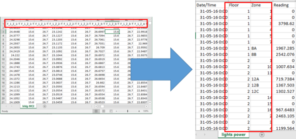
An immediate challenge faced was in the building data. Despite having a large amount the data, its format is not ideal. The floor and zone of the data are in the header, which makes it difficult to do comparison and filtering. As such, I decided to reorganize the data and separate them into different files for easier management.
I wrote a small Java program to read and separate the data into different files and also add additional columns to include the floor and zone.
Prox-id
All employees issued card has a prox-id which ends with a number. Eg. 001. As such, when employees lose their cards and get a replacement, they will be issued with another card numbered 002.
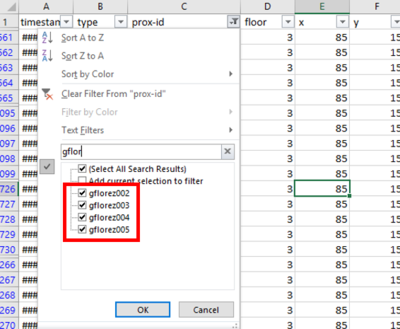
At the start, there were prox-id with same alphabets but different ending numbers. On closer investigation, the increment in numbers suggests that those were replacement cards but by the same employee. As such, I created another field called userid and removed the trailing numbers, leaving only the alphabets. This helps to identify the employee despite the different prox-id.
Mapping Prox-id to employee
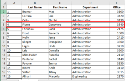
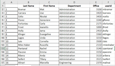
The data containing the employees did not the prox-id they were assigned to. Upon analyzing, I realized that the prox-id is generated based on the employee's name. Eg. Earlean Edward = eedward001. The prox-id is generated by taking the first character of the first name and combining it with the last name. With this insight, I was able to map the prox-id to the respective employee.
However, this did not work for all employees as some of them have more unique names. Eg. Ada Campo-Corrente = acampo. For such special cases, manual mapping was used.
Mapping floor zones on the map
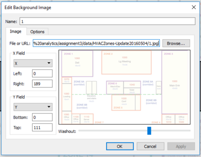
To facilitate a better exploring experience, I decided to include mapping in the visualization. To achieve that, it was necessary to map out each floor zone on the map. I looked up a tutorial online and the references can be found below. First, I had to insert the image into Tableau and put it into the background.
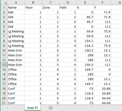
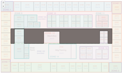
After which, I had to point and find out the coordinates of the corners surrounding the floor zone and write them into a csv file. This process was done manually. Afterwards, the csv file is loaded into Tableau and the polygons are created based on the data inside the csv.
Challenges and steps to overcome
Lack of background knowledge
One problem when doing this assignment was the lack of knowledge about buildings and its ventilation systems. As such, it was difficult to understand how HVAC and VAV Systems operate and their terminology. To overcome this, extra time had to be spent researching and understanding how do these systems work and how they correlate with one another. The improved background understanding offered better appreciation of the data given.
Visualization
Link: https://public.tableau.com/profile/arnold1293#!/vizhome/a3_0/Story1
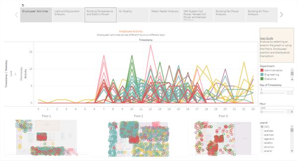
Employee Activity
This dashboard allows users to view employees' activities throughout the day. Based on the data provided, it will also indicate the estimate location of the user on the map below. However, since the fixed-proximity data does not contain any coordinate values, I plotted the employees' location randomly within the zone to simulate his presence. While this may not provide an accurate visualization of the exact employee's location, but it helps to plot his presence within the floor zone.
Uses:
- Filter by day. User can select the day he wants to explore by selecting the filter. Mandatory filtering by day is done to prevent overcrowding of data on the visualization which does not benefit the user. As such, I decided to limit the filter to per day, allowing the user to have a better experience and appreciate the employees' activities by hour per day.
- Filter by hour. The user can also select to filter by hour. This allows the user to see the employees movement on the map as he navigates across the hours. With it, he can see during which hours, where do the employees tend to gather or work.
Light and Equipment Analysis
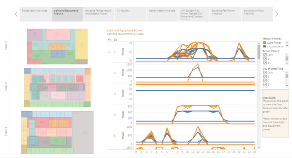
This dashboard allows user to view the different light and equipment power consumption for different zones.
Uses: Mouse over floor zone. By mousing over floor zone, the chart will filter accordingly to display the appropriate chart for that zone. Initially the view was set to display all. However because there are many different zones, the chart became too cluttered. As such, I decided to help the user filter when he mouses over the floor zone he wishes to see. If he wishes to view the charts for all the zones, he can still do so by scrolling down the chart.
Building Temperature and Electric Power
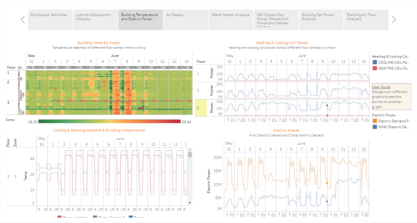
This dashboard shows the user an overview of the temperature in the building and the electric power consumed. These charts are placed together because they relate to regulating the building's temperature.
Uses: Mouse over heatmap. When user sees an area of interest on the heatmap, he can mouse over the region to see how it corresponds with other charts.
Air Quality
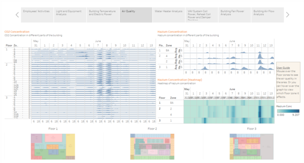
This dashboard shows the air quality in the building. Specifically, it analyzes the CO2 concentration and hazium concentration.
Uses: Mouse over charts. By hovering over the charts, user can view the floor zone highlighted at the bottom.
Water Heater Analysis
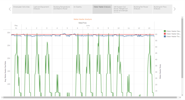
This dashboard shows the data related to water heater.
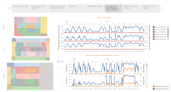
VAV System Coil Power, Reheat Coil Power and Damper Position
This dashboard shows charts related to coil power and damper position
Uses: Mouse over charts. By hovering over the charts, user can view the floor zone highlighted at the bottom.
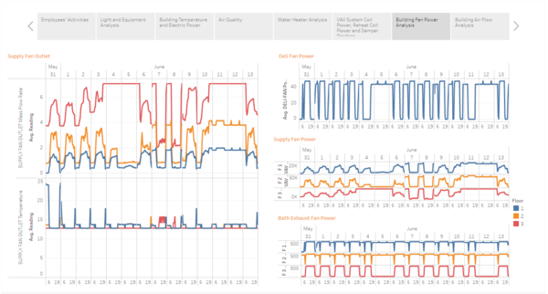
Building Fan Power Analysis
This dashboard shows charts related to fan power and supply fan.
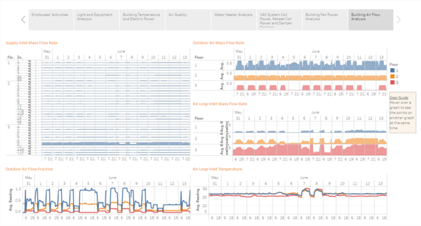
Building Air Flow Analysis
This dashboard shows charts related to air flow rate within the building.
Observations and Answer to Questions
What are the typical patterns in the prox card data? What does a typical day look like for GAStech employees?
- Most employees report to work from 7am onwards. Data reveals that during the 7th hour, employee activity is the highest.
- Lunch time at work is around 12pm onwards. For most employees, there is an increase in activity on the 12th hour.
- Office hours is until 5pm. For most employees, the last peak in activity is at 5pm after which there is no activity. This suggests that the employees are no longer in the office.
- Most departments only work until 5pm and go home. These departments are Admin, Executive, HR and Security. Most of these employees do not have any recorded activity after 5pm.
- Other departments like Engineering, Information Technology and Facilities tend to have longer operating hours as there are recorded activity from 7am until 11pm.
- On closer look, some employees that are detected in the office after office hours only have recorded activity from 4pm onwards. This suggests that they probably work the night shift and hence get off work later.
- Employees that report to work at 7am tend to get off work before 8pm. This suggests that employees usually do not need to work overtime.
- Every Sunday, there would be an employee from Administration in office in the afternoon. On both Sundays, a different Admin employee was detected. It is likely that the department has a rotation of which Admin employee come in on Sunday to work in the afternoon.
- Employees stick to their area of work most of the time without roaming the office too much. For example, Executives usually stay on the 3rd floor while Engineers stay on the 2nd.
- Security employee Felix Resumir is the security employee of the 3rd floor. He has a similar routine each week. Everyday at 5pm, he will go to the 3rd floor to patrol and will always check in Zone 6. In the morning, he will always visit the building Deli. It is likely he goes there for breakfast every morning. On Tuesday and Thursday, he will visit the 2nd floor in the morning to do patrolling. He does not visit the 2nd floor on Monday, Wednesday and Friday.
Describe up to ten of the most interesting patterns that appear in the building data. Describe what is notable about the pattern and explain its possible significance.
- Lights power and equipment power in certain floor zones share similar patterns. Example of such places are the offices on the 2nd floor. A possible reasoning is that an employee has entered the zone to do something. This suggests that the employee switched on the lights and use the equipment which explains to similar pattern in light and equipment power consumption.
- Some floor zones have constant usage of light power. An explanation for this is that these areas are common areas and thus the lights are always kept on for safety reasons.
- Another pattern that is observed is that lights and equipment power in most zones usually increase sharply from 6h and drops close to 0 after 17h. This probably maps the employees’ behavior in the office whereby the arrive into work in the morning and leave after office hours.
- At 2pm, light and equipment power usually take a sharp dip. Upon checking, there are still employees in the area but yet the power consumption went down. Their location suggests that they are in their offices and not together in a meeting room which may reduce the energy consumption. However, noting that it is immediately after the lunch hour, it is likely that most employees tend to take afternoon naps after their lunch. This would explain their presence in the office and yet their lights and equipment is not switched on.
- Water heater gas rates is usually low during the weekends when there are no employees. However, during the weekdays, it is observed that the gas rate usually peaks at 12h, which coincides with the lunch hour. It is likely that employees consume more hot water during lunch which results in the water heater having to heat more water and thus the higher gas rate.
- Reheat damper position. It usually follows the employee activity patterns whereby there are higher recordings during office hours. This is likely due to damper position being used to regulate ventilation in the building and hence are more active during that time.
- Reheat damper position & supply inlet mass flow. From observation, these 2 readings follow very similar patterns. This suggests that they correlate with one another very strongly as when the damper position is opened more widely, it increases the inlet mass flow rate by the same constant.
- Total electric demand power. It follows a similar pattern whereby it goes up during office hours. During the day, it has 3 peaks during 8h, 12h and 17h. This coincides with employees arriving for work, going for lunch and leaving the office. The employees use more power during these hours. It also follows a similar pattern with HVAC electric consumption. It can mean that the increase electric consumption by HVAC significantly contribute to the increase in overall electric consumption.
Describe up to ten notable anomalies or unusual events you see in the data. Prioritize those issues that are most likely to represent a danger or a serious issue for building operations.
- On 11 June after 10am, hazium levels started to shoot upwards in various zones. Most zones reached the peak at 6pm before starting to decline. Whereas, hazium level on level 3 continued to climb until 8pm.
- On 7 and 8 June, the building temperature was much higher than usual. The warmer temperature may make the environment less suitable for work for the employees.
- On 7 and 8 June, the supply fan power were not operating at its usual power. From observation, the fans seem to be switched off during the working hours on both days. This may lead to the air being stuffy and make it uncomfortable for employees. Employees with respiratory problems might be at risk.
- On 7 and 8 June, it is observed that the temperature heating setpoint is set much higher than usual. This would have led to the air conditioners to hold the temperature at a higher reading and thus causing the temperature during those days to be much higher than usual. It is unlikely that this incident is due to machine error as the setpoint was reduced much lower during the wee hours before going up again during the office hours. It is more likely an error in setting of the heating setpoint.
- Co2 concentration in the building on 7 and 8 June was also observed to be higher on both days. This may be due to the poor ventilation as highlighted above. Higher co2 concentration may pose a risk to employees with respiratory problem.
- During the weekend of 11 and 12 June, it is observed that HVAC demand power was high. This suggests that the HVAC systems were left on over the weekend. The power consumption was also much higher than normal office consumption. An initial thought was that there was some testing going on with the HVAC systems over the weekend, resulting in the high consumption of HVAC power. However, noting that there were issues with the temperature over the past few days, it is likely that there is something wrong with the air conditioning system.
- During the weekend when most employees are not in office, it makes sense that electric consumption is low. However, on the weekend of June 11 and 12, it is observed that electricity consumption over that weekend remains high. This is likely due to the high HVAC demand power over the same weekend.
- Reheat coil power. During the weekend of 11 and 12 June, reheat coil power was high and not in its usual form. This means that more heat is generated by the system and would result in warmer air to be produced in the building. This may explain why HVAC power consumption was high over the same period because it was trying to cool the building down.
- Reheat damper position. During the weekend of 11 and 12 June, the reheat damper position was also left open. Because of that, heated air entered the building and cause the HVAC systems to work to bring down the building temperature.
Describe up to five observed relationships between the proximity card data and building data elements. If you find a causal relationship (for example, a building event or condition leading to personnel behavior changes or personnel activity leading to building operations changes), describe your discovered cause and effect, the evidence you found to support it, and your level of confidence in your assessment of the relationship.
- When the number of employees in the building is high, the consumption of building resources also increase. An example of this is the light and equipment power. The pattern follow closely to employee activities in the building. The extremely strong correlation suggests that the presence of employees greatly influence the usage of light and equipment. Given this strong evidence, I am highly confident of this assessment.
Future Improvements
One future improvement that can be done is assess the effectiveness of the current dashboard. Based on their interaction with the dashboard, the users can highlight limitations of the current design and thus make improvements to it. For example, the user may wish to have certain building charts and employee movement charts on the same page to see how they would react due to building changes. The current design does not facilitate such an objective well. As what prof covered in week 11, it is important to go through the best practices for dashboard design to get the feedback from the client and better understand the needs and usability from the user. This will help fine tune the dashboard design and deliver business value for the client.
Tools used
- Tableau
- Microsoft Excel
- Java code for extracting and printing data
References
- Tableau Background Images tutorial (https://www.youtube.com/watch?v=CdqEio_8KTo)
- Tableau Drawing Polygons on Background Images (https://tableauandbehold.com/2015/04/13/creating-custom-polygons-on-a-background-image/)

