IS428 2016-17 Term1 Assign2 Timothy Tan Swee Guang
Perception and Data: How the media influences our implicit folk theories on consumption patterns around the world
Contents
Abstract
This study makes a case against how media can skew peoples perceptions of everyday life. In this study, the focus was on how our everyday media influences our formation of our implicit folk theories of healthy/unhealthy food consumption patterns around the world; more specifically so for the perceptions of Europe and America. It was found that Europe is the healthiest in terms of types of product consumed thus, supporting the media's portrayal of European food being healthy. However, comparing unhealthy types of product consumed, it was concluded that America is not as unhealthy as made out to be. The French from Europe are more unhealthy compared to Americans from the US. This finding did not support what the media has been associating American food as (i.e. always associated to fast food on television). The study concluded warning its readers to be wary on what is portrayed on television as it may not be representative of the reality.
Problem and Motivation
With the ubiquitous presence of the media in everyday life, it is easy for us to form conscious or unconscious perceptions of different societies based on what the media portrays it to be. For example, the media always depict European meals as fresh and healthy (I.e. Italian Pastas, Paella from Spain, Greek Salads or fresh fish from the Netherlands) whilst associating fast-food or unhealthy foods to countries like the US or Canada. But is this really true? Or is the media truly biasing our perceptions?
This study aims to explore how media can influence our perceptions on how we perceive differing countries consumption patterns. Through the use of food facts, the study attempts to proxy how media bias our views on how healthy or unhealthy a country truly is through its advertisements on what they eat.This study will proxy products availability in a country as an indicator of what people eat in that country.
Health Indicators
Healthy Measures (per 100g)
- Fiber
- Fruits, Vegetables and Nuts
- Monounsaturated Fat
- Omega 3 Fat
- Polyunsaturated Fat
- Proteins
Unhealthy Measures (per 100g)
- Alcohol
- Fat
- Salt
- Saturated Fat
- Sugars
- Trans Fat
Approaches
Data Preprocessing
1. Removed "Null" Product Names
2. Treated "Countries_en" column
- Delimited multivalued cells
- Stacked Columns
3. Treated "main_category_en" column
- Removed names with ":" by formula
4. Standardized "Product_Category_D1" to start with lowercase to resolve double-counting issues
5. For the measures, only attributes that seem to be good predictors of health were kept.
- Data points without any measures were excluded (22,026 rows were filtered out due to all 26 measurements missing [this 26 includes the measures of interest]. Leaving 39,996 rows left for analysis)
6. Organized Groupings
- Grouped Countries by Continents
- Grouped Measures by Folders
Research Questions
- What products are the different countries consuming?
- What product contents are the different countries consuming?
- What are some of the patterns of products available in each country?
- How healthy or unhealthy are these products?
- Which continent eats the healthiest?
- Are there different patterns of consumption between Europe and America as showcased on television?
- Are these patterns align to what media portrays them to be?
- If Europe and America's consumption patterns differ, what are they consuming differently? What are the reasons for these differences?
Link to Interactive Dashboard
https://public.tableau.com/profile/timothy.tan5930#!/vizhome/TableauA2/TheExplorer
How to Explore the Dashboard?
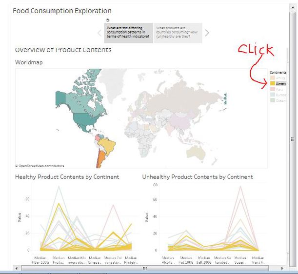
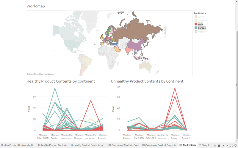
The first tab visualizes the different consumption patterns (in terms of health indicators) of various countries and are grouped by continents. In this section, we would be able to click on a country, to view the median levels of healthy and unhealthy indicators of that particular country. This gives us an overview of how healthy or unhealthy a country's consumption pattern is. For example, in Figure A, America was select off the map, and it can be seen that the median levels of healthy and unhealthy indicators are about the same hence, giving a rough indication of the consumption patterns of Americans.
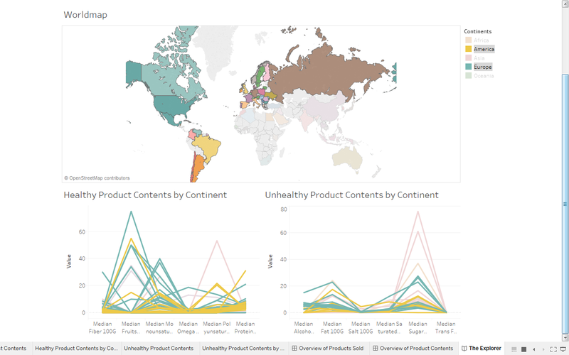
Alternatively, if we were to want to view the health indicators of a continent, we would click "America" off the legend instead. (Figure B)
Diving Deeper
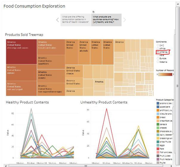
Once we get a sensing of the first tab, we can dive deeper into a country of interest for further analysis. Now, let us suppose we would like to look at the food products of America again (Figure C). We would simply select America and we are able to see the top products being consumed by America (via tree map) and how healthy or unhealthy the products are (via parallel coordinates).
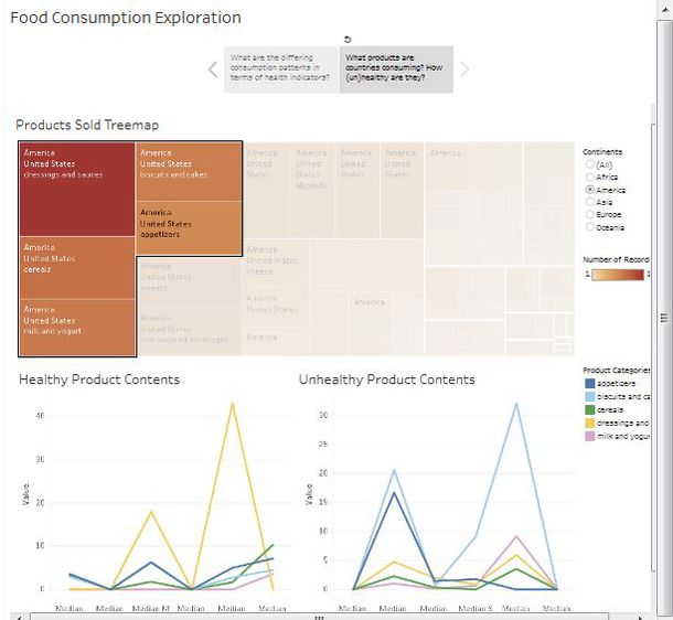
From here, we could zoom into the top products being consumed by the country and look into the health factors of it easily by control+clicking on the respective products. (Figure D)
From here, it is the matter of exploring different countries of interest and perhaps form comparisons on how differing countries top products differ. Therefore, giving in further insight into how different countries consumer healthier/unhealthier products juxtaposed to other countries.
Analysis
Healthiest Continent
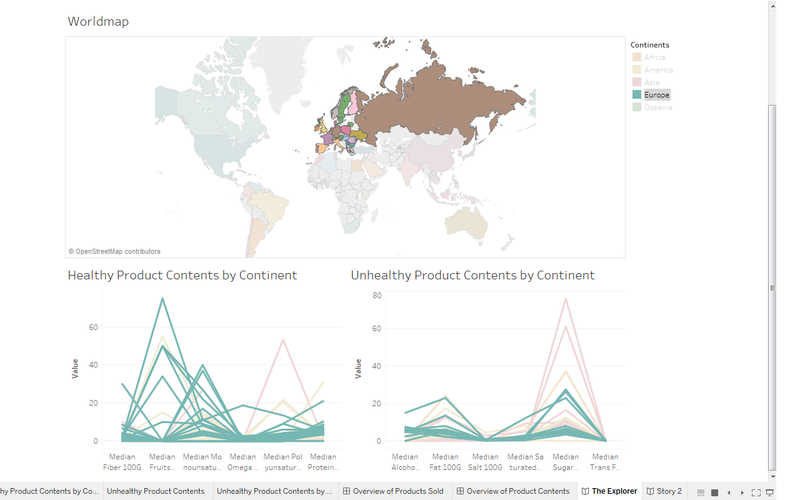
In terms of healthy measures (Figure 1a), Europe seems to be consuming greater amounts of healthy products than any other continents. Europeans seem to eat fruits, vegetables and nuts more than most countries and also take more monounsaturated fat more. This higher intake of monounsaturated fat comes to no surprise as Europeans do appear to have their meals with olive oil and cook with it more often than other countries.
What is interesting is that, we can see the exact same type of pattern when it comes to the intake of polyunsaturated fat in Asia, specifically, Hong Kong (Figure 1b). The intake of this particular type of fat is due to the oils (I.e. Sesame oil, Sunflower Oil, Canola Oil etc.) Asians tend to use to cook with. A stark difference in types of oil usage for cooking can clearly be seen here between the Europeans and Asians.
Consumption Differences: Europe vs America
Comparing the consumption patterns of Europeans and Americans (Figure 2a), it does seem like Europeans consume healthier products than Americans. Having said that, Europeans and Americans do not seem to differ much in terms of their unhealthy products consumption. This pattern seem to show support to what media portrays on television that Europeans do eat healthy. However, it is noteworthy to point out that the media might be choosing to portray European cuisine as being healthy and giving a twisted perception of American cuisine as being unhealthy. This can be inferred as there are no clear difference between the continents in terms of unhealthy product consumption.
Consumption Differences: A Deeper Look
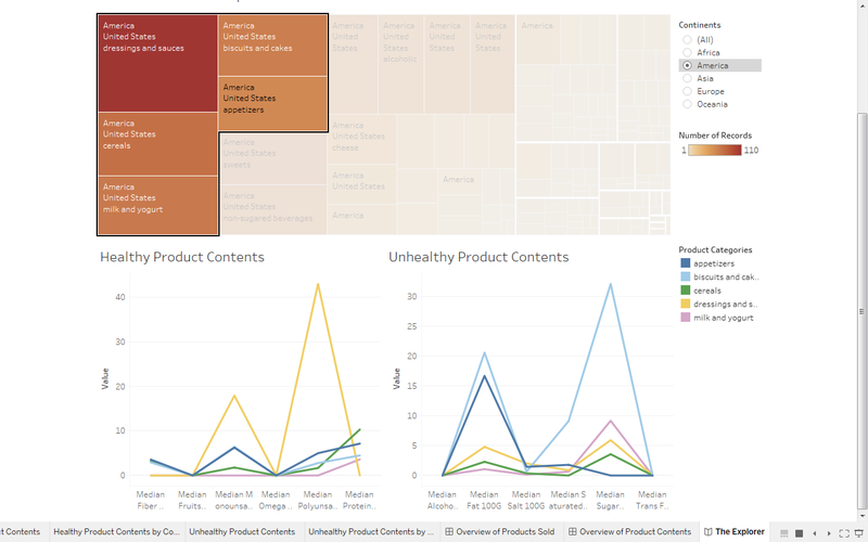
Figure 2b - America
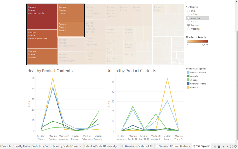
Figure 2c - Europe
Take a look at the side by side comparison of the top 5 products consumed in each continent. A few key patterns can be seen here (Figure 2b & 2c).
Firstly, the consumption patterns in Europe mostly came from France while in America, came from the United States (US).
Secondly, a few consumption differences have been brought to light. In France, One-dish meals, Cheese and Sweets are the top 5 products consumed while in the US, dressing and sauces, milk and yogurt and appetizers are in the top 5. Biscuits & Cakes and Cereal seem to be the common products in both countries. From here, it becomes evident why the initial findings suggested that Europeans (or much rather, France), eat healthier than Americans. All of the top 5 products the French consume contain high levels of fruit, vegetables and nuts. Juxtaposed to the US, who has only it's dressings and sauces that gives its health benefits via healthy oils. Again, in terms of healthy consumption patterns, it looks like the data confirms what the media has been portraying on television. The French from Europe do eat healthier than Americans in the US.
Comparing Unhealthy Consumption Patterns: France vs USA
Comparing across the top 5 products between the two countries (Figure 2b & 2c), we can see that in actuality, French products contain more unhealthy contents than the US in terms of total grams of fat, sugar, salt etc. (France vs US: 175.96g vs 113.5g unhealthy contents). This is a significant finding as it supports the initial hypothesis on how media can bias our perceptions on viewing a country as being unhealthy or healthy. It looks like the US is not as unhealthy as it is made out to be. Although the media could potentially be on to some truth by portraying the US as being more unhealthy (i.e. basing their content on the US growing obesity rates), they might be placing more weight on this perception than they ought to be without realizing it's widespread impact.
Summary
To sum up what we have so far, we can see from the interactive visual the products together with their contents each country sells. It was assumed that consumption & health patterns can be proxied by what is available and sold in each respective country. Thus, product contents were grouped into healthy and unhealthy categories used as health indicators. We also found that Europe seem to be the healthiest continent showing the first signs of support for what media has been showing on television. Additionally, we discovered some interesting patterns in the type of healthy oil (mono & poly – unsaturated fat; I.e. olive oil and sesame oil) consumption between European and Asian societies.
Diving deeper, we took a closer look at two continents, Europe and America where we confirmed Europe as being healthier in terms of types of food contents consumed. However, as for the unhealthy types of food content, it remained inconclusive. We ended the section pointing out that the media could be portraying the truth about Europe in terms of the type of food they consume but might be skewing the perception of America.
To further investigate this, we compared the top 5 products most consumed in each respective continent. Two interesting insights were derived from this. Firstly, it could be seen that the consumption patterns in Europe mostly came from France while in America, came from the United States (US). Secondly, we found support for what media has been portraying on television - that Europeans (or much rather the French in this case) ate healthier than America. All top 5 products in France were high in fruits, vegetables and nuts per 100g as compared to the US with no products high in this content.
Finally, having found evidence to support our perceptions of European food being align to reality, we then decided to take a closer look at unhealthy consumption patterns to see if the perceptions of America was aligned as well. We compared France and America across their top 5 respective products but found that Americans are not as unhealthy as portrayed to be on television in terms of the products and product contents they consume. In fact, the French from Europe were consuming more unhealthy contents than Americans from the US. It was concluded that the media, could be placing more emphasis on America having an unhealthy lifestyle than warranted.
Implications
This finding has deeper implications than it seems. If the media is able to exacerbate views on mere food facts what else might we have a false perception against without even knowing it? It is therefore important for people to continuous keep a sharp mind and not take in everything media portrays at face value.
Recommendations
Perhaps, in the future, data could be collected on the actual food consumed by each countries broken down by their food contents rather than food facts from "off the shelf" products to give a more accurate picture of healthy/unhealthy food consumption.
Secondly, it was a pain to separate multi-valued cells during the preprocessing phase. As such, it might be wiser to collect data in a database format to reduce the time spent on preprocessing data.
Lastly, we would be nice to have all country names standardized when collected (I.e. france vs France vs FR). This would make the life of the data analyst simpler as well. In addition to that, perhaps an additional column of which continent the country belongs to would nice as well.
Tools Utilized
- Excel 2013 for data preparation
- SAS Enterprise Guide for data preparation
- JMP-PRO for data preparation
- Tableau for visualization
References
http://www.webmd.com/diet/obesity/features/skinny-fat-good-fats-bad-fats#1
http://statisticstimes.com/geography/countries-by-continents.php
