IS428 2016-17 Term1 Assign2 Margot Marie T Stelleman
Contents
- 1 Abstract
- 2 Data Visualisation System Design Process
- 3 Visualization Software used and evaluation
- 4 Results
- 4.1 How does the size of company affect injuries number?
- 4.2 Is age playing a role?
- 4.3 Are injuries linked to a lack of experience of the employee?
- 4.4 What type of activity is the most affected by injuries?
- 4.5 Injuries on a timeline
- 4.6 Respecting Legal Conditions?
- 4.7 A profile of injured people
- 5 References
- 6 Comments
Abstract
People can have the feeling to feel safe everywhere but still, there is always a risk to get injured. This project concentrates on injuries in workplace in Singapore. Thanks to Interactive Data Exploration and Analysis of data of Workplace and Health Institute of Singapore, it allows us to answer easily to several questions about this topic. Which type of industries is more affected by injuries? Will more injuries happen in larger companies? At what time of the year or of the day, for example, is it more common to get injured? What sex is injured the most?
Data Visualisation System Design Process
Step 1: Identify a theme of interest
This study concentrates on the workplace in Singapore and specially on the safety of these places. The theme of interest is "Injuries in workplace located in Singapore". Such information as the employee affected, its sex, the company in which it happened, her size and sector of activity will be essential. This is provided in the EXCEL file delivered by the Workplace and Health Institute of Singapore.
Step 2: Define questions for investigation
Now the theme is identified, we need to define the questions that we would like to find some answers thanks to exploration and analysis.
- Which sector is the most affected by injuries? And how the size of a company affects this number?
- What is the proportion of males/females having injuries? We can ask ourselves how this proportion is by age categories, overtime hours, sectors or still in duties hour.
- Are some time’s moments more particularly affected by injuries? (month, weekday, day time)
- Are the injuries reported immediately? I was cleaning the data file and I realized this question could not be answered precisely because information available was not precise. The accident date was available but the reported accident month was only available, which makes non-sense and no utility when we want a precise answer to this question.
- Which body part will be more injured regarding the different sector?
- Is an injury linked with a lack of experience?
Step 3: Find appropriate data attributes
I have first cleaned the file. This step is very important. Why? Because some columns in the Excel file are not relevant to the study and the questions we want to answer. I have deleted the following ones:
- "Reported date" since this date was not giving any information about the day and that there is a column specifying the month when the injury has been reported called “Reported Month”.
- "Accident date" has been deleted because it was presenting the same problem as "Reported date" by not specifying the day, "Accident day" presents the entire and complete date but has been also deleted since we have any complete information for the reported one we are keeping only the month for Accident happening.
- Since we are keeping the written month and making it as categorical data, "Accident month" in date form, adding no information, has been deleted.
- "Accident Year" is only 2014, this column is not giving any additional information and is deleted. We just need to specify that the data we are dealing with are from 2014 when we are presenting the results.
- "Org SSIC (2010)" is given an indication of the activity of the company but since we have the “Sub Industry (SSIC 2010)” column giving us an insight of it , this "Org SSIC (2010)", "3-digit SSIC (2010)", "2-digit SSIC (2010)", "Major Industry (SSIC 2010)" columns are not necessary because they are not giving clear and not enough precise information to read for the purpose of the research.
- "Accident Type Level 2 Desc", "Accident Type level 2 Category", "Cause", "Accident Type Level 2", "Accident Agency Level 1 Desc", "Accident Agency Level 1", "Accident Agency Level 2 Desc", "Accident Agency Level 2", all these columns have been deleted. Because of the choice to keep an aggregate level of this information with the “Major Injury Indicator” column.
- "Victim's Employment Start Mth" and "Victim Employment Start (MMM)" give similar information than “Victim's Employment Start Date” so they have been deleted.
- "Employer's SSIC" is not necessary because occupation has already a column dedicated.
- "Pct Manual Work" is just dividing in two categories, not enough precise and will be deleted.
- "Accident Weekday No" has also been deleted because repeating with ”Accident Weekday”.
- "Reported Month" has been deleted since it could not give an accurate and representative answer to the fact we wanted to know if the reports were reported immediately since we do not have the precise date and then the number of days between accident happened and actually reported.
- "Informant Type" is not relevant for our questions and has been deleted.
- "Victim's Employment Start Date" and "Victim Employment Start (MMM" have been deleted since we are considering experience only with column “Months Worked”.
- "Hospital / Clinic Treated or Examined" has also been deleted because not giving essential information to our questions.
And then, some transformations to have the final, good and useful attributes were necessary. Here are all the modifications I have done:
- "Number of Employees" has been separated in categories to let appear the size of the companies since we are wondering in which size of enterprises are the most affected by injuries. It has been splitted following this pattern found on EuroStat website:
- micro enterprises: fewer than 10 persons employed;
- small enterprises: 10 to 49 persons employed;
- medium-sized enterprises: 50 to 249 persons employed;
- large enterprises: 250 or more persons employed.
And the following formula has been used: =IF(E2<10;"Micro";IF(AND(E2>=10;E2<50);"Small";IF(AND(E2>=50;E2<250);"Medium";"Large"))). Giving birth to new column "Company Size" which I have copied and pasted to have no link anymore with the numbers of employees and deleted this column.
- "Accident time" has been modified to be separate in categories. Morning if the time was between 6am and 12am, Afternoon between 12am and 18pm and Night for the rest. The idea is to know what part of the day was most affected by injuries. The following formula on Excel has been used: =IF(AND(H2>$I$2;H2<$I$3);"Morning";(IF(AND(H2>$I$3;H2<$I$4);"Afternoon";"Night"))). Then the column of the results has been paste and next deleted, also Accident Time with the hours to have only a column Accident Time but in these categories.
- "Victim’s Gender" has been transformed into GENDER column to get a more esthetic form by having F=Female, M=Male and using an IF formula.
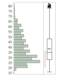
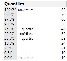
- Then I have splitted "Age" under category following this: Under 24 for Young, 25-44 for Young Adult, Above 45 for Adult. When we look at the distribution in JMP, these categories look “homogenous” even if the Young Adult one will have more people in it. A bit less of 25 percent is in the Young Category and a bit more than 25 percent are above 45 years old. As we can see in the boxplot graph under, this last category is way more dispersed.
After these two steps, the right data attributes are available and ready to be analyze.
Visualization Software used and evaluation
- Excel has been use not for visualization but to complete the cleaning and transformation steps.
When we focus on the visiualization properly, it is also a process to get to the final graph.
- I have first analyze the type of my data. Mostly of them are categorical. It means that every single type of interactive graph can not be done. All the graph requiring all continuous data as Ternary Plot, Parallel Coordinates coul not be done. Mosaic Plot and Parralel sets were thought perfect for the purpose of the study because they are carrying categorical data. This dataset is not only composed of categorical data. For example, Months worked is continuous. It means that some others graphs dealing with categorical AND continuous data are possible to construct. I was thinking then to Treemap.
- I asked myself: what program is able to deal with Mosaic Plot, Parallel Sets and Treemap? At the same time, none. Three different programs have been used to this project.
- JMP: The strength of JMP compared to Tableau is that he can effectively deal with a lot of interactive graphs. Mosaic Plot are way more easy to realise on JMP than Tableau, you open the X/Y related window and select your data.
- Tableau Software: Basically, Tableau can deal with Mosaic Plot, but seems to be less easy and intuitive than on JMP, and Treemap. I used this program to do Treemap because once you select the data, you can switch with other data and see instantly the difference. In JMP, you need each time to open the window reselect the data and save your work. Plus, I find the design and colors in Tableau more modern and better looking.
- Parralel Sets: Tableau, JMP, Qlik Sense, Power BI, when we are searching in the program or on the internet, none of them seem to be able to do a Parallel Set. This left two options: D3.js or Parallel Sets. D3 requires coding, a complication when we know that Parallel Sets is basically importing dataset and select the categories we want on the graph. So this program is really easy to use BUT Parallel Sets does not deal with a large of categories. I imported my entire cleaned file, but the program was not working, I needed to delete some columns and have less than 10. So the strength is that it’s easy to use but not handling a lot of data. Plus, it is quite unstable since it is not a licensed program. For example, the program was not opening on my computer, crash report was always appearing on the screen and I needed to find a Mac computer for him to work finally. So definitely, D3.js will be more convenient because it can be code on every computer and I think all these famous program as JMP or Tableau should include this Parallel Sets visualization, that I think personally very useful.
Each program has definitely its strengths and weaknesses. Unfortunately, any program is complete. You need to be able to know what program is able to do to be effective and propose the best design.
Results
How does the size of company affect injuries number?
In 2014, medium companies have known the most of the injured accidents in Singapore, such as small enterprises too. Majority of injured employees were male. But Female have known more injuries while working in large and medium companies.
Is age playing a role?
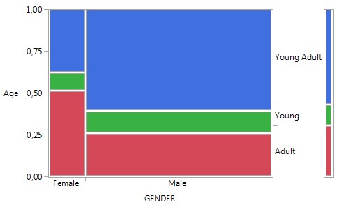
In 2014, the young people were the less injured while male between 25 and 44 years old and and a majority of female were above 45 years old.
Are injuries linked to a lack of experience of the employee?
All the following treemaps presented can be seen interactively at the following URL link: https://public.tableau.com/views/Assign2_10/Tableaudebord1?:embed=y&:display_count=yes
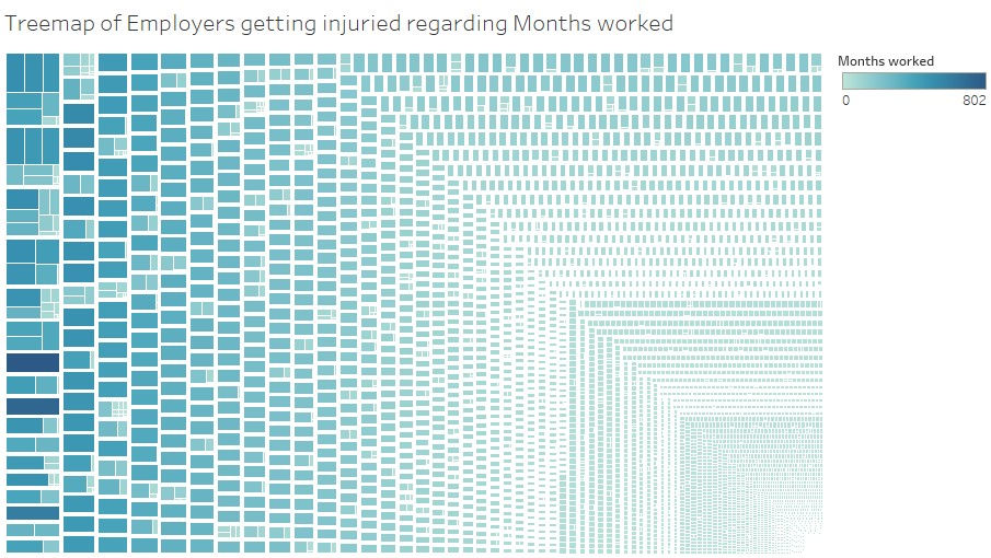
Light blue is predominant on this graph which means that people got injured mostly when they were not working for such a long time in the company.
What type of activity is the most affected by injuries?
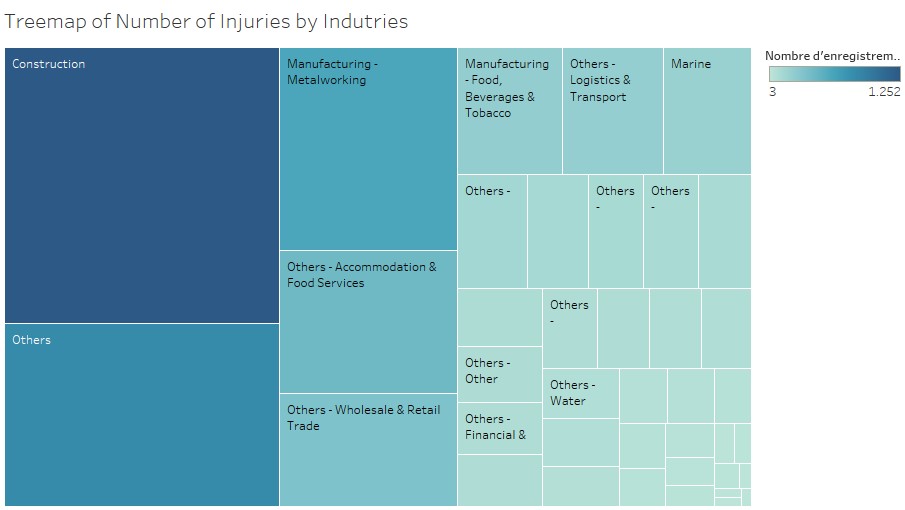
In 2014, Construction is the field that have known the most of people injured.
Injuries on a timeline
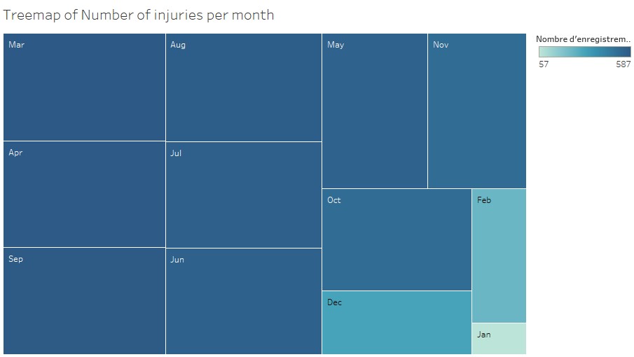
By months, in 2014, January following by February and December are the months having less accidents. Could we explain that by the fact that people are taking day-off for holidays and that companies are usually running slowly with less effective because they are making the account and all taking a break for christmas time and new year?
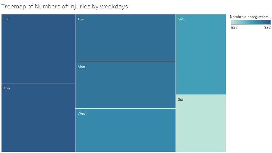
When we focus on the week, sunday and saturday are the less affected. Of course less people are working on the weekend. But the most of injuries are at the end of the working week on friday and thursday, that could be due to people tired after a full week.
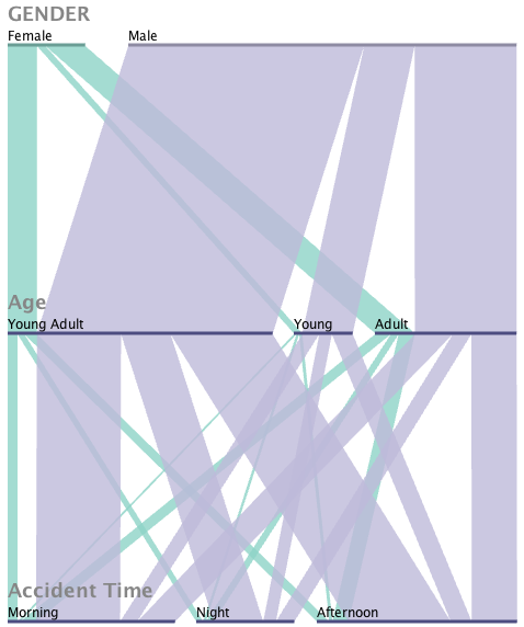
Age categories have already been analyzed in a Mosaic Plot but this graph confirms well our conclusion as like most of people injured are between 25 and 44 years old but also that women will be usually mostly older, above 45 years old. What is interesting to see is that injuries happens slightly more in the afternoon than in the morning.
Respecting Legal Conditions?
It is interesting to notice that injuries comparing Micro and Large industries happened more in Large companies. But when it happened during overtime the numbers are quite equally, Micro companies have experienced injuries almost as Large companies. We notice the same conclusions regarding performing official work duties. And usually people doing overtime where performing their official work duties. But again for Micro companies it seems that almost the half was not.
A profile of injured people
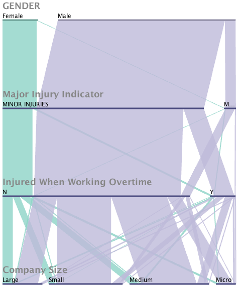
Different profile can be generated regarding the categories. Here we focus how female and male had major or minor injuries during overtime or not and working in what size of company. Female had usually minor injuries while they were not working overtime and working for a bigger company as large or medium-sized. Male had usually minor injuries while not working overtime and working for small or medium-sized companies. Barely not female have major injuries.
References
http://ec.europa.eu/eurostat/statistics-explained/index.php/Glossary:Enterprise_size https://public.tableau.com/views/Assign2_10/Tableaudebord1?:embed=y&:display_count=yes
