IS428 2016-17 Term1 Assign2 Liu Bowei
Contents
- 1 Introduction
- 2 Data Cleaning
- 3 Question 1: Is there a relationship between the nature of work and number/severity of accidents?
- 4 Question 2: Does a difference in working experience affect the number and severity of accidents?
- 5 Question 3: Does the age of the worker affect how prone he is to work place injury?
- 6 New Question 2: Is the accident rate and severity correlated to the employer?
- 7 New Question 3: What are the main causes of injury?
- 8 Visualization
- 9 Changes to Visualization
- 10 References
Introduction
For this assignment, the dataset I will be using will be the WPI dataset provided on the assignment wiki page. As this is a dataset about Work Place Injury, my theme of interest would therefore be closely related. Workplace fatality has been on the rise in recent years, increasing to 1.9 fatalities per 100,000 workers, and projected to hit 2.2 this year[1]. This does not bode well for Singapore, with our large number of foreign workers, such negligence can be interpreted as them being mistreated. As such, the theme of interest I have chosen for this project are issues related to accidents at work.
Data Cleaning
I have identified three initial questions for investigation:
1.Is there a relationship between the nature of work (e.g How dangerous the work is) and number and severity of accidents?
2.Does a difference in working experience affect the number and severity of accidents?
3.Does the age of the worker affect how prone he is to work place injury?
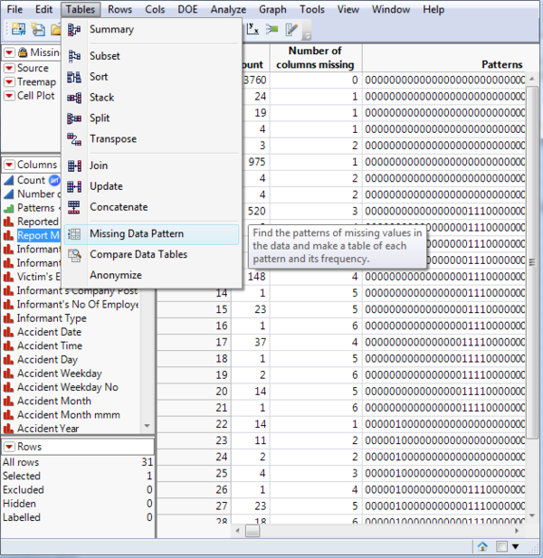
Before any analysis is to be done on this dataset, the data must first be cleaned. The first step towards data cleaning would be to identify missing values. In this project, I will be using jmp for this purpose. After loading the WPI dataset into jmp, I made use of the Tables->Missing Data Pattern function.
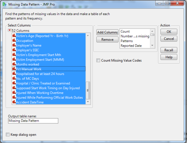
For a quick overview, I dragged all columns into the Add Columns box in the Missing Data Pattern Window.
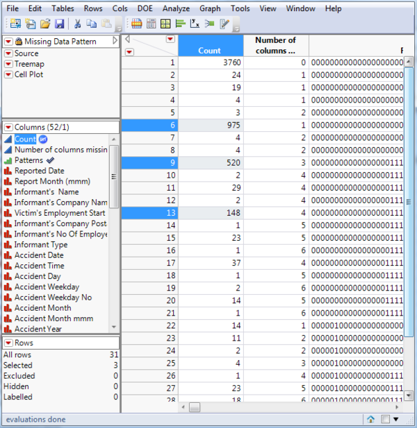
Due to some columns having a large number of missing values: 975 records have the column Accident Type Level 2 missing 520 records have the columns Org SSIC, 3-digit SSIC and 2-digit SSIC missing 148 records have the columns Org SSIC, 3-digit SSIC and 2-digit SSIC and Accident Type Level 2 missing
As columns Org SSIC, 3-digit SSIC and 2-digit SSIC and Accident Type Level 2 have a large number of missing values, I will be refraining from using these columns in my visualization.
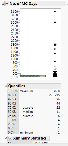
To begin my analysis, I would need to determine the attributes in the data that can help answer my questions. Firstly, to determine the number of accidents, I have decided to simply count the number of records. To determine the accident severity, I have two options, to use the Major Injury Indicator or the No. of MC Days given. To answer question 1, I would need the attributes Major Industry and Sub Industry. I would need the attribute Months Worked to answer question 2 and Victim’s age to answer question 3. Using JMP to visualize the distribution of each attribute, I realized that one of my accident severity attributes, the No. of MC Days given, is highly skewed.
As such, I have decided to transform the attribute by applying a natural log operation to it for my visualizations in tableau.
Question 1: Is there a relationship between the nature of work and number/severity of accidents?
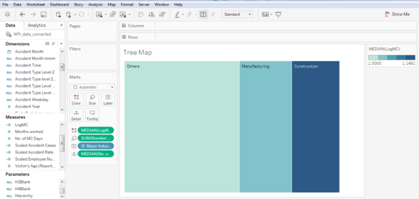
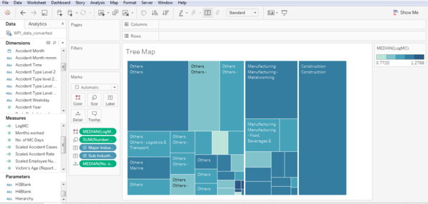
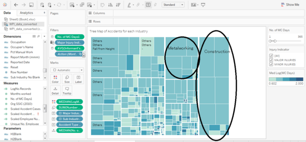
For question 1, due to the high number of attributes: Major Industry (Categorical), Sub Industry (Categorical), No. of Accidents (Numerical) and No. of days of MC (Numerical), I have decided to make use of a tree map for the visualization. For the tree map, I created a hierarchy of Major Industry->Sub Industry, and used the No. of Accidents as size and Median Log (No. of days of MC) as intensity. The results are shown below:
TreeMap for Major Industries
Tree Map for Sub Industries
As expected, injuries sustained in dangerous and physically laborious jobs like Construction, Metalworking, Petrochemical and Marine are generally more serious compared to other jobs like Food & Beverages and Logistics & Transport. From this visualization, it can be seen that Construction, Metalworking and Others have a large number of high severity accidents, and perhaps more caution or additional safety measures can be implemented in these industries.
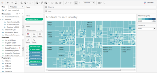
After understanding the data more, I realized that the sub industry can be further broken down into nature of work using the Employer’s SSIC (Singapore Standard Industrial Classification). For example in the Sub-Industry of metalworking, the degree of danger for SSIC(18115)-Silk Screen Printing is much less compared to SSIC(25951)-Manufacture of Tin Plate Cans [2] . As such, I have added Employer SSIC into the hierarchy to form the Major Industry->Sub Industry->Employer SSIC tree map.
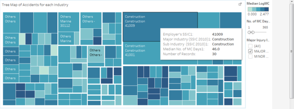
From this new tree map, we can see that construction is a particularly dangerous industry. Construction SSIC 41009 (Building Construction NEC) and SSIS 41001 (General Contractors (Building Construction Including Major Upgrading Works) are the two biggest causes of Major Injuries, with Building Construction NEC being extra nasty, having a median of 46 MC days for injuries sustained.
Question 2: Does a difference in working experience affect the number and severity of accidents?
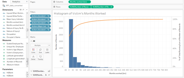
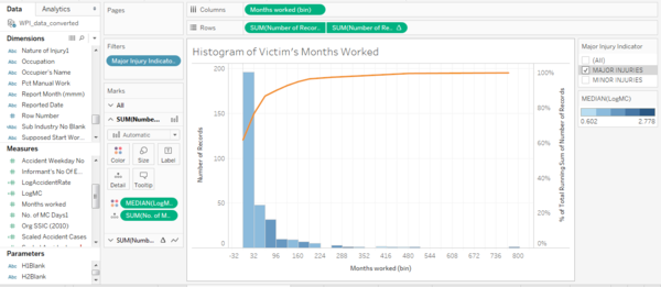
To determine the relationship between age and injury, I created a histogram of victim’s months worked. The idea is that the number of months worked would be an indicator of the victim’s job experience, and the height of each bin of the histogram would show the number of accident cases. The histogram created is shown below:
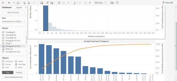
From the histogram, we can see that there is indeed a correlation with work experience, with 65.19% of accidents happening to workers with less than 32 months of work experience. To get a better idea of the main causes of accidents in each bin, I created a pareto chart of accident causes, and joined both charts in the dashboard, such that clicking on one bin will filter the results of the accident cause chart.
Viz 3.2
Unfortunately, looking at work experience did not seem to provide me with much information except that new workers are more prone to accidents. As such, this questions seems to have limited usefulness in providing a prescriptive solution, other than looking out for new workers.
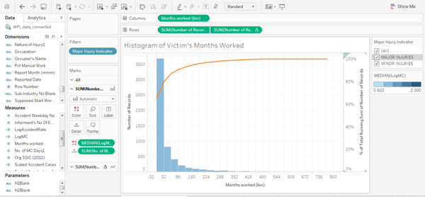
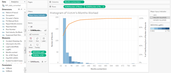
I added another dimension, the number of MC days to see if there is a variation in the severity of the accidents.
It seems that for both major and minor injuries, workers with an intermediate amount of work experience, between 64 and 192 months, tend to suffer more severe injuries.
Question 3: Does the age of the worker affect how prone he is to work place injury?
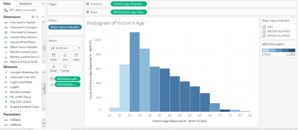
Similarly with question 2, I created a histogram of workers’ age, and used the number of MC days an indicator of the severity of injury sustained. As the number of MC days is skewed, I transformed the attribute using natural log, and used it for the color of the bars. As a result, we can see from the histogram that the severity of injuries tend to increase with age.
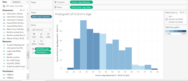
However, it is interesting to note that for Major Injuries Category, younger workers tend to suffer more severe injuries. We can also see that the proportion of older workers suffering Major Injuries has increased.
For the Minor Injuries Category, the severity of injuries tend to increase with age.
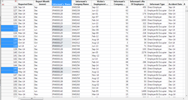
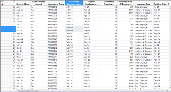
Although questions 2 and 3 gives some interesting findings, the results does not seem to point towards a specific cause of accidents, and have limited uses in helping the user come up with a solution to reduce workplace accidents. From observing the visualization of question 1, I realized that although the current view can give us a general idea of the industries’ performance in regards to workplace safety, perhaps the tree map can be drilled down further to give a view of employers’ performance in terms of work place safety. The first measure that occurred to me would be the accident rate of each employer. As such, I have formulated a new question: Is the accident rate and severity correlated to the employer? The accident rate could be achieved by taking the number of accidents divided by the number of employees the employer has, scaled to 100%. However, after looking through the data, I have found that the attribute Informant’s number of Employees varies, even though the Informant name is the same.
The same problem is seem when looking at the number of Employees for the Informant’s company name.
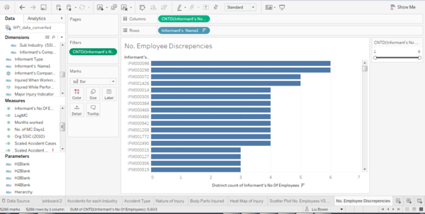
This makes aggregating the accident rate challenging. Furthermore, it is difficult to determine if the accident rate should be calculated for Informant Name or Company Name. To help me decide, I plotted a bar graph with Count Distinct (No. of employees) as the column and Informant name as rows.
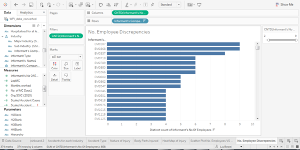
I did the same with Company name, to determine which has more inconsistencies.
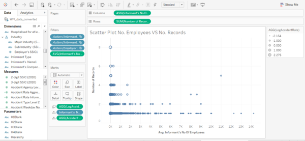
As a result, I determined that Informant Name is a better indicator with inconsistencies numbering around 270, and went ahead to aggregate the accident rate according to the formula: (No. of Accidents) / (No. of Employees). However, the weakness of doing this is that the information about the No. of Accidents and No. of Employees is lost. As such, I have decided to create a scatter plot, with the Y-Axis showing No. of Accidents, X-Axis showing No. of Employees and the size of the circle showing the Accident Rate.
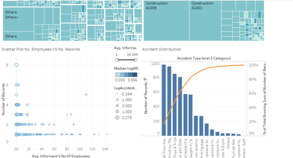
We can observe some patterns from this visualization. Firstly, there is an informant with a large number of accidents despite the small number of employees, which could possibly hint towards some form of negligence. We can also see that generally employers with small number of employees are ones with high accident rates. Another interesting observation is that large companies, with more than two thousand employees have very little accidents, with almost none having more than 2 accidents in the year. This is possibly due to large companies having more resources and management capabilities available to help ensure worker’s safety. Due to differences in industries, sub industries and nature of work, the overall view of all informants may not be as useful. As such, I have decided to link the two visualizations of Tree Map and Scatter Plot together, with Tree Map showing the Industry Performance and Scatter Plot showing the Individual Employer performance. I have also included a filter to show allow the user to select Major Injury Indicator types.
New Question 3: What are the main causes of injury?
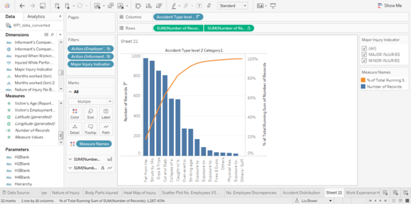
For the last question, I have decided to look at how the accident causes are distributed in general. This would help identify the main causes of accidents, and allow actions to be taken to minimize these causes. As the goal is to simply look at the shares of each accident cause, a bar chart is sufficient for the visualization. The bar chart I have created uses the accident cause as the X-Axis and the Number of Records as the Y-Axis. To give a better idea on the proportion of accidents each cause makes up, I have converted the bar chart into a pareto chart by adding a reference line. The bar chart created is shown below.
As we can see, the major cause of accidents in year 2014 is due to fall from height.
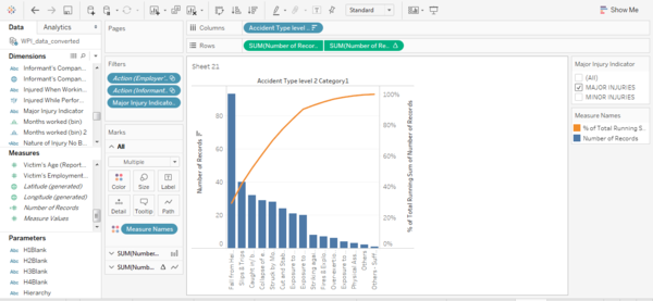
The major cause of accidents changes when we look at Major or Minor injuries. For Major injuries, fall from height remains as the top cause, being more than double that of the second cause, slips and trips.
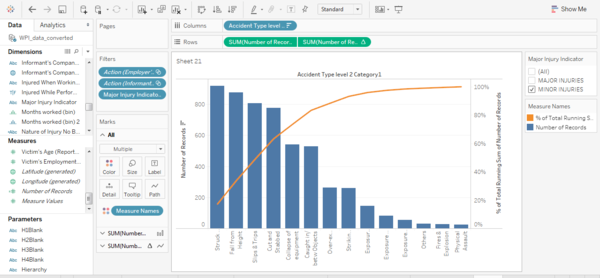
We see that the top cause for minor injuries changes, with struck by moving objects being first. However, accidents caused by fall from height and slips and trips are still significant, with them causing the second and third most number of injuries respectively. This bar chart can also be combined with the Tree Map and Scatter plot created earlier to show how the accident causes are distributed across industries and employers.
Visualization
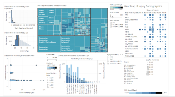
The visualization consists of three parts, a Tree Map showing the number and severity of accidents across the various industries,
A scatter plot showing the accident rate of each Employer, and a bar chart showing how accidents are distributed for each accident cause.
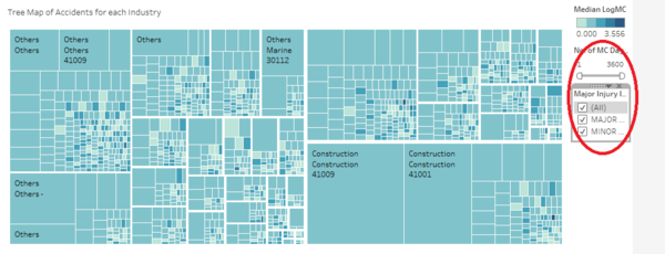
For the Tree Map, as the number of MC days can go upwards to very high numbers like 3600 days, I have included a slider filter to allow users to decide the range which they would like to visualize. I have also included a filter to allow users to visualize Major Injuries, Minor Injuries, or both.
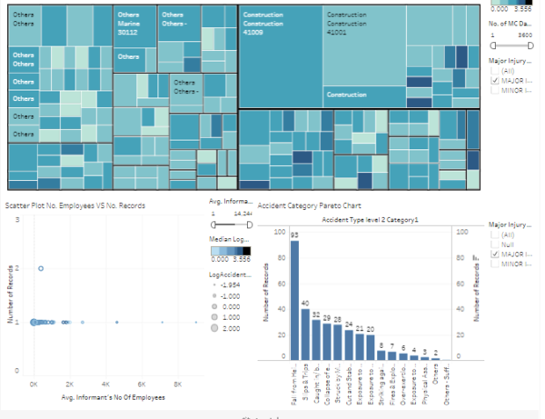
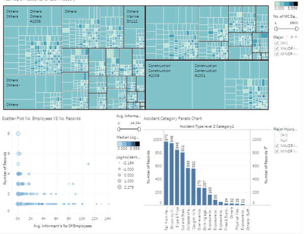
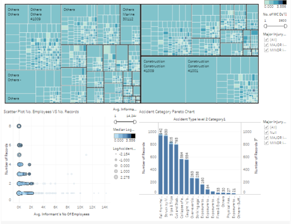
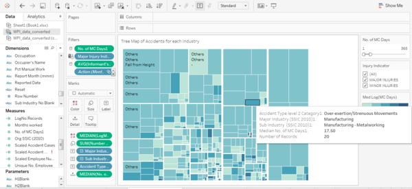
The tooltip shows information on the Major Industry, Sub Industry, Employer’s SSIC, number of records and median no. of MC days. Selecting one or more of the squares of the tree map will update both the scatter plot and the pareto chart by filtering to only includes the results selected. Using this, users can view the accident rate, accident severity and the causes of accidents for selected industries. The size of the squares represents the number of accidents and the hue of the square represents the severity of the accident.
Before
After
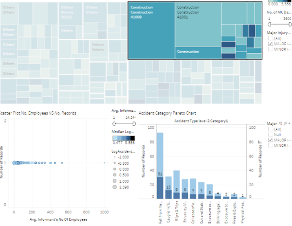
For the bar chart, I have chosen to highlight the selected portion instead of using a pareto chart as I felt that this could represent the part-whole relationship better. From here we can see that for the construction sector is responsible for one-third of major fall-from-height injuries.
The scatter plot includes a filter to allow users to select Employers based on the number of employees they have. This allows the user to compare accident rates between companies of similar sizes. The scatter plot tool tip includes information about informant’s name, informant’s number of employees, number of accidents, median number of mc days and accident rate. Selecting one or more points in the scatter plot will further filter the bar chart beside it, allowing users to see the accident causes for individual companies. The hue of each circle represents the severity of the accident while the size of each circle represents the accident rate.
Before
After
Finally, the bar chart contains information about the cause and number of accidents with each cause. The filter beside the bar chart allows the user to select the reference bar. Here we can see that companies with under 2000 employees are responsible for a majority of the accidents.
Changes to Visualization
After having been provided a time extension for the project, as well as having the opportunity to look through the work of fellow students, I have been able to gain some additional ideas to expand on my tableau visualization.
Change 1-Lower level of detail for the Industry Tree Map
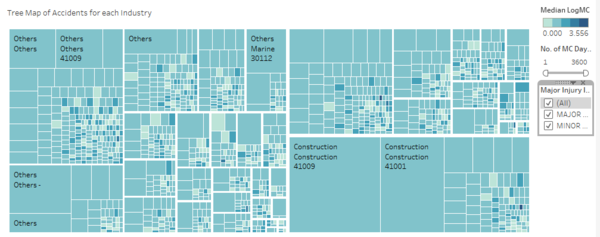
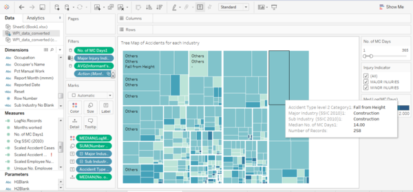
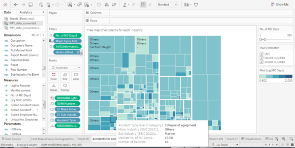
After some thought, I felt that adding the Standard Industrial Classification (SSIC) code into the hierarchy gave the tree map too much detail, and made it difficult for users to make comparisons. Therefore, I have decided to swap out the SSIC Code for the Accident Category instead. In this way, users can tell from a glance using the tree map how each accident type is distributed across industries, without relying on the Distribution of Accidents by Accident Type bar graph provided.
From the new tree map, we can tell from a glance that “Fall from Height” and “Struck By Moving Objects” are the two main causes of injuries in Construction, with both of them together taking up almost one-third of all accidents in Construction.
Another piece of interesting information that can be observed from the tree map is that the Marine Industry has a large number of higher severity accidents, with almost two-thirds of them resulting in MC of more than 15 days.
Finally, we can see that excluding the Others-Others Sub-Industry, Construction has the highest number of accidents, followed by the Metalworking Sub-Industry in Manufacturing. This is intuitive as these are industries requiring strenuous physical labor and working in dangerous environments.
Interestingly, over-exertion/strenuous movement is a big cause of moderate injuries in metalworking and construction industries. The other cause is Fires and Explosion
Change 2-Incorporating Work Experience and Age as filter
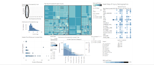
Taking inspiration from Hui Min's work, I've realised that the Work Experience and Age attribute that I previously thought had limited uses in the visualisation could be used as filters. As such, I have added histograms of both attributes into the visualization as filters for the other graphs. Using these, the users can look at how the accident attributes changes with age and work experience.
Using work experience as a filter, we can easily see that work experience plays a major part in work place injury. In the visualization above, I have selected victims with less than 2 years of work experience, and we can see that they make up more than half of all accident cases.
From the age histogram, we can see that surprisingly, older workers are less prone to accidents, with workers above the age of 60 making up only a small portion of total accidents. We can see that the main cause of accidents for those aged 60 and above is Slips and Trips.
It is interesting to see that younger workers, below the age of 30, are most prone to a different type of accident, which is being Struck by moving objects.
Change 3-Adding a new HeatMap Component
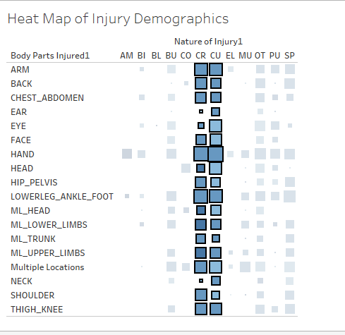
I felt that the original visualization was lacking details in the severity and nature of injuries resulting from the accidents. As such, I have added a new heat map to allow users to visualize the body part injured in the accident, as well as the nature of the injury.
We can see from this heat map that cuts and crushes are the most common injury types, and that the hand is the most commonly injured body part.
Visualization Hiearchy
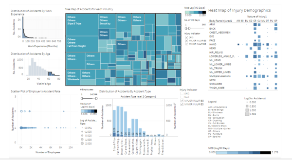
The new tableau dashboard has this current hierarchy:
-> Distribution of Accidents By Work Experience
-> Distribution of Accidents By Age
-> Tree Map Of Accidents for Each Industry
-> Scatter Plot of Employer’s Accident Rate
-> Heat Map of Injury Demographics
-> Distribution of Accidents By Accident Type
The visualization at the top applies filter actions to the visualizations below it. The features of the dashboard remains the same except for the two histograms and heatmap added in.
The link to this new visualization is provided here: https://public.tableau.com/shared/3ZWXDP9YX?:display_count=yes
References
1. http://www.straitstimes.com/singapore/manpower/workplace-fatality-rate-set-to-rise-this-year
2. https://www.acra.gov.sg/components/templates/SSICCodeSearch.aspx
3. http://www.mom.gov.sg/workplace-safety-and-health/work-injury-compensation/types-of-compensation
