IS428 2016-17 Term1 Assign2 Heng Yi Teng Mabel
Contents
Abstract
I decided to explore the Open Food Facts dataset. Being a foodie, I was curious to know how well each country was eating. My final visualization was created using the Parallel Coordinates plot on Power BI.
Question
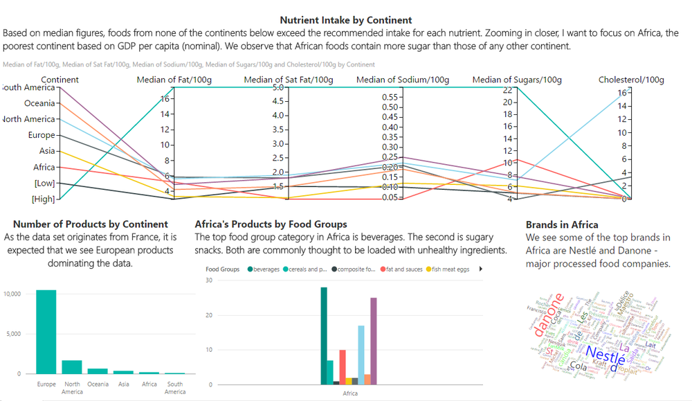
I wanted to explore the nutrition profiles of each continent, specifically with regards to nutritional guidelines provided by the National Health Service (NHS), UK. The following figures were obtained mainly from the NHS UK website and were used as a basis for reference in analysing the different countries' nutrition profiles:
| Nutrient | Low (per 100g) | High (per 100g) | Source |
|---|---|---|---|
| Sodium | 0.1g | 0.6g | http://www.nhs.uk/Livewell/Goodfood/Pages/salt.aspx |
| Fat | 3g | 17.5g | http://www.nhs.uk/Livewell/Goodfood/Pages/Fat.aspx |
| Saturated Fat | 1.5g | 5g | http://www.nhs.uk/Livewell/Goodfood/Pages/Fat.aspx |
| Sugar | 5g | 22.5g | http://www.nhs.uk/Livewell/Goodfood/Pages/sugars.aspx |
| Cholesterol | - | 0.1g | https://en.wikipedia.org/wiki/List_of_cholesterol_in_foods |
Visualization
Click here to see the interactive model.
The data exploration and visualization process will be further elaborated on below.
Data Exploration
JMP was used for all data cleaning.
Initial columns removed
The following columns were removed as they were irrelevant to the question I wanted to answer:
- quantity
- packaging
- url, creator, created_t, created_datetime, last_modified_t, last_modified_datetime
- image_url, image_small_url
- product_name
The following columns were removed as similar information was already captured in other columns:
- countries, countries_tags
Columns removed due to missing data
Missing data was explored using the "Explore Missing Values" function under "Cols".

The following columns were removed as more than 50% of the rows were missing data and available data had count < 1000:
- origins, origins_tags
- manufacturing_places, manufacturing_places_tags
- labels, labels_tags, labels_en
- emb_codes, emb_codes_tags
- first_packaging_geo
- cities, cities_tags
- stores
- allergens, allergens_en
- traces, traces_tags, traces_en
- serving_size
- no_nutriments
- additives_tags, additives_en
- ingredients_from_palm_oil, ingredients_from_palm_oil_tags, ingredients_that_may_be_from_palm_oil, ingredients_that_may_be_from_palm_oil_tags
- nutrition_grade_uk, nutrition_grade_fr
- energy_from_fat_100g
- omega_3_fat_100g
- sucrose, glucose, fructose, lactose, maltose
- starch
- caffeine
- carbon_footprint_100g
Reformatting country variables to create Country variable
I wanted to clean up the variable, countries_en. I noticed that some products were linked to more than one country under countries_en. This is likely because the Open Food Facts database is a French initiative and France is experimenting with mandatory country of origin labelling for milk and meat in processed foods. Hence foods might be labelled with more than one country. For simplicity's sake, I removed country's labelled with more than one country. Simply using the first country in the list of countries labelled would have caused some countries to be overly-represented since the countries were listed in alphabetical order.
- Step 1: Using "Text to Columns" function
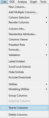

- Step 2: Countries under countries_en column are now split into different columns
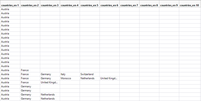

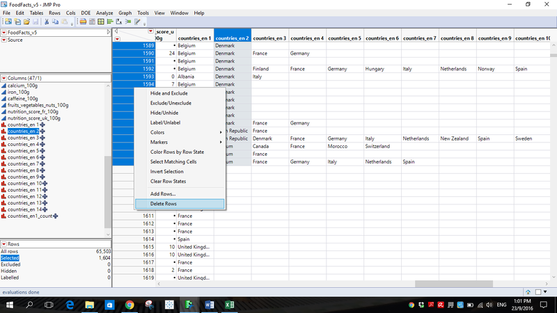
- Step 3: Sort by countries_en_2 and delete rows with two and more countries tagged to them

- Step 4: Rename countries_en_1 to countries_en_new and delete all other columns, countries_en_#, created by “Columns to Text”
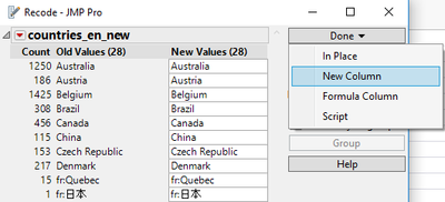
Next, I looked through the countries_en_new column and cleaned up countries that were keyed in twice under different names.
- Step 1: Using "Recode" function
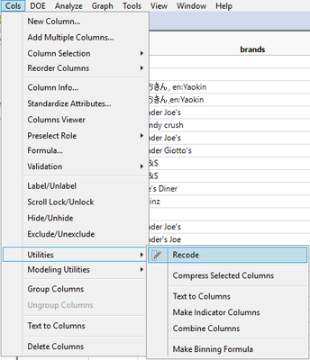

- Step 2: Recoding countries and creating new column, Country

Recoding Country column to create Continent column
Step 1: Using "Recode" function

Through this, I managed to create the Continent column.

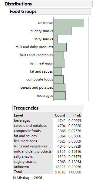
Recoding pnns_groups_1 to create "Food Groups" column
The Programme National Nutrition Santé is France's national health and nutrition programme. Hence, pnns_groups_1 and pnns_groups_2 are actually classifications under the PNNS for different types of food. In this case, I will only be looking at pnns_groups_1 as they are the primary food groups.
Step 1: Inspecting pnns_groups_1
We can see that there entries that are repeated but with different formatting

Step 2: Recode pnns_groups_1

Step 3: Creating cleaned up Food Groups column
:

Visualization Process
First try: Trellis Plot in Tableau
I explored Tableau and tried to create a Trellis plot but was unable to get the plots to overlay. The visual below makes it difficult to have an overview of the different nutrition profiles.

Second try: Radar Chart in Power BI
I attempted to use a custom Radar Chart visual on Power BI. However, I did not like it as the visualization does not allow for much insight. Some nutrients are of a distinctly different scale. This results in variables, such as Cholesterol and Sodium, being too small to analyse in the visual. However the chart did reveal that, while most continents consume more Sugar than Fat, the opposite is true for Europe - Europe consumes more Fat than Sugar.

I also found that the analysis was weak because there was no basis for comparison. What is considered high or low consumption? When I added in the respective low or high values for comparison's sake, I found the chart's scale to be useless for any meaningful analysis.

Click here to see both interactive Radar Charts.
Third try: Parallel Coordinates chart and dashboard in Power BI
To me the most logical visualization to use would be a Parallel Coordinates chart. It allowed for easy comparisons across continents and even enabled me to easily compare with current standards for low or high nutrition intake. I used a custom visualization for Parallel Coordinates from the Power BI Community. I also downloaded a Word Cloud custom visualization.
The resulting visualization is as seen in Section 3 Visualization.
You can click here for a short tutorial on how to navigate the Parallel Coordinates chart.
Power BI Limitations
Filtering
I wanted to note that filtering does not appear to be as flexible on Power BI as on Tableau. I wanted to filter Countries by those with row count >= 100 to reduce clutter in the visual but could not. It was something I did easily in Tableau. For categorical data, it seems Power BI only allows manual selection of the data points you want. Hence, I had to go back to JMP, filter out the data by country count >= 100 and import it into Power BI again.
Formatting X- and Y-axis
Power BI does not provide the option of formatting the X- and Y-axis fonts. This is inconvenient, considering how small and faint the label fonts are.