IS428 2016-17 Term1 Assign1 Teo Hui Min
Contents
Abstract
The focus of this assignment will be on understanding the private residential property market of Singapore in year 2015 and the purchasing patterns of Singapore residents. I will be identifying possible reasons behind the trend we see from the visualisations, such as the ‘hottest’ regions among Singapore residents.
Problem & Motivation
In the years to come, will people still be able to afford housing? Through this assignment, I would like to find out how the changes in property prices throughout the year has affected the purchasing power of the Singapore residents. Also, finding out some possible factors that will entice people to make a purchase.
The main variables that I will be looking at is the average unit price of a property and the number of units sold to understand the purchasers.
Approaches
This section details the data sets that were used to create the visualisations, the data exploration phase to understand the data and decide what are the relevant data to use and how the data were prepared for visualisations.
Data set
Project: The ‘Project’ dataset was used to find out the number of units that were sold in every quarter of the year. It was also used in the assignment to find out the total number of units for a property project, cumulative sold, unsold, unlaunched, launched, completed and uncompleted units. With this data, it will be possible to find out the vacancy and occupancy rate of a project, which will be shown in one of the visualisations.
Transaction: The ‘Transaction’ dataset records property where caveat was lodged after the option-to-purchase was exercised or purchase agreement was signed. The dataset was used to find insights on the property prices, the type of sale, type of property and the planning area and region which the property was built.
Data Exploration
Initially when looking at the datasets, I thought that ‘Transaction’ was solely the number of units sold. However when I compared it to the ‘Project’ datasets, it actually did not tally. An example is the 26 Newton project.


I thought the data was not clean and when online to do a check on the development project. However the information provided online was the same as the downloaded datasets.
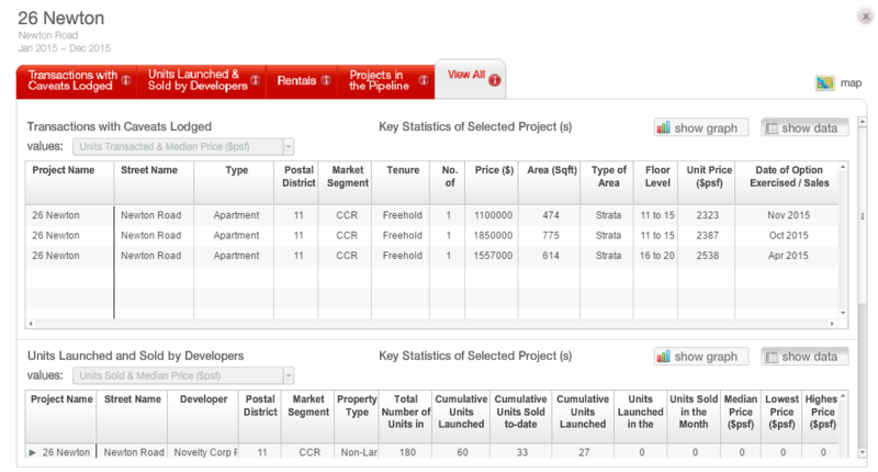
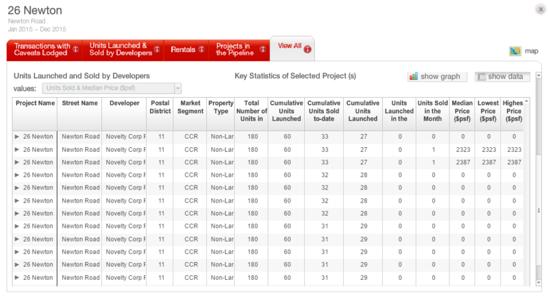
Then I realised that the datasets were slightly different. Based on online explanation:
Transaction dataset: Are transactions with caveats lodged with SLA
Project dataset: Units sold and launched by developers
Data Preparation
As the ‘Project’ datasets which detailed the number of units sold quarterly, the first thing that was done was to combine all the datasets into one file. Based on the file, the data was imported into Tableau for data exploration purposes. Simple drag and drop was performed in Tableau to find out the total number of units that was sold and number of units sold for a particular project. The penetration rate was then calculated and data was exported from Tableau to .csv to be visualised in QGIS.
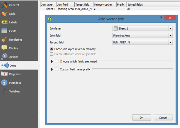
In QGIS, a ‘join’ was performed on the csv and planning area SHP file so as to visualise into a choropleth map.
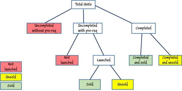
To find out the proportion of the units that were sold, unsold and not launched, the data needs to be explored. Through the data exploration, I have mapped out how those measures can be calculated with the columns in the ‘Project’ dataset.
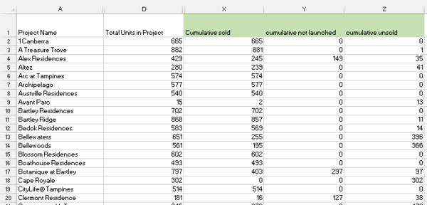
The measures could be calculated in Tableau, however I have done the calculation (by summing the respective columns) in the dataset first before importing it into Tableau.
Other than the above, the rest of the visualisation was performed in Tableau with the datasets.
Tools Utilized
Tableau: Used for data exploration, to understand the data and trends. To visualise the other distribution graphs/charts such as box plot and bar chart.
QGIS: To prepare a choropleth map to visualise the penetration rate in terms of the number of units sold across Singapore.
Results
This section details the findings and visualisation used. The design methodology that I have used is that darker shades represents a high number, such as higher number of units sold and higher penetration rate. The choice of colour is blue and green for visualisation, and salmon red for headings.
Penetration Rate
Finding 1 (share of private properties supply)
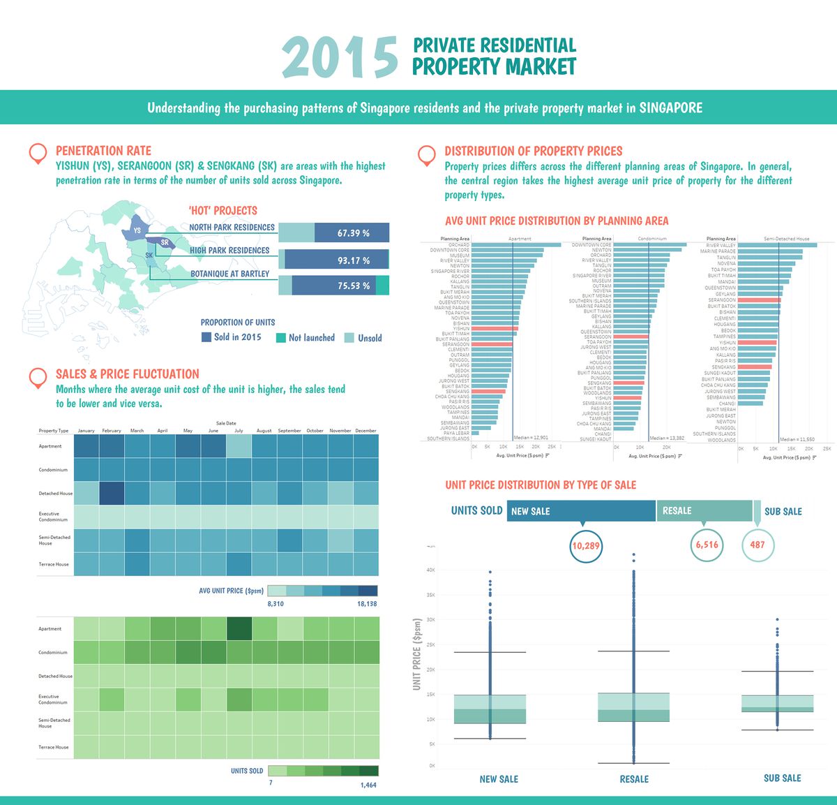
The above choropleth map was to identify the areas with high penetration rate based on the number of units sold across Singapore. North and North-East region experienced the highest penetration rate, and are planning areas such as Yishun (10.46%), Serangoon (7.13%) and Sengkang (20.25).
Finding 2 (share of private properties supply)
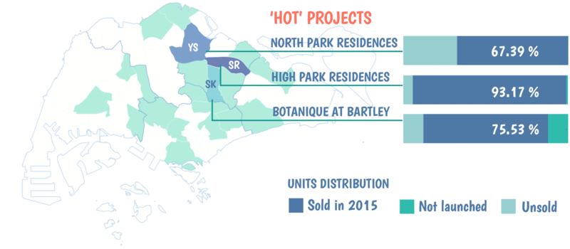
The ‘hottest’ selling projects in each of the planning areas are North Park residences, High Park residences and Botanique at Bartley. One similarity between these 3 projects is that all 3 projects are all New Sale projects, which means that new housing may be a more popular choice among the people. By looking at the proportion of units that are sold, all of the projects are at least 65% sold, although it was only launched in the year.
Distribution of property price
By Planning Area
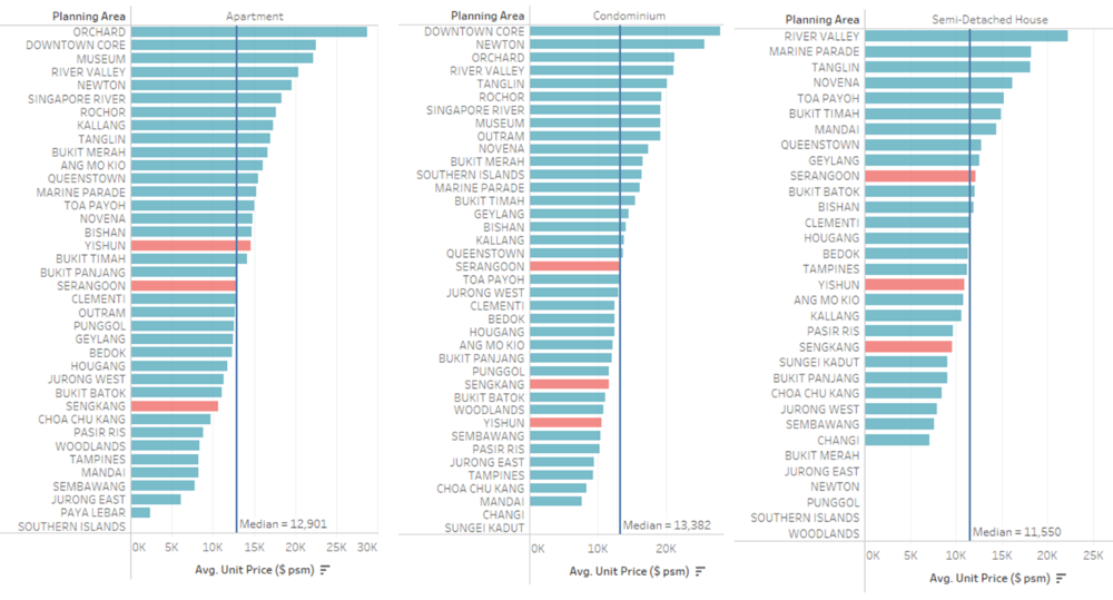
Next, let’s focus on the 3 most popular planning areas that we have identified. I would like to find out if the prices of the property there are generally cheaper, which attracted a large number of purchase. Since the property that were developed by the 3 projects were only Apartment, Condominium and Semi-detached house, we will be looking at the average unit price of the property ($psm) across the other planning areas and make a comparison with the median average unit price.
Finding 1 (distribution on private properties prices)
Indeed, the average unit price of property in Yishun, Sengkang and Serangoon (highlighted in red) are below or just slightly higher than the median, which means that property in those planning areas are generally cheaper. On the other hand property in the Central region like Orchard and Downtown Core are generally higher in price.
By Type of Sale
Other than looking at the areas which are more popular, let us look at the type of sale of property which are favoured among them.
Finding 3 (share of private properties supply)
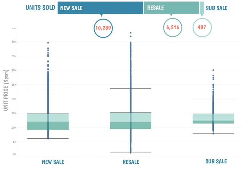
Based on the units sold, new sale has the greatest share followed by resale and sub sale. As such, let’s look at the price to see if it is a factor that contributes to this trend.
Finding 2 (distribution on private properties prices)
By looking at the box plot distribution, the median unit price ($psm) of the different type of sale are generally quite close. The outliers in the distribution are mostly units from the Central Region, where prices are generally higher.
Lastly, let’s look at the change in price over the months to understand if the changes in price will affect the number of units that were sold.
Finding 3 (distribution on private properties prices)
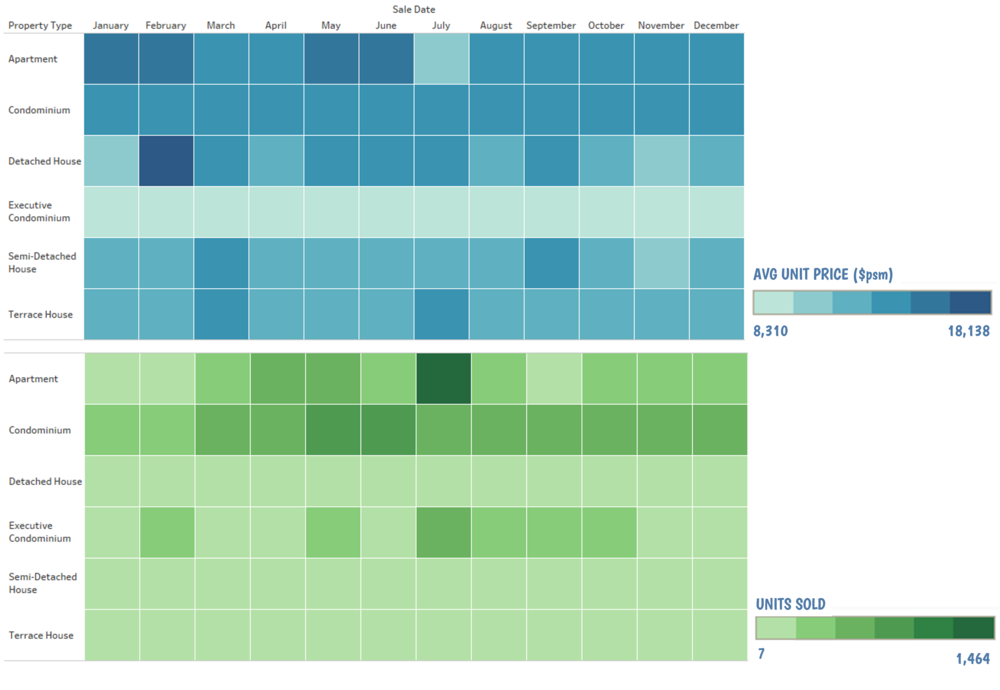
The average unit price of Executive Condo (EC) did not have much variations over the month, the number of units sold were generally consistent over the months.
The average unit price of Apartment was the lowest in July, whereas the number of units sold was the highest in that month. In Jan and Feb where the price was the highest for Apartment, the sales of Apartment was the lowest. The other type of property did not show much variation is price and units sold. Hence in general, we can deduce that price does affect the decision of a purchaser and sales is slightly correlated to price.
Policy Recommendations
Purpose: To attract more people to buy Landed properties
Recommendations: Based on the findings, sales of landed properties are generally lower than non-landed properties as landed properties are more expensive and more affordable for the rich. Thus, in order to allow the less affluent people to purchase landed properties, a policy can be implemented where the interest rate on loan depends on the income level of the people. Interest rate will be lower for people who are earning lesser, and higher for those earning more.
Purpose: To increase sales in areas where penetration rate is lower.
Recommendations: Lower the price at different time of the month to entice people to purchase.
Purpose: To increase sales
Recommendations: Based on the findings, majority of the sales are from the non-landed property. Hence developer can build more non-landed properties and lesser landed properties since non-landed properties are more popular and less space constraints.
Infographics
Possible Improvement
Amenities data: By looking at amenities such as shopping malls, schools, park, markets etc around the planning areas, these may be factors that affects the popularity of an area.
Past data: A year of data by itself may not be sufficient to identify trends. With the past data, we may be able to understand if the same trend is observed yearly. If so, we could have find out the reasons behind the observations.
