IS428 2016-17 Term1 Assign1 Tan Kee Hock
Contents
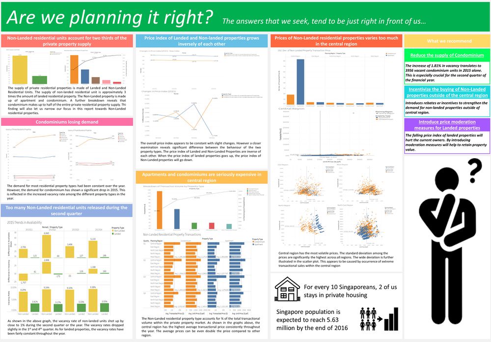
Infographic
File:IS428 2016-17 T1 MA1 Tan Kee Hock Alternative.pdf (Alternative)
Abstract
The project puts Singapore’s private residential property market under scrutiny. Given Singapore’s limited land resource, our housing needs has to be strategically planned so as to ensure a sustainable growth. We will investigate the supply and the price fluctuation of the market. Firstly, we do not want an oversupply of residential units given the limited land space. Secondly, we want to protect the current home owners from dangerous property fluctuations. We will further examine these 2 areas through the use of data visualisation. Through the use of data visualisation tools such as Tableau, it will help us uncover trends that are previously invisible to the naked eye. We will then propose policies which will help us better manage this market.
Problem and Motivation
Singapore is a small island nation, limited to some 710 sq km of land. As the country continue to grow, there will be an inevitable greater demands on the limited land resource. This scarce land resource is used not just to host its businesses and industries but also all its other needs – utilities, homes, schools and defence. As Singapore continues to strive to be a global city in the heart of Asia, she must learn to support its aspirations while ensuring the needs of its citizen are well served. Nevertheless, Singapore has never viewed its limited land area as a handicap. Instead, it provides a strong impetus for all of us to craft strategic policies which focuses on sustainable development.
One of the key struggles for managing Singapore’s limited land resource was housing. How much of land should be allocated for housing to ensure Singapore can continue to sustain its growth? Although public housings are home to 80% of Singapore’s resident population, there had been a significant movement from public housing to private housing. As Singapore grows to be more affluent, more and more of its residents are moving over to private housing. Private housing not just serve Singaporeans but also other non-Singaporean residents as well.
Therefore, in this assignment, I have decided to focus on Singapore's private residential property market. Housing has been a close issue to us Singaporeans. Many Singaporeans joked about the "5Cs", namely "Cash, Card, Car, Condominium, Country Club". The word "Condominium" refers to one of the private housing property types which will face much scrutiny in the following analysis.
The key objective of this report is to investigate the if the supply of private residential property market is adequate to Singapore's growing demand. Secondly, we are to investigate volatility of the prices within the residential property market. I will define the problem with 2 questions to help facilitate the analytical process:
- “Are there private residential properties sufficient to serve the needs of Singapore and its resident?”
- “How are the prices behaving?”
We will look at the problems within current private residential properties market and determine how we can better manage it. From the data in 2015, we would then propose new private residential housing policies to better manage the market. In light of the problem statement, we will focus our analysis in these two sub-areas:
- Share of the private residential properties supply in 2015 It is of our strategic interest to monitor the supply of private residential properties. Given Singapore's limited land resource, we do not want an oversupply of residential units, as it may incurr high opportunity cost. We would want to use the land wisely to promote a sustainable growth for the nation.
- Distribution of the private residential properties prices in 2015 We want to closely monitor the prices of these private residential properties closely. As much as possible, we want to maintain stability in the prices so as to protect the homeowners.
We are looking at how we can introduce new policies in relation to the supply of private residential units and the volatility of their prices. To achieve this, we will retrieve data from Urban Redevelopment Authority (URA)'s Real Estate Information System ("REALIS").
The report along with the infographic is designed for examination by relevant housing authorities. The readers are expected to be professionals who are in position, to shape the next private housing policies. It consists of compiled statistics put together to highlight the key developments within the private residential market.
Methodology
In general, start with the big picture and spot abnormalities. Subsequently focus on the finer details of the data.
-
Share of the private residential properties supply in 2015
- Breakdown of the available property type within the private residential properties supply. Determine the composition of private residential properties supply. Further analysis will be focused on the more popular property type (Landed/Non-Landed).
- Analyse the vacancy of the more popular property type (Landed/Non-Landed), across time. Determine the period which oversupply occurs.
- Based on the more popular property type, compare the vacancy of each sub-property type across time. Determine which sub-property type is losing demand.
-
Distribution of the private residential properties prices in 2015
- Overview of the price indexes of the 2 main property type (Landed/Non-Landed). Determine the behavior/relationship between the property type, compared across time
- Based on the more popular property type (Landed vs Non-Landed), analyse the average price behavior across region. Determine the which region which the highest average transaction (Transactional volume).
- Investigate the volatility of the prices of the more popular property type (Landed /Non-Landed). Determine which region has the most volatile transactional price.
Share of the private residential properties supply in 2015
To understand how the supply of private residential properties is like in 2015, we will be looking the 3 main components.
- The distribution of private residential units by property type
- The new private residential units compared across time
- The vacancy rate of various private residential property type across time
To help in investigating the above components of the private properties supply, we will need to rely extensively on 4 main variables.
- Property Type
- Time
- Available Units
- Vacant Units
Distribution of the private residential properties prices in 2015
To understand what the distribution of the private residential properties prices is like in 2015, we will be looking the 3 main components.
- Private Index of private residential units across time
- The average transaction prices of popular residential type compared across time and region
- The volatility of transaction prices among the popular residential property types against time and region
To help in investigating the above components of the private residential properties prices, we will need to rely extensively on 4 main variables.
- Property Type
- Price Index
- Transactional Price
- Region
Data Cleaning
There are several concerns with regards to the original data provided by REALIS
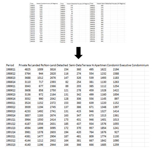
- Raw data retrieved from REALIS is not “user-friendly” as it does not allow other data from other excel files to be integrated together.
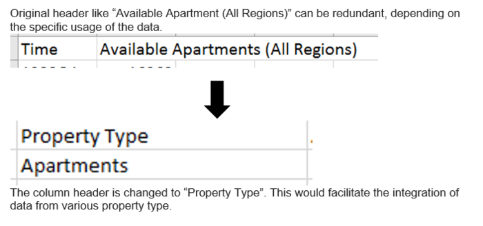
- There are redundant data which provides additional explanation for the data downloaded.
- The column headers can be too verbose.
- Data is compiled into multiple excel files when downloading from REALIS
- [FINDING] Non-Landed residential units account for two-thirds of the private property supply
- [FINDING] Too many Non-Landed residential units released during the second quarter
- [FINDING] Condominium losing demand

To investigate the supply of private residential property, breakdown the properties into its generic property type (Landed/Non-Landed). A bar chart comparing the available stock of the property type shows the difference in volume. The total number on the bar provide the exact figure of the volume. The stark difference in height is able to illustrate the significant difference in volume. However, to understand the exact composition of private residential property supply, we can use a Pareto chart to analyse the distribution. This is possible as the property types are categorical data. From here, we are able to easily determine that condominiums make up to 52% of the entire private residential property supply. Colours are used in both graphs to illustrate the different property type. This is to ensure the reader understand that each bar represents a different property type.
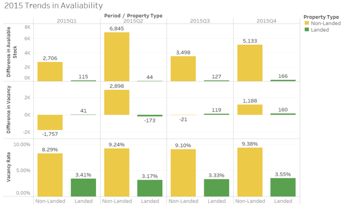
To understand the how the changes in vacancy is attributed every quarter, we need to study the how many new units are added to the market. Then we will compare it with the changes in vacancy. Lastly, we make reference to the vacancy rate for the same period. Thus, the last set of graph allows us to draw context to the overall picture. Since we are comparing property type, bar chart is used to illustrate the data. Colour is added to highlight the different property type (Landed/Non-Landed). The first row shows the growth of the property type during the time period (per quarter). We can identify that non-landed properties had the highest increase in the second quarter. It has significant different between each period as well. As for landed properties, the growth is relatively constant. Next, the second row illustrates the changes in vacancy of each property type within the quarter. For the Non-Landed property, there was very high demand (drop in vacancy = increase in demand) in the first quarter. However, in the second quarter, there are too many non-landed residential units are released. It had contributed to close to an 1% increase in the vacancy rate. As for the landed residential properties, the demand and supply had been constant.
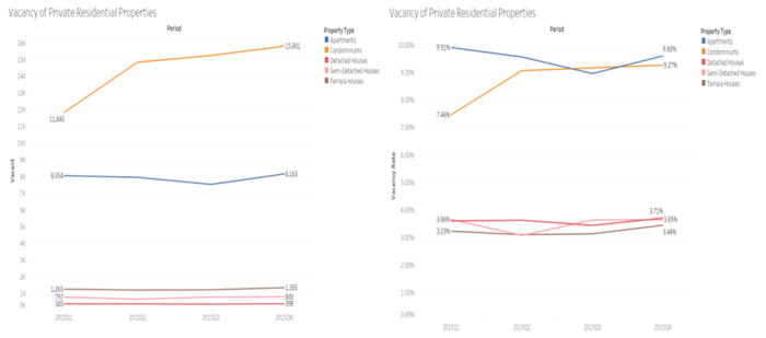
We are going to investigate the demand of property type across time. Since time is a continuous data, we use a line graph to illustrate the change in vacancy across time. This would allow us to spot the difference in demand across the property types. The line graph is further illustrated with colours to show the difference tin the property type. Additional labels on the ends of the line help to highlight the changes in the volume. The second graph which uses the vacancy rate instead of the vacancy volume is used to further amplify the changes in the vacancy. For example, the change in vacancy of semi-detached houses and apartments are further amplified to show the difference. In this section, we are able to see that the vacancy increased sharply for Condominiums. The increased vacancy correlates to lower demand for the specific property. Thus, there is an oversupply of Condominiums in the private residential market, as the demand drops.
Approach : Distribution of the private residential properties prices in 2015
- [FINDING] Price index of Landed and Non-landed properties grows inversely of each other
- [FINDING] Apartments and Condominiums are seriously expensive in central region To understand how the overall prices are like in the private residential property market, we look at the total transactional volume and how it is broken down. For this purpose, we use Pareto chart to show the distribution of the transactions.
- [FINDING] Non-landed residential property prices in the central region are the most volatile

To analyse the changes in the price index, we compare it across time. Since time is continuous, we use a line graph to show the changes across time. In the first graph, we can tell that there are minor changes in the price index across time. However, the changes are not that visible. The purpose of the graph is to give us an overview of the behaviour of the price indexes. Thus, we change the variable to percentage change of the price index per quarter. The second graph is able to show the stark difference in the behaviour of the two price indexes. It shows an inverse relationship between the two major property type (Landed/Non-Landed). When one increases, the other decreases and vice versa. Labels are added to the end of the graph to show the raw numbers. Colours are used to differentiate the 2 property types.
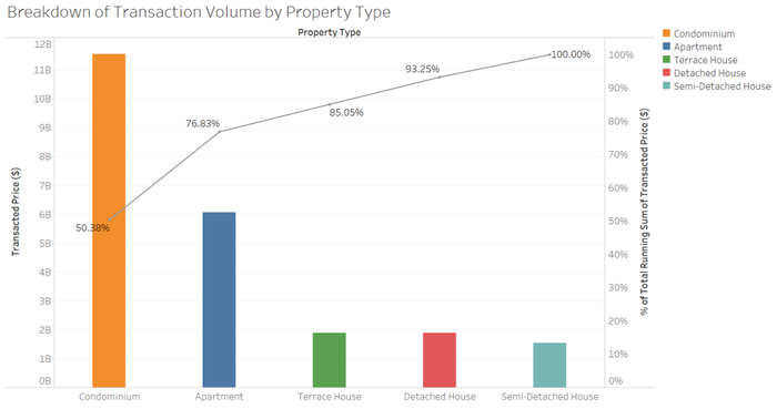
From here, we know the condominiums contribute to half of the transactions. The Non-Landed residential properties, which comprises of condominium and apartment attributes to close to ¾ of the transactions. Thus, from here, we will focus our analysis on Non-Landed residential properties. For our analysis, we are only interested in the popular property types.
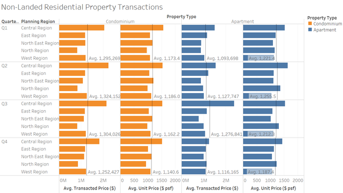
Next, we look at the average prices of Condominium and Apartment (Non-Landed residential properties). Consistently across the year, central region has the highest average transactional price. The average unit price of the price per square foot (psf), is shown here as well. It is consistent with our early findings of the transactional price. Central region is undoubtedly the most expensive region as shown in both the average price and average psf. Colours are used to differentiate the property types. The reference line (average) is used to shown the average price of the individual cell. It offers a reference of the region’s performance in relation to other regions.
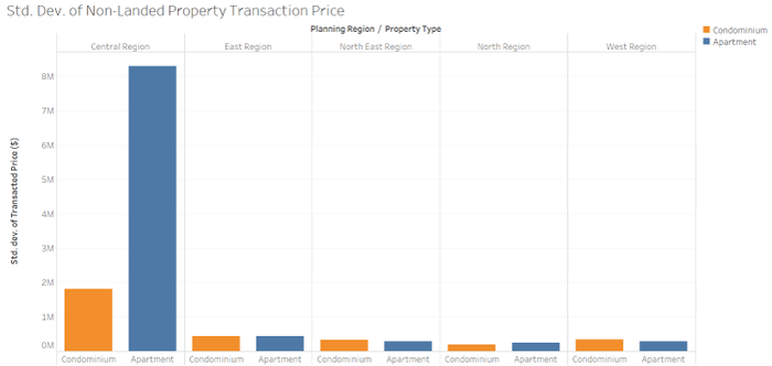
Next, we want to investigate the volatility of the prices based on the popular property type (Non-Landed). First, we take the standard deviation of the transactional prices and compared it across regions. In this case, a bar chart would suffice to show the stark difference of the standard deviation. Why we use standard deviation in this case is because it offers as a simple quantitative metric to measure the spread of the prices across regions. Thus from here, we know that central region has the widest spread of transactional prices. Colours are used in the bar chart to differentiate the property type. Moving forward, we want to understand how this spread is illustrated on the property type visually. To emphasis on the impact of the spread, we can use scatter-plots to show how the individual transaction by region, is being laid out on a graph.
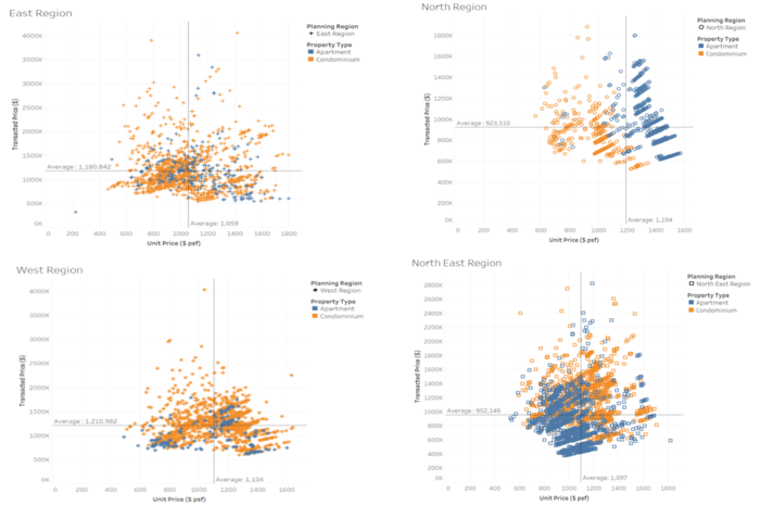
The x-axis shows the psf while the y-axis shows the transaction price. The scale of x-axis alone can tell us how the difference in the psf across the region. The central region has a wider range of psf. The properties are uniformly distributed as well across x-axis. The scale on y-axis also illustrates the stark difference in terms of the transactional price. However, for the central region, there is one specific outlying transaction. Such extreme data point pulls up the average significant and shows how varied the data can be in the central region. The two average lines were used to show where is the main clustering point. This is to show us where the average transaction price and psf are. Colours are also used to differentiate the property type. The stark difference in the dispersion further highlights on the earlier point which states that central region has the widest dispersion of transaction. In correlation to volatility of the price, the wider the dispersion/greater the standard deviation, the more volatile the price of the region is. Therefore, the central region has the most volatile prices.
Recommendation
In light of the above findings, I would like to propose the following recommendations.
- Reduce the supply of Condominium The increase of 1.81% in vacancy translates to 3956 vacant condominium units in 2015 alone. This is especially crucial for the second quarter of the financial year.
- Incentivize the buying of properties outside of the central region Introduces rebates or incentives to strengthen the demand for non-landed properties outside of central region. This is to divert the demand away from the popular region. So that we can avoid necessary strain on the land use of the central region.
- Introduce price moderation measures for landed properties The falling price index of landed properties will hurt the current owners. By introducing moderation measures, it will help to retain property value.
Results
The work is used to highlight key developments within the private residential property market. It can be used as an additional reference point for future policies. Such work would not be possible without the use of such credible data. These data insights would help think-tanks and authorities alike, to better manage and shape the future of Singapore's private residential property policies.
For the future development of this project, more data points can be collected as well. We should not solely restrict our data to REALIS only. We can also collect data from relevant commercial companies in the private residential property market. This will expand our scope of investigation and allow us to make more discovery.
Tools Used
- Excel Primary data source
- Tableau Creation of graphs and charts
- PowerPoint Creation of Infographics
