IS428 2016-17 Term1 Assign1 Lee Wai Tong Arnold
Contents
Abstract
This project aims to give potential homebuyers an overview of the private residential market. This is achieved by presenting meaningful infographics to help them visualize and understand the latest market trends and patterns. Homebuyers are then able to target which areas of housing to buy and when is the best time to buy. This helps them make more informed decisions.
Problem and Motivation
Owning private property is a popular desire for most Singaporeans. The number of private properties in Singapore has been growing steadily over the years and so has its prices. For medium to high income Singaporeans, some would want to purchase or upgrade to a private property. Noting that housing is expensive in Singapore, this project aims to help these potential homebuyers to evaluate the private residential property market and thus make an informed choice before buying their new home.
The main variables involved is the supply of vacant properties and the price index of private properties in various categories.
Approaches
The first step I took was to check the data to make sure that it is suitable for comparison and that there are no errors. In this case, the data have a common variable which is quarters, allowing me to make comparison by quarters.
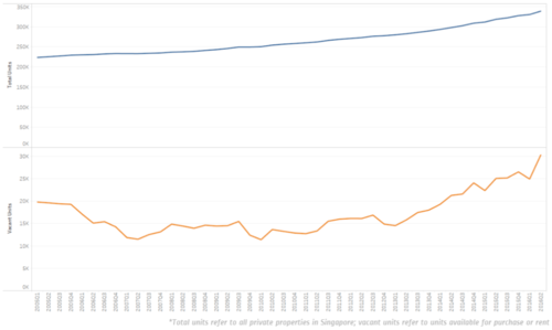
First, given the vast amount of data, I decided to extract data only from the past 10 years. I plot the supply data (both available and vacancy) onto a line graph. I decided to use a line graph as my aim is to view trends and line graphs is a good visual tool for this purpose. I plot both available and vacancy graph vertically next to each other, allowing easy comparison between the two graphs in the same quarter.
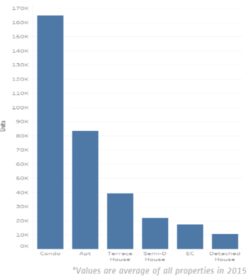
Next, to better understand the supply of private residential properties, I took the average number of each type of private property and put it into a bar graph. This offers a clear visual showing the demographics of private properties. From the graph, it is evident that the most popular property type is condo, and is about twice the number of apartments.
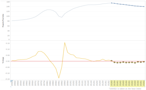
After that, I plot the property price index onto a line chart. As mentioned, a line chart is preferred for identifying trends. In my analysis, I find that in the third quarter of 2013, property prices started to fall. It is an area which I want my readers to focus on, hence I decided to highlight the area of interest and fade slightly the remaining part of the graph. This helps readers to zoom in quickly to the area of interest.
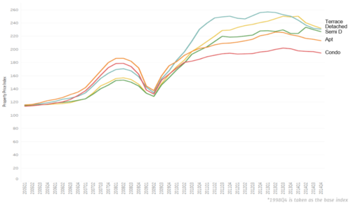
Lastly, in order to have a more detailed analysis, I decided to plot the price index of different property types onto the same graph for comparison. This allows the reader to easily figure out that the condo prices increased the least whereas terrace houses increased the most.
Policy Recommendations
Noting that the increase in supply of private properties has helped to ease property prices, the government can perhaps continue to encourage developers to build more private properties such as condominiums and apartments. This can help to further lower property prices and make private housing more affordable to Singaporeans. This gives Singaporeans more housing options and thus reduce reliance on government to build more BTO flats.
Some of the recommendations that can be made is:
- Offer incentives to developers to develop land
- Award contracts to developers who can offer more residential units per square feet, thereby making effective use of the land
- Have more apartments to be built so that homebuyers can have more housing options and not just mainly condominiums
Tools Utilized
- Excel 2013 for data preparation
- Tableau for visualization
- Piktochart for compiling infographic


