IS428 2016-17 Term1 Assign1 Cornelia Tisandinia Larasati
Contents
Infographic
Abstract
In recent years, there has been growing concern of oversupply of residential property in Singapore which could have led to a sharp fall in demand for private residential property amid hefty supply. Thus, this project aims to analyse the private residential property market in Singapore by looking at the private property supply and prices in 2015 and provide recommendations to the current housing policies for 2016.
Problem and Motivation
Property analysts have warned that the private residential property market may have to prepare for a decline in demand in 2016, due to the “lacklustre economic environment”[1].
To help buyers make better decisions on the price and the region they should buy at, a thorough analysis of past year transactions should thus be analysed. This, hence, gives a better glimpse of what type of units will be sold at what certain price in the coming quarters as well as gives buyers better information on types of units being sold according to regions.
Approach
Data Preparation
Datasets in the form of .csv files were downloaded from the REALIS portal. These datasets included information on the type of private properties, the number of units sold, the price brackets and the region where these units are. The .csv files were downloaded in batches as only yearly and quarterly data was available.
Executive Condominiums were excluded from the data set as these are hybrids of public and private housing and the project calls for only the supply of private properties.
Excel’s text-to-column function was used to delimit the dataset into its respective columns, as the original .csv files were in comma limited form. Excel was also used to manually combine datasets together to form one main file which would be uploaded into Tableau.
Use of Charts
Bar Charts
To best display and compare the frequency of certain categorical characteristics, a bar chart can be used. Bar charts were used to visualise the relative number of units sold in different regions, price brackets or quarters.
Line Graphs
To visualise the data across years or quarters, a line graph can be used to track changes over these periods of time. Line graphs can also be used to compare changes over the same period of time across different categories. In this case, the changes in the number of units sold within each price bracket or within each type of unit can be compared across quarters using a line graph.
Pareto Charts
A pareto chart is used to focus on the most significant contributors of a certain characteristic. In this case, a pareto chart was used to identify the which price bracket(s) did most of the units sold belong to.
Results
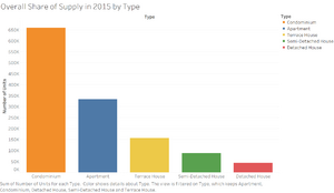
An overall share of supply in 2015 was first visualised using a bar chart.
This shows the number of units sold in 2015 according to the type of units.
From this graph, we can see the non-landed properties are the most common type of unit being sold in 2015, with a total of 659,071 condominiums and 333,513 apartments sold in 2015 alone. This may be due to an increase in household income through 2015[2], which may lead to a higher desired standard of living for these households. As condominiums offer more facilities such as swimming pools, clubhouses and playgrounds and provide added security through its gated compound, yet are less expensive than owning a landed property, this type of housing would thus be on the rise.
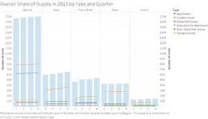
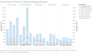
Drilling down further, the trend across quarters in 2015, categorised by region, was then visualised using bar charts and line graphs. The total supply in each region has been increasing through the quarters, with the central region having the highest total number of units sold. Considering the tumultuous demand in the housing market, the fact that the supply of housing is increasing may lead to concerns of a lack of demand for this supply.
While the most common type of units sold in each region matches that of the overall supply, which showed that condominiums were the most commonly sold, there is a deviation shown in the North East region. This region bucks the trend as terrace houses are the next most common type of housing, instead of apartments. This is a surprising trend, given that this region is considered the most densely populated in Singapore, which should give rise to more non-landed properties being supplied.
In summary:
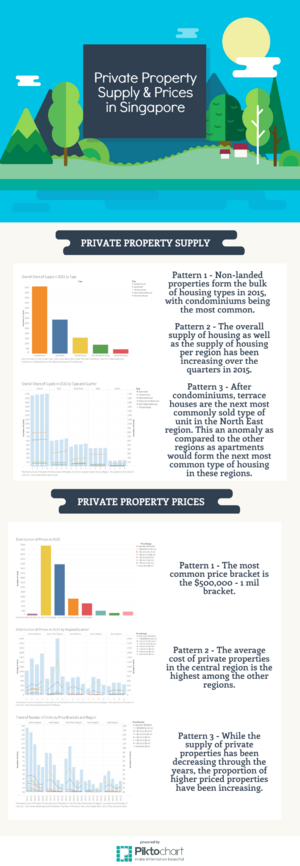
- Pattern 1 - Non-landed properties form the bulk of housing types in 2015, with condominiums being the most common.
- Pattern 2 - The overall supply of housing as well as the supply of housing per region has been increasing over the quarters in 2015.
- Pattern 3 - After condominiums, terrace houses are the next most commonly sold type of unit in the North East region. This an anomaly as compared to the other regions as apartments would form the next most common type of housing in these regions.
Distribution of Private Properties Prices in 2015
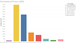
Quarter 3 saw the most sales, with the $500,000-1mil priced houses being the most common type of house sold. This price bracket also saw a peak in quarter 3.
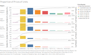
This was seen throughout all the regions, except the central region, where more houses were sold in a higher price bracket. This may be explained by the fact that houses in the central region are competing for the use of land, which is densely used in the center of Singapore.
Furthermore, cheaper forms of housing form the bulk of housing in Singapore. For all the regions except the central region, 80% of the houses come from the lowest 3 tiers of housing. The graph again confirms that the central region has higher than average priced houses, where 80% of the houses also include those in the 1.5 - 2mil price bracket.
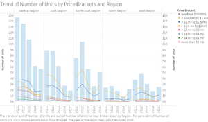
A closer look at the trend of housing throughout the years also show that supply of houses in 2015 was recovering from low supply in 2014. However, the trend of the 500,000 - 1mil price bracket being the most common still holds throughout the years.
In summary:
- Pattern 1 - The most common price bracket is the 500,000 - 1 mil bracket.
- Pattern 2 - The average cost of private properties in the central region is the highest among the other regions.
- Pattern 3 - While the supply of private properties has been decreasing through the years, the proportion of higher priced properties have been increasing.
Three Policy Recommendations
- Provide more non-landed property in more densely populated areas
- Plan for a more even spread of supply across quarters, instead of just in quarter 3. This is to improve the disparity between demand and supply of private properties.
Tools Utilized
Microsoft Excel
Microsoft Excel was used to combine batches of .csv files downloaded from the REALIS portal as well as to clean the data in preparation for upload into Tableau 10.0.
Tableau 10.0
Tableau was the main software used to manipulate data and build visualisations to better spot and understand patterns within the dataset. Tableau was also used to create calculated fields to represent the data as well as to compare certain aspects of the data with each other.
Piktochart
Piktochart is a free web app which allows users to create their own infographics using "drag-and-drop, point-and-click" functions on their online platform. This was used to create the analytical infographic.
