IS428 AY2019-20T2 Assign ANG WEI XUAN DION
Contents
Overview
Every two years, SMU libaries conduct a comprehensive survey in which faculty, students and staff have the opportunity to rate various aspects of SMU library's services. The survey provides SMU libraries with input to help enhance existing services and to anticipate emerging needs of SMU faculty, students and staff.
The 2018 Survey Results can be found here and the full report is available by following this link. However, the past reports are mainly made-up of pages of tables, which are very difficult to comprehend. Therefore, the objective of this project is to create an interactive dashboard that allows SMU Libraries to easily view the results of the survey and gain useful insights, and reveal the level of services provided by SMU libraries as perceived by the following stakeholders:
- Faculty
- Undergraduate students
- Postgraduate students
- Staff
Objectives
The interactive dashboard aims to achieve the following:
- Allow users to get a quick overview about the survey results (who were the people taking the survey, what was the overall satisfaction, and how likely they will recommend the Library to others
- Allow users to see the distribution of scores for each survey question, and allow for gap analysis by comparing performance and importance
- Allow users to see what are some comments made by visitors from each of the different groups (undergraduates, postgraduates, faculty, and staff), and by the Net Promoter Score groups (detractors, neutrals, promoters)
With this dashboard, SMU library will be able to gain a better understanding of their visitors and find out which are the areas where they need to improve on.
Data Preparation
The survey results were stored in a excel sheet in transactional form, where each row represented one respondent in the survey. For each respondent, the following information was captured
- Which library they used more (Li Ka Shing or Kwa Geok Choo Law Library)
- Whether they were undergraduate, postgraduate, faculty or staff
- Their area of study (business, economics, etc.)
- How often they came to campus, used the library, and accessed library resources
- Their responses for each of the survey questions, represented by one column each in the dataset
- Comments about the library
The format of the data makes it difficult for analysis, such as comparing scores between survey questions, or to perform gap analysis between importance and performance. In addition, many of the categorical variables were number coded into a legend, so they have to be translated.
Pivoting the Data
Pivoting the data transforms the data by placing questions under a single column, so we can compare between different questions or filter them out by question categories. However, we also want to allow for comparison between the importance and performance of a particular question, instead of treating them as different questions. Therefore, Tableau Prep was used to achieve this.
The relevant survey questions for Importance and Performance were pivoted separately. Afterwards, the letters from the question codes were stripped so that I01 (importance score for question 1), and P01 (performance) was treated as the same question. Afterwards, joins were used to combine the different tables so that each question has an importance and performance score associated with it.
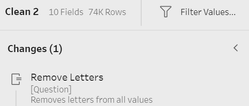
Lastly, before loading the data into Tableau, Excel lookup functions were used to replace the number coded values in the data to their actual values. This reduces the amount of renaming work that needs to be done in Tableau. After that step, the final form of the data looks like this:
Preparing the Wordcloud data
From the raw data, a duplicate of the sheet was created and all survey related questions were removed, except the satisfaction score question, which will be used. Afterwards, the comment field was duplicated and placed at the last column of the sheet. Using Excel's Text to Columns function, the comments were split into multiple fields and the resultant file was loaded into Tableau.
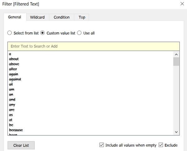
In Tableau, all the text columns in the comments file was then pivoted into one column. Afterwards, a calculated field called Filtered Text was created, by filtering out all symbols from existing words, as well as excluding the stop words using a stop words list, which can be found online
Interactive visualization
The interactive visualization can be accessed here: https://public.tableau.com/profile/dion.ang#!/vizhome/Assignment1_15840879937550/Home
Home Page
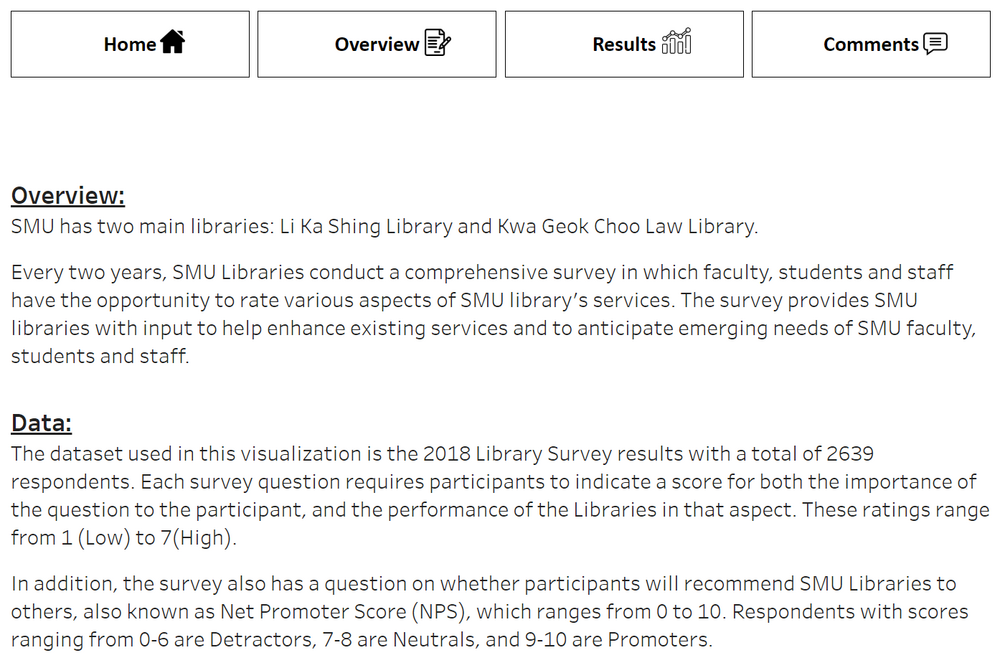
The home page gives a brief description about the library survey, as well as provide navigation to all other pages
Overview Page
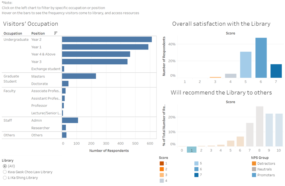
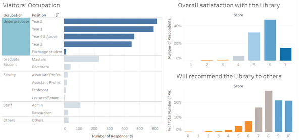
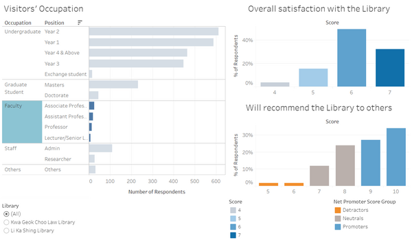
The overview page allow viewers to see at a glance the overall demographic of the Library's visitors, as well as the overall satisfaction with the library, and how likely they are to recommend the Library to others.
Design Rationales
1. To show key summary information without over-cluttering the overview page. This is done by:
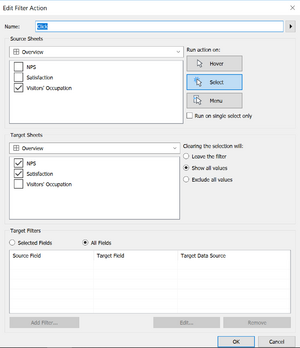
- Using dashboard actions to do filtering instead of filters, so more space is available
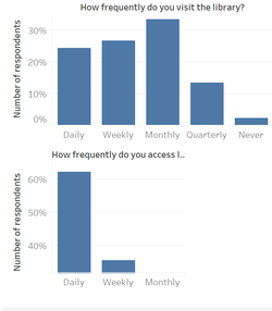
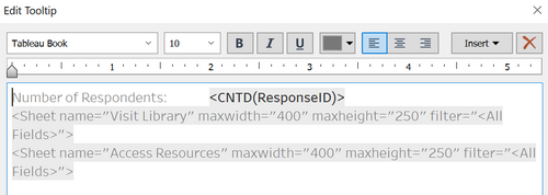
- Using charts embedded in tooltips to display supplementary information that is not critical but may be of interest to the users
2. To allow viewers to quickly grasp the key insights from the charts. This is done by:
- Grouping the different positions by their occupation to organize them
- Sorting the counts in descending order by group
- Using colours and legends to highlight good scores from poor scores, as well as grouping the net promoter scores by their net promoter groups
Interactive Techniques Used
| Interactive Technique | Rationale | Brief Implementation Steps |
|---|---|---|
| ||
| ||
|
Results Page
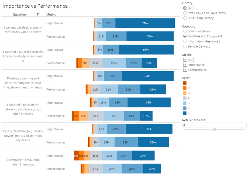
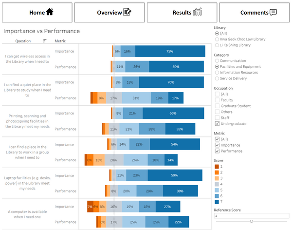
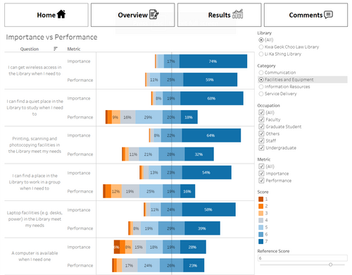
The results page allow viewers to compare the scores between different survey questions, and also the performance against the importance within one question. This helps the library see what it is doing well or poorly on, and compare that with the importance of these issues to its visitors.
Design Rationales
1. To allow viewers to quickly grasp which issues are important to library visitors, and compare them to the library's actual performance. This is done by:
- Using a divergent stacked bar chart aligned by a user defined reference score
- The alignment helps viewers quickly seeing which question has the most number of positive/negative survey scores
- Sorting the questions in descending order of importance to visitors
- Placing the Importance and Performance bars next to each other for easy comparison
2. Prevent the page from being over-cluttered while still allowing for in-depth analysis. This is done by:
- Only allowing single selection for the question categories
- Allowing users to select which library, which metric they are interested in, and what reference score to align the chart by through filters and parameter controls
Interactive Techniques Used
| Interactive Technique | Rationale | Brief Implementation Steps |
|---|---|---|
| ||
|
Comments
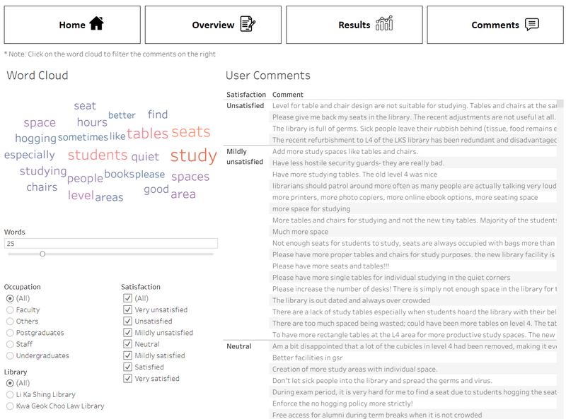
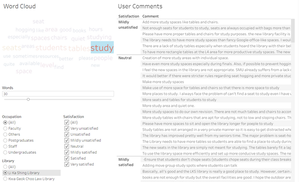
The comments page allow viewers to see what are the most common words appearing in comments through the word cloud. The words in the word cloud can then be selected to filter the comments accordingly, together with other filters such as the satisfaction score, occupation of the visitors, and the library building.
Design Rationales
1. To allow viewers to see which are the most commonly mentioned words in comments at a glance, based on the selected filters. This is done by:
- Using a word cloud where the size depends on the occurrence of the word
- Updating the word cloud based on the user's selection of filters
2. To allow viewers to identify relevant comments that they wish to explore. This is done by:
- Applying the word cloud's selected word as a filter for comments
- Adding other filters for satisfaction score, occupation of the visitors, and the library building.
Interactive Techniques Used
| Interactive Technique | Rationale | Brief Implementation Steps |
|---|---|---|
|
Insights
Undergraduates
Finding 1: Undergraduates were the least satisfied group
From the Overview Page, select the different occupation groups on the left graph and observe the distribution of satisfaction scores and recommendation scores. Among the different occupation groups, undergraduates were the least satisfied group. Among the undergraduates, the Year 2 undergraduates were the most dissatisfied, followed by Year 3, Year 1, then Year 4 undergraduates.
Further analysis can be done to see if there's a correlation between frequency of usage and lower satisfaction. Hovering over the bars shows the frequency of visiting the libraries of the selected group. Among the undergraduates, Year 2 undergraduates were the most frequent visitors to the library with the largest percentage of daily visitors, followed by Year 1, Year 3, then Year 4 undergraduates.
From these findings, there may be some correlation with frequency of library usage and lower satisfaction. It may also be possible that the satisfaction scores for Year 1 may be higher as they are newer to the school and less familiar with the facilities or are more reserved in their survey scores.
Finding 2: Undergraduates are least satisfied with Facilities and Equipment
From the Results Page, filter the results by selecting Undergraduate from Occupation, and go through the different question categories. Among the question categories, Facilities and Equipment had the largest gap between performance and importance, in which the library was not performing as well as undergraduates felt was important.
In particular, the 3 most significant areas in descending order are:
- Finding a quiet place to study in the library when they need to
- Finding a space to work in a group when they need to
- Printing, scanning and photocopying facilities in the Library meeting their needs
These are areas that the library could then work to improve on in the future
Finding 3: Undergraduates feel that they need more study spaces in the library, and wants stricter rules on seat hogging
From the Comments Page, filter the comments by selecting Undergraduate from Occupation. As "study" is the largest word in the wordcloud, click on it to filter the comments with this word. Further filtering can be done by selecting the library and the satisfaction level.
Reading through the comments with lower satisfaction reveal that the undergraduates' main complaint is that there is a lack of study spaces. In particular, the recent refurbishment in Level 4 of the Li Ka Shing Library has led to a lot of negative comments about how it is "redundant" and "wastes space".
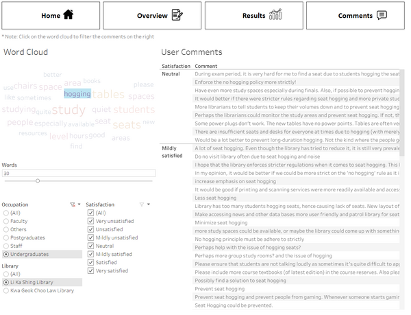
Another interesting finding is that among the top 30 words for undergraduates, hogging stands out as a different word compared to the rest. The size of the word is particular large for the Li Ka Shing library. Looking at the comments for "hogging", many students believe that there can be stricter rules on seat hogging and that the issue is particularly bad during the finals period.
From this, the library can review the decision on refurbishing the Level 4 study area of Li Ka Shing Library, as well as look at measures to reduce incidents of seat hogging
Postgraduates
Finding 1: Postgraduate students studying for doctorates have the highest frequency of access of the Library's resources
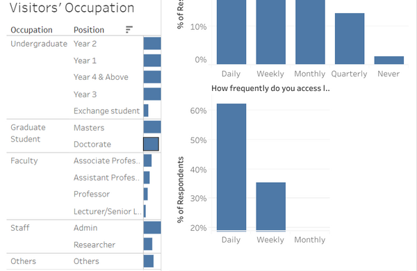
From the Overview Page, hovering over the bars shows the frequency of accessing library resources of the selected group. The proportion of doctorate postgraduate students who access library resources daily is over 60%, even more than the professors, and the research staff. Masters students on the other hand have much lower frequency of accessing the library's resources, with about 50% using them weekly, similar to that of undergraduate students
Finding 2: Postgraduate have a larger proportion of negative scores with Information Resources
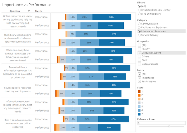
From the Results Page, filter the results by selecting Graduate Student from Occupation. Comparing the proportion of negative scores with that for all groups reveal that graduate students are more critical about their information resources. This is in line with the finding that graduate students particularly the doctorate students have the highest frequency of accessing the libraries resources.
In particular, the 3 most significant areas in descending order are:
- Ease of access of library's online resources through mobile devices
- Course specific resources meeting their learning needs
- Usefulness of library's online resources in meeting their studying and research needs
These are areas that the library could then work to improve on in the future
Faculty
Finding 1: Faculty members have the highest satisfaction scores and NPS than other groups
From the Overview Page, select the different occupation groups on the left graph and observe the distribution of satisfaction scores and recommendation scores. Among the different occupation groups, faculty were the most satisfied group and have the highest NPS. However, this finding should be taken with caution as the sample size for faculty members doing the survey is very low and may be highly biased
Staff
Finding 1: Staff give the lowest importance scores for Facilities and Equipment
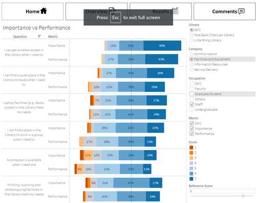
Left shows the results for Staff, Right shows the results for all groups
From the Results Page, filter the results by selecting Staff from Occupation. By setting the reference score to a higher number such as 6, the difference between the 2 charts are made even clearer. Staff show a significantly lower score for importance for Facilities and Equipment, which is higher in all the other groups. The gap between performance and importance is thus much lower than that of the other groups.
This could suggest that in terms of needs related to Facilities and Equipment, the staff do not require as much from the library as other groups
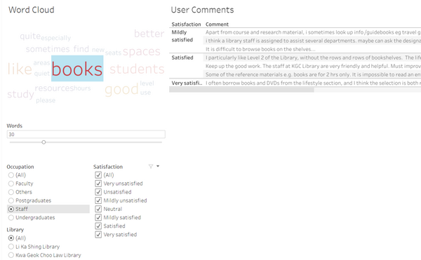
An interesting finding found was that staff had a high proportion of comments related to books. From the Comments Page, filter the comments by selecting Staff from Occupation. "Books" is the largest word in the wordcloud, significantly larger than the others, and clicking on it filters the comments relevant to books.
Reading through the comments reveal that some staff face issues with the misshelving of books, while other comments show that staff have good impressions on the lifestyle section in Level 2 of the Li Ka Shing Library
Limitations
Naturally, the survey data is highly skewed towards undergraduates due to the number of visitors of the library who are undergraduates. However, the lower count for the other groups of visitors would make the findings for these groups of visitors less reliable.
Another limitation would be the wordcloud functionality of the dashboard. Currently, the words are not processed using a proper natural language processing tool, which means words such as 'seat' and 'seats' are treated separately. Using a proper tool would greatly increase the reliability of the wordcloud to get a better representation of the comments


