From Visual Analytics for Business Intelligence
Jump to navigation
Jump to search
Problem
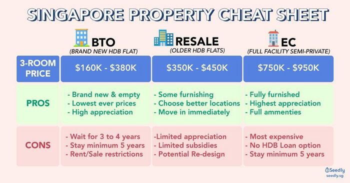
The above is an example of information online in helping Singaporeans decide the type of house they should choose from which clearly lack in terms of other important details. In the context of this project, Resale HDBs are the focal point. Choosing a home has never been easy as there are so many factors to consider such as, location, HDB type, number of remaining lease years, resale value, etc. Thus, WeHouse comes into play to provide ample information for people to understand the HDB resale market better and allow them to make a wise decision for their choice of HDB.
Motivation
Given the abundance of information available on the internet in terms of resale prices. There have been online resources provided to map out HDB locations and prices, however, such visualisations tend to be overwhelming due to vast data and non-specialized focus on visualisations. Hence, we are looking to re-organise and present an interactive dashboard, specifically pertaining to HDB dwellings, to empower users to make better informed choices of their HDB location.
Data Set(s) Used
| DataSource
|
Data Attribute
|
Data Description
|
Rationale of Usage
|
|
HDB Resale Flat Prices
https://data.gov.sg/dataset/resale-flat-prices
|
Month
|
Description
|
To attain valuable insights on HDB Real estate prices which can be classified by the following
- Resale Prices trend by location
- Cost PSM
- Maturity of estate
- Area size and floor level vs Price
|
| Town
|
Description
|
| Flat Type
|
Description
|
| Block
|
Description
|
| Street Name
|
Description
|
| Floor Area sqm (SQM)
|
Description
|
| Flat Model
|
Description
|
| Lease Commence Date
|
Description
|
| Remaining Lease
|
Description
|
| Resale Price
|
Description
|
Background Survey
| Example
|
Takeaways
|
|
|
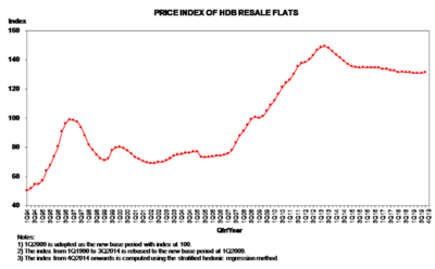
- The time-series chart used provides a detailed overview of the trending price index of HDB resale flats as each plotted point follows a quarter/year timeline. However, showing each year’s quarter does make the x-axis legend hard to process upon a quick glance.
- This chart could be further improved by adding a filtered selection to view the quarters for a specific year rather than all quarters for the 25 years displayed.
- Also, an average reference line could be added to provide a benchmark for the various price
|
|
|
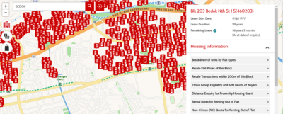
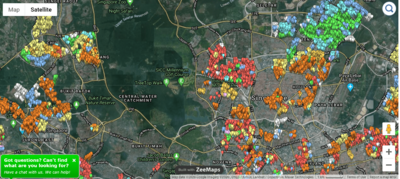
- Although the use of HDB flat icons on the map does help in depicting the cluster of HDB flats in the specified area, however, it makes the visualisation too cluttered which impacts the map visuals as the street names / landmarks might be blocked.
|
|
|
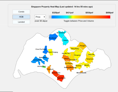
- The heatmap provided good sectioning of HDB densities across singapore, however a lighter grey shade of the planning areas that are not highlighted could be included.
- With this addition it could depict a better idea on where the densities of HDBs are close to which other areas for route planning or even workplace mapping.
- The various colours used might not be a clear representation of exactly how dense the HDB planning area is.
- A gradual gradient of single colour could be used:
- darkest tone → lightest tone (Most dense town → Least dense town respectively)
|
|
|
- The use of pin-drop allows the user to get a visual representation of the landmarks in the area and the details provided in the visualisation are plentiful.
- However, the most important detail, pricing is not included which may defer users from utilising this platform to compare prices.
- The cluttered pins and multi-colour pins may be confusing to the user and the differences are not clear at first glance for a HDB buyer.
|
|
|
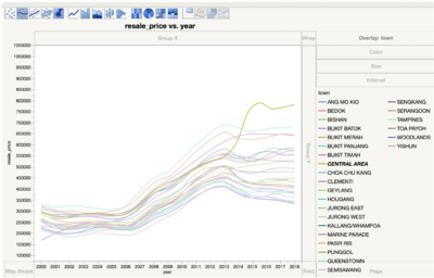
- The use of legends helps to tell which lines belong to which estate but the use of too many colours might detract viewers from the main purpose of the visualisation
|
|
|
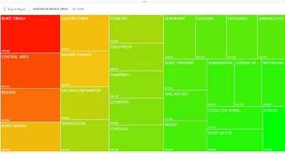
- Here, the use of the treemap is good in terms of the colour-shading as appropriate colours are used depict the varying resale prices
- (Red → High Resale Prices)
- (Green → Average to Low Resale Prices)
- What’s lacking in this treemap is a little more in-depth information on the type of HDBs within the planning areas stated.
- It would be good to let viewers gain insight on which type of HDBs tend toward higher resale prices for future planning if home dwellers decide to sell the house at a later time
|
List of References
Proposed Storyboard
| Dashboards
|
Rationale
|
Dashboard 1: Overview of Resale Trend in Singapore Volume VS Price
|
|
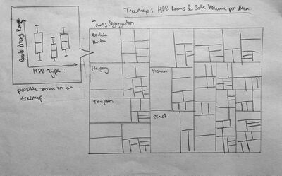
Dashboard 2: Tree Map of Room Cost Vs Area
|
|
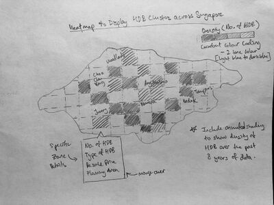
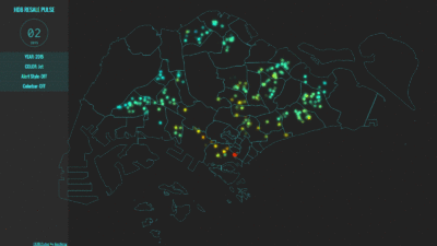
Dashboard 3: Animated Visualisation Heat Map of Singapore's HDB PSF Cost
|
- We are intending to use an animated version with a static map that illustrates the variations in the changing cost PSF in generalised land marks
- With the animated version, we are able to note the trend of changing cost PSF in each area
- Together with the static version, any Singaporeans would be asble to understand the cost of HDB in each respective area
|
Key Technical Challenges
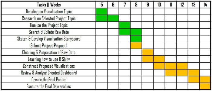
Team Milestones
Do Leave a Comment on how we can improve :)
| No.
|
Name
|
Comments
|
|
1
|
Name
|
Insert Comment Here
|
|
2.
|
Name
|
Insert Comment Here
|
|
3.
|
Name
|
Insert Comment Here
|
