From Visual Analytics for Business Intelligence
Jump to navigation
Jump to search
Problem Description
PS and motivation of the case
Data Set(s) Used
Blah blah black sheep have you any wool
Background Survey
| Dashboards
|
Rationale
|
|
1
|
|
|
2
|
|
|
3
|
|
|
4
|
|
|
5
|
|
|
6
|
|
|
7
|
|
}
List of References
Proposed Storyboard
| Dashboards
|
Rationale
|
Dashboard 1: Overview of Resale Trend in Singapore Volume VS Price
|
|
Dashboard 2: Tree Map of Room Cost Vs Area
|
|
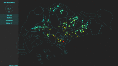
Dashboard 3: Animated Visualisation Heat Map of Singapore's HDB PSF Cost
|
- We are intending to use an animated version with a static map that illustrates the variations in the changing cost PSF in generalised land marks
- With the animated version, we are able to note the trend of changing cost PSF in each area
- Together with the static version, any Singaporeans would be asble to understand the cost of HDB in each respective area
|
Key Technical Challenges
Team Milestones
Do Leave a Comment on how we can improve :)
|
