Group06 proposal
|
Growth Signal |
|
|
|
|
Contents
Problem & Motivation
Problem
In Singapore, education is one of the sectors that is heavily invested by the state besides defence and health. As years progress, more data are accumulated and made available to the public by various government institutions such as Singapore Department of Statistics and data.gov. Despite the abundance of data, it is often not easy for someone fresh out of post-secondary education to plan for further studies in an efficient and thorough manner due to decentralisation and lack of visualisation (data are in raw/unstructured/tabular form).
Motivation
Enrolling in higher education such as polytechnics, especially universities is becoming a commonplace in Singapore. Not only does it prepare the next generation for the future (individual level), the country as a whole can significantly benefit as a result of a highly-educated population. This interactive visualisation will serve as a platform for post-secondary individuals to analyse the changing landscape and trends of higher education where they can uncover interesting insights and make well-informed decisions to ensure a sustainable future.
Objectives
Target Group: Post-secondary individuals
Many of the available data such as Graduate Employment Survey, Enrolment of students in institutions of higher education and government expenditure are located either on various institutions’ website, government generated reports or on data sites. The general reader is unable to get the full information on higher learning institutions in Singapore.
As such, our dashboard will fulfil the following objectives:
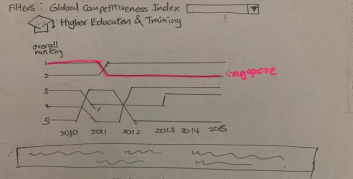
- Visualise Singapore’s ranking in various metrics of GCI’s 5th pillar (higher Education and Training) over time
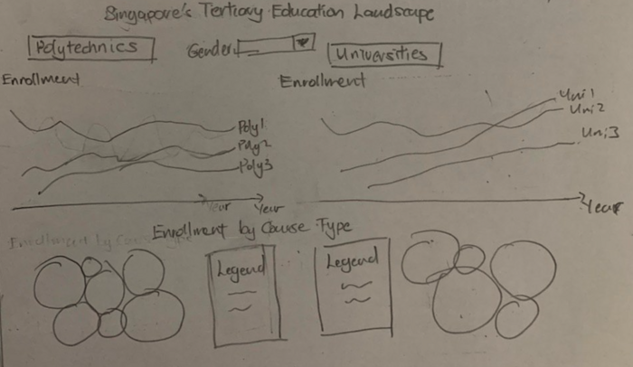
- Identify enrolment demographic across different institutions and courses and how they changed over time
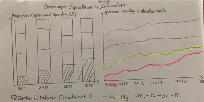
- Comparison of Governments’ efforts in developing Polytechnics and Universities with different sectors and other levels of education
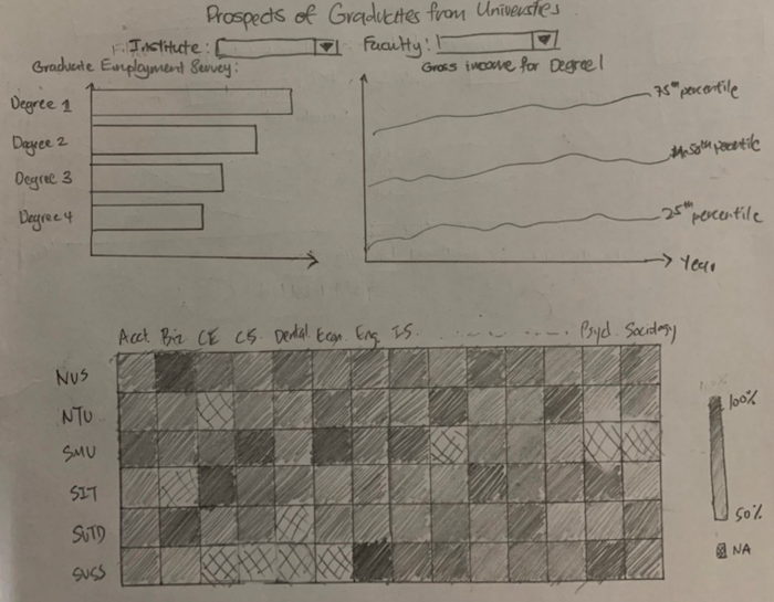
- Identify the courses which churns out the most successful graduates by employment rates and starting income
Dataset
| Dataset/Source | Variables Used & Description | Rationale of Usage |
|---|---|---|
|
Dataset: GCI_Dataset_2007-2017 |
|
This dataset is rich and comprehensive, providing various attributes across years which allows us to extract the attribute of interest and plot it against time. Here, we were able to extract both the series pertaining to higher education and ranking of 152 countries. This allows us to plot the bump chart (time-series showing the top 10 countries) based on different series to illustrate the quality of higher education in Singapore. |
|
Dataset: Enrolment by Institutions |
|
This dataset allows us to study the trend of enrolment over the years for different institutions (6 universities and 5 polytechnics) by charting line graphs. With that, we can identify if there were any sudden drops or peaks of enrolment from an institution and possibly investigate further as to why it happened. After which, parents and the post-secondary individuals will be able to make a better choice as to which institution to enrol in. |
|
Source: SingStat |
|
This dataset provides enrolment patterns for different course types (e.g. Accountancy, Applied Arts, Engineering Sciences). With finer information such as gender and year, one can study the popular course types for either gender (or all), as well as how the number of enrolments of different course types changed over the years. |
|
Source: SingStat |
|
This dataset allows for comparison between government spending across different sectors and portray their efforts in developing the Education system. With data ranging across several years, insights can be taken on how the government's focus on developing the nation's education have changed over the years as compared to other sectors. |
|
Dataset: Government Expenditure On Education, Annual |
|
The government's expenditure in various levels of education provides insights on their focus and efforts in developing each level of education program. As the dataset is a time series, it will also allow comparison of government spending over the years to tell us how has the government's focus in the development of Singapore's education system shifted at various types of education institutes and levels. |
|
Dataset: Graduate Employment Survey - NTU, NUS, SIT, SMU, SUSS & SUTD |
|
The dataset is credible as it is generated by the Ministry of Education. The employment rate and gross monthly salary over the course of several years enable us to plot line graph of salary over years for each degree and a heatmap of employment rate for each degree to provide insights on the competitiveness and job prospects of graduates from each course offered by the university. |
Background Survey
| Research | Learning points | Improvement |
|---|---|---|
|
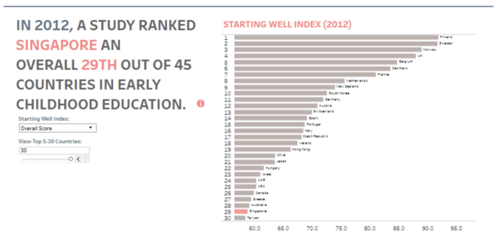
In addition to a good starting point, this visualisation allows users to select different metric of the Starting Well Index. This allows users to compare not only across different country but also Singapore’s ranking and score in the different indexes. This paints a more accurate picture of the exact area in which Singapore performed well in rather than just an overall aggregated score. In addition, the main country of study is highlighted in red to emphasis it, while the others are in grey. |
However, Since Singapore ranked 30th in this index, there were too many bar graphs, making the chart and its labels too small to be seen. An area of improvement is to display only the top ten and have a separate section of the dashboard to display Singapore’s ranking. Another alternative is to fixed Singapore’s bar graph at the top of the chart while allowing users to scroll through the remaining bar graphs. Additionally, as the only displayed data is from 2012, it will be good if data from past years could be added to allow users to compare Singapore’s improvement over the years. This data can be added by including a slider bar filter for the year. Alternatively, a line chart for each country’s ranking can be plotted to compare how each country fair throughout the years. | |
|
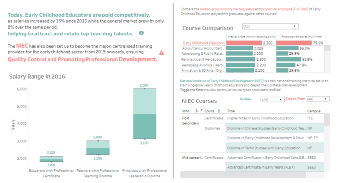
The dashboard is neatly organised into different sections, one side showing the salary and the other side representing data of courses. The salary range of educators is depicted in a box plot of with the higher range and lower ranges of salary. Also, for the bar graph, the main study, early childhood education, is fixed. The others can be scrolled through to allow users to compare the main study with other fields. Such a method enables easy comparison of Early childhood educators to other profession. Also, allowing for scrolling reduces the space occupied and makes the graphs easier to read as there were less data for the viewer’s eyes to read at any one time. |
However, despite the pleasing colour theme and neat organisation, there was still too many words and items on the dashboard, reducing the visibility of information. The dashboard can do without the table on NIEC courses as this information is not a factor to the quality and performance of childhood education. | |
|
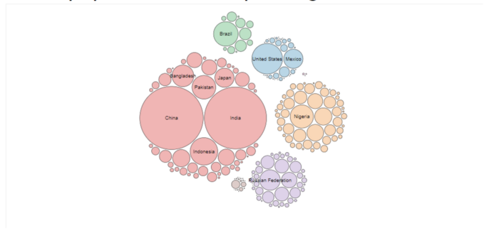
Lastly, during research, our team has discovered circles packing algorithm and the bubble chart. We found it useful in representing populations from different categories, as such a graph have no need for x-axis or y-axis. Furthermore, the bubble chart allows comparison of population sizes at one glance and the bubbles can be colour coded to highlight main categories. Such a chart would be useful for us when building graphs to visualise enrolment across different institutions and courses. |
However it would be hard to decipher smaller areas of the population without a legend |
References
- Pisa 2018: Singapore Slips to Second Place behind China but Still Chalks up High Scores.” The Straits Times, 4 Dec. 2019
- SingStat Education Data
- World population - Circle Packing
- Bump Chart - Doing Business in Singapore
Technical Challenges
| Challenge | Description | Mitigation Plan |
|---|---|---|
| Unfamiliarity with Tools | Most of the team members are not too familiar with R and R Shiny. |
|
| Lack of policy knowledge | There may be gaps in knowledge of policy jargons. |
|
| Data Quality & Integrity | Difficult to consolidate data as they are from different government agencies. Some of the data are in an unstructured format. |
|
Storyboard
| Dashboards | Description |
|---|---|
Dashboard 1: Higher Education Ranking |
|
Dashboard 2: Enrollment |
|
Dashboard 3: Government Expenditure |
|
Dashboard 4: Graduate's Prospects |
|
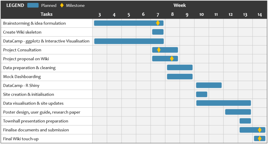
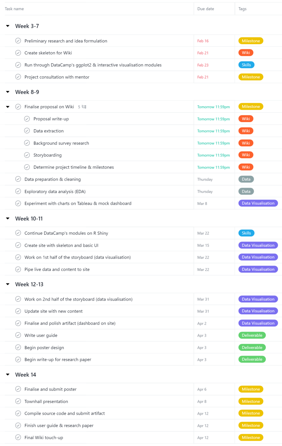
Project Timeline & Milestones
Comments
| Name | Date | Comments |
|---|---|---|
| (Name) | (Date) | (Comment) |
| (Name) | (Date) | (Comment) |
| (Name) | (Date) | (Comment) |
