From Visual Analytics for Business Intelligence
Jump to navigation
Jump to search
Problem
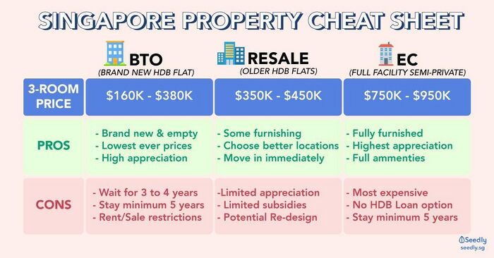
The above is an example of information online in helping Singaporeans decide the type of house they could choose from. In the context of this project, Resale HDBs is the focal point of our project. Choosing a resale HDB has never been easy as there are many factors to consider such as location, HDB type, number of remaining lease years, resale value, etc. On top of that, thousands of Resale HDBs transactions are happening each month, making it almost impossible for an owner to get a view of every transaction. Therefore, the majority of buyers and sellers have to consult property agents for their services.
Majority of buyers or sellers have to consult property agents for their services which might not always be satisfactory. It is still advisable for the buyer and/or seller to have a better understanding of the resale market before making an informed decision. In most cases, people tend to rely on multiple platforms to help them in understanding and predicting the market trend. On that note, our team would like to know whether the information provided to them is truly insightful or usable. Thus, WeHouse comes into play to provide greater insights for people to better understand the HDB resale market which can provide better aid in making more informed decisions.
Motivation
Our team would like to minimise the number of visualisations a prospective buyer would have to see. The data visualisations provided were generally overloaded with information, hence, we aim to create concise visualisations surrounding resale HDB trends. It is vital to relay critical information pertaining to yearly sales trends, average resale prices and volume based on floor level.
Objectives
In this project, we aim to deliver a focused and compact visualisation to allow Singaporeans to be well-informed of the average HDBs resale prices around their desired location.
- Overall change in HDB price trends over time by each planning region and by HDB Town
- Comparing price differences for each HDB Town area and planning region given the remaining lease of the HDB flat
- Determine which month had the highest or lowest resale price sold and number of transactions
- Identify the most expensive streets within each Town area given the floor level
Background Survey
| Example
|
Takeaways
|
|
|
- Benefits from the box plot is that it can depict outlier resale prices within each town listed, indicating which towns have more certainty with flat resale prices
- Improvements could be made with the order in which the box plots are displayed, it could be sorted in a descending order according to the coloured region for a more uniform chart output
- The heat map provided an overall view on the distribution of average resale flat prices given the year selected.
- Improvements could be made about the gradient colour type; a darker varied gradient could have been used to make the shaded regions stand out more on the grey scaled mapping. If not, the whiter shade portions are hard to distinguish upon the grey unshaded tones.
|
|
|
- The main benefits of using this treemap is that the median resale prices were segregated according to the 5 regions within Singapore given the year selected.
- The gradient tone depicted the varying median resales prices.
- Improvements could be made by perhaps removing the model type and only having the number of room type as it has a greater decision impact on the viewers rather than HDB model types
|
|
|
- The benefits of using these line charts is that the overall increasing/decreasing transaction trends and the average price trends can be observed within a span of 5 years
- However, it could be better illustrated in a chart that incorporates both elements which would create a more visually appealing chart with just a chart to focus on
|
|
|
- The correlation charts provided an overview how the factors (remaining lease years, floor area) have an effect on the resale prices over the years
- Improvements could be made to the chart by excluding the exact address of the flats and only keeping the comparison specifically between remaining lease years and Resale Price by town area to reduce the cluttered scatter plots.
|
List of References
Proposed Storyboard
| Dashboards
|
Rationale
|
Dashboard 1: Overview of Resale Trend in Singapore Volume VS Price
|
- After a thorough discussion with prof, we have decided to revise our overview dashboard to include a trellis plot together with the line chart with bar chart to give an overview of resale prices over the past few years.
- The inclusion of having a trellis chart is to provide a snapshot view of pricings by all HDB room types.
- In addition, a radio button allows the user to swap between unit price and average resale price.
|
Dashboard 2: Overview of HDB Pricing VS. Floor Level Categories
|
- After much research, we have decided to categorise the levels according to Low, Low-Mid, Mid, Mid-High and High.
- The user will be able to switch between Unit Price and Average Resale Price that affects the colour intensity to allow an interactive view of all prices.
- The size of the treemaps are based on sales volume The layers of Treemap are in the following sequence:
- Planning Region → HDB Town → HDB Precinct
|
Dashboard 3: Visual Mapping of Singapore's HDB PSF Cost
|
ASPATIAL MAP
- Map out the different HDB towns and the trend of each area with respect to the no. of hdb transacted.
- The user will be able to toggle between unit price and average resale price for interactivity.
- We have included a scatter plot that changes with accordance to the user selection on the map.
- The scatter plot is a map between resale price and resale years with box plot marginal.
|
Technologies Used
Team Milestones
Do Leave a Comment on how we can improve :)
| No.
|
Name
|
Comments
|
|
1
|
Name
|
Insert Comment Here
|
|
2.
|
Name
|
Insert Comment Here
|
|
3.
|
Name
|
Insert Comment Here
|


