IS428 AY2019-20T2 Assign LU ZHIMAO

From Visual Analytics for Business Intelligence
Revision as of 01:43, 18 March 2020 by Zhimao.lu.2018 (talk | contribs)
(diff) ← Older revision | Latest revision (diff) | Newer revision → (diff)
Jump to navigation Jump to search
C8tpsT8UMAAN3c .jpg
Project Motivation

Every two years, SMU Libraries conducts a comprehensive survey in which faculty, students and staff have the opportunity to rate various aspects of our services. The survey provides SMU Libraries with input to help enhance existing services and to anticipate emerging needs of SMU faculty, students and staff.

However, based on the current report provided by the library it requires readers to complete 155 pages of report in order to have a full understanding of the content. After reading through all the pages of the report, the report only provides a surface level of analysis in which the library cannot draw much insightful information out of it.

Thus, in order to have better visualization and understanding of the data from the survey results, I have decided to use Tableau as a platform which allows the Library to toggle between the various groups; Undergraduate, Postgraduate, Staff and Faculty and also offer several types of data visualization that can be more easily readable.

Project Objectives and task

In this assignment, the aim is to apply 10 Weeks of Visual Analytics for Business Intelligence module's knowledge with self-learning techniques to help Singapore Management University Library to deliver a focused and compact visualisation. By doing, it allows Singapore Management University Library to be well-informed of their service feedback from users as well as to identify those critical areas currently in the needs of improvement in order to satisfy user's experience.

Using visual analytics approach to reveal the level of services provided by SMU libraries as perceived by:

  • the undergraduate students,
  • the postgraduate students,
  • the faculty,
  • the staff.

Data Preparation

Data Cleaning Using Excel and Tableau

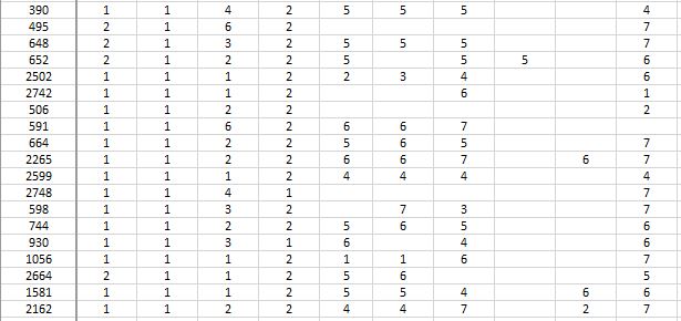
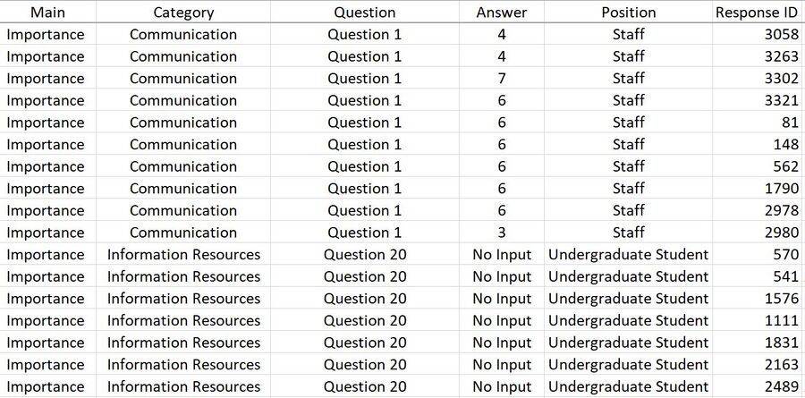
  1. Analysing the raw excel data, it becomes evident that there are multiple rows with data that are either an empty space " " or "NIL". Since both of them are referring to the same output. In order not to confuse the readers, I have decided to combine both data together and label it as "no input". Hence in ranking columns, it would show 1 to 7 and "no input".
  2. Under the question "Which library do you use most", the answer is reflected on the excel sheet as "1" or "2" where "1" is a representation of "Li Ka Shing Library" and "2" is a representation of "Kwa Geok Choo Library". This can be quite confusing, as the usage of numbers is to represent the ranking but it is only exceptional in this case. Therefore, I have decided to convert those relevant data into a word format instead of it being represented by numerical numbers.
Before
Qqqq.jpg
Dfjbdu.jpg
After
111qqq.jpg
  1. Tableau prefers data to be formatted in a machine-readable format. To reshape data for easier analysis in Tableau, I need to perform a pivot. In Tableau, pivoting means transposing data from a crosstab format into a columnar format–from wide, short tables into thin, tall tables. Tableau Prep Builder makes pivoting visual, allowing to see how data changes with every step.
    1. Connect to the library data source
    2. Drag the table that you want to pivot
    3. Click the down arrow icon and select Pivot from the context menu
    4. After selecting, the results appear immediately in the pivoted form
Before
Bhh.jpg
After
B.jpg
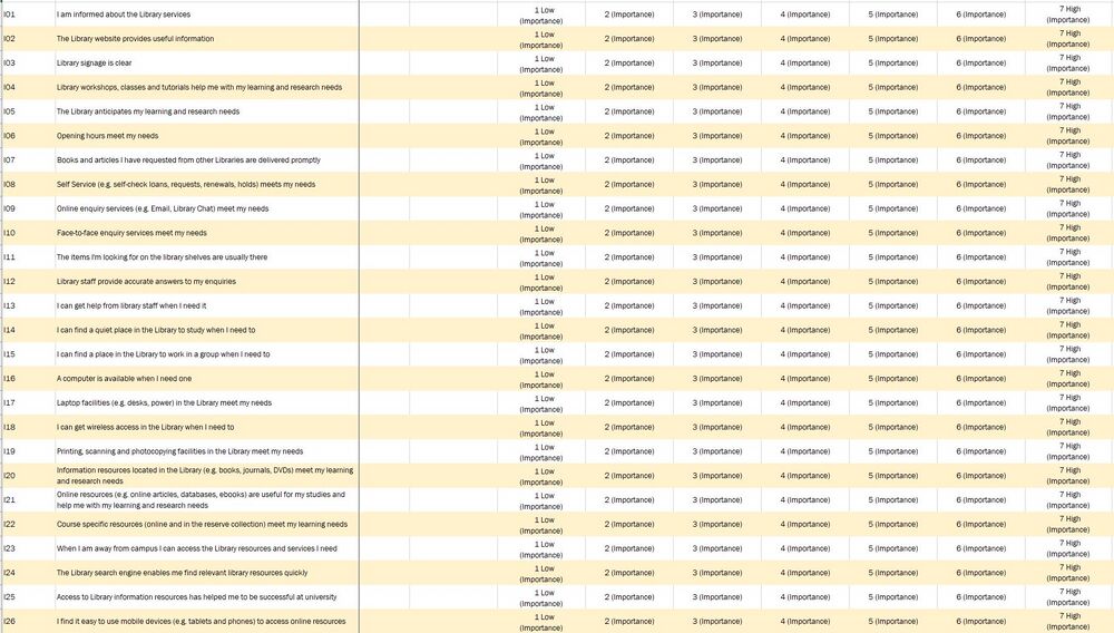
  1. After looking through the pivoted data and comparing with the report provided, I realised that the category types are missing in this data. These categories are important as it allows those relevant questions to group under the same category. So that it allows the users to choose how deep they prefer their data to be in terms of presenting the data visualization which allows the use not only limits to question along. With that, I will be extracting the latest pivoted data set from Tableau and saved as a csv file. On the csv file, I will create a new column and label it "Category". Under that column, I will insert the relevant grouping titles; Communication, Facilities and Equipment, Information Resources and Service Delivery. This is in accordance with the groupings as by the report provided.
Before
888.jpg
9999.jpg
After
99999999.jpg

Selection of Graphs used in Data Visualization

Graph Type Reasoning Type of Graph would like to use in library survey data analysis
Likert Scale
  • They are one of the most reliable ways to measure opinions, perceptions and Behaviours. It is used to an analysis survey question that uses a 5 or 7-point scale, in our Survey Data it uses 7-point scale and it referred to as a satisfaction scale, that ranges from Low (represented by 1) to High 7 (represented by 7).
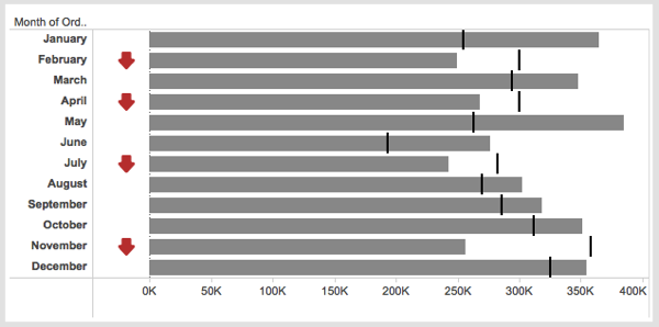
KPI Performance Chart
  • The KPI chart is used to, at a quick glance, give information about the current performance of the library. KPIs can be used to track the performance of the library against importance. They can provide a management tool for gaining insight and decision making. For our library survey data analysis is to identify the gaps between the importance and performance and in this case, both indicators are set by the survey responders. By looking at the gap we are able to identify if the library services currently under user's expectation or achieved user's expectation.
Vertical Bar Chart
  • Use vertical column charts to display ordinal variables. For Net Promoter Score, it arranges ordinal categories from left to right so readers can view the sequence accordingly.
Horizontal Bar Chart
  • Use horizontal bar charts to display nominal variables like Question ID. It allows arranging Question ID in a list from top to bottom and in a horizontal manner.
Population Pyramid Chart
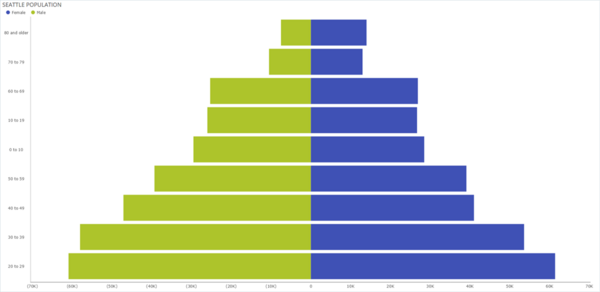
  • For Population Pyramid chart, breaks down SMU population into positions such as Undergraduate, Postgraduate, Staff and Faculty. For this assignment, you'll find the left side of the pyramid graphing the LKS population and the right side of the pyramid displaying the KGC population.
Highlight Table
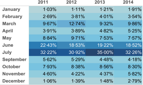
  • The highlight table allows us to apply conditional formatting to a view. Tableau will automatically apply a colour scheme in either a continuous or stepped array of colours from highest to lowest. It is great for comparing a field’s values within a row or column.
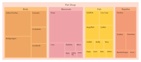
Treemap
  • A treemap is a visualization that nests rectangles in hierarchies so that can compare different dimension combinations across one or two measures (one for size; one for colour) and quickly interpret their respective contributions to the whole.
  • By looking at the colour and the size of the rectangles represented by treemap, we able to identify the category and question quickly based on user's input.

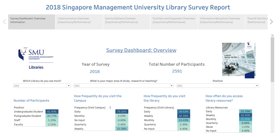
Survey DashBoard Overview Information

Tableau Visualization

The interactive Tableua visualization can access here.

DashBoard Overview

Screenshot (30).png
Screenshot (31).png
Screenshot (32).png
Screenshot (33).png

DashBoard Summary

Picture Number Description & Analysis
1
Screenshot (4).png
  • It is clear that majority of the law students use Kwa Geok Choo Library (KGC) more often than Li Ka Shing (LKS) while Li Ka Shing library host more students from the Business School.
  • We can see that the majority of the school population opt for Li Ka Shing library over Kwa Geok Choo library. This is probably due to the fact that LKS is located in the middle of the school compound and right next to campus green, making it more accessible for students as compared to KGC which is located at the far end of school with no sheltered walkway.
  • LKS should allocate more books catered for the rest of the students while KGC can focus more law books which may come in handy. By allocating their services, can improve reputation.
2
Likert scale promoters.jpg
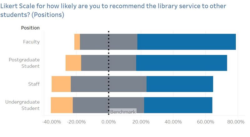
  • Using a Likert Scale to represent the Net Promoters Score where
    • Blue represents ratings 9 and 10 (Promoters)
    • Grey represents ratings 7 and 8 (Passive)
    • Orange represents ratings 6 and below (Detractors)
    • We can see that Faculty has the greatest number of promotors with Postgraduates following behind while Staff and Undergraduate student has the least promotors when it comes to recommending library services to other students.
    • Since undergraduate students comprise of the majority usage of LKS and being the ones who use it daily, LKS should focus on improving their services. In SMU majority of the population are come from undergraduate students, if the library wants to increase the Net Promoter Score they should pay more attention to undergraduate students.
3
Screenshot (34).png
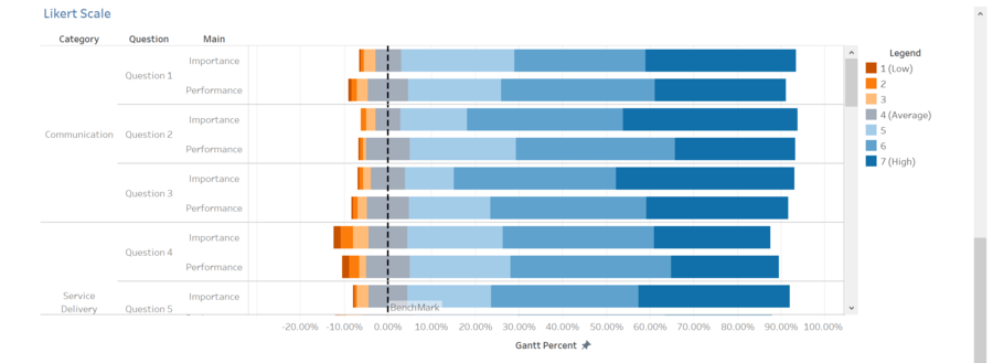
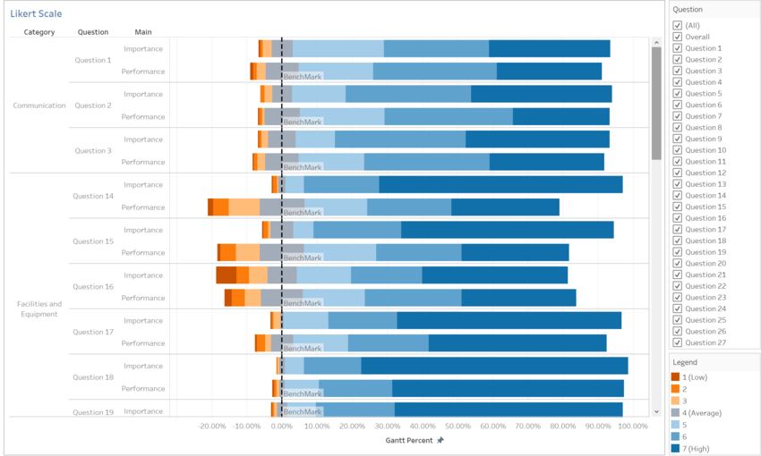
  • By using the Likert Scale we are able to group the answers into 3 categories (low, neutral, high). Neutral will be the benchmark to divide low and high apart. The size of the neutral split evenly and the splitting point will be the point 0 also known as the benchmark point.
  • The Likert Scale is presented in the form of category followed by the question which is split into importance and performance).
  • Although there is a benchmark on each bar but the reader unable to have a clear comparison of each ranking between importance and performance. As the reader has to manually compare both figures provided.
  • Therefore, at the later part of the individual analysis, I have added in an extra KIP Chart to help readers to have a clear understanding of the differences between Importance and Performance.

Introduction for Gap Analysis

Gap Analysis Explanation

  • The highlight table shows the percentage breakdown of rating for both importance and performance for each group – Undergraduate, Postgraduate, Staff and Faculty.
  • Since, the individual breakdown will be represented in the form of KIP Chart. For every KIP chart, there will be a KIP pre-set in order to conduct the comparison. In this case, the KIP will be the Importance figure set by the responders themselves which will be representing in the red line and the performance figure will be represented in the form of bar chart.
  • Conducting a gap analysis where we take the Performance minus the Importance to find the gap between the importance of the question to them and compare it to how the library performs.
  • Since Importance is defined as how important it is to that individual and performance is defined as how well the library is performing in that area.
  • We will take the difference between these two, to measure how well the library is performing when compared to the level of importance held to them.
  • If the gap analysis turns out positive, it means that performance has exceeded importance. If it turns out negative, it means that performance has not met the same ranking as importance. And this is one key aspect the library should look at when improving their services.
  • I will be picking out 1 major change in each group for each category – Undergraduate, Postgraduate, Staff and Faculty and the rest can be viewed on Tableau Public.

Undergraduate Student

Gap Analysis

Picture Number Description & Analysis
1 Category: Communication
Screenshot (9).png
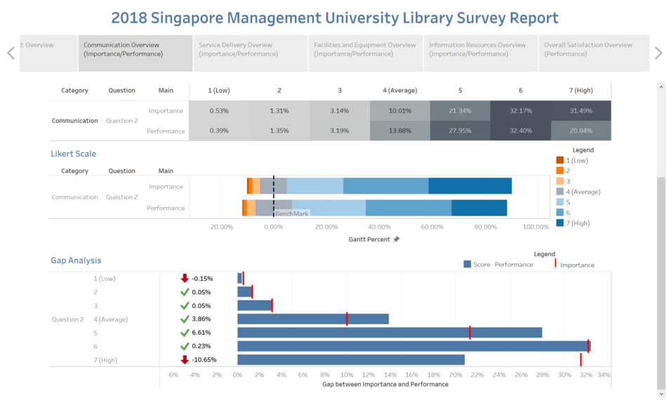
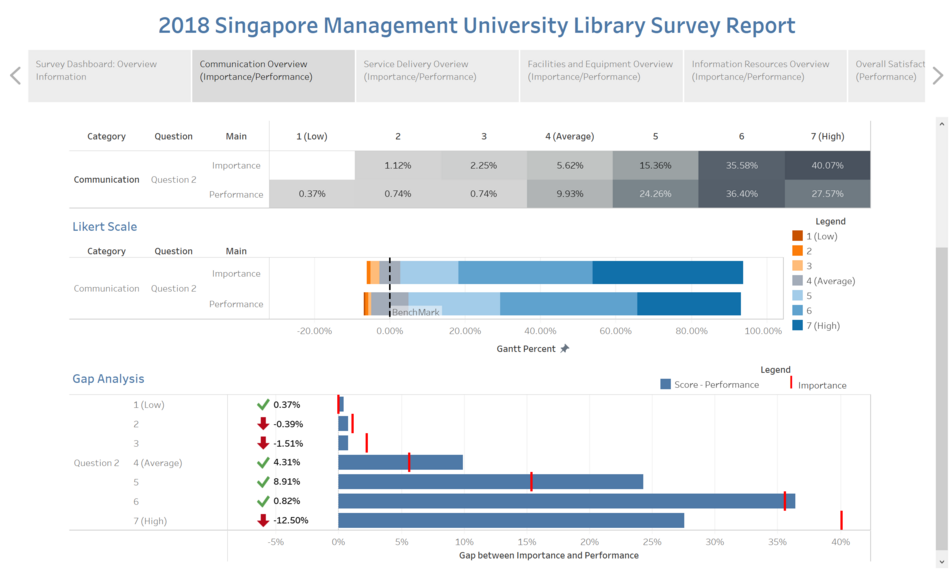
  • Under this category, question 2 has been identified to have the biggest gap identified.
  • For ranking 7 the importance is held at 31.49% while performance is only up to 20.84%, which shows a gap of -10.65%. This gap is significantly larger than the other 2 questions in the same category.
  • Since the question is asking about if the library website provides useful information and base on the answers answered by undergraduates, we can clearly infer that library does not provide enough information. In order to improve this segment, the library should look into the information provided on the library website and adjust according to suit student needs.
2 Category: Service Delivery
Screenshot (8).png
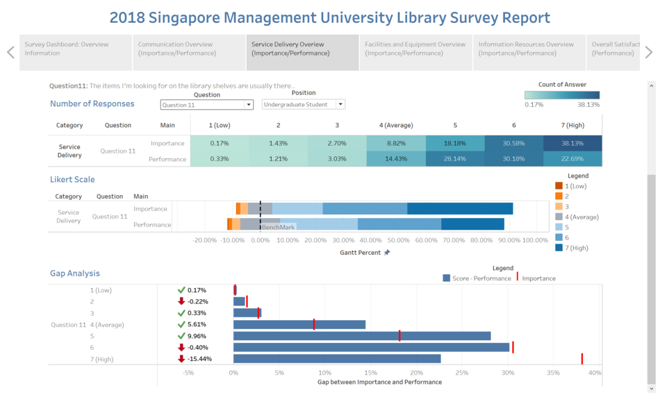
  • For Question 11, through the gap analysis, we can see that the library is underperforming in 3 rankings, where performance did not hit the importance level.
  • Out of the 3 rankings that are underperforming, the library ranked especially low under the category 7.
  • Importance for this question is rated quite high up the scale, at close to 40% and yet the library is only performing up to less than 23%. Since the question is asking if the items I'm looking for on the library shelves are usually there and based on the answers we can understand that the library does not provide enough books for students. Or misplacing of the items may lead to current issue too.
3 Facilities and Equipment
Screenshot (10).png
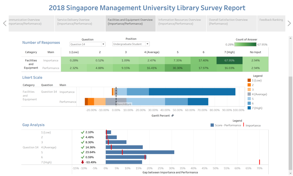
  • Question 14, through the gap analysis where performance is below importance by 53.49%.
  • This shows that the library is not providing sufficient studying areas for undergraduates to study in since the performance for it is rated way below the importance level.
4 Information Resource
Screenshot (11).png
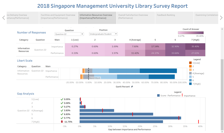
  • For question 22, we can see that 39.40% rated a high for importance and 27.65% rated a high for performance.
  • Through this gap analysis, we can see that the library is underperforming by -11.75% when comparing it against the importance ranking.
  • The question is asking if the course-specific resources meet my learning needs since it shows a negative gap which means the library unable to provide enough course resources for the undergraduate which may affect the learning experience for undergraduate. Therefore, it definitely is one of the key important areas that the library should look into.

Examining Correlation

Capturew.jpg
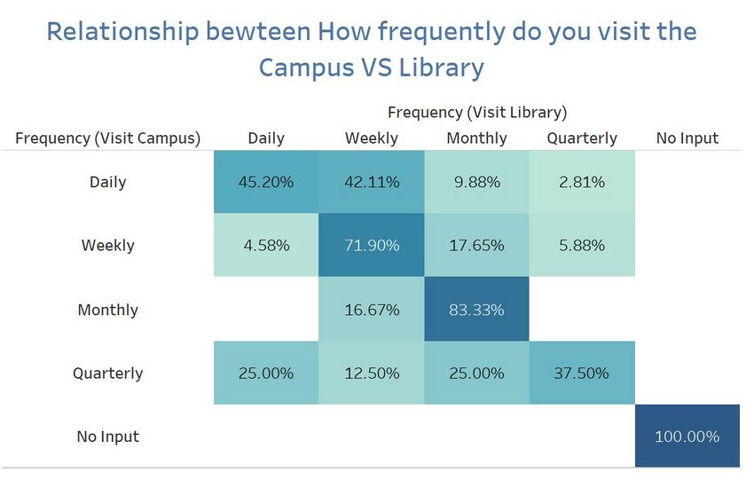
  • Using a highlight table to examine the correlation between library visits and campus visits, we can see the percentage breakdown of the student’s frequency.
  • The table shows that although 25% indicated that they visit the school campus quarterly while also visiting the library daily.
  • From the data shown, we can reach to a conclusion that it is likely impossible for a student to be visiting the campus quarterly and yet at the same time visiting the library daily. Hence, there might be a problem in the choices given to the students which led to this data given.
  • So overall, this data is not accurate due to misinterpretation of the questions hence, this data cannot be used completely and the mistake only surfaced when the data is visualized.

Library Frequency Visits

Screenshot (24).png
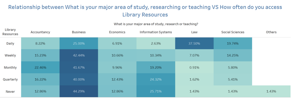
  • It can be seen from the breakdown of the library visits by undergraduates would be that majority of Business students patronize the library more than other schools. And the highest visits would be the weekly visits of business students across all schools at 42.44%.

Trend of Missing Data

Screenshot (27).png
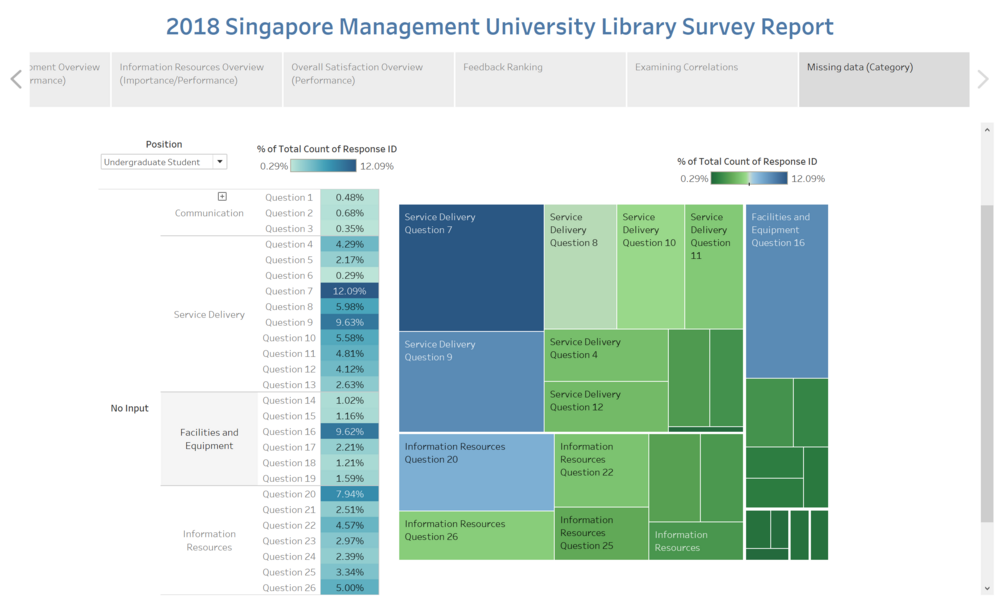
  • It is evident that under “Service Delivery”, the majority of Undergraduate students did not answer some of the questions in that section as compared to the rest. This is especially so for question 7 and question 9 where 12.09% and 9.63% did not answer the question.
  • The questions that are generally left unanswered can be seen as irrelevant to the students as they probably never used that “service” or they do not require the library to provide them with such services.

Postgraduate Student

Gap Analysis

Picture Number Description & Analysis
1 Category: Communication
Screenshot (12).png
  • For question 2 based on the Likert scale, it is shown that 40% rated high in terms of importance and only 27% were satisfied with the services provided by the library.
  • Hence, the library is underperforming where they did not provide much useful insights for the Postgraduates in the library website.
  • Again, the library could look into conducting an external survey to further dive into the specific needs required for the Postgraduates.
2 Category: Service Delivery
Screenshot (13).png
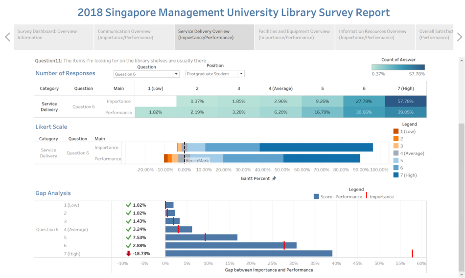
  • For question 6, it can be seen that the majority chose this service to be of the highest importance holding a percentage at 57.78% whereas performance held a weightage of 39.05%.
  • Using the gap analysis, it has shown that there is a stark difference of -18.73%, the biggest percentage difference out of all the questions in that category. Hence, in terms of the service delivery category, the library should look into it.
3 Facilities and Equipment
Screenshot (14).png
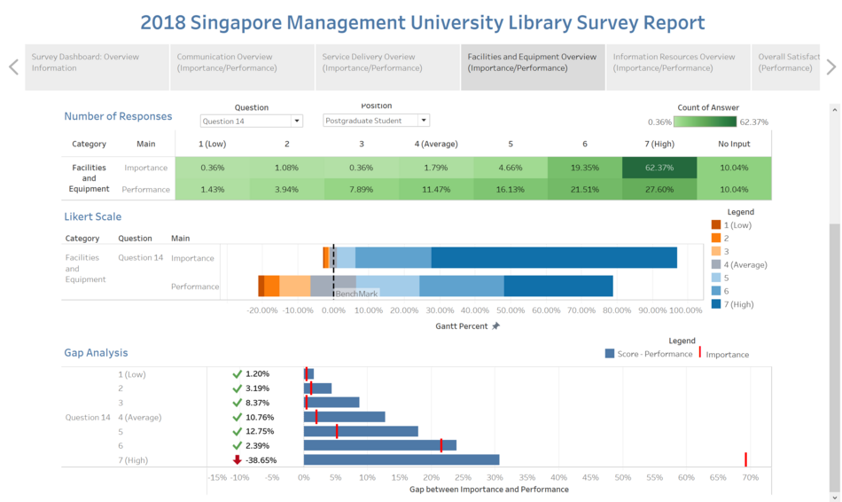
  • For question 14 based on the Likert scale, we can see that majority of the Postgraduates labelled this of high importance at (7) but yet it is tremendously underperformed.
  • The most alarming gap value at 29.34% out of all the questions in this section.
  • In addition, for undergraduate also rank question 14 tremendously underperformed. Since both undergraduate and postgraduate are having the same expectation on this question. Hence, in this section, the library should look into improving this first before moving on to solving other problems under this section.
4 Information Resource
Screenshot (15).png
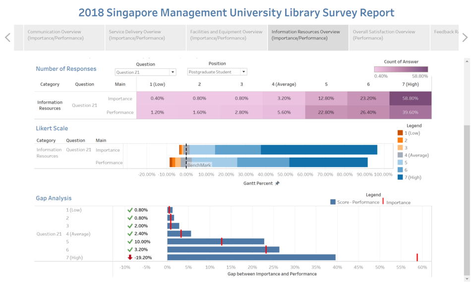
  • In terms of Information resources, it seems that the majority of the needs for rank 7 are not met under this category. This is from the gap analysis identified where those that were ranked as the most importance, appeared to have faced a huge gap when it came to the library performance of that particular service.
  • The largest gap coming from question 21 at -19.20% where it means online resources are not useful for postgraduate studies.
  • The library should come out with an additional survey for these Postgraduates to feel the ground for the needs of these Postgraduates.

Library Frequency Visits

Screenshot (25).png
  • It can be seen that Postgraduates students that visit the library largely constitutes of business students. And the frequency of their visits is usually quarterly, at its highest of 64.71%.
  • Whereas the percentage of visits, as well as the frequency of visits, is significantly lower for the other schools.
  • The number of business students patronizing the library is almost double to triple the amount compared to other schools.

Trend of Missing Data

Screenshot (28).png
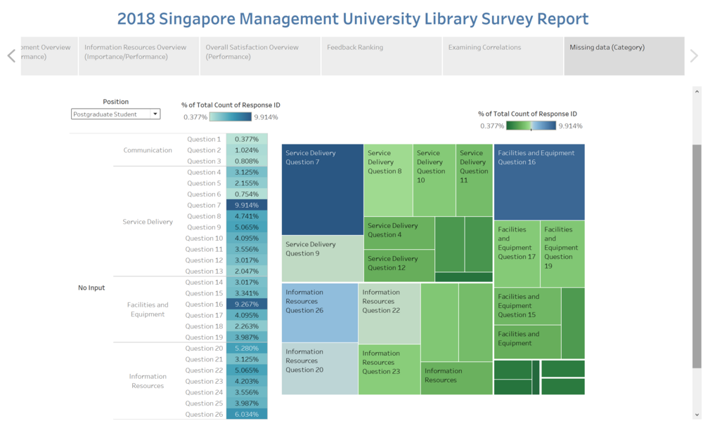
  • Question 7 and Question 16 are seen to have the highest percentage of seeing no answers provided and again, this can be due to the nature of services or facilities which satisfies the needs of the target group.
  • In the case of Postgraduates, it is evident that certain questions do not apply to them.
  • For example, Question 16 is about “a computer is available when I need one”. This usually does not apply to Postgraduates as the majority would have had their own.

Faculty

Gap Analysis

Picture Number Description & Analysis
1 Category: Communication
Screenshot (16).png
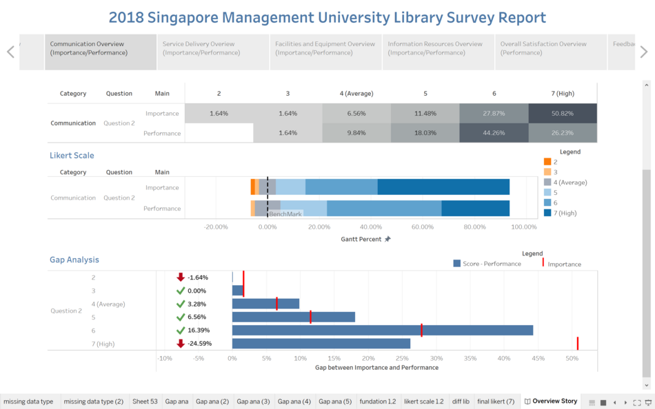
  • The gap analysis shows an alarming figure of -24.59% where Faculty members wishes to find useful information from the library website but are unable to.
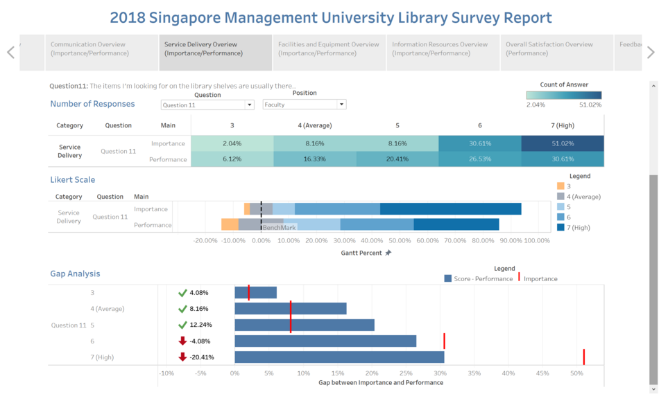
2 Category: Service Delivery
Screenshot (17).png
  • For question 11, it can be seen that there is a gap of -20.41% between performance and importance.
  • Largely due to the fact that the Faculty members are unable to find the suitable books on the library book shelves which led to a low rating in terms of library service.
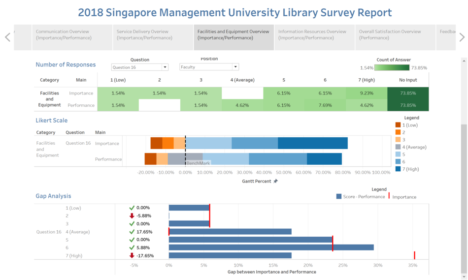
3 Facilities and Equipment
Screenshot (18).png
  • Out of all the questions, it is showed that question 16 has the biggest gap value of -17.65% where the question asked if “a computer is available when I need one”.
  • There can be 2 conclusions from this. First, would be that the number of computers loaned out per day has hit the maximum. Second, would be the Faculty professors are not aware of this service (loaning of computers), hence they indicated a low performance in this area.
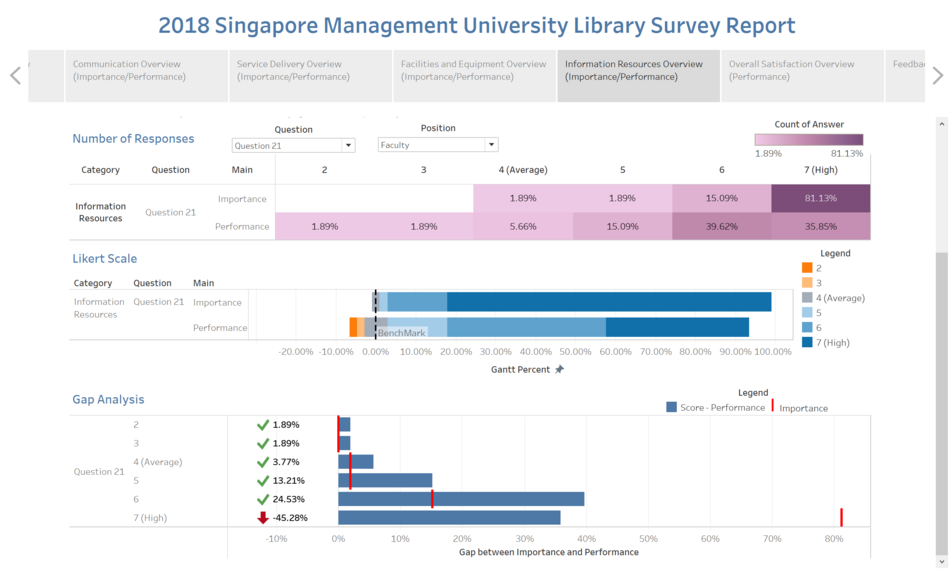
4 Information Resource
Screenshot (19).png
  • Question 21 is the one with the largest gap, with a difference of -45.28%.
  • Faculty professors would require a larger base of a database in order to facilitate their research for class materials or external research.
  • However, it is stated in the survey that the library is not performing up to par where there might be insufficient resources provided or lesser variety for them.

Library Frequency Visits

Screenshot (26).png
  • From the data shown, we can see that the number of visits is evenly spread between 3 schools, namely; Accounting, Business and Economics.
  • However, it can be seen that it is a consistent value of between 26%-29%.
  • Law and Social Sciences do not even have the data for monthly, quarterly visits to the library, with the majority being daily and weekly.

Trend of Missing Data

Screenshot (29).png
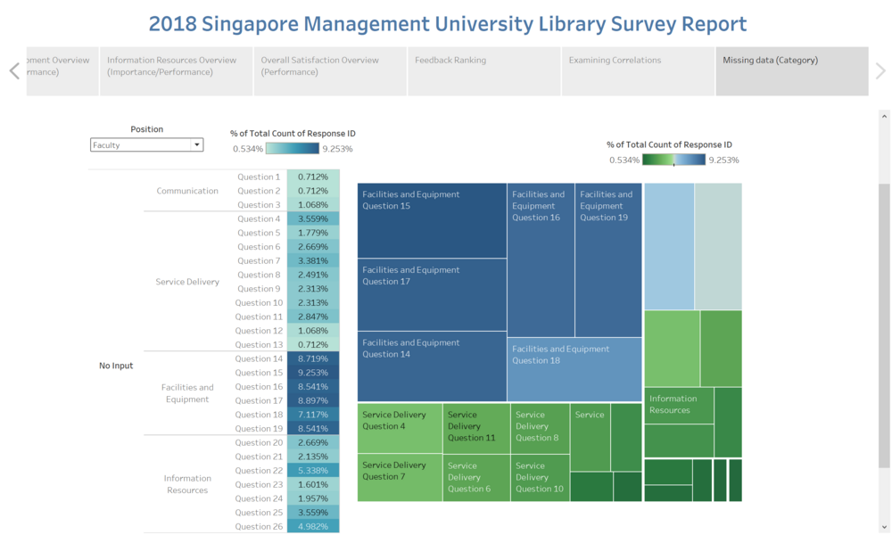
  • The high number of “no answers” is evidently flagged out under the “Facilities and Equipment ranging from 7-9%.
  • With the second-highest coming from the category “Information Resources”, the highest at 5.34%.
  • This shows that there is a large number of people under the Faculty category that did not answer these questions.
  • As we can see those questions fall under “Facilities and Equipment” are generally asking about printing, photocopying facilities or can you find a quiet place for group project or study. As we know all the faculty member are able to get printing or photocopy facilities either from their own office or send for mass printing, which means that in most of the time they do not require such services. Not only that, but all the faculty members do also own an individual office to do their research or preparing for teaching material. Therefore, they do not require a place in the library.

Staff

Gap Analysis

Picture Number Description & Analysis
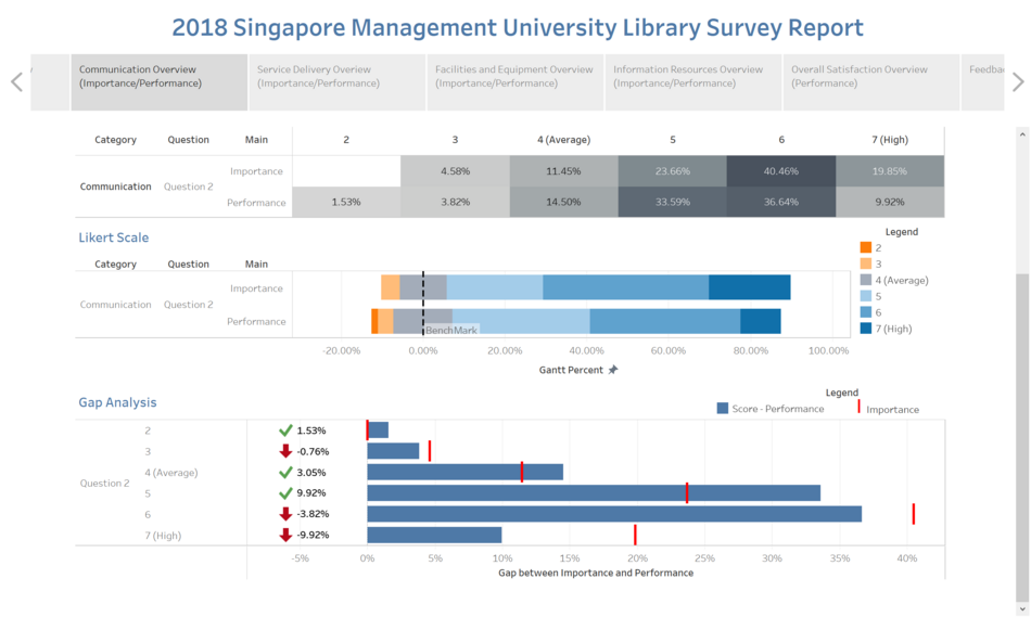
1 Category: Communication
Screenshot (20).png
  • The gap analysis has shown that there is a -9.92% difference for Question 2.
  • Staff has indicated that the SMU library website does not provide useful information to their benefit.
  • Again, it is up to the library to decide if this is an area they should focus on because the large population that uses the library the most is the undergraduate students. Hence it would be wiser to be focusing on the needs of undergraduates than the staff.
2 Category: Service Delivery
Screenshot (21).png
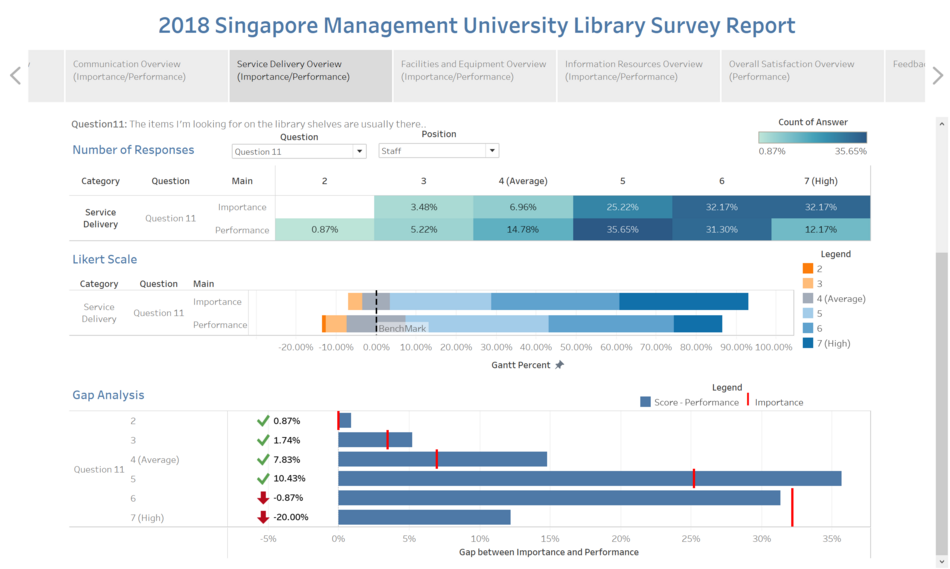
  • There is a -20% gap identified for Question 11 where the questions ask if “the items I am looking for on the library shelves are usually there”.
  • This problem is similar to the problem identified under Faculty where the same issue arises and it was also one the highest gap difference identified.
  • Hence, the library can look into grouping these two positions together and come up with a survey question that would cater more to their needs rather than a generic question for the entire SMU population.
3 Facilities and Equipment
Screenshot (22).png
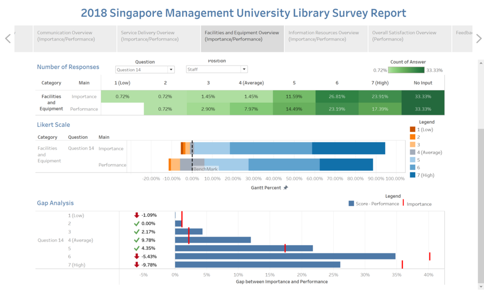
  • The highest weightage in terms of the gap between performance and importance would be Question 14 of -9.78% where the question states that “I can find a quiet place in the library to study when I need to”.
  • It is likely that the staffs are unable to find a place to do their work because most of the spaces are taken up by the undergraduates. Hence, the library should look into this where there is an equal chance for staffs to utilize the facilities provided by the libraries apart from just the undergraduates.
4 Information Resource
Screenshot (23).png
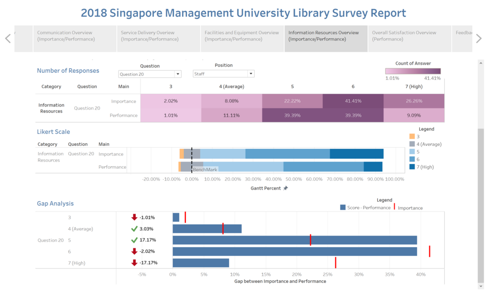
  • Out of all the questions, Question 20 had the highest weightage in terms of gap difference between performance and importance of -17.17%.
  • Importance is at 26% while performance is at 9%. There is almost triple the number in underperforming when we are comparing the numbers.
  • This is critical and it is something that the library should look into where information resources located in the library did not meet the needs of the staff.

Data Reference