Group02 proposal v2
|
|
Contents
PROBLEM & MOTIVATION
Problem
The weather reporting of Singapore has always been primitive and does not provide in-depth insights to the viewer. Although the weather in Singapore does not seem to be an essential part of everyone's lifestyle, the weather can play an important role in affecting one's health. Dr. Muhammad Eeqmal Hassim, a senior research scientist with the MSS Centre for Climate Research Singapore mentioned that “When temperature and humidity get high enough, our bodies struggle to cope. We get higher heat stress levels and it can be quite lethal for us.”
In 2019, multiple media companies reported that Singapore is heating up twice as fast as the rest of the world. When combined with the island’s constant high humidity, it could be life-threatening. Professor Matthias Roth of the department of geography at the National University of Singapore (NUS) attributed the rising temperatures to global warming and the Urban Heat Island (UHI) effect. However, there was no data given to back up their claims on the changes in Singapore's weather.
Motivation
Our team aims to present Singapore's weather data in more user-friendly and meaningful interpretation ways. Through our user-friendly dashboards visualization, we hope to provide users in-depth insights, to identify the trends and patterns inherent within the weather data available, and answer questions regarding the changes in Singapore's weather from available historical data.
OBJECTIVES
Provide meaningful graphs for viewers to identify weather patterns in Singapore.
- Changes in Singapore’s climate patterns over the past few years
- Rain
- Temperature
- Rainfall distribution across Singapore
DATASET
The Data Sets we will be using for our analysis and for our application is listed below:
| Data/Source | Variables/Description | Rationale Of Usage |
|---|---|---|
|
Temperature and Rainfall Data |
|
This dataset covers a good time series of Singapore's weather from 2012 to 2019 across different weather categories. Our team wish to spot the trend or pattern of Singapore's climate in every town if possible. |
|
Amenities Location Data |
|
The data set will be used to anchor the amenities available for the selected property in a specified range. Note: We will be looking into the API and use the JSON format to extract the geocoordinate for our amenities. Use both links to ensure we do not miss out any possible location. |
BACKGROUND SURVEY OF RELATED WORK
Below are a few visualizations and charts we considered making for our projects.
| Visual Considerations | Insights / Comments |
|---|---|
Title: Monthly mean temperature compared to long term average Source: http://www.weather.gov.sg/wp-content/uploads/2019/03/Annual-Climate-Assessment-Report-2018.pdf |
This is a graph taken from the report by NEA. From this graph, we are able to see that the temperature in 2018 has exceeded the mean of temperatures of the past 30 years. However the limitation in this graph is that although we can see that the temperatures has increased, we are unable to see if this is a systemic increase, or whether it is an anomalous year for temperature. |
Title: Isopleth map Source: http://www.weather.gov.sg/wp-content/uploads/2019/03/Annual-Climate-Assessment-Report-2018.pdf |
This is the isopleth map taken from the report by NEA. From the graph, we are able to see that January, June, October, and November are the months where there is more rainfall. Our group can implement such a design to let users get a feel for how the rainfall distribution across Singapore for a specific month will look like. |
Title: Whisker plot of temperature Source: https://www.ck12.org/statistics/box-and-whisker-plots/rwa/The-Ways-of-Weather/ |
We are able to see the temperature for the selected area over the course of a year. The whisker plots are able to show the upper and lower boundaries of temperature, and we can observe that the temperature gradually rises to a peak from Jan to Aug, before decreasing until December. We hope to apply this chart to display the rainfall for a selected area over the course of a year. This allows viewers to be able to better understand the rainfall pattern. This can also be applied to temperature to get a better understanding of temperature patterns in the year.
|
Title: Heatmap of rainfall Source: https://www.shanelynn.ie/analysis-of-weather-data-using-pandas-python-and-seaborn/ |
This is a heatmap of daily rainfall. Darker colours of red represent heavier rainfall. This is another way to have a visualization to understand the patterns of rainfall. Through this, we are able to quickly see how many days in a year where there is rain for a selected area. This can also be applied to temperature to get a quick visualization on how hot singapore has been across the year. |
Title: Violin plot of temperature with rainfall overlaid Source: https://www.r-bloggers.com/part-3a-plotting-with-ggplot2/ |
One of the plots that we chanced upon was a violin plot that overlaid the rainfall points on top. So for May, we are able to see the distribution of average temperature in that month along with how there are few days where there is 20mm of rainfall, and many days where there is no rainfall. One reason why we can consider using this plot for our visualization is that it will allow us to merge the temperature and rainfall data together into one visualization. |
Title: Ridgeline plot of temperature Source: https://cran.r-project.org/web/packages/ggridges/vignettes/gallery.html/ |
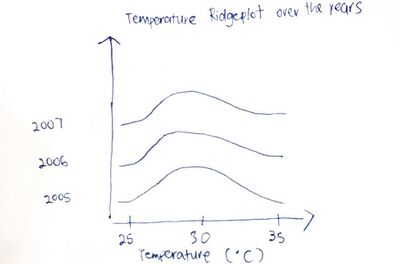
This graph is a ridgeline plot about temperature over the course of a year. From this graph, we can see that the days in May - July are hotter than the days in Jan - Dec. Our group hopes to apply this to our temperature and rainfall so that we can see if there is any change to the distribution over the course of the years that we have collected the data for. |
KEY TECHNICAL CHALLENGES & MITIGATION
| No. | Challenge | Description | Mitigation Plan |
|---|---|---|---|
| Software Challenge | Unfamiliarity of visualisation tools such as R, R Shiny, Tableau. |
| |
| Programming Challenge | Inexperince with data cleaning and transformation using R |
| |
| Workload Constraint | Time and Workload Constrains |
| |
| Dataset Complexity |
Our have different data from multiple sources in multiple different formats, hence we foresee a huge challenge in standardizing the data
|
|
STORYBOARD
| Dashboards | Description |
|---|---|
Dashboard 1: Isopleth Map for Weather |
Our group plans to do an Isopleth Map which reflects the weather distribution based on the year, month and locations. This chart will show the data at a high level for users to identify which area has higher rainfall than average and which has lesser rainfall throughout the filtered Month/Year Period. Similarly, our team plans to do another Isopleth Map to show the distribution of the temperature throughout the whole of Singapore. This chart will show the data at a high level for users to identify which area is hotter than average and which are colder throughout the filtered Month/Year Period. The purpose of this chart is to understand and identify the rain and temperature patterns of every area in Singapore throughout the past 20 years so as to find out if there is a climate change and if global warming is affecting the weather in Singapore. Filters used includes:
From this chart, users will be able to select the location of their interests to gather data from more specific charts. |
Dashboard 2: Weather Distribution with Violin Plot |
Our group aims to use Violin Plots to visualize the distribution and density of the historical weather data. The violin plot chart is a combination of a Box Plot and a Density Plot that is rotated and placed on each side, to show the distribution shape of the data. Our charts will show the distribution of the historical rainfall data for users to identify the distribution of the historical temperature data and visualize the difference of the temperate by month throughout each year. The violin plot will be mapped to the continuous variable to represent the amount of rain to visualize the relationship between the rain and temperature in each month. Additionally, we aim to discover any other existing trends and patterns from the weather data. Altogether, these charts will use Year and Area filters. The area filter can be selected from the chart in Dashboard 1 to carry out a further in-depth analysis from dashboard 1. The purpose of this chart is to understand and identify the rain and temperature distribution patterns of Singapore overall throughout the past 20 years so as to find out if there is a climate change and if global warming is affecting the weather in Singapore. Filters used includes:
|
Dashboard 3: Distribution of Rain Precipitation Amount/ Temperature/ Wind Speed in Postal Areas{Based on Users selected areas in Dashboard 1} |
Filters used includes:
|
Dashboard 4: Comparing Rainfall {selected weather} and the median pricing of All Properties{selected property type} |
The chart in this storyboard reflects a combination of two thematic maps, a bar chart map as well as a spatial interpolation map. Similar to the chart in Dashboard 1, this chart will show data at a high level for users to identify which area meets their needs in a glance. However, this chart is more-straightforward as the results shown in this chart is more clear cut and less informative.
|
Dashboard 3: Distribution of Rain Precipitation Amount/ Temperature/ Wind Speed in Postal Areas{Based on Users selected areas in Dashboard 1} |
The purpose of this chart is to show a detailed breakdown of the weather (which includes Rain Precipitation Amount/ Temperature/ Wind Speed) for User’s shortlisted area(s) from the chart in Dashboard 1.
|
MILESTONES
COMMENTS
| No. | Name | Date | Comments |
|---|---|---|---|
| 1. | (Name) | (Date) | (Comment) |
| 2. | (Name) | (Date) | (Comment) |
| 3. | (Name) | (Date) | (Comment) |


