IS428 AY2019-20T2 Assign LIM SI LING
Contents
Overview
Every two years, SMU Libraries conduct a comprehensive survey in which faculty, students and staff can rate various aspects of SMU library's services. The survey results are an important feedback for SMU libraries to understand the quality of their services and facilities and identify key areas that needs improvement to better meet the needs of their users.
Objectives
I am tasked by SMU libraries to use visual analytics approach to reveal the level of services provided by them as perceived by:
- the undergraduate students
- the postgraduate students
- the faculty
- the staff
There was previously a report (Library Survey Report) generated. However, it consists of many separated graphs and charts which is too disjointed to be read properly. Additionally, the report incorrectly uses Mean as a measure. The survey questions are graded based on a 7 point Likert scale. The mean in a Likert scale can't be found because it is not possible to find an average of “agree”, “disagree”, and “neutral. Therefore, the goal is to produce a visualisation of the survey results by reducing the number of charts and providing dashboards to highlight performance of SMU libraries in terms of overall satisfaction, facilities, resources and services provided.
Survey Data
Description of Data
The survey data provided is a single excel workbook containing two sheets:
| Sheetname | Description |
|---|---|
| SMU | The raw survey results containing survey respondents and each of their reply to the survey questions in the form of ratings.
The raw survey results have a total of 2639 rows or number of participants. There are a total of 89 column. However, there are missing data as well that needed to be removed. The attributes of the data can be divided into the following:
|
| Legend | The legend that contains the exact survey questions and the question code that they represent. |
Data Preparation
The data collected from the survey had many missing values apart from those who have picked N/A for the question. Therefore, data with key areas missing are to be excluded from the data visualisation since they were no longer useful in providing insights.
To remove missing data, codes were written in python to determine which rows to remove.
| Screenshot | Action taken and description |
|---|---|
| The excel workbook "Raw data 2018-03-07 SMU LCS data file - KLG.xlsx" is imported into jupyter notebook. | |
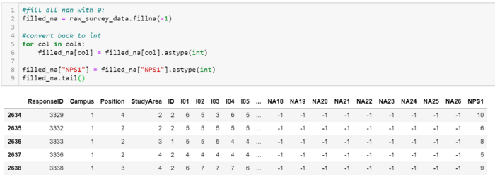
| To make it easier to deal with the data, cells that are empty are filled with -1 as their values | |
| |
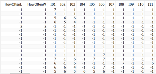
Next, the criteria for which data to be removed is determined as follows:
|
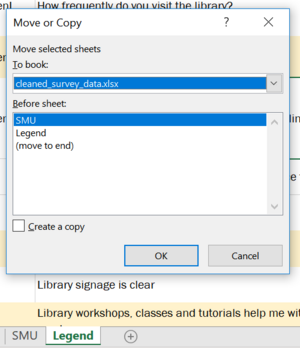
| Legend is copied over to the newly exported dataset. | |
| The new excel workbook is then imported into Tableau. | |
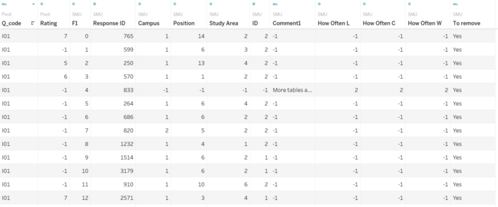
| However, the dataset cannot be used directly, as the question codes are not linked to the actual question itself. Pivoting of the data set is required.
| |
| Lastly, the survey questions have to be mapped to the question code.
|
On top of the data preparation above, the survey questions can be split into the following categories to better identify the areas of improvement for SMU Libraries:
| Category | Survey Questions |
|---|---|
| Overall Satisfaction | 27: Overall how satisfied are you with the Library? |
| Library Resources |
11: The items I'm looking for on the library shelves are usually there
|
| Facilities |
14: I can find a quiet place in the Library to study when I need to
|
| Services Provided |
01: I am informed about the Library services
|
Interactive Visualization
Link to Story on Tableau Public
| Dashboard | Screenshot | Description |
|---|---|---|
| Survey Demographics | The demographic Dashboard is built to allow SMU Libraries to tell which group of users are made up the majority of participants (Undergraduates in this case) | |
| Library Usage | The Library Usage tells how often participants visited the library and used its resources.
Additionally, the Study Area vs Library Preference graph will provide insight on the which faculty preference of library. | |
| Facilities, Library Resources & Services Provided | There are 3 Dashboards showing the performance and importance rating given to SMU library facilities, resources and services provided respectively.
Each Dashboard allows users to filter and select the Position (role) of survey participants to filter results and compare differences between the groups. The Importance and Performance graphs are put side by side highlight whether SMU libraries’ performance has met the expectation of its users (represented by importance rating) | |
| Overall Satisfaction | The overall satisfaction will represent the overall rating given by survey participants.
The graphs are split by Study Areas and Position respectively to compare the different demographics rating. | |
| Net Promoter Score | The net promoter score will provide the library insights of which group of people they should focus their marketing strategy towards as they are the ones that will promote their services to others. |
Analysis and Insights
The importance represents user’s expectation of a libraries service. The higher the importance rating, the higher a user’s expectation for quality of that service. I have split the survey questions into the following categories to better compare the performance across different kinds of services provided by the library.
Demographics
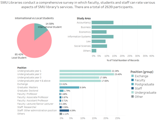
The primary audience of the survey is undergraduate students, taking up 80.62% of the survey's respondents. Postgraduate students came in next at 9.04%. In proportion to the overall demographics of SMU, Business students take up 39.12% of the respondents, making up largest among the other schools. Information Systems comes in second, with about half of Business's students at 14.43% of the total students, with Accountancy Students coming in at a close third of 14.38%.
Library usage
Both the Library Visit and Resource Access Frequency have roughly the same distribution with minor differences.
The libraries campus has seen more proportion daily frequents than their online resources. Majority of the users have frequented the library campus or access library resources on a weekly basis. What was unexpected was that there was a significantly larger proportion of people that has never access the library’s resources despite having a more convenient online platform of databases to access. On the contrary, there is almost no one (0.44%) that has never been to the Library.
This maybe due to the fact that there are many more users who frequented the libraries for its facilities such as having a quiet studying area and project rooms with monitors for group discussions than to access its learning resources, whether online or physically visiting the library.
Facilities
From the overall data, it can be concluded that computer availability is the lowest rated attribute under facilities. Despite having the largest proportion of ratings that are less than 4 (19.6% for both performance and importance), there is no gap in the amongst any ratings from 1 to 7. Thus, while performance is low, expectation of having computer availability is also low. One underlying cause could be that most if not all students will have brought a laptop whenever they visit the school campus. Thus, there is little need for the library to provided computers.
Differences between importance and performance is small even among the different positions of people.
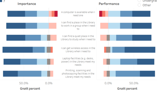
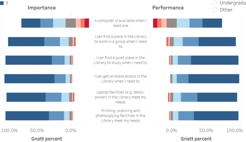
By varying the filters, it is evident that for faculty members (left chart) have a larger proportion of low ratings of importance and performance of library facilities than compared to all the students and staff (right chart). This may be due to lower needs of library’s facilities like computers, groups study rooms and printing needs. Faculty members often have offices to serve as their personal working spaces to meet students and other staff for work or projects.
Library Resources
From the overall data, it would seem that the physical copies of information resource available in the library is not fully meeting the needs of students. Performance rating has a larger proportion than importance rating. The difference is larger for students (postgraduate and undergraduate) than for staff and faculty.
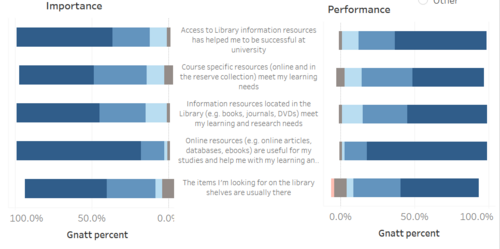
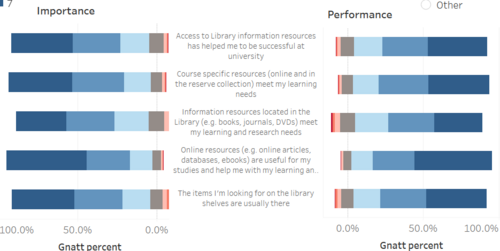
Compared to the ratings given in Facilities (left chart), this time, Faculty members gave the highest ratings instead compared to all members (right chart), giving almost no negative ratings. The results for Faculty members have no ratings less than 4 other than the attribute of availability of physical resources in the library, which have a small proportion of 2.1% for performance rating.
Services Provided
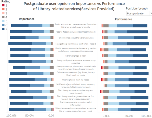
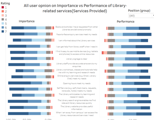
For service provided by the library, postgraduates have the largest difference in importance and performance ratings, showing that this group have the largest portion of needs not being met. This may because postgraduate have the largest needs of library services and the highest expectation of them because of the many research projects and papers as compared to undergraduate.
Additionally, similar to the previous ratings given to resources, faculty members gave the lowest proportion of negative ratings. This may be because of a lower need of services provided by the library such as workshops, information on library services, and opening hours.
Overall Satisfaction
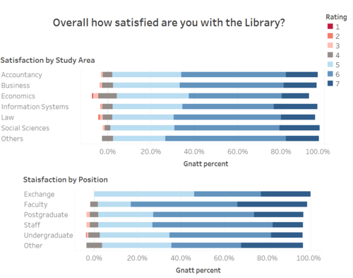
Comparing across the different positions, it seems that Exchange Students and Faculty were the most satisfied with library facilities and services. The higher ratings given by exchange students may be due to having lower expectations as exchange students are only studying in SMU for a few months.
Faculty members also have lesser needs in library facilities and services as compared to students as they have their own offices and less need to attend workshops offered or for information provided by the library.
On the other hand, we see a larger proportion low ratings given by students who access the library facilities more and have more need for the library’s resources.
Net Promoter Score (NPS)
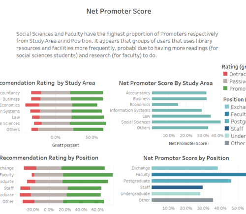
Comparing across the different faculties, School of Economics have the lowest net promoter score whereas School of Social Sciences have the Largest, with law coming in a close behind. As a humanities area of studies, the students require more readings and research resources from the library.
On the other hand, across the different positions, Undergraduates have the lowest proportion of Promoters and the lowest NPS. On the other hand, Faculty members have the highest NPS score.

