IS428 AY2019-20T2 Assign KHEMKA SHIVIKA
|
LIBRARY SURVEY 2018 |
Contents
PROBLEM & MOTIVATION
PROBLEM
The SMU Libraries are used for several purposes ranging from information access and a quiet place to study to computer and printing services. The library conducts a survey every two years to try and enhance their service quality. They ask some pertinent questions and collect useful data, but the reports generated are long and difficult to comprehend because of which the Libraries aren't able to make relevant improvements.
MOTIVATION
As an undergraduate student at SMU, the library is an essential part of my university experience and I would like to help the administration better understand the results of their survey. As a respondent myself, I have been given the rare opportunity to ensure that my feedback is well analysed and I would like to make the most of it.
DATA PREPARATION
MODIFICATIONS
| No. | Tool | Tasks and Modifications |
|---|---|---|
|
Microsoft Excel |
| |
|
Tableau Prep |
|
TABLEAU PREP FLOW
DATA TRANSFORMATION
| Original Data | Processed Data |
|---|---|
|
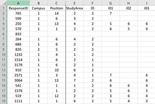
Size: 2639 rows and 90 columns |
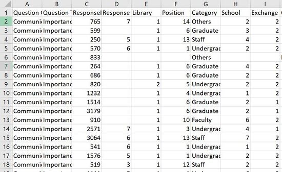
Size: 150423 rows and 12 columns |
STORYBOARD
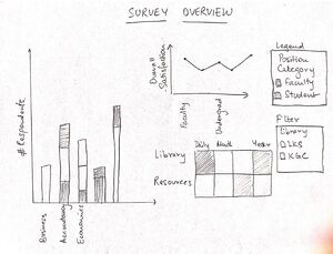
SKETCH 1: Survey Overview Dashboard
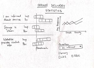
SKETCH 2: Survey Results Dashboard
VISUALIZATION
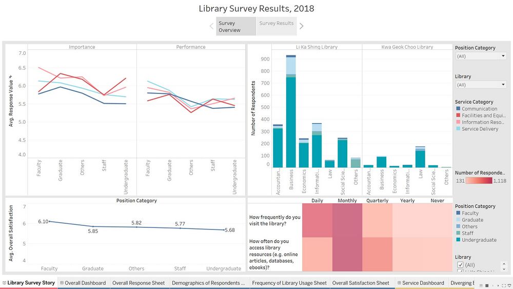
Dashboard: Survey Overview
| No. | Chart | Description |
|---|---|---|
| This chart shows the average response value for each of the different types of people who responded: Undergraduates, Faculty etc. It provides their views on the importance and performance of the libraries' services. The different color for each line is for the different categories of services provided by the library: Communication, Information Resources. | ||
| This chart shows the overall satisfaction of the different categories: Undergraduates, Faculty etc. with the libraries' services. It provides a high-level view of their satisfaction. | ||
| This chart shows the number of people who responded to the survey. It categorizes them by their preferred choice of library and by the ares of study they belong to: Accountancy, Information Systems. It gives the viewer an idea of the background of the people who have responded. | ||
| This chart shows frequency with which people use the library. The first row shows how often the respondent visits the library and the second one shows how often the respondent accesses library resources. This can provide insightful information to the viewer about why one visits the library: is it because they need a quiet space or because they need to borrow a book or both? |
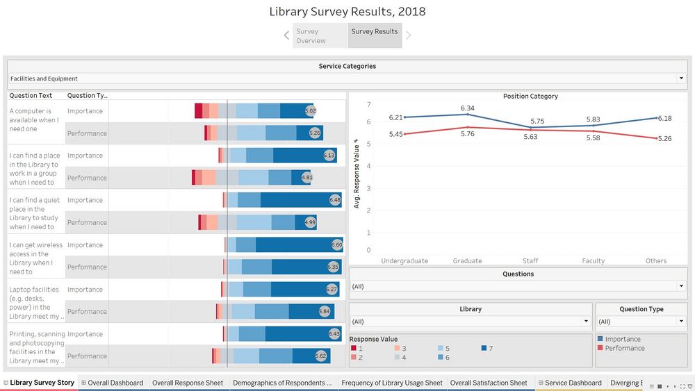
Dashboard: Survey Results
| No. | Chart | Description |
|---|---|---|
| This chart shows the response value for all the different questions asked in the survey. The questions can be viewed by the different service categories: Communication, Service Delivery etc. It makes it easy for the view to see what is most important for the library users and compare it with their current performance in those same areas. The bar shows the distribution of response values and the grey circle shows the overall average of response values. | ||
| This chart shows the average of response values by Category: Faculty, Undergraduate, which makes it easy for the viewer to compare the performance for each of these categories. It adds a layer of detail to Chart 1 and provides details at a deeper level. |
INTERACTIONS
| No. | Technique | Purpose |
|---|---|---|
| These have been used in several places so as to allow the user to specify their search to a particular category of people: Faculty, Graduates, a specific library: Li Ka Shing, Kwa Geok Choo etc. This can give them to opportunity to concentrate on a particular group of respondents. The dropdown for the library will allow for analysis to be done for each library separately and make improvements based on that. They can uniquely compare only the importance or only the performance of services as well. | ||
| These have been used for users to select specific questions or areas for which they want to compare performance or importance. For example if a user wants to compare the importance and performance of 2 specific questions from the Information Resources category, they will be able to make that selection and compare. | ||
| The dashboards have this button so as to make it easier for the user to reset all filters that may have been selected. Since there are multiple filters, the user will now be able to click just one button and reset them all instead of going to each of them and selecting the "All" option. | ||
| This option allows the user to specify his analysis category by choosing which type of data he wants shown on screen. For example, in the Survey Results Dashboard, if the user wants to see how different groups of people have responded to a particular question, they can easily select that question on the diverging bar chart and see the adjacent graph change simultaneously to show the average response value for that question only by the different categories of people: Graduates, Faculty etc. |
1. Single Value Dropdown
2. Multiple Value Dropdown
3. Reset Filters
4. Dashboard Actions
INSIGHTS
Observations and Recommendations
| No. | Observation | Recommendation |
|---|---|---|
| Focus on response values for Undergraduates only and see where the problem lies. The library can focus on those areas to improve services for the Undergraduates. | ||
| This highlights that Faculty uses the library more for its information whereas Undergraduates probably use is most for studying and printing services | ||
| Find pain points for the Staff at LKS. | ||
| Improve online information resources keeping Faculty in mind, whereas improve Facilities and Equipment with Undergraduates in mind. |
Key Areas of Improvement by Category
| Category | Areas with Highest Difference in Importance and Performance |
|---|---|
| |
| |
| |
|
KEY TECHNICAL CHALLENGES & MITIGATION
| No. | Challenge | Description | Mitigation |
|---|---|---|---|
| I was first using the data without any reshaping and modification. The original data is very difficult to use in Tableau because each of the questions was considered another dimension. | I watched a few videos published by Tableau where survey data was reshaped to get some direction. After using Tableau Prep to pivot and process the data, imagining the visualizations became much easier. | ||
| I was initially trying to put in everything there was in the dataset into the dashboards. I realized that the idea was not useful and could potentially confuse the viewer. For example, I was trying to add the individuals positions (Faculty-Professor, Faculty-Lecturer) when the question clearly stated that the analysis should be based on "Faculty" as a single category. | I drilled down on the task given in the assignment and tried to focus on the questions and responses rather than making my assignment complicated by adding unnecessary details. |
LINK TO VISUALIZATION
<link>
COMMENTS
Do leave a comment on how I can improve my visualizations so as to be able to provide more value to the SMU Library Administration or if you require any files for reference!
| No. | Name | Date | Comments |
|---|---|---|---|
| 1. | (Name) | (Date) | (Comment) |
| 2. | (Name) | (Date) | (Comment) |
| 3. | (Name) | (Date) | (Comment) |


