IS428 AY2019-20T2 Assign NICHOLAS TAN JUN HAO
Contents
Overview
Background
Every two years, SMU Libraries conduct a comprehensive survey in which faculty, students and staff have the opportunity to rate various aspects of SMU library's services. The survey provides SMU libraries with input to help enhance existing services and to anticipate emerging needs of SMU faculty, students and staff. The latest survey is currently on going and will be ended by 17th February 2020.
The 2018 Survey Results can be found here and the full report is available by following this link. The past reports are mainly made-up of pages of tables, which are very difficult to comprehend. In view of this, your task is to apply appropriate data visualisation to transform these tables into visual representation that allow SMU libraries to gain useful insights.
Task
In this assignment, you are required to use visual analytics approach to reveal the level of services provided by SMU libraries as perceived by:
- the undergraduate students,
- the postgraduate students,
- the faculty,
- the staff.
Limit your findings to not more than 10 images and 1000 words per group.
Dataset
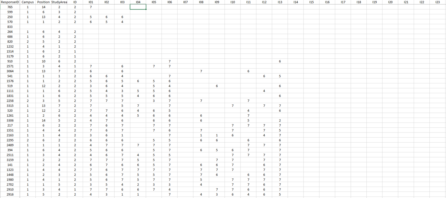
Dataset used: 2018 Library Survey Dataset
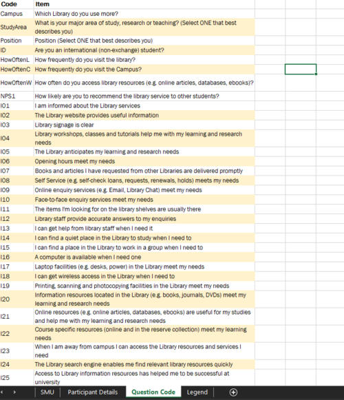
| Field | Description |
|---|---|
|
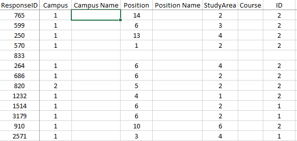
Campus |
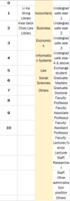
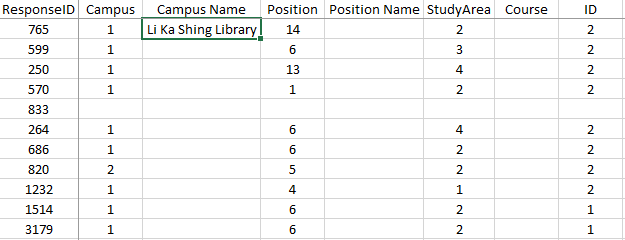
Which library do they frequent the most? (Li Ka Shing Library / Kwa Geok Choo Law Library) |
|
Position |
What is the participant type? (Undergraduate/Postgraduate/etc.) |
|
Study Area |
Which faculty do they belong to? (Business/Information Systems/etc.) |
|
ID |
Yes/No question as to whether the participant is an international(non-exchange) student |
|
Remaining of the dataset
|
Free-text answers / 1-7 scale / 1-5 scale |
Data Configuration
| Screenshots | Steps |
|---|---|
| |
| |
| |
|
Data Cleaning
Due to the nature of the project, we do not require the responses from exchange students. Therefore, we will be removing their entries from the dataset.
Assumptions
- Everyone read the questions properly and fill in the “Position” question correctly.
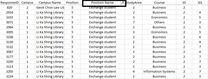
Considering that everyone filled in their positions correctly, I will then filter the column, “Position Name” to only display the survey participants with the value of “Exchange student”.
| |
|
Interactive Dashboard
| |
|
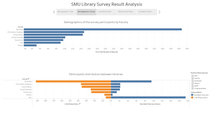
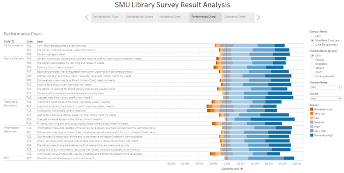
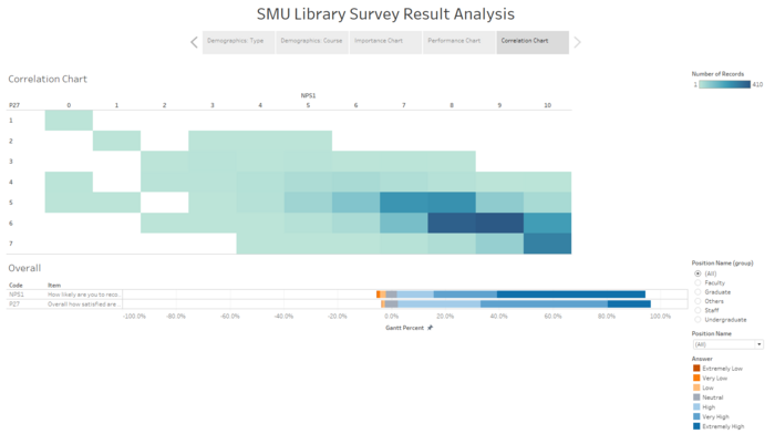
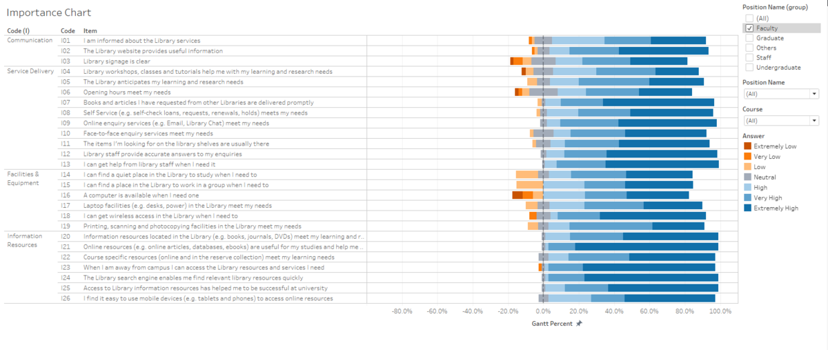
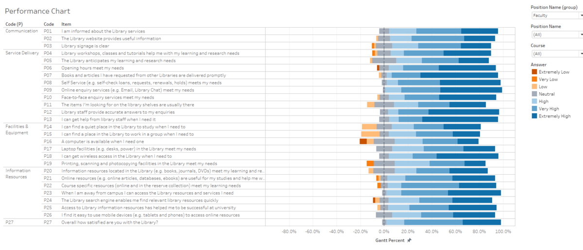
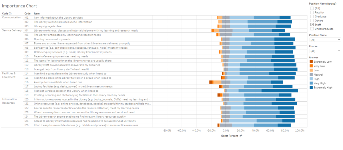
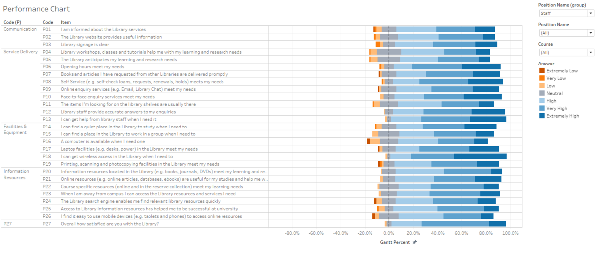
There are two graphs displayed in this dashboard, which consist of the following:
| |
| |
| |
|
Analysis/Insight
Undergraduate
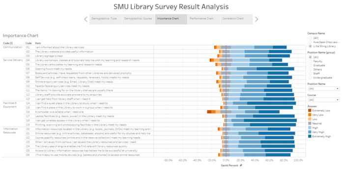
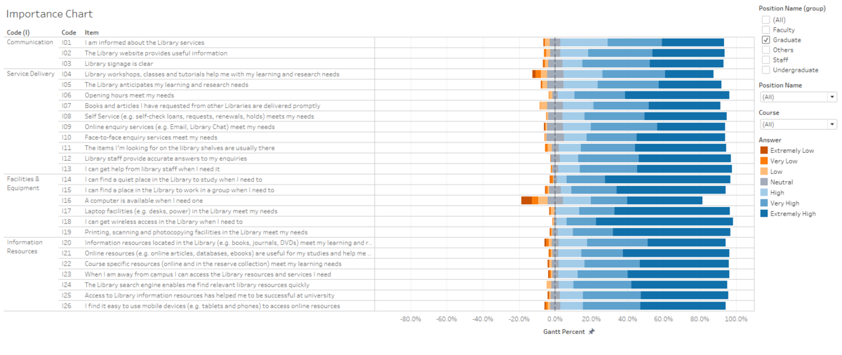
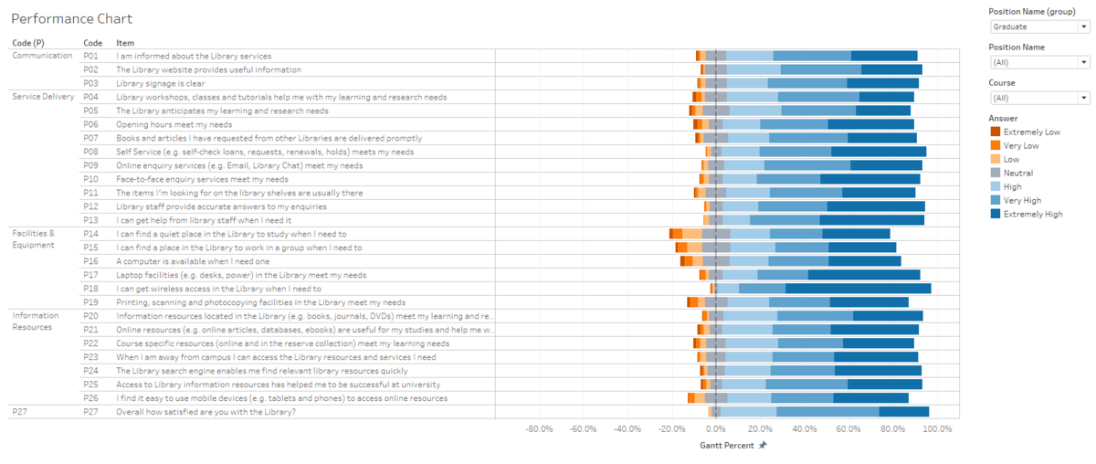
Likert Chart
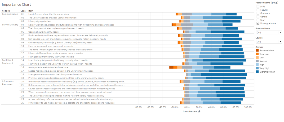 Top 3 best performing Important services are as follows:
- I can get wireless access in the Library when I need to
- I can find a quiet place in the Library to study when I need to
- Printing, scanning and photocopying facilities in the Library meet my needs
Justification
- The school wifi, SMU-WLAN, is accessible throughout the campus which makes sense for the students to naturally have the least complaints about the WIFI issue.
- The nature of the study environment in the library will definitely be quiet which thus explains why the participants will find a quiet place in the library.
- Printing, scanning and photocopying facilities are all available in the library at multiple levels.
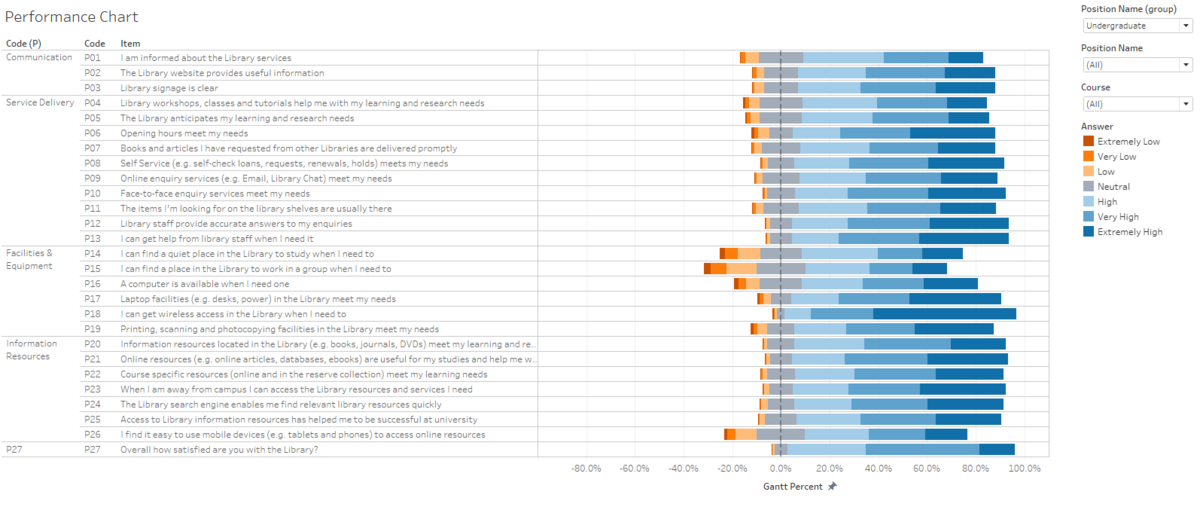 Top 3 Performance services are as follows:
- I can get wireless access in the Library when I need to
- I can get help from library staff when I need it
- Opening hours meet my needs
Justification
- The library is practically a 24/7 building with the library commons serving the 24/7 no closure issue.
