Overview
Background
Every two years, SMU Libraries conduct a comprehensive survey in which faculty, students and staff have the opportunity to rate various aspects of SMU library's services. The survey provides SMU libraries with input to help enhance existing services and to anticipate emerging needs of SMU faculty, students and staff. The latest survey is currently on going and will be ended by 17th February 2020.
The 2018 Survey Results can be found here and the full report is available by following this link. The past reports are mainly made-up of pages of tables, which are very difficult to comprehend. In view of this, your task is to apply appropriate data visualisation to transform these tables into visual representation that allow SMU libraries to gain useful insights.
Task
In this assignment, you are required to use visual analytics approach to reveal the level of services provided by SMU libraries as perceived by:
- the undergraduate students,
- the postgraduate students,
- the faculty,
- the staff.
Limit your findings to not more than 10 images and 1000 words per group.
Data
Data Configuration
| Screenshots
|
Steps
|
|
|
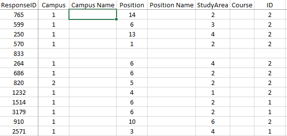
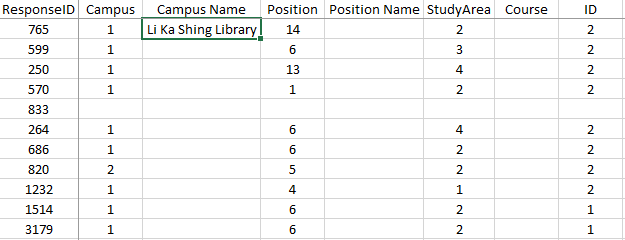
- Create 3 additional columns to replace the following columns (Campus, Position, StudyArea).
- Reason being that these numerical values are not useful for identification purpose when it comes to data visualisation in Tableau. They are categorical values which can be easily classified with the Legend Sheet.
|
|
|
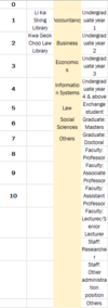
- Create a new sheet under the excel file called “Participant Details” for easier reference when we do VLOOKUP to search for the information.
- Copy values from “Legend” Sheet from D1:R3 as these are the important identifiers for the type of participant for each response. Paste the copied values in the new sheet “Participant Details” using the special paste method, “Transpose” for the rows and columns to swap places.
|
|
|
- Under column, “Campus Name”, input the following method (=VLOOKUP(B2,'Participant Details'!$A$1:$D$15,2)) for the cell value to refer to “Participant Details” Sheet.
- Under column, “Position Name”, input the following method (=VLOOKUP(D2,'Participant Details'!$A$1:$D$15,4)) for the cell value to refer to “Participant Details” Sheet.
- Under column, “Course”, input the following method (=VLOOKUP(F2,'Participant Details'!$A$1:$D$15,3)) for the cell value to refer to “Participant Details” Sheet.
|
|
|
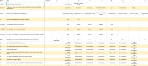
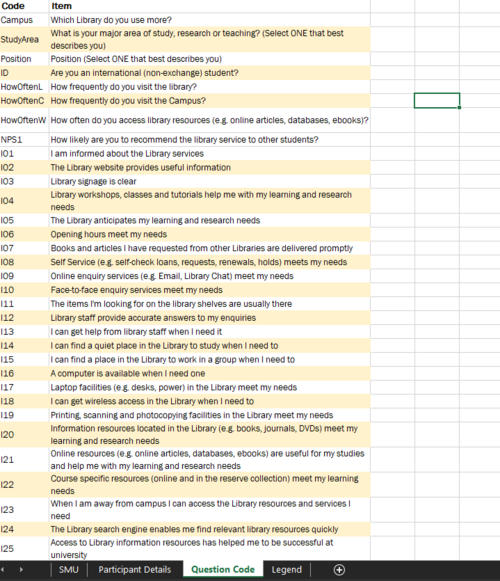
- Create a new sheet under the excel file called “Question Code” in order to tag the Question Code to the Question itself when we pivot the columns in Tableau.
|
Data Cleaning
Due to the nature of the project, we do not require the responses from exchange students. Therefore, we will be removing their entries from the dataset.
Assumptions
- Everyone read the questions properly and fill in the “Position” question correctly.
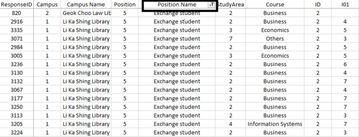
Considering that everyone filled in their positions correctly, I will then filter the column, “Position Name” to only display the survey participants with the value of “Exchange student”.
|
|
- Press Ctrl+Shift+L on column E to apply the filter.
- Select only the option “Exchange student” to filter the participants.
- Delete the respective rows.
|
|
|
- In the process of data cleaning, I found that there is a participant, ResponseID 833 which does not belong to any school/faculty and did not indicate a position name nor course.
- I have decided to take out “ResponseID” 833 because, without proper identification, the survey results would be considered unreliable.
|
Dashboard
|
|
- Bar graph to understand and breakdown the demographics (Type of participant) among the survey population.
- When hovered over, you will see the respective percentage of the type of participant (Undergraduates, Staff, etc.)
|
|
|
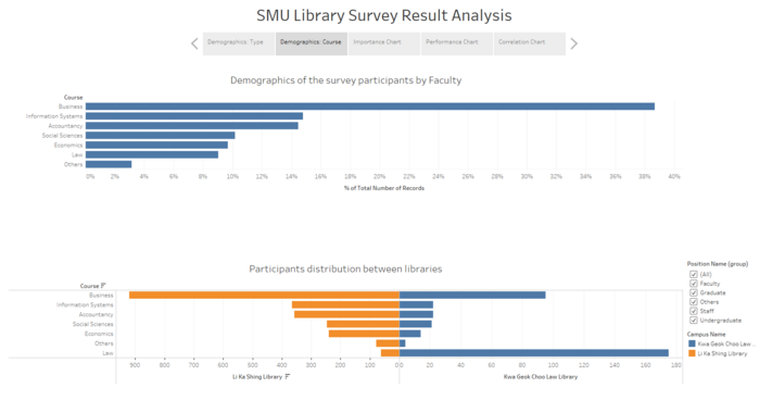
There are two graphs displayed in this dashboard, which consist of the following:
- Bar graph
- To understand and breakdown the demographics (Faculty) among the survey population.
- Butterfly Chart
- To separate the participants by their more preferred library.
|
|
|
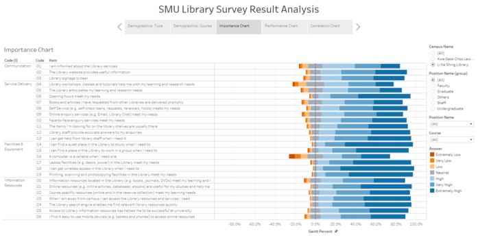
- The likert scale chart shows us the Importance Ranking of the assessment items.
|
|
|
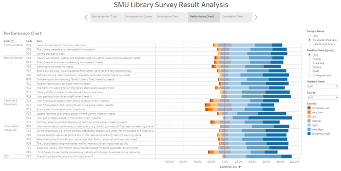
- The likert scale chart shows us the Performance Ranking of the assessment items
|
|
|
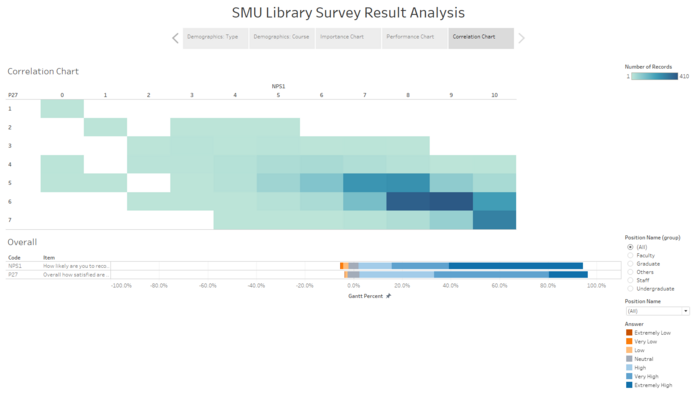
- Co-occurrence Matrix to compare two different scores which are NPS1(How likely are you to recommend the library service to other students?) and P27(How satisfied are they with the library?) to see if there is a correlation between both questions.
|
Analysis/Insight
Conclusion
