IS428 AY2019-20T2 Assign ANG WEI XUAN DION
Contents
Overview
Every two years, SMU libaries conduct a comprehensive survey in which faculty, students and staff have the opportunity to rate various aspects of SMU library's services. The survey provides SMU libraries with input to help enhance existing services and to anticipate emerging needs of SMU faculty, students and staff.
The 2018 Survey Results can be found here and the full report is available by following this link. However, the past reports are mainly made-up of pages of tables, which are very difficult to comprehend. Therefore, the objective of this project is to create an interactive dashboard that allows SMU Libraries to easily view the results of the survey and gain useful insights, and reveal the level of services provided by SMU libraries as perceived by the following stakeholders:
- Faculty
- Undergraduate students
- Postgraduate students
- Staff
Objectives
The interactive dashboard aims to achieve the following:
- Allow users to get a quick overview about the survey results (who were the people taking the survey, what was the overall satisfaction, and how likely they will recommend the Library to others
- Allow users to see the distribution of scores for each survey question, and allow for gap analysis by comparing performance and importance
- Allow users to see what are some comments made by visitors from each of the different groups (undergraduates, postgraduates, faculty, and staff), and by the Net Promoter Score groups (detractors, neutrals, promoters)
With this dashboard, SMU library will be able to gain a better understanding of their visitors and find out which are the areas where they need to improve on.
Data Preparation
The survey results were stored in a excel sheet in transactional form, where each row represented one respondent in the survey. For each respondent, the following information was captured
- Which library they used more (Li Ka Shing or Kwa Geok Choo Law Library)
- Whether they were undergraduate, postgraduate, faculty or staff
- Their area of study (business, economics, etc.)
- How often they came to campus, used the library, and accessed library resources
- Their responses for each of the survey questions, represented by one column each in the dataset
- Comments about the library
The format of the data makes it difficult for analysis, such as comparing scores between survey questions, or to perform gap analysis between importance and performance. In addition, many of the categorical variables were number coded into a legend, so they have to be translated.
Pivoting the Data
Pivoting the data transforms the data by placing questions under a single column, so we can compare between different questions or filter them out by question categories. However, we also want to allow for comparison between the importance and performance of a particular question, instead of treating them as different questions. Therefore, Tableau Prep was used to achieve this.
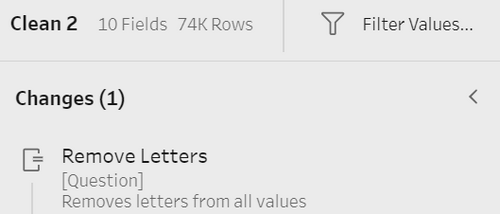
The relevant survey questions for Importance and Performance were pivoted separately. Afterwards, the letters from the question codes were stripped so that I01 (importance score for question 1), and P01 (performance) was treated as the same question. Afterwards, joins were used to combine the different tables so that each question has an importance and performance score associated with it.
Lastly, before loading the data into Tableau, Excel lookup functions were used to replace the number coded values in the data to their actual values. This reduces the amount of renaming work that needs to be done in Tableau. After that step, the final form of the data looks like this:
Interactive visualization
The interactive visualization can be accessed here: https://public.tableau.com/profile/dion.ang#!/vizhome/Assignment1_15840879937550/Home
Overview Page
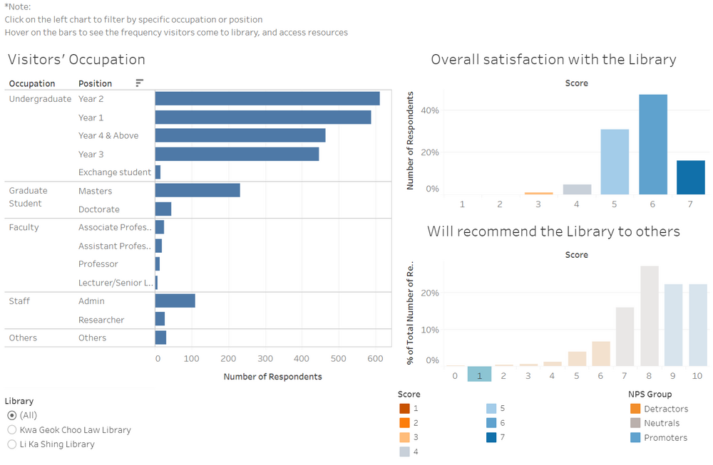
The overview page allows for viewers to see at a glance the overall demographic of the Library's visitors, as well as the overall satisfaction with the library, and how likely they are to recommend the Library to others.
Design Rationales
1. To show key summary information without over-cluttering the overview page. This is done by:
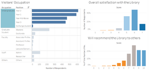
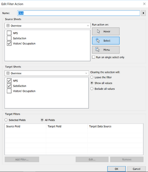
- Using dashboard actions to do filtering instead of filters, so more space is available
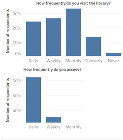
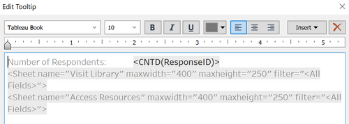
- Using charts embedded in tooltips to display supplementary information that is not critical but may be of interest to the users
2. To allow viewers to quickly grasp the key insights from the charts. This is done by:
- Grouping the different positions by their occupation to organize them
- Sorting the counts in descending order by group
- Using colours and legends to highlight good scores from poor scores, as well as grouping the net promoter scores by their net promoter groups
Interactive Techniques Used
| Interactive Technique | Rationale | Brief Implementation Steps |
|---|---|---|
| ||
| ||
|


