PROBLEM & MOTIVATION
PROBLEM
The SMU Libraries are used for several purposes ranging from information access and a quiet place to study to computer and printing services. The library conducts a survey every two years to try and enhance their service quality. They ask some pertinent questions and collect useful data, but the reports generated are long and difficult to comprehend because of which the Libraries aren't able to make relevant improvements.
MOTIVATION
As an undergraduate student at SMU, the library is an essential part of my university experience and I would like to help the administration better understand the results of their survey. As a respondent myself, I have been given the rare opportunity to ensure that my feedback is well analysed and I would like to make the most of it.
DATA PREPARATION
MODIFICATIONS
| Tool
|
Tasks and Modifications
|
|
Microsoft Excel
|
- Understanding the dataset provided by the survey.
- Adding a Category column to combine the several different positions (For example: Undergraduate Year 1, Faculty-Professor) into the 4 relevant categories which are: Undergraduate, Graduate, Faculty, Staff.
|
|
Tableau Prep
|
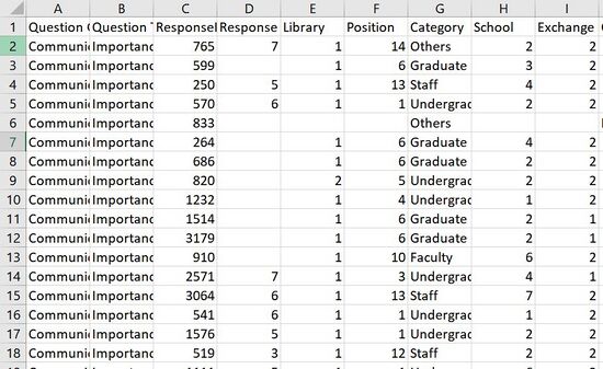
- Pivoting the dataset so as to bring the different rows for each question to columns. This make analysis on Tableau easier.
- Renaming of fields to make them more intuitive. For example: Campus to Library, ID to Exchange Student.
- Removal of seemingly unnecessary fields. For example: NA1, NA2.
- Joining the legend sheet with the data sheet so that each question text can be available and we do not have to rely on its ID.
- Grouping questions based on Service Categories used in the Be Heard Survey Report. For example: Questions 1,2 and 3 under Communication.
|
TABLEAU PREP FLOW
DATA TRANSFORMATION
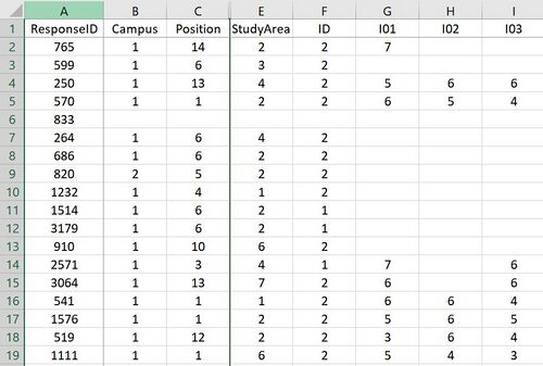
| Original Data
|
Processed Data
|
|
Size: 2639 rows and 90 columns
|
Size: 150423 rows and 12 columns
|
STORYBOARD
| Dashboards |
Description
|
Dashboard 1: Overall Price Distribution by Submarket and Submarket Sizes
|
- The first dashboard that we would like to envision is to have a filter that is visualized by the Singapore map. This will allow users to intuitively find an area that they are familiar with. Since this is only just a filter, it will not show the distribution of HDB Resale Flats in the map itself.
- By clicking on a specific town, the dashboard will dynamically change (a) and provide insights of its submarket price distribution. This will be visualized in the form of a box plot.
- Furthermore, by clicking on a specific box plot, it is used as a filter for graph (b), where there will be a histogram plot to visualize the distribution of flat sizes for each submarket, in each town.
|
Dashboard 2: Comparison of price changes and volume transacted across time periods
|
- The second dashboard that we envision is to allow users to compare average price and volume changes across the years. Users would be able to compare average prices and volume transacted for specific estates and specific submarkets. Users would also be able to identify the high and low value estates based on the data.
- The charts on the left displays the overall picture of average price changes as well as average volume changes across each year (e.g. 2015 - 2020). While the top left chart has price as its Y-axis, the bottom left chart has volume as its Y-axis.
- The charts on the right allow Users to view average price and volume changes across each quarter. By selecting a point on the charts on the left (e.g. Year = 2015), the charts on the right is changed to display the quarterly data for the selected year. The charts provide Users with the flexibility to view the data from a high level view (Yearly) as well as from a funneled down view (Quarterly).
- The Multi-select Estate filter in the middle, which might be shifted elsewhere depending on our UI design, allows Users to view the data of 1 estate as well as compare across multiple estates. The Single-select drop-down menu allows Users to view data or make comparisons from the perspective of 1 submarket at a time or all submarkets. (E.g. Users can compare average price and volume changes for 3-ROOM flats in AMK vs. Pasir Ris or all submarkets in AMK vs. Pasir Ris)
- We are still exploring the possibility of adding more filters, features, and having a more flexible view. We could possibly add a benchmark line so that estates that have a value above the benchmark is classified as a high value estate.
|
Dashboard 3: Tree Map of HDB Storeys by Volume and Price
|
- The final dashboard that we envision to complete is a Tree Map plot to visualize the volume and price of HDB Resale flats by their Storeys. The size of the boxes will be equivalent to the volume transacted value and the colours will represent their respective price.
- The dashboard will come with filters that enables users to select the particular towns that they will want to compare with. The maximum allowed number to select is up to 2 towns. The number of towns selected will generate the same number of graphs for visualization.
- Lastly, one other filter is the submarkets in which the user is able to select the type of submarket for deeper analysis.
|
KEY TECHNICAL CHALLENGES & MITIGATION
| No.
|
Challenge
|
Description
|
Mitigation
|
| 1.
|
Lack of Familiarity with Tools
|
Everyone in the group do not know how to program in RShiny for visualisation
|
We will learn Rshiny during class, call for consultation and rely on Googling for any programming challenges. Alternatively, there is also Datacamp available for us.
|
| 2.
|
Viability of Ideas
|
We do not know if the current dataset is sufficient in providing all the information needed to conduct analysis and building of planned visualizations.
|
There are multiple dataset online to use and we can use Prof Kam's REALIS dataset provided to us to supplement our dataset if we are lacking of certain variables. We could also derive our own variables based on the current dataset if needed (e.g. Geocoding).
|
| 3.
|
Lack of Domain Knowledge
|
HDB resale prices are affected by a spectrum of different factors such as policy measures and redevelopment. It is hard for us to understand without domain knowledge.
|
Learn from informative websites such as from HDB and iteratively discover and learn insights into the dataset
|
STORYBOARD
| Dashboards |
Description
|
Dashboard 1: Overall Price Distribution by Submarket and Submarket Sizes
|
- The first dashboard that we would like to envision is to have a filter that is visualized by the Singapore map. This will allow users to intuitively find an area that they are familiar with. Since this is only just a filter, it will not show the distribution of HDB Resale Flats in the map itself.
- By clicking on a specific town, the dashboard will dynamically change (a) and provide insights of its submarket price distribution. This will be visualized in the form of a box plot.
- Furthermore, by clicking on a specific box plot, it is used as a filter for graph (b), where there will be a histogram plot to visualize the distribution of flat sizes for each submarket, in each town.
|
Dashboard 2: Comparison of price changes and volume transacted across time periods
|
- The second dashboard that we envision is to allow users to compare average price and volume changes across the years. Users would be able to compare average prices and volume transacted for specific estates and specific submarkets. Users would also be able to identify the high and low value estates based on the data.
- The charts on the left displays the overall picture of average price changes as well as average volume changes across each year (e.g. 2015 - 2020). While the top left chart has price as its Y-axis, the bottom left chart has volume as its Y-axis.
- The charts on the right allow Users to view average price and volume changes across each quarter. By selecting a point on the charts on the left (e.g. Year = 2015), the charts on the right is changed to display the quarterly data for the selected year. The charts provide Users with the flexibility to view the data from a high level view (Yearly) as well as from a funneled down view (Quarterly).
- The Multi-select Estate filter in the middle, which might be shifted elsewhere depending on our UI design, allows Users to view the data of 1 estate as well as compare across multiple estates. The Single-select drop-down menu allows Users to view data or make comparisons from the perspective of 1 submarket at a time or all submarkets. (E.g. Users can compare average price and volume changes for 3-ROOM flats in AMK vs. Pasir Ris or all submarkets in AMK vs. Pasir Ris)
- We are still exploring the possibility of adding more filters, features, and having a more flexible view. We could possibly add a benchmark line so that estates that have a value above the benchmark is classified as a high value estate.
|
Dashboard 3: Tree Map of HDB Storeys by Volume and Price
|
- The final dashboard that we envision to complete is a Tree Map plot to visualize the volume and price of HDB Resale flats by their Storeys. The size of the boxes will be equivalent to the volume transacted value and the colours will represent their respective price.
- The dashboard will come with filters that enables users to select the particular towns that they will want to compare with. The maximum allowed number to select is up to 2 towns. The number of towns selected will generate the same number of graphs for visualization.
- Lastly, one other filter is the submarkets in which the user is able to select the type of submarket for deeper analysis.
|
Do leave a comment on how I can improve my visualizations so as to be able to provide more value to the SMU Library Administration or if you require any files for reference!
| No.
|
Name
|
Date
|
Comments
|
| 1.
|
(Name)
|
(Date)
|
(Comment)
|
| 2.
|
(Name)
|
(Date)
|
(Comment)
|
| 3.
|
(Name)
|
(Date)
|
(Comment)
|


