IS428 AY2019-20T2 Assign SHERRY TAO SHI HUA
Contents
Overview
Background
In light of the ever-changing needs and requirements of faculty, students and staff, an extensive and comprehensive survey is conducted every two years, in which the users of both the Li Ka Shing Library and Kwa Geok Choo Law Library have the opportunity to rate various aspects of their services. The results aim to learn about the users’ perception of both libraries, especially in terms of importance and performance, and provides SMU libraries with input to help enhance existing services to adapt and improve their services.
Objective and Tasks
A Library Survey Report is generated after the survey. However, upon closer scrutiny of the report, we can see that it comprises of many pages of tables and confusing charts, which are difficult for users of the report to comprehend and find out the areas to improve. Hence, our objective is to apply appropriate data visualisation using what we have learnt in class to transform these into interactive visualisations so that users can save effort in understanding and making out the meaning of the tables and charts and focus on the main perceptions and areas of improvement, allowing for greater gain of useful insights to SMU Libraries.
The task is split into four groups of users’ perceptions:
- undergraduates,
- postgraduates,
- faculty and
- staff.
Since these four groups are so varied, they may have different perceptions of the various importance and performance of the library services, of which we need to further explore and gleam insights from.
Data preparation
Dataset
The 2018 Library Survey dataset is used for this Assignment, since the 2020 Library survey ended in late February and the dataset is not published. There are 2639 responses in this dataset, each to a unique Response ID. Of the 88 variables left in the dataset (excluding the unique identifier Response ID), 26 of the 88 are not applicable (NA01 to NA26) and will be excluded from the visualisations.
Of the 62 variables remaining in the dataset, 9 variables contains information on demographics of the respondent, such as which library they use more frequently (Campus), what their field of study is (StudyArea), how frequently they visit the campus, the library and accessing library resources (HowOftenL, HowOftenC, HowOftenW), which year of study they are in (Position), whether they are an international student (ID), net promoter score (NPS1) and an open-ended comment section (Comment1). The open-ended comment section will be excluded from the visualisations as well.
Of the rest of the 53 variables, 26 of them (I01 to I26) measures the importance of each assessment item while another 26 (P01 to P26) measures the performance of the same assessment items. All measures are in Likert Scale, from 1 to 7, stating how important or well-performed the assessment item is in each respondent’s view. The final variable (P27) is an overall satisfaction of the library, measured under Performance.
Data Cleaning and Transformation
| Screenshots | Description and Steps Taken |
|---|---|
|
|
Since the fields NA01 to NA26 are not applicable, they are excluded from the visualisations
|
|
|
The data is in a row format, with every row corresponding to a ResponseID, indicating the respondent. However, Tableau cannot do calculations on data like this, and it needs to be pivoted so that we can proceed with the later steps
|
|
|
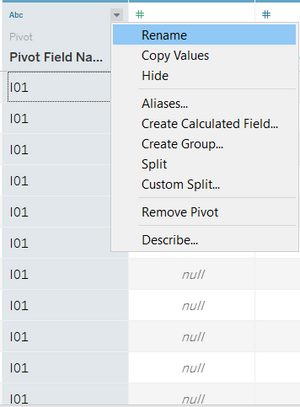
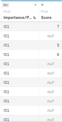
After pivoting the data, Tableau automatically names the column with the I01 to I26 and NA01 to NA27 as "Pivot Field Names" and the column with the respective scores as "Pivot Field Values". To help us recognise the fields better, "Pivot Field Names" is renamed as "Importnance/Performance" and "Pivot Field Values" is renamed as "Score".
|
|
|
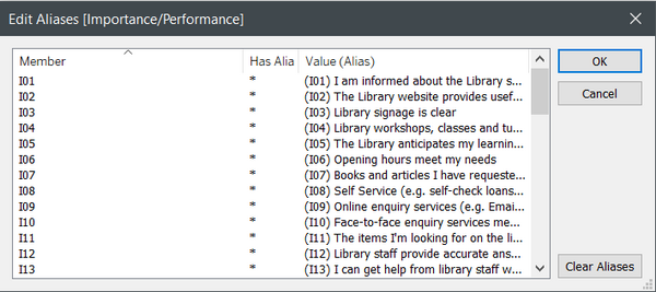
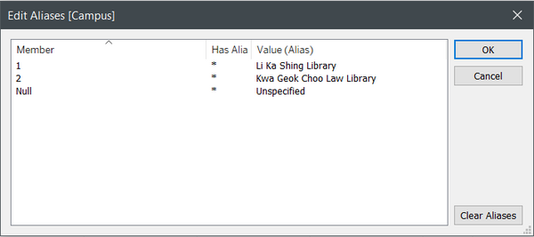
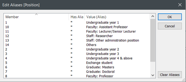
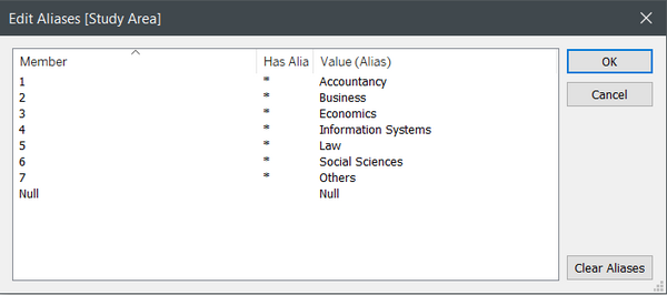
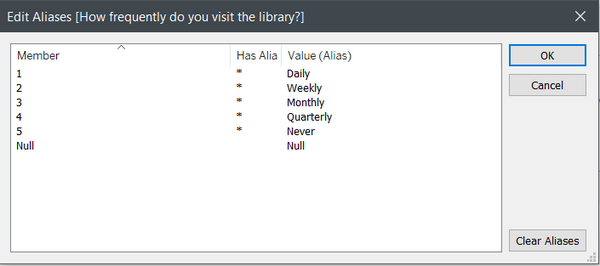
There are several fields with numbers as the data in the Excel file, but they are actually codes that symbolises some discrete data. To have a clearer representation of the data, aliases are created in place of the numbers.
|
|
|
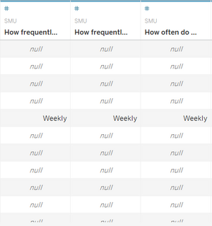
There are several other fields that need renaming for quicker recognition, namely "HowOftenL", "HowOftenC" and "HowOftenW". These are renamed as "How frequently do you visit the library?", "How frequently do you visit the Campus?" and "How often do you access library resources (e.g. online articles, databases, ebooks)?" respectively.
|
|
|
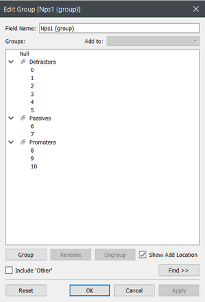
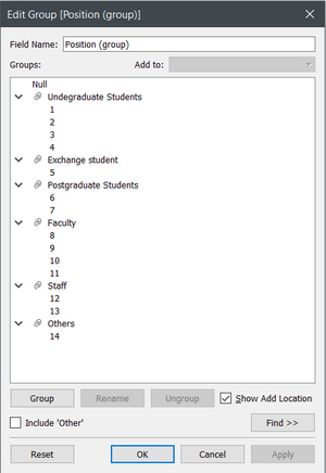
There are data in the columns that can be grouped, such that similar traits are represented in the group. One column where the responses can be grouped is Net Promoter Score, responses from 0 to 5 are Detractors, responses from 6 to 7 are Passives and responses from 8 to 10 are promoters, according to the Library Survey Report. Another column is the Position, where Undergraduates from the different years are grouped together, Postgraduates Masters or Doctoral are grouped together, different positions in the Faculty are grouped together and both types of Staff are grouped together.
|
|
|
To create a divergent stacked bar chart for the responses in the Likert Scale, several calculated fields need to be created. These are:
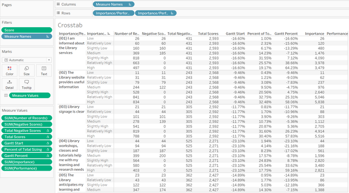
After each calculated field, drag the newly created field into the sheet to create a Crosstab to check the validity and accuracy of the calculations.
|
|
|
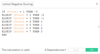
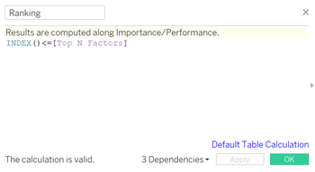
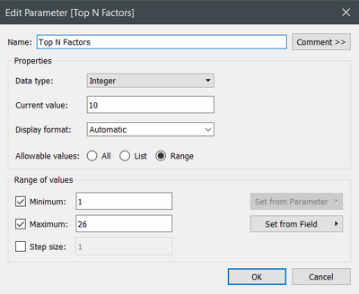
There are a total of 26 services in the survey that are ranked by both their importance and performance. However, we do not want to analyse the entire list of factors all at once, but focus on the top few based on how positive the services are ranked by scoring each score. To achieve this, we first have to create a Positive/Negative scoring system, then set a parameter so that the number of services that are being looked at can be varied. Then we need a calculated field to filter the list to only the number of services stipulated by the parameter.
|
Interactive Visualization
Link
Link to Dashboard: https://public.tableau.com/profile/sherry.tao#!/vizhome/IS428_AY2019-20T2_Assign_SherryTaoShiHua/Dashboard1?publish=yes
Dashboard Overview
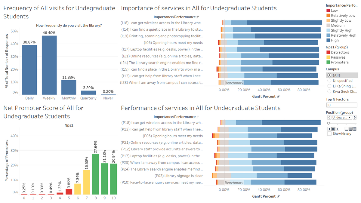
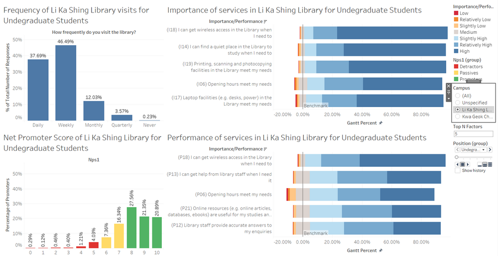
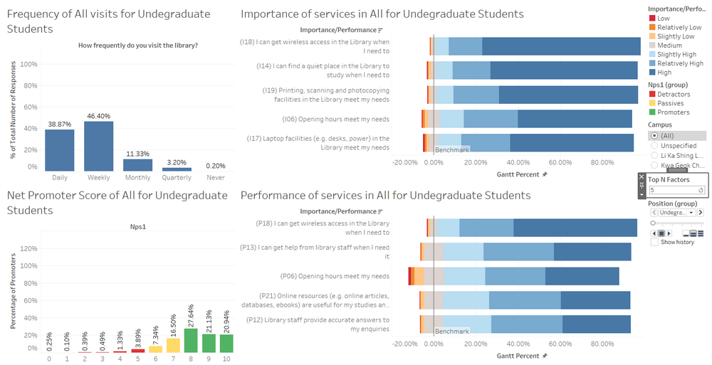
This is the overview of my Dashboard. By default, the Dashboard shows all responses from Undergraduates for both the Li Ka Shing Library and the Kwa Geok Choo Library. The Importance and Performance of the services have been ranked and the top 10 are shown by default. The individual components that make up this dashboard is further explained below.
Components
Frequency of Library visits
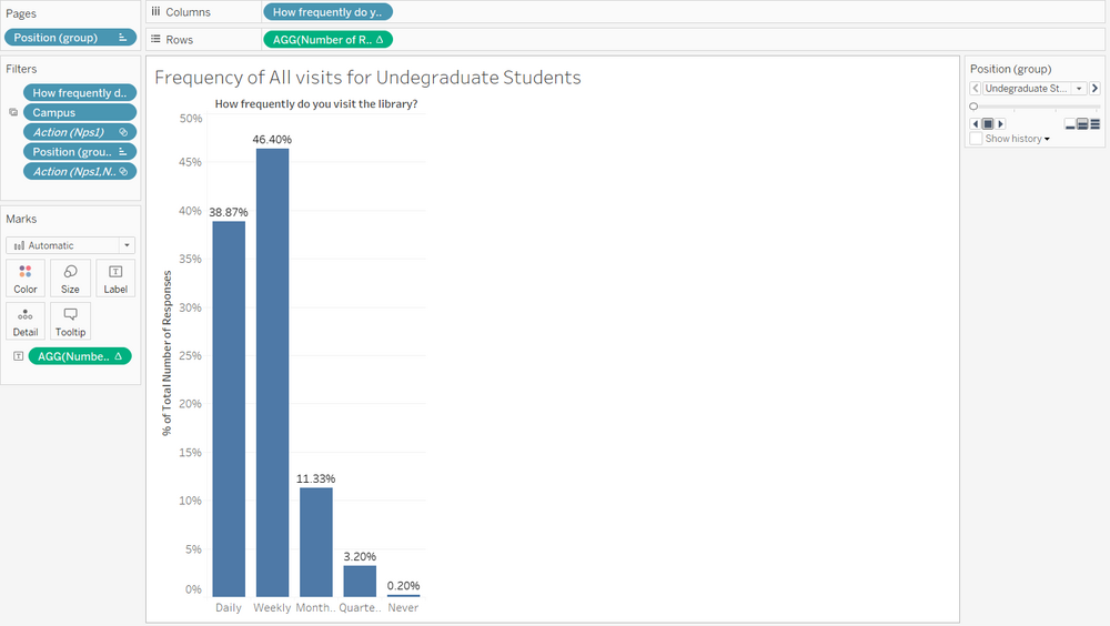
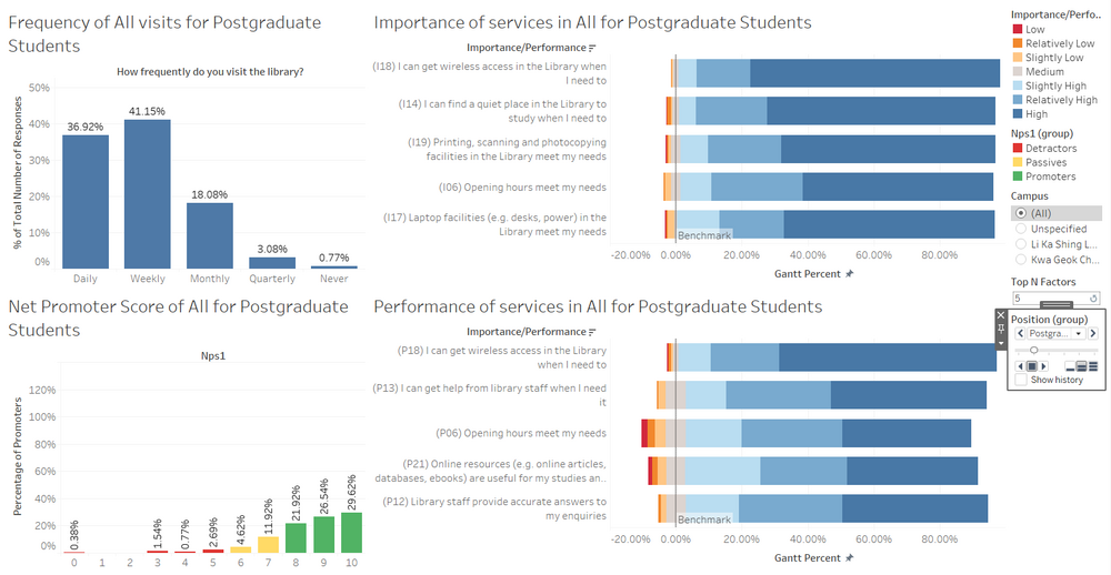
On the top left of the Dashboard is the bar graph for frequency of library visits. The columns (Daily, Weekly, Monthly, Quarterly, Never) show the frequency and the height of the bar shows the percentage of respondents by group (default being Undergraduate Students) that corresponded to each column.
Net Promoter Score
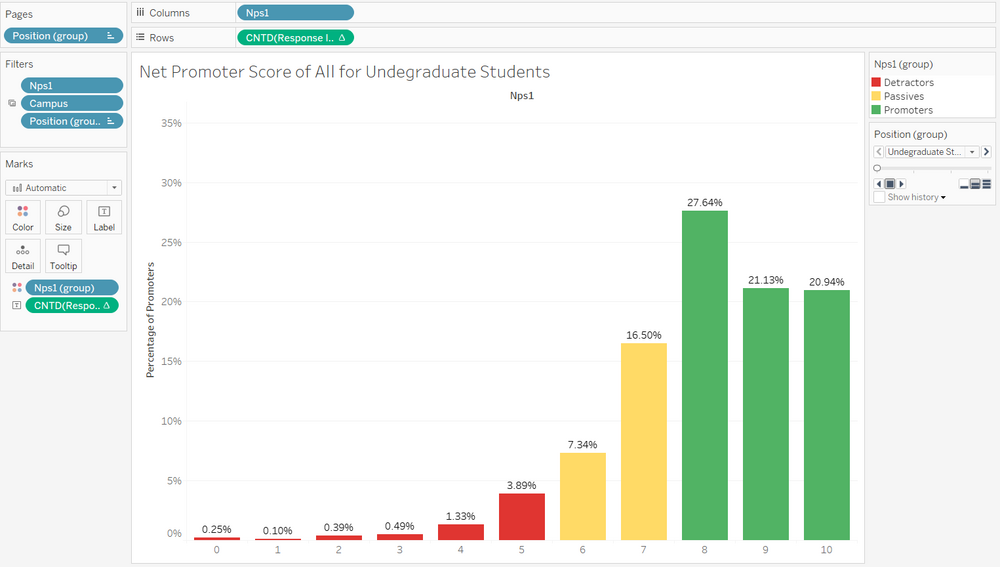
On the bottom left of the Dashboard is the bar graph for Net Promoter Score. The columns (0 to 10) show the possible range of Net Promoter Scores and the height of the bar shows the percentage of respondents by group (default being Undergraduate Students) that corresponded to each column. The colour on the graph shows those who are Detractors, Passives and Promoters. Detractors are those that are unhappy about the Library, Passives are those that are satisfied but not enough to recommend the Library, and Promoters are those that would encourage others to use the Library.
Importance and Performance
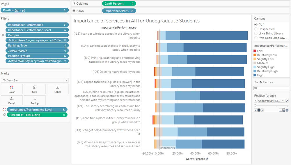
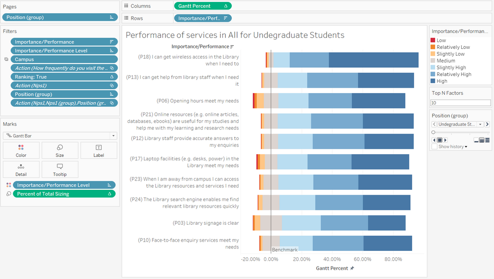
On the top right of the Dashboard is the divergent stacked bar chart for respondents' perception on the importance of each service that the Library offers, and the bottom right of the Dashboard is the divergent stacked bar chart for respondents' perception on the performance. The responses are on a Likert Scale, hence a divergent stacked bar chart is appropriate to draw insights from the respondents' perceptions. By default, the Top N services can be seen as stipulated by the user input of N, up to a value of 26. The colour of the graphs correspond to those who believe the Importance/Performance to be low to high, with the lower values coloured red and the higher values coloured blue. Those that are on the fence are coloured grey, since they are on neither end of the spectrum.
Interactive Elements
Sidebar
There are several interactive elements present on the side bar.
Firstly, this is a filter for the Campus that the user would like to analyse. By changing the filter of Campus, all 4 components in the Dashboard will be filtered and showing only the responses from respondents that use Li Ka Shing Library more frequently in this case. Notice that the titles of each of the 4 components are being changed as well.
Next, this is a filter for the Top N services to look at by Importance/Performance. Users are able to change the values from 1 to 26, and by changing the filter, the Importance and Performance sheets will be filtered to only the Top N services.
Finally, this is a Pages filter for the group of respondents by position (Undergraduates, Postgraduates, Faculty and Staff). Users are able to scroll through the pages manually, or click the play button to let it loop automatically. Notice that the titles of each of the 4 components are being changed as well.


