Group09 proposal
| Proposal | Poster | Application | Research Paper |
Our primary motivation for doing this project would be to provide a useful visualization for economic policy development. Climate change will without doubt cause great shifts in how everyone lives and does business within the next few decades. Billions of people will be affected. We are very motivated by this problem because one of our team members worked closely with the founder of Nomadlist.com, the No. 1 website for digital nomads. While working on it, he noticed that Air Quality Information (AQI) was affecting the way people looked at cities – if they were worth living and working in. We believe that as climate change unfolds, AQI will be one of the key indicators that helps anyone – especially policy makers – decide if progress is happening and at a pace which is feasible. In addition, we are working on helping travellers and digital nomads to filter cities by Air Quality Information (AQI). Nomads usually travel from place to place and want to work in countries that are conducive for their remote work. To plan their travels on an affordable budget, they usually use nomadlist.com to plan their trips in advance. As such, they need to know if countries they are planning to go to for an extended duration of time have a tendency to be polluted.
Currently, NomadList which uses a variant of the dataset we have, displays everything in a tabular format with so many different colors. This makes it visually confusing to any digital nomad that wants to quickly filter information out. The trend for digital nomads is growing – this product was the #1 product of the day on a top product website, with over 797 upvotes. More and more people are also becoming sensitive about climate change and want to know how polluted exactly various cities are. In addition, it would help climate scientists look at whether cities are responding adequately to climate change.
The data we are using is scraped from http://aqicn.org using a Ruby script. There are 921 cities in total out of a target list of around 960 cities. There are 39 missing cities because there are no sensors for those cities – not all cities have fully functional sensors connected to the AQICN platform.
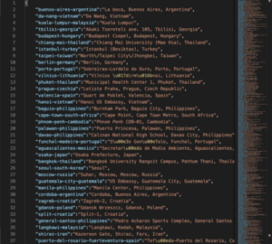
The target list is from a JSON file that looks something like this:
We will have to merge this dataset with geodata so we can visualize AQI on a map.
The data we've scraped comes from a website called AQICN. As you can see in the image, the website is rather busy and the visualisations can be quite clunky if you don't know what you're looking for.
Our project focuses on the correlations between economic development and political policy and the delta in the quantity of pollutants that results in, as well as any inverse relationships (i.e. does the quantity of pollutants affect economic development?). In that sense, compared to AQICN, we won't be showing as much data. Rather, we want to make it as concise as possible while showing the relationships we want to illustrate.
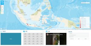
A notable example of another of the visualisations we're referencing to do is Hazegazer: Theirs is more focused on demographics and the Indonesian haze crisis, but we aim to have that level of clarity when showing hotspots of cities and the GDPs and how they correlate. However, there are many options that a new user might not comprehend. We hope to be more concise than this website in our application.
In a 2017 paper, Guillaume Vandenbroucke and Heting Zhu both argue that ‘We find that pollution in the United States, measured by particulate matter or CO2 emissions, rises with economic activity, but at a noticeably slower pace.' Given the GDP of a country/city and the pollutant data we have, we will test this trend across more than just the United States.
In a chapter by Ying Li and Ke Chen, they note that over 70 years of China’s history, ‘Control policies have been largely ineffective and air quality in the majority of the nation has not been significantly improved and even worsened in many urban areas’. For each policy and the timeframe that they are being implemented over, we’d like to see if this claim is true and show a correlation between the policy and pollutants.
https://research.stlouisfed.org/publications/economic-synopses/2017/06/23/measures-of-pollution
https://www.intechopen.com/books/energy-management-for-sustainable-development/a-review-of-air-pollution-control-policy-development-and-effectiveness-in-china
http://hazegazer.org/home
https://aqicn.org
| Sketch | Description |
|---|---|
| We plan to track various policy implementations and their time frame, correlating to the Air Quality Index of that city. We want to track if the policies the city or state implements are truly effective in reducing or controlling air pollution. | |
|
We want to track if there truly is a correlation between GDP and AQI. We aim to show the GDP per capita of various cities around the world as well as their air quality index on a map. In addition, we will show the delta in GDP vs the delta in AQI. |
With the amount of data we have and the new platforms we have to learn, we anticipate a large challenge ahead in tackling this project.
| Potential Challenges | Solution |
|---|---|
|
Not being familiar with R and R-Shiny. We are all more used to programming in Python, React, Javascript, etc. |
Set up a group chat for the class to discuss about R and R-Shiny Compile a list of useful resources we can all share with each other Pair program if we really have to Refer to R and R Shiny documentation Look at other people’s projects and how they did it (similar to how one learns from open source projects) |
|
Dataset is not tagged and is not sorted by country; it is sorted only by city. |
Find a convenient source of country vs city data and write a python script to organize and tag the data appropriately. |
|
Correlation is not causation: We might find other factors that distort our findings. |
Our dataset is large: we are able to scour through multiple cities to see if the trends we are predicting reflect in multiple cities. |


