IS428 AY2019-20T2 Assign KANG HUI YUN
Overview
Background
In the interests of faculty, students and staff of Singapore Management University (SMU), an all-encompassing survey is conducted by SMU Libraries every 2 years to learn about their perception of the libraries (namely Li Ka Shing Library and Kwa Geok Choo Law Library), with particular focus on the importance and satisfaction level of different library-related services. This piece of information serves as a valuable input for the department to calibrate the standards of the facilities by identifying areas where users are underserved and those that exceed expectations but are relatively less important.
Objective & Tasks
After closure of the survey, a Library Survey Report is generated for consumption. However, this traditional method of analysis comprising huge number of tables and ineffective charts can be frustrating and difficult for users to grasp. Hence, the objective here is to make use of existing tools and technologies to develop an interactive visualisation of the survey data (Feb 2018), such that it is intuitive, easy to comprehend and telling at the same time. By cutting down on the report's "verbosity", the people in charge can save time deciphering trends and underlying patterns of the data with high degree of conciseness and accuracy.
The primary task is to reveal the level of services provided by the 2 SMU libraries as perceived by the following four groups: the undergraduates, postgraduates, faculty and staff. This mainly includes the concept of the Importance-Performance (or Importance-Satisfaction) rating as well as the Net Promoter Score (NPS).
Survey Data
About the Data
The data for the 2018 Library Survey Report consists of:
- 2639 records (rows)
- 89 fields (columns), which includes
- A new column for ResponseID (unique to each respondent)
- All other 88 columns related to the original survey questions
The survey is predominantly made up of importance and performance rating (26 such questions, represented by 78 fields in the dataset). The 78 fields are spread across 3 main categories: importance, performance and N/A (hence 26x3, giving us 78). Respondents who picked 'N/A' for the question need not select a rating for both importance and performance. Prior to these questions, there are 4 basic background and demographic questions that are all non-quantitative. Also, there are 3 questions on the frequency (of visits and access), 2 rating scales on overall satisfaction and likelihood of recommendation, and one textual input for comments and suggestions. For the most part, the survey questions are based on Likert scale (questions with suffixes between 1-27 except those with NA prefix; and out of the 27, 26 are the previously mentioned Importance-Performance rating questions). Worthy of mention is yet another rating scale—the Net Promoter Score (NPS), which, when calculated can tell us the overall (net) satisfaction/loyalty of library users.
Data Cleaning & Preparation
Before jumping into data visualisation, it is important to make sure the data is clean, rightfully organised and structured. This will facilitate the visual development using tools such as Tableau, allowing for categorisation and sorting. In the cleaning process, we shall engage in steps such as removal and/or creation of new fields, field renaming, and pivoting. Finally, we will piece up the bit-sized information into a single dataset via merging (e.g. join/union). Ultimately, we would like our data structure to be thin and tall (i.e. less columns, more rows) so we can analyse certain dimensions easily as we wish.
Initially, I have used Tableau Prep to clean the data. However, I quickly switched to using R (on RStudio) mainly because certain steps are tedious when performed in Tableau Prep—it requires a lot of manual work, especially repetitive clicking and entering of values. Writing a single R script is much cleaner, significantly faster and less prone to undesired changes which can be made through accidental interactions within the interface of Tableau Prep. Nonetheless, I have successfully created the same dataset using both methods besides Excel.
Excel
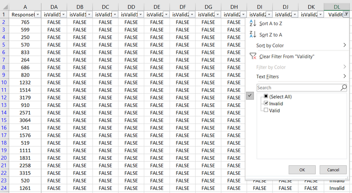
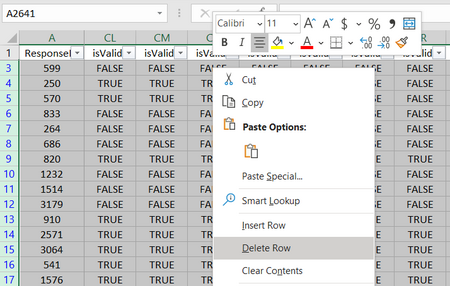
As mentioned previously, if the respondent selects N/A for a given question (which is represented as 1 in dataset under column NAxx), he/she will not be able to select an option for both Importance and Performance for the same question. Similarly, if N/A is not selected, it logically follows that he/she must select a choice for both Importance and Performance. However, there are records in the dataset that violate this rule. For example, the record where ResponseID is 765 has empty cells for both I02 and P02. Yet, NA2 is not filled with 1 when it should be.
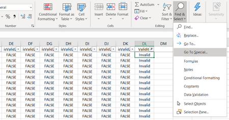
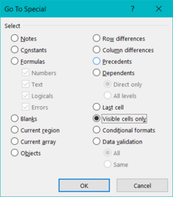
To simplify the data cleaning process later, we will fix this issue by removing such records in Excel first.
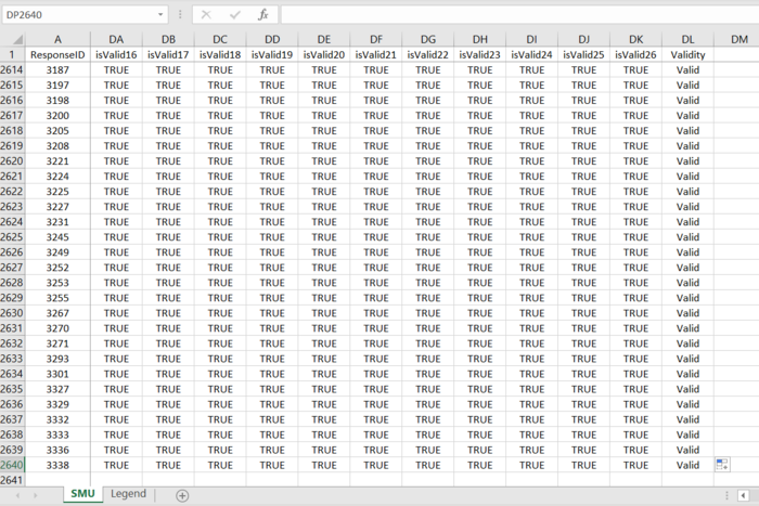
Now we have successfully removed invalid records with regards to the questions. In the next phase, we will be able to remove the NAxx columns and focus on transforming other aspects of the data using R as it will be more efficient.
Tableau Prep Flow
Below shows the initial data cleaning process (flow) using Tableau Prep before switching to R.
R and RStudio
| Step | Screenshot | Rationale & Description |
|---|---|---|
| Import Libraries | Import the libraries that are required to perform certain functions for data manipulation later on. | |
| Import XLSX | Read in the Excel file that we have saved previously. | |
| Remove Fields | First, we remove fields that are not of interest in the analysis. In this case, we remove Comment1 as sentiment analysis (via text mining) is not in our scope. Also, we can remove the 26 NA-prefixed fields as it is redundant (as we can refer back to Importance and Performance values to deduce whether user selected N/A). | |
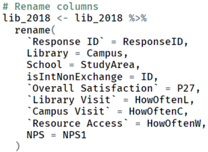
| Rename Field Names | We then rename the columns from the coded version to human-understandable words/phrases so that it is not confusing when working out the visualisation in Tableau. | |
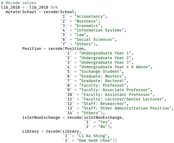
| Recode Field Values | Again, we recode the field values to human-understandable words/phrases to avoid confusion when working out the visualisation in Tableau. | |
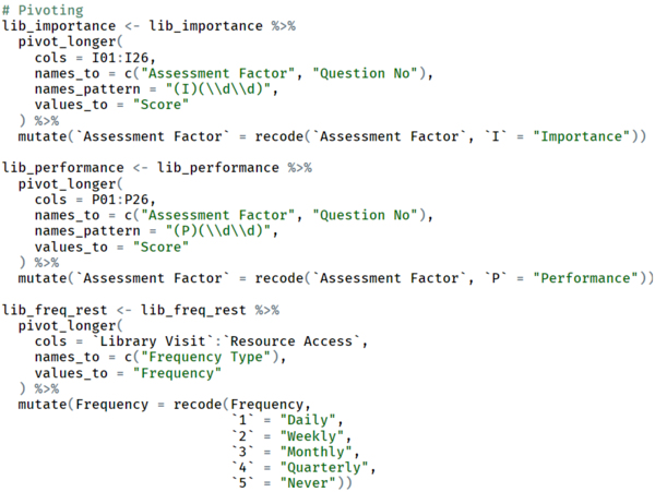
| Split Data | First, we have to split our data into smaller subsets with the interested fields to be pivoted. In our case, we wish to distinguish between whether a question-score pair belongs to the Importance or Performance factor, as well as the nature of the frequency question (i.e. whether the frequency is for library visits, campus visits or resource access). Hence, we will split the dataset into 3 smaller pieces. | |
| Pivot Data | With the individual subsets, we then pivot the relevant columns for each subset to get the data structure we need. | |
| Merge Subsets | Subsequently, we will merge the subsets together back into a single dataset. | |
| Create New Field | Here, we will create a new field to generalise the respondents into a bigger group (i.e. Undergraduate, Postgraduate, Faculty, Staff and Others). For exchange students, we will group them along with the undergraduates. | |
| Reorder Field | This step is not mandatory. However, it allows me to view/check the dataframe more efficiently when fields are logically grouped. | |
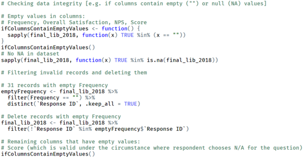
| Remove Invalid Records | Now, we will find out invalid records and remove them from the dataset. Invalid records include those with empty or null values for the columns except Score. | |
| Export Data | Finally, we export the R dataframe into a CSV! |
Tableau Desktop
Upon importing the dataset to Tableau Desktop, we will make final adjustments to the dataset.
1. Firstly, arrange and set the fields according to the right format (i.e. Dimension or Measure, data type—String, Date, Boolean, etc).
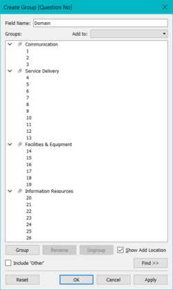
2. Then, we will create a Group based on Question No to group different bunch of questions to their category (i.e. Communication, Service Delivery, Facilities & Equipment and Information Resources).
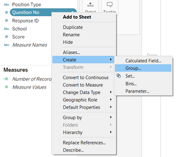
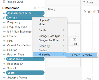
3. Next, we create hierarchies to better organise the related fields into logical subsets in our working area for better productivity due to the phenomenon known as ease of recall.
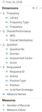
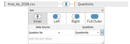
4. Last but not least, we will join our dataset with a separate Excel file containing the question metadata to extract the actual wordings for each question. This way, we do not have to manually type in an alias later.
Interactive Data Visualisation
Link to interactive visualisation: https://public.tableau.com/profile/kang.hui.yun#!/vizhome/Assignment2018SMULibrarySurvey/2018SMULibrarySurvey
For the visualisation, I have made use of Tableau's storyboard composed of a customised dashboard on each tab.
Overview & Demographics
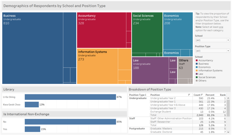
The first tab will allow users to capture demographic information of the survey respondents. Here, we can see the make-up of the respondents by their school and position type. The filter also provide us a breakdown analysis to see the relative proportion of the respondents according to their school and position type. To view the specific breakdown of position type, users can look into the bottom-right table. The horizontal bar charts tells us which library is more popular and if the majority of students are international.
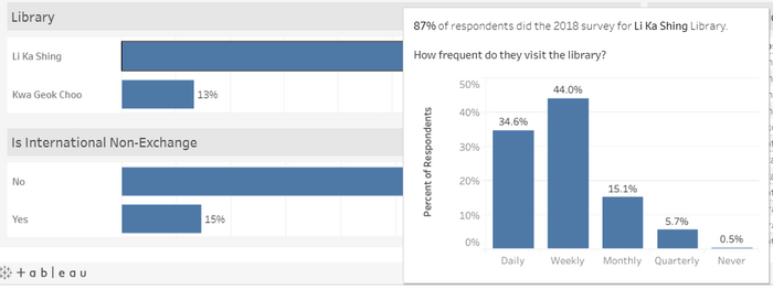
Given the frequency data, I have created a tooltip when users hover over the library bar chart. It tells us the respondents' visiting patterns (i.e. daily, weekly, monthly, quarterly or never) for each library in SMU.
Importance & Performance
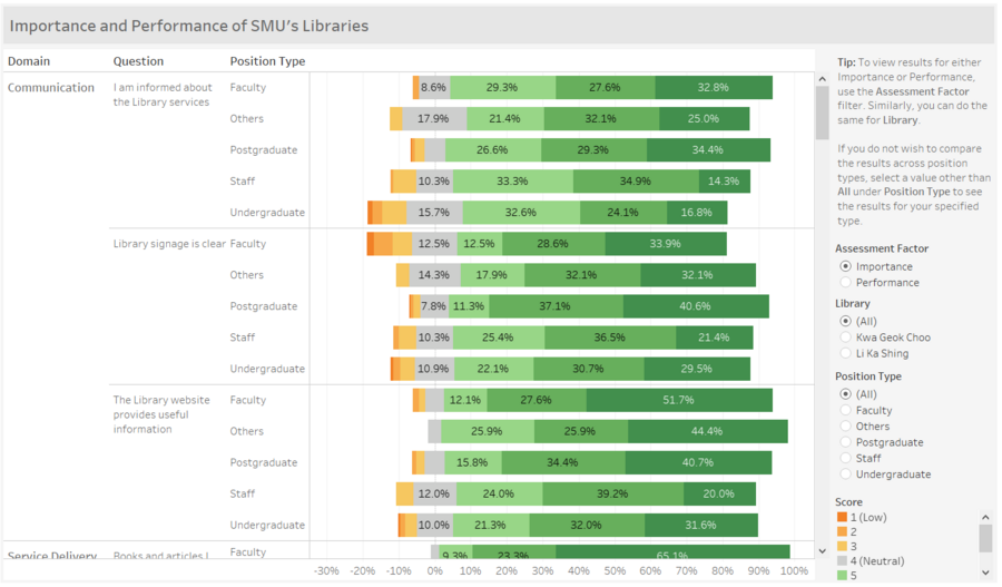
The second tab shows us the respondents' sentiments on the importance and performance of each library service. As there are a handful of questions, a divergent stacked bar chart is used so that we can easily compare between them. We can also use the Assessment Factor filter to switch between the Importance and Performance view. Additionally, we can gather further insights by drilling down to finer levels, namely by library and position type.
Gap Analysis
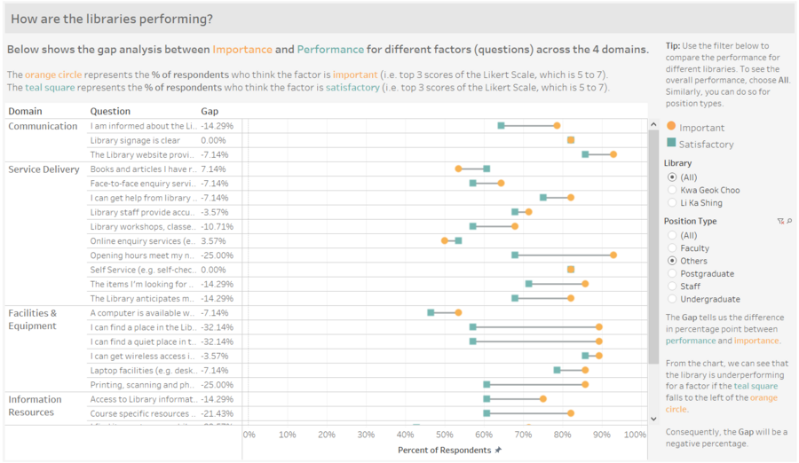
The third tab compares the difference between Importance and Performance (i.e. gap analysis of library service levels). Here, we are able to tell whether a service is under or over performing by studying the plot. It tells us the percentage of respondents who find the service important, as well as the those who think that the service is satisfactory. The percentages are based on respondents who have chosen a score between 5 to 7 out of the 7-point Likert scale. The gap represents the percentage point difference. If it is positive, the service is beyond expectations. Otherwise, it is underperforming and should be looked into.
Overall Performance
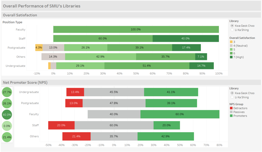
Lastly, the fourth tab summarises the overall performance of the libraries—overall satisfaction and NPS (advocacy). Like before, we can break down the analysis to the 2 libraries on top of the position type that is default in the chart. The bubble beside the NPS divergent stacked bar chart provides us with the actual net promoter score.
Analysis & Insights
Overall
Undergraduates
For undergraduates, the biggest disparities are found under the Facilities & Equipment domain for both libraries. From the screenshots below, we can see that 'I can find a place in the Library to work in a group when I need to' has the largest gap, of -31.30% and -29.11% for LKS and KGC library respectively. This implies that the libraries are underperforming for this service, and fail to meet the needs of the undergraduate. Other than that, the second biggest gap tells us that this group of respondents are most likely to be frustrated due to difficulty in finding a quiet place to study. Hence, SMU's priorities lie on providing more space to accommodate the undergraduates, as well as to ensure that the volume in the libraries are kept down perhaps through a more stringent supervision.
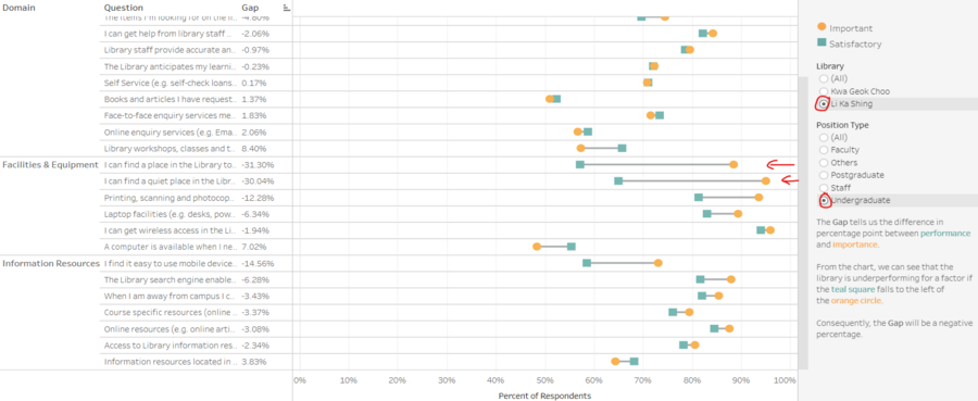
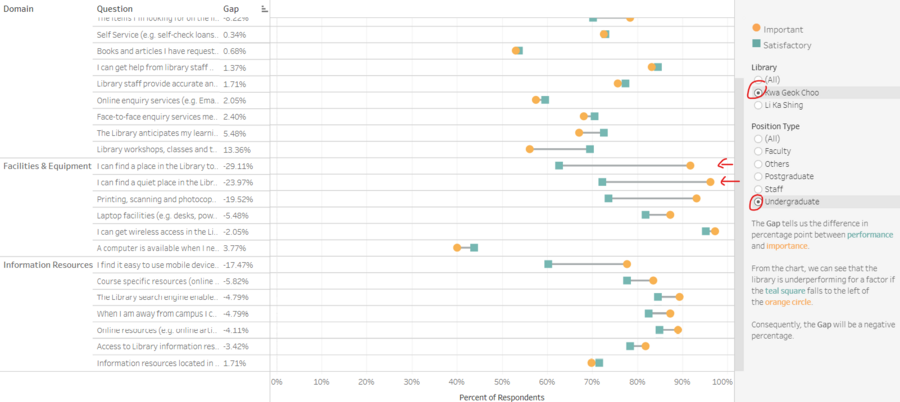
From the importance analysis, it is found that the availability of computers is the least important compared to other services. As library user, more often than not I see that almost all computers in SMU's libraries are unattended. With that, a good suggestion would be to reduce the number of computers so that the space can be freed up for studying purposes which is one of the lacking service identified above.
Also, the undergraduates has the lowest net promoter score for LKS library. We can see that the percent of detractors is the highest among other position types. Not only that, the percent of passives are relatively high as well. As the majority of the library users are undergraduates, SMU should tackle the pressing issues for this group in hopes to improve the advocacy rate, especially in terms of reducing the number of detractors.
Postgraduates
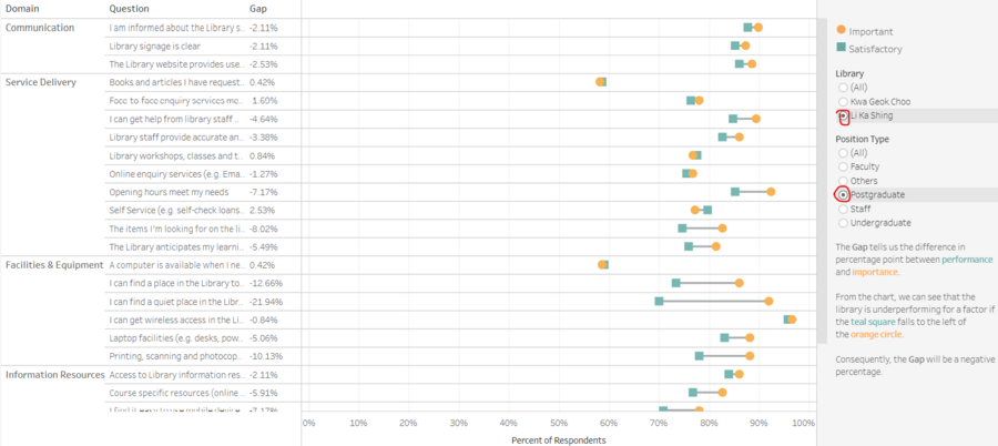
From the screenshots below, we can see that a higher proportion of postgraduates who frequent KGC library find most of the services important, compared to postgraduates who frequent LKS library (most orange circles are nearer to 100% for the former). Also, the gaps are wider for KGC library, where majority of them are attributed to underperformance. That said, more focus should be paid to the level of services provided in KGC library if we are looking at this group.
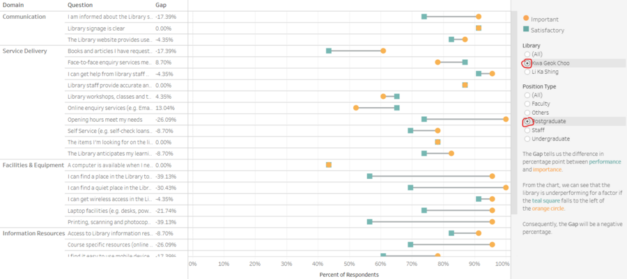
As expected, the NPS is higher for LKS library among the postgraduates as we have identified the Importance-Performance gaps to be significantly lower than that of KGC library. Worthy of attention is the large number of passive postgraduates for KGC library (almost 50%). In this case, SMU should address most of the gaps above in hopes to at least bring the passives to become promoters.
Faculty
Out of all the services, the ones under Facilities & Equipment are found to be the lowest in importance to the faculty members. Surprisingly however, the performance of the same services are also among the lowest compared to the others. Hence, the minority of faculty members who actually use such services are rather unsatisfied with the performance.
Unlike the postgraduates, faculty members who uses KGC library are more willing to recommend the library to others (60% compared to 26.1%, refer above). On a positive note, too, there are no detractors for this group of users. Although there are detractors for LKS library, it is not significant and the proportion of promoters are similar to that of KGC library. Therefore, the NPS for both libraries are very close.
Staff
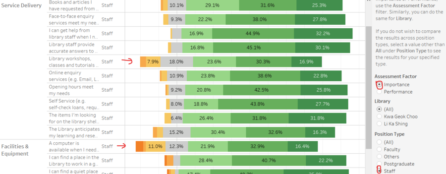
Out of all the services, SMU staff find that the ability of workshops, classes and tutorials in helping them with their learning and research needs to be not as important. The other service where most staff find to be not important is the availability of a computer. This might be because they already have their own desktop in the office.
Interestingly, although all the staff are overall satisfied with KGC library, the NPS is 0%, with only 20% of them willing to recommend the library to others. Perhaps the SMU library in-charge could look into that further and ask them why to find out the "mismatching" sentiments, as it can be said that both measures are highly related.


