IS428 AY2019-20T2 Assign CERULEAN KOH SHILIANG
Contents
Introduction
Given data from the 2018 SMU Library Survey, covering 4 demographics of Undergraduates, Postgraduates, Faculty and Staff, I aim to explore interesting trends, patterns and insights that could potentially be of use to the surveyors.
Steps
| Step | Type | Description |
|---|---|---|
| 1 | Data Preparation | First, we load the excel file “Raw data 2018-03-07 SMU LCS data file – KLG” into Tableau. |
| 2 | Data Preparation | We look at the legend and take note of which names correspond to which numbers. |
| 3 | Data Preparation | We use calculated fields to assign the right names to the numerically represented attributes. |
| 4 | Data Preparation | We rename these calculated fields appropriately, leaving the I01-I26, P01-26 and NA01-26 the same. We hide comment1 as the data for suggestions is in another file, as well as the original columns the calculated fields are derived from. |
| 5 | EDA | For undergraduate students, we first use simple views to explore Library Preference, Study Area, Year Breakdown, International or not, Frequency of visiting the library and campus, and likeliness to recommend library services. We remove null values by filtering them out.
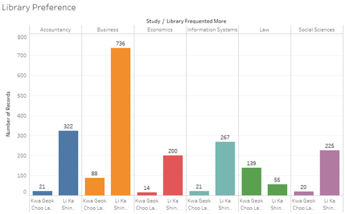
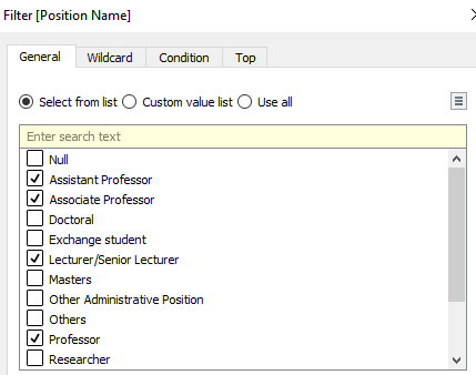
For our first visualization, we see how students from different schools use the Library. First, we filter the position so we are only looking at year 1 to 4 undergraduates. Then, we drag the calculated field Study over to the Columns. We then filter out others in the Study field. We rename the visualization library preference. |
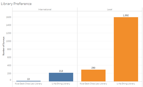
| 6 | EDA | For our second visualization, we explore whether there is the potential that exchange students are not aware of either library. To accomplish this, we plot a similar bar chart as before, except now instead of study area, we check whether they are exchange students. |
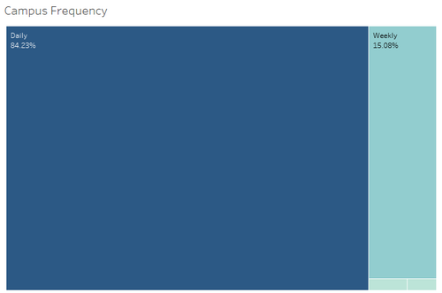
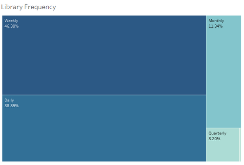
| 7 | EDA | For our third and fourth visualization, we compare the frequency of visiting the library versus visiting the campus.
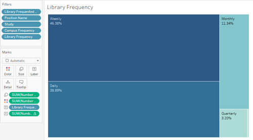
We create two visualizations for this, changing them to tree maps then adding percentage of total number of records as labels, so that we can see clearly the proportions of the frequency of those who go to the library versus those who go to campus. |
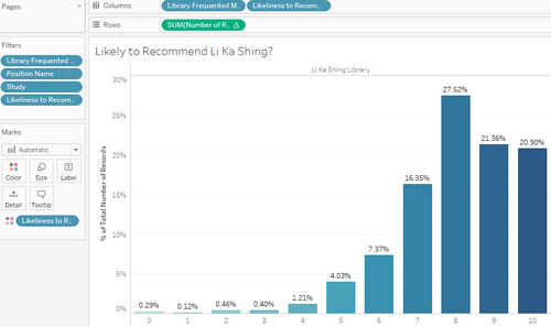
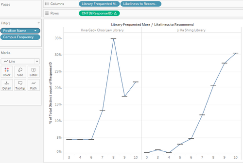
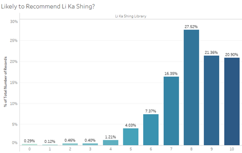
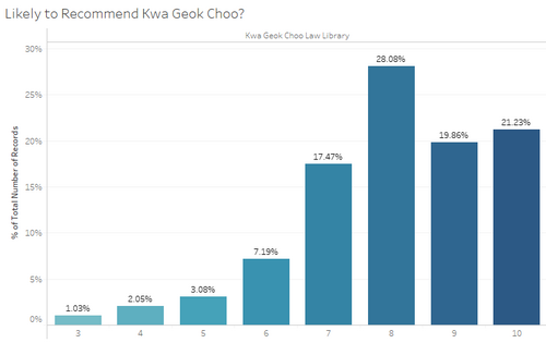
| 8 | EDA | Now, we look at the likeliness for undergraduates to recommend library services. This can easily be seen in a bar graph. We convert likeliness to recommend into a dimension, then plot it against the Library they seem to frequent more. We also remove null values from the likeliness to recommend. We then show this as a percentage so we can compare the libraries.
We create 2 visualizations here, one filtered for the Law Library and the other for Li Ka Shing. Here we use a gradient of colours to show the ordinal nature of the numerical values. |
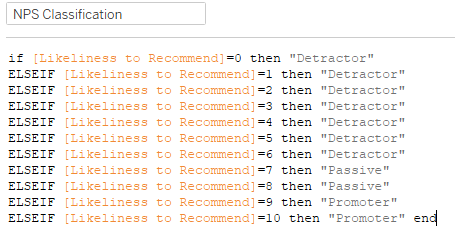
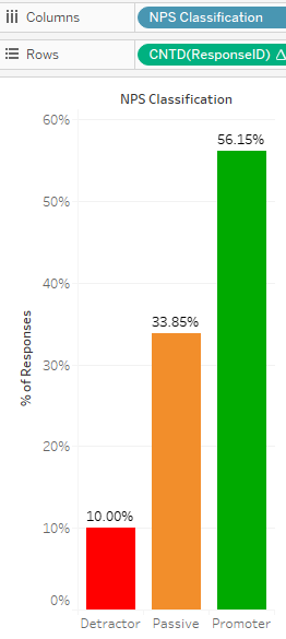
| 9 | EDA | Now, we will calculate overall net promoter score for the two libraries, which we will attain by first grouping 6 and below as detractors, 7,8 as passives and 9,10 as promoters. We can show this in a pie chart. By taking detractor percentage from promoter percentage, we can get the net promoter score. For undergraduates, we will not display this but simply display it in a table. |
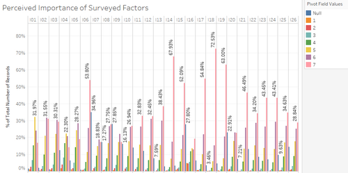
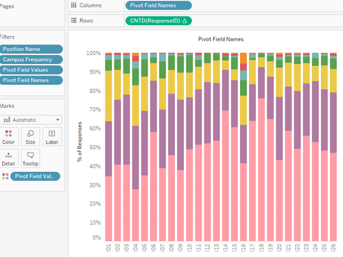
| 10 | EDA | Now, we start to look more into the importance and performance of the 26 listed factors. We pivot I1 to I26, add Pivot Field Names and Pivot Field Values into the Columns, and add SUM of Number of Rows into the Rows, ensuring that the calculation is across the pane. |
| 11 | EDA | Now, let us run the same process on P1 to P27 to see the performance across the 27 measures. At this point, we need to change all SUM(number of rows) in previous visualizations into CNTD(ResponseID) due to the pivoting so we don’t show duplicates. |
| 12 | Data Preparation
and EDA |
As for the final visualization for Undergraduates, we look at the comments given.
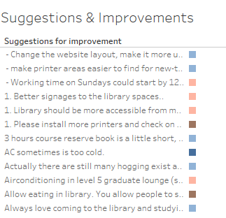
We open a new worksheet and load the comments data source. We filter by position to be undergraduate and remove null form area of study. We colour code by the schools so we can see which school the comment came from. |
| 13 | EDA | Now, we move on to Postgraduate Students. For the following three subsets of the demographic, we will show similar data, but use slightly different visualizations, hopefully to get new insights.
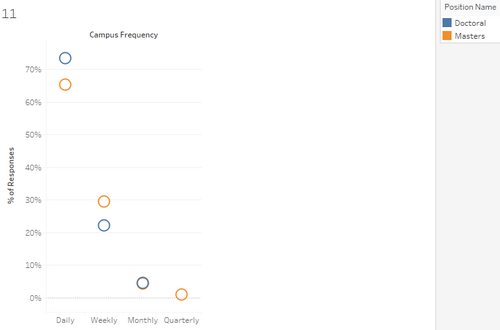
We want to explore Library Preference, Study Area, Year Breakdown, International or not, Frequency of visiting the library and campus, and likeliness to recommend library services. We remove null values by filtering them out. For our first visualization, we now filter by Masters and Doctoral students. Here, we use a circle view to compare the frequency of how often masters and doctoral students come to campus and visit the library. |
| 14 | EDA | Now, we will look at the breakdown of study position, area of study, and likeliness to recommend library services. |
| 15 | EDA | Next, we look at preference between the two libraries. We look at the library that is preferred and show the likelihood of recommendation. |
| 16 | EDA | Next, we show the individual importance and performance for each of the questions.
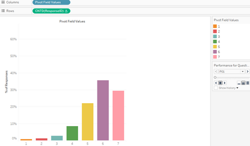
We use stack bars to show the importance, and filter by page for performance to compare individual questions to the importance. |
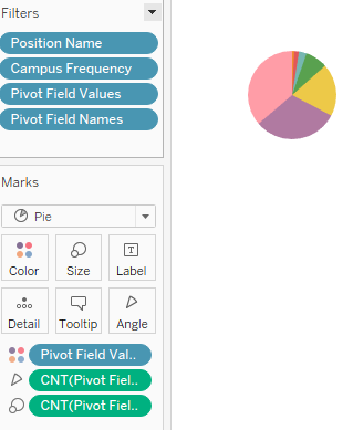
| 17 | EDA | We do a simple pie chart to see how the performance was overall. |
| 18 | EDA | Next, we visualize the NPS in two forms, bar chart and pie chart. We use the calculated NPS field found earlier.
We show mark labels for the pie chart |
| 19 | EDA | We show the same suggestions as before, except we show it for postgraduates rather than undergraduates. |
| 20 | EDA | Now, we will be looking at Faculty.
We want to explore Library Preference, Study Area, Year Breakdown, whether they are International or not, Frequency of visiting the library and campus, likeliness to recommend library services, their opinions on the survey questions and comments. As before, we remove null values by filtering them out. This time, we use histograms and box plots to visualize the faculty’s study area, library preference and frequency to recommend library services. For these visualizations and those in Staff the techniques we will use are similar to those used above, just that we take a different approach in how we view them (i.e attributes chosen and small details in visualization). |
Visualizations and Insights
Undergraduate
| Number | Visualization |
|---|---|
| 1 |
We can see that in all Schools except for Law, the Li Ka Shing Library is used far more, with the Law Library taking up approximately only 10% of the total for the other Schools. This may suggest that there is space in the law library that is not being used, and that should there be too many people in the Li Ka Shing, the school can push students to make use of the additional space in the Law Library. |
| 2 | We can see that it does not appear to be the case the international students are not aware of either library. The proportion of international and local students going to either library appears to be similar. |
| 3 | We can see that most undergraduates come to school daily, while some go weekly. This is to be expected as many of them are taking modules spread out over several days. For those who go once a week, they may be schooling part time while they work, or putting all modules on a single day. This information is more useful once we contrast it to library frequency. |
| 4 |
We can see that Library Frequency wise, most either visit Daily or Weekly. Interestingly, a substantial percentage of approximately 15% go monthly or quarterly. This may be due it being the exam period or finals period. As such, we could hypothesize that during such crunch times, we can expect around a 15% increase in library population for undergraduates. Of course, time-series data will have to be provided to see when this uptick happens, or if it is spread out. |
| 5 |
We can see that majority of undergraduate students are likely to recommend Li Ka Shing. |
| 6 |
We can see that this is the case as well for Kwa Geok Choo, with fewer outliers in the 0,1 and 2 categories. |
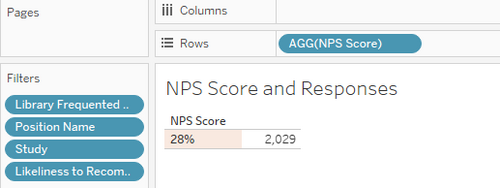
| 7 | We can tell that there is an NPS score of 28% over 2029 responses. Based on global NPS standards, this is a “good” score. |
| 8 | Here we can see, three surveyed factors that seem the most important for undergraduates would be I14, I18, and I19. |
| 9 |
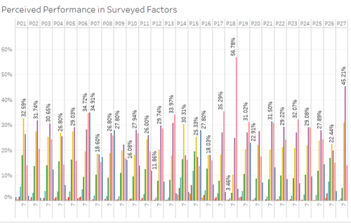
Here we can see, the surveyed factor that appears to have performed the best for undergraduates would be P18, wireless access. This is something the library is doing well that is also perceived by undergraduates as important. Furthermore, of note is also that for P27, overall satisfaction with the library, a lot give a 6, indicating very good performance, yet not the best. It is important for us to uncover what potentially is causing the mode of the overall perception of the library to drop from a 7 to 6. |
| 10 |
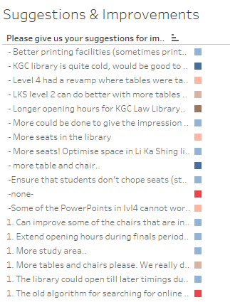
This gives us a view of some examples of suggestions. For example, from here we can see that a law student wishes for longer opening hours in the Law Library. |
Postgraduate
| Number | Visualization |
|---|---|
| 1 |
We can see that in general, the frequency of coming to campus is similar between Doctoral and Masters students. |
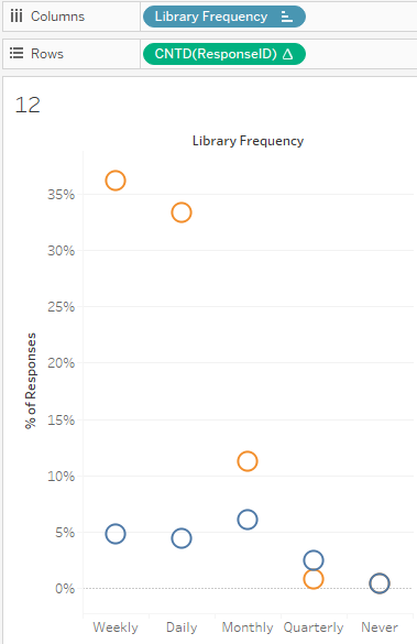
| 2 |
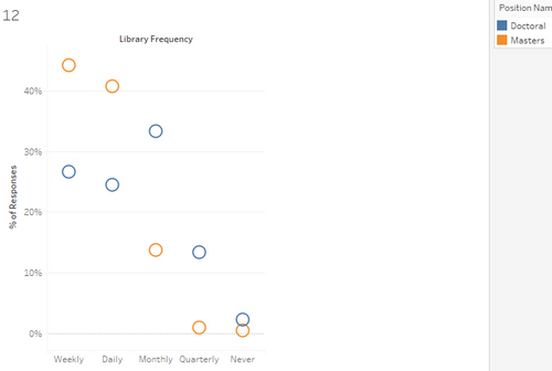
We can see that there is some difference in the frequency in library visits. An interesting trend is that Doctoral students seem to go to the library Monthly or Quarterly, versus Masters students, who go more Weekly and Daily. This may be due to the different nature of their studies. |
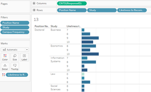
| 3 |
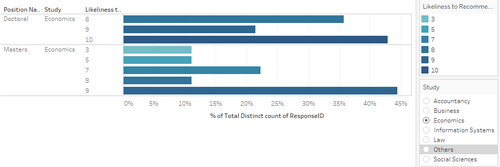
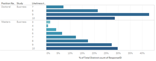
Here, we can see that in general, Masters Business students are less happy with the libraries than Doctoral students. |
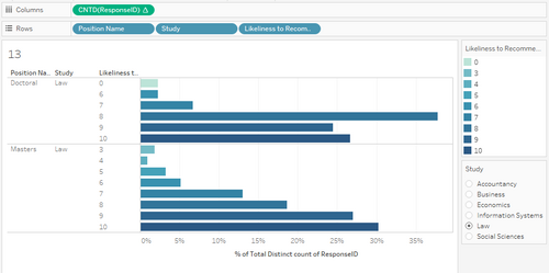
| 4 |
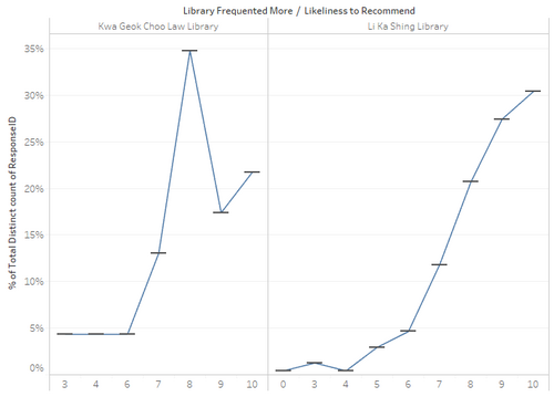
We can see that there is a peak for the Law library at a score of 8, while for Li Ka Shing, the peak is 10. |
| 5 |
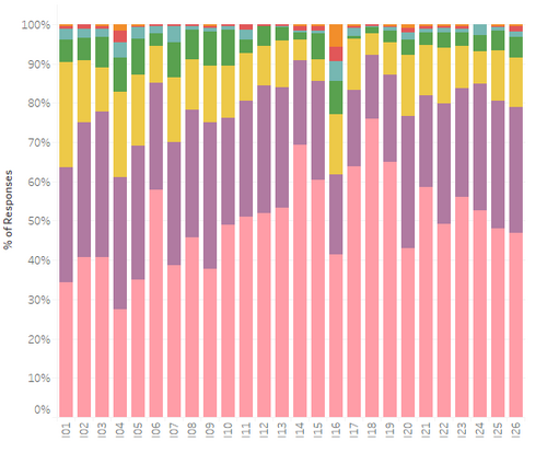
We can see that I18 has the highest proportion of full (7) scores. This is congruent with what we saw with the undergraduates. |
| 6 |
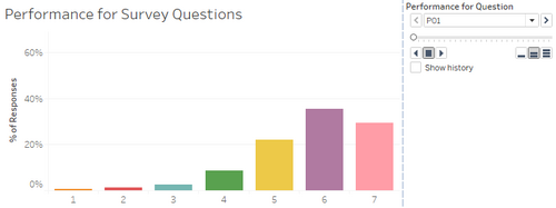
Looking at P01, we can see that most are informed about services. However, a few responders appear not to be, which is crucial as they may not be able to fully take advantage of services the library offers. |
| 7 |
Here we can see that majority of post graduate students score a 7 or 6 for performance. |
| 8 |
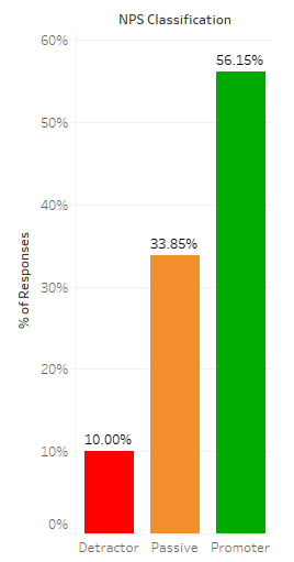
We can see the distribution of promoters and detractors. It is clear that for postgraduates, we have much more promoters than detractors. |
| 9 |
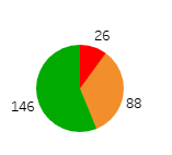
Here, we can see the breakdown by numbers. It is evident that the sample size for postgraduates is relatively smaller, but still substantial. |
| 10 | We can gain some insight by looking at this, for example, we can tell that postgraduates face similar issues with lack of seating, but we also can see some graduate specific complaints such as about the air-conditioning at the graduate lounge. |
Faculty
| Number | Visualization |
|---|---|
| 1 |
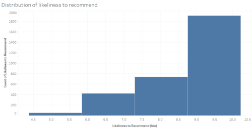
From the histogram we can see that the majority of Faculty are highly likely to recommend the library, and that this is an increasing trend over each bin. |
| 2 |
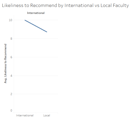
We can see that international faculty are more likely to recommend the library. This may be due to goodwill coming in from a foreign place, or because they have a basis of comparison, having more likely had experience in other university's libraries overseas. |
| 3 |
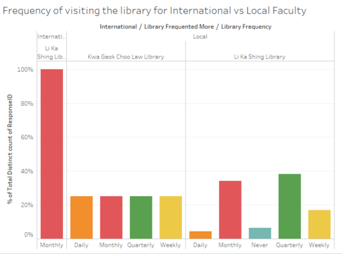
We can see that internationally, faculty all only visit Li Ka Shing. This may be due to sample bias, where there are not many international faculty surveyed. However, for local faculty, it is interesting that those who frequent the Law library seem to have a large variance in where they go. While those going to the Li Ka Shing library don't. This may indicate that non-law faculty visit the library less, while law faculty vary in how often they go to the library. |
| 4 |
We can see from this that the two biggest boxes are daily campus and either monthly or quarterly library frequency. Most faculty come to campus daily but only go to the library monthly or quarterly. As such, it is likely much of active faculty display infrequent library use. |
| 5 |
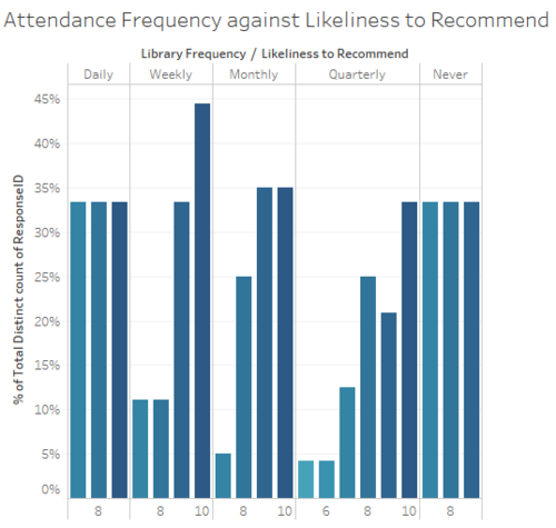
We can see that for those faculty who only come quarterly, they are the least likely to recommend the library they visit. On the other hand, those who come weekly seem to have the largest variance in how likely they are to recommend the library. |
| 6 |
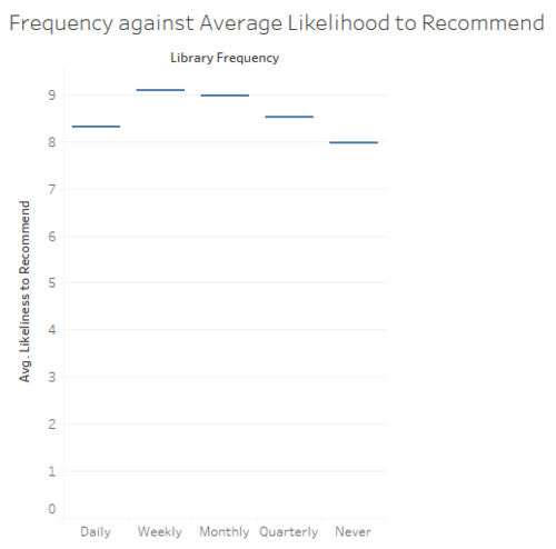
We can see that in general, the less frequently they visit the library, the less likely they are to recommend it. However, interestingly, this doesn't apply if they come daily. |
| 7 |
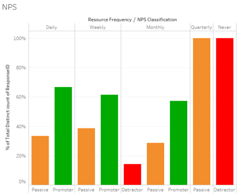
We can see that in general, the more they use the library's resources, the more likely they are to be a promoter, versus a passive or detractor. This is important as it may indicate the value of the library's resources to faculty. |
| 8 |
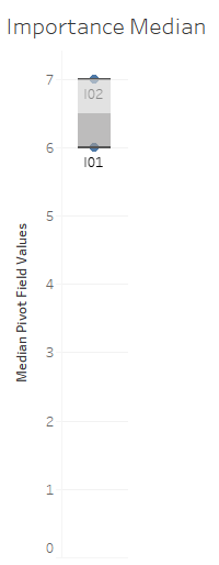
Here we can see that there is little variance in the median performance, with it varying between 5 and 7. There are no outliers but it appears for I01, the importance of being informed about web services, faculty feel it is less important relative to the other factors, while for I02, that the library website provides useful information, faculty feel that it is more important than other factors. This potentially is because faculty rely more on the library website to do their research, using library databases. |
| 9 |
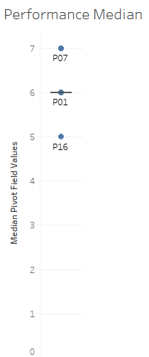
Here, we can see that there is hardly any variance, with zero area to the boxplot. We have outliers, P07 and P16, which are books and articles being delivered promptly and the computer being available when needed. P07 is doing better than the others, which indicates that the library is doing a good job getting the required references for faculty, however, P16 being a negative outlier means that during crunch time, faculty may not have as much access to the library computers as they may need. This could be something the library looks into. |
| 10 |
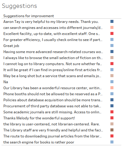
Looking at suggestions from faculty, we see that several mention library staff by name. This underscores the importance of having well trained and efficient staff on hand as it seems to contribute greatly to the overall experience. We also see several suggestions regarding access to academic resources. The library could aim to be more comprehensive in having these resources available, and seek means to acquire them. |
Staff
| Number | Visualization |
|---|---|
| 1 |
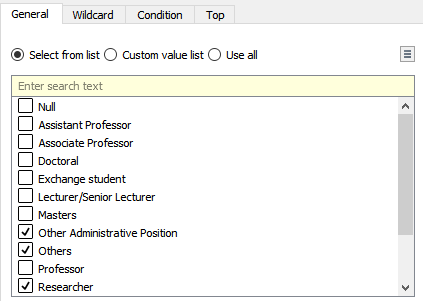
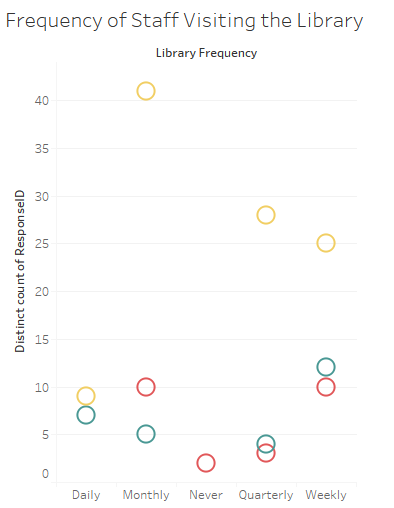
Through the legend (not shown but shows that Other administrators are yellow, Others are green and researchers are red), we can see that in general, researchers and other tend not to go the libraries often, but administrators do in comparison. |
| 2 |
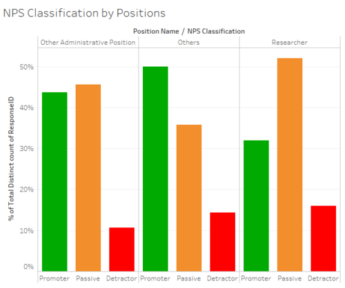
We can see that comparatively, researchers are the most critical of the staff. There are both more detractors and passives. |
| 3 |
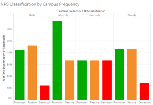
Interestingly, it seems that those who go to the library monthly have a far higher proportion of promoters as compared to other frequencies. This may indicate that those who use the library more frequently encounter issues that the user who seldom goes doesn't. |
| 4 |
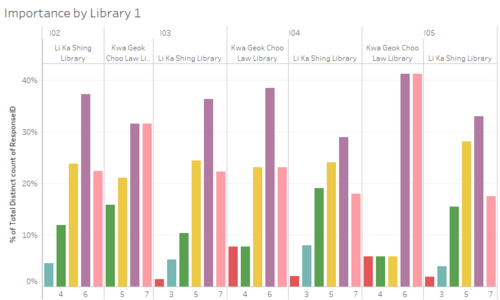
Zooming into 5 specific survey questions, I01 to I05, which are measures of importance, we find that I05, which is the anticipation of learning and research needs seems far more important for those who use the Law library more often. This may be due to Law staff having higher research needs, among other reasons. |
| 5 |
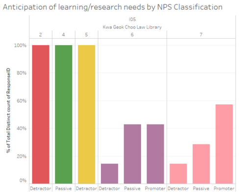
Zooming into I05, we find that those who viewed the anticipation of learning and research needs more important in the Law library seemed to have a have proportion of promoters. This may indicate that the Law library does address learning and research needs. |
| 6 |
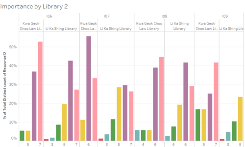
Zooming into the next few survey questions, I06 to I10, we see that I07 is one factor that doesn't seem as important as the others. That books and articles are delivered promptly not being as important as other factors may be due to the increasing digitization of the library. As the library gets more and more databases and books online, this factor will only continue to decrease in importance. |
| 7 |
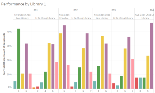
Now, looking at the first 5 performance measures, we can tell that P01, performance on whether the library informed them about the services, is a clear outlier, getting a much lower score than the rest. This may be due to it not being part of staff's on-boarding, and the library could take measures to ensure that all staff that use the library learn about the services available to them, through an e-learn-type method or other means. |
| 8 |
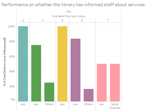
Looking at P01, and splitting by area of study, we can tell that those who answered this question either came from Law, Social Science or others. Although we do not have sufficient data to say this conclusively, we can see that social science staff seem to be more informed about such services. |
| 9 |
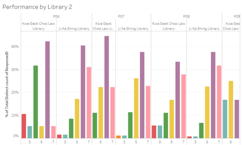
Finally, we look at the next 5 performance measures, where we can see P06 in the law library seems a little different from the rest. Perhaps staff from the law would like opening hours to be extended more, and the 24 hour services for some reason do not meet their needs. |
| 10 |
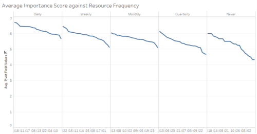
Looking at average importance score against resource frequency, we can see that in general, staff who use resources more tend to place greater importance on the measures measured by the survey across the board. |
Project URL
https://public.tableau.com/profile/cerulean.koh.shiliang#!/vizhome/MidTerm_15842782941690/HomePage


