SMU Library Survey
Background
Every two years, SMU Libraries conduct a comprehensive survey in which faculty, students and staff have the opportunity to rate various aspects of SMU library's services. The survey provides SMU libraries with input to help enhance existing services and to anticipate emerging needs of SMU faculty, students and staff.
Objectives
With the feedback obtain from the survey, I am tasked to utilize visual analytics approach to reveal the level of services provided by SMU libraries as perceived by:
- the undergraduate students,
- the postgraduate students,
- the faculty,
- the staff.
Summarising Data Set & Planning for Visualisation
The Dataset being used in this visualisation is from SMU Library: 2018 Survey Results. Can be found here
| Dashboard
|
Purpose
|
Variable Require
|
Measurement
|
| Overview
|
This will be the home dashboard of the visualisation which summarise the entire processed data. It is interactive as viewer able to toggle filtering simply by selecting the field. This include:
- Total number of respondents and the background of the respondents
- Total respondents reponding to Li Ka Shing and Kwa Geok Choo Law Libraries respectively
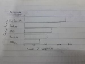
- Total respondents from different position such as Undergraduate/ Graduate / Staff/ Faculty
- Total respondents from different study area such as Accountancy/ Business/ Economics
|
StudyArea, ResponseID, Position
|
Number of respondents
|
| Importance VS Performance
|
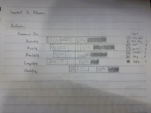
This dashboard will provide an overview of respondents' response to libraries service. Rating their importancy and performance for different aspect. Presenting 1 being the lowest to 7 the highest. This will be a interactive interface where viewer able to toggle filtering to narrow down the details such as filtering through which library, which study area and their group position
|
Assessment Item, Score, HowOftenL, HowOftenW
|
Distribution of score rating 1 - 7, Number of respondents
|
| Summary
|
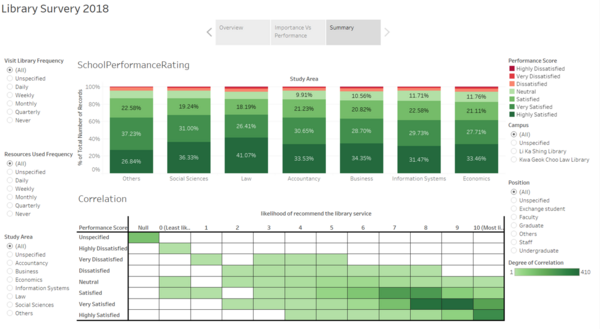
This dashboard will provide an summary of the analysed data where viewer able to compare satisfactory between study area to on the general scale. This could acts as a medium for library to target specific study area to cater to their needs. It also allow viewer to see respondents relationship towards recommending to others based on their overall satisfactory
|
StudyArea, Number of Records, likelihood of recommend the library service to others
|
- Satisfactory difference between study area
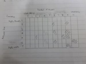
- Correlation between people who are satisfied and people who likely to recommend to others
|
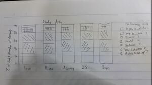
Hand-drawn visualisation
Overview
Chart1:
Chart2:
Importance vs Performance
For performance and important (chart 3&4):
Summary
Chart 5:
Chart 6:
Data preparation
| Screenshot
|
Steps Taken
|
|

|
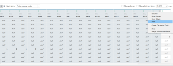
Data Preparation: Hiding
- Hide column NA1-NA26 and comment by right clicking and select hide
|
|
|
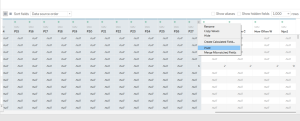
Data Preparation: Pivot
- Select column from I01-P27
- Right click and select pivot
|
|
|
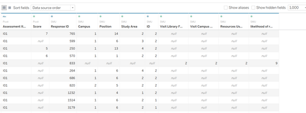
Data Preparation: Renaming
Rename the column heading:
- 'Pivot Field Names' to 'Assessment Item'
- 'Pivot Field Values' to 'Score'
- 'How Often L' to 'Visit Library Frequency'
- 'How Often C' to 'Visit Campus Frequency'
- 'How Often W' to 'Resources Used Frequency'
- 'Nps1' to 'likelihood of recommend the library service'
|
|
|
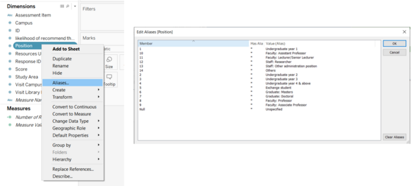
Edit Alias for fields
- Right click the attribute
- Select Aliases
- Change the value(Alias)
- Change for Position, Study Area,Campus, Frequency
|
|
|
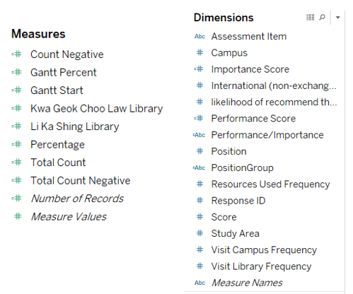
New calculated field and set
- Gannt percent, Gannt start, count negative, total count negative, percentage, total count for creating divergent chart in Important Vs Performance Dashboard.
- Kwa Geok Choo Law Library & Li Ka Shing Library for creating pyramid chart in Overview Dashboard.
- Performance Score and Important Score were use for Important Vs Performance Dashboard to show the meaning of the legend
- PositionGroup were use to group position together for filtering and for Overview Dashboard.
|
Interactive Visualization
The interactive visualization can be accessed
here:https://public.tableau.com/profile/neo.tee.yong#!/vizhome/assignment3_15842852167560/LibrarySurvery2018
Overview Dashboard
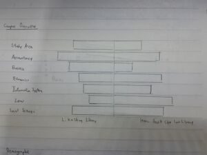
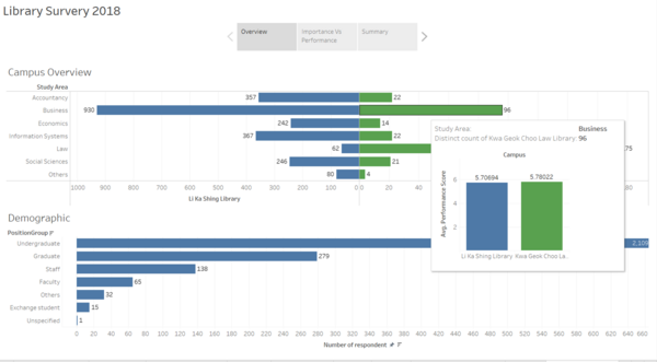
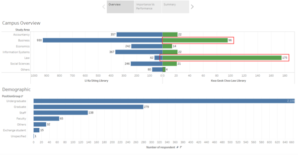
Overview dashboard.This dashboard depicts a pyramid chart with Kwa Geok Choo Law and Li Ka Shing Libraries with the number of respondents in each study area. It also shows the demographic of the respondents. The interactivity allows user to examine the no. of respondents from KGC Law and LKS libraries in each study area and also in demographic of people in each study area
Library Importance vs Performance
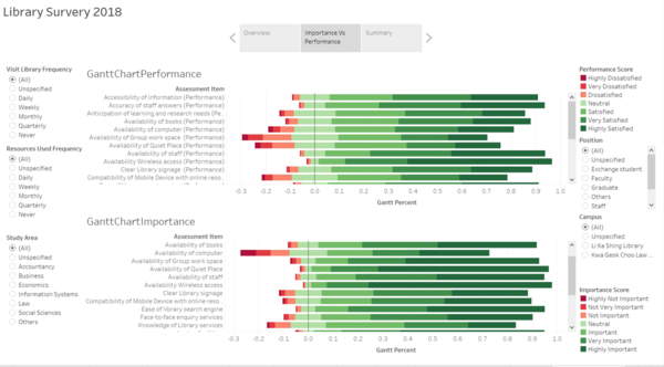
Library Importance vs Performance dashboard. This dashboard shows a divergent chart (Library Performance) as the main visualisation of both important and performance of each different aspect. The interactive of the filter button allows users to narrow the search to get the information easily.
Summary
Summary dashboard. This dashboard shows a stacked bar graph of each study area rating the performance of the libraries. It also have a Correlation matrix table that allows users to see the degree of correlation between the rating given to the performance against the likelihood of them recommending to others. The interactive of the filter button allows users to narrow the search to get the information easily.
Findings
Insights
| S/N
|
screen shot
|
Insight and Significance
|
| 1
|
|
Overview
Based on the pyramid chart, we can learnt that there is high respondents from business and law that go to Kwa Geok Choo Library as compared to other study area. We also can see that there afew repondents from law will go Li Ka Shing Library. This could because that Kwa Geok Choo Library is nearer to their study area and respondents preferred to go nearer libraries than travelling to a further library
|
| 2
|
|
- 328 undergraduates from accountancy show a 2% higher highly satisfied as compare to highly important in service delivery segment, differentiating this category of undergraduate from the rest.
|
| 3
|
|
- 22 law undergraduate that visit library and uses the resources daily has 7% highly satisfied performance than highly importance in the communication segment. Communication segment had performed fairly well in this set of filter.
|
| 4
|
|
- 229 Undergraduate that visit the library monthly has 3% highly satisfied performance than highly importance in the service delivery segment. Therefore, from previous insight, SMU Library could conduct a more detail interview with undergraduate from accountancy that visit the library monthly about the strength of delivery service quality and make improvement.
|
| 5
|
|
- 229 Undergraduate that visit the library monthly has 3% highly satisfied performance than highly importance in the service delivery segment. Therefore, from previous insight, SMU Library could conduct a more detail interview with undergraduate from accountancy that visit the library monthly about the strength of delivery service quality and make improvement.
|
Reference
<ref>https://www.datarevelations.com/resources/visualizing-net-promoter-score-data/<ref>
<ref>https://www.datarevelations.com/resources/rethinkingdivergent/<ref>
<ref>https://www.datarevelations.com/resources/got-likert-data-neutrals/<ref>
<ref>https://blog.hubspot.com/service/how-to-calculate-nps<ref>
<ref>https://www.udemy.com/course/tableau10-advanced/<ref>
Prof week 6 class exercise on divergent chart
