IS428 AY2019-20T2 Assign GUO LINGXING
Contents
Problem & Motivation
SMU Libraries conduct a comprehensive survey in which faculty, students and staff have the opportunity to rate various aspects of SMU library's services. The survey provides SMU libraries with input to help enhance existing services and to anticipate emerging needs of SMU faculty, students and staff. However, despite all the efforts in developing the surveys, the past reports were too primitive and difficult to gather high-level insights. Hence a more interactive dashboard visualisation is needed to help the management to understand how well the library has been serving the SMU community.
We will be using visual analytics approach to reveal the level of services provided by SMU libraries as perceived by:
- the undergraduate students,
- the postgraduate students,
- the faculty,
- the staff.
Dataset Analysis & Transformation Process
This section will elaborate on the dataset analysis and transformation process for each dataset in order to prepare the data for import and analysis on interactive visualization. There's one excel file provided which contains 2 sheets:
- Sheet 1: SMU
- Sheet 2: Legend
SMU sheet contains all the data that were recorded in 2018. Legend Sheet contains all the legends for all the values in each column in the SMU sheet. Generally, we can breakdown the dataset into 2 broad categories, Respondent Characteristic categories, Question categories.
For Respondent Characteristic' categories we have:
- Campus
- StudyArea
- Position
- Response ID
For Question categories, we can further break it down into 4 different categories:
- Importance and Performance Question*, which consists of 4 categories (5 for performance):
- Communication
- Service Delivery
- Facilities and Equipment
- Information Resources
- Overall Satisfaction (Only applicable to performance)
- Frequency of the Library Resource Usage Question*, which contains questions that query the respondents the number of usage/access towards library resources.
- Is the service applicable to the surveyee (NA) Question*, which questions the respondents if the services in importance/performance are applicable to them.
- Net Promoter Score (NPS) Question
Fixing the "Fat and short" data table problem
The datasheet (SMU) is challenging to interpret for both human eyes and machine to process. Therefore, we need to preprocess and massage the data before we design and visual.
Issue: Dataset is "fat and short", in other words, not machine friendly. As the raw data have not been processed the two broad categories, respondent characteristics and question category, are not properly segregated; bad data structure to feed into the machine for analytics. Therefore, the records will be unmanageable for the machine to process and create challenges for us as we are developing the visuals. Hence, we need to slim it down (reshape) into "tall and long" data structure so that we can do proper calculations within our analytic tools.
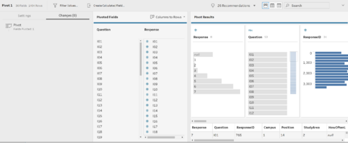
Solution: Pivot and Pivot. Since we need certain fields to help us to identify our records, we will not touch the respondent characteristics fields and keep it as it is for now. However, we need to do some processing with the question categories using Tableau Prep Builder.
- Upload the data into Tableau Prep Builder, remove fields that we will not be working on.
- Pivot the columns that belong to the 3 question categories we have identified earlier (Question category with *).
- We will pivot the fields that fall under Importance and Performance (inclusive of p27).
- Create a new step in tableau prep for the remaining question categories, except NPS question as it only has a single field. (Single fields are not required to pivot.)
- Save the flow and output the processed result and the data will be ready for tableau!
Further data cleaning
In the previous steps, we have done the basic cleaning and processing. Before we proceed further, we need to identify and filter out only relevant records. To achieve this, we need to establish the relationships between our features and create necessary calculated fields.
Issue: Dimensions are in the raw form and has no much meaning/relationship. More high-level dimensions are needed.
Solution: Make use of calculated fields to create high-level dimensions and group relevant data records for better manipulations.
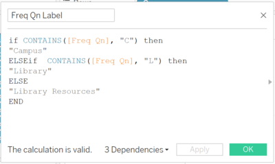
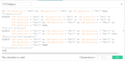
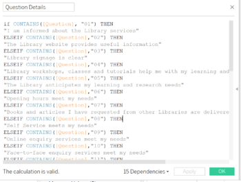
- Generate labels (alias) for the dimensions using calculated fields to create label (meaning) for the data.
- Use Calculated fields to form relationship between data.
- Repeat these steps until we are able to establish a hierarchy of the relationship among the data we identified in section 1 (Question categories)
- Once all the necessary dimensions are established, we will need to filter data that is not within our interest before we build our visual dashboards. We can do so by utilising the combinations of the filter and set functions in Tableau to filtered records that are NULL after our previous steps from our display/future calculation.
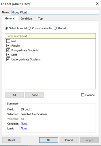
- Previously, we created a calculated field to categorise the respondents from positions (e.g.Year 1 student) into user group category (e.g. Undergraduate Student). As a result, there will be a NULL label for those positions that did not get categorized in our define calculated field. Therefore, we will want to exclude these records from our future calculations. To achieve this, we can create a Set to define the values of interest within the dimension.
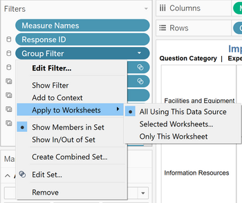
- Once we created the set, place it into the filters shelf and set the set filter to apply to all worksheets. This will help us to ensure our calculation's consistency throughout our worksheets and dashboards.
- Repeat the previous steps for all the necessary dimensions that we can keep it consistent throughout dashboards. Besides, we can also make use of the "apply to selected worksheets" option if we wish to keep constant records for certain worksheets/dashboard only.
Interactive Visualization
The interactive visualization can be accessed here: https://public.tableau.com/profile/lingxing7291#!/vizhome/SMUSurveyDashboard2018/HomePage?publish=yes
There were several considerations exercised while designing the visual dashboard to ensure a nice balance between functionality and usability for our users. Below are some of the implementations to make the dashboard user-friendly, and at the same time, provide high-grade functionalities that empower users for in-depth analysis.
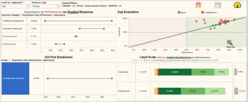
Dashboard: Service Importance vs Service Performance
- Multiple filters can be applied at the same time!
| Bubble | Purpose | Description |
|---|---|---|
| 1 | Filter | Segments the surveyee into 2 collections: Those that are aware of the service library offers and those who consider the services as not applicable to them. Selecting all will display the whole valid respondent records. Changing the values will filter the data used for the remaining calculation for the charts in the dashboard. |
| 2 | Filter | Segments the surveyee into 3 collections: those responses that are positive (5 to 7 in scale), negative (1 to 3 in scale) and neutral (4 in scale). Changing the values will filter the data used for the remaining calculation for the charts in the dashboard. |
| 3 | Status board | Its purpose is to display all the filters applied so that users can make immediate reference to what the visuals are displaying. |
| 4 | Navigation bar | Allow users to access to different dashboards for analysis. |
| 5 | Interactive chart with filtering functions | By clicking on the fields within the table, the dashboard will change to visual of the selected Question Category. |
| 6 | Gap evaluation chart with filtering functions | Each circle represents the performance gap of a survey question. The circles are clickable and it works as a question filter. When selected, the dashboard will change to visual of the respective Question. The red star beside the magnifying glass is a navigation button that directs users to another dashboard. When clicked, it will bring the user to a zoom-in version of the chart as I understand that due to the inadequate space, the charts and shapes are compact and a little difficult for users to select the desire question. Hence, a larger dashboard that will help the users to overcome these struggles. |
| 7 | Interactive chart with filtering functions | By clicking on the fields within the table, the dashboard will change to visual of the selected User Group. |
| 8 | Legend for the Likert scale chart | Its purpose is to overcome the space constrain challenge. |
| 9 | User tips | This line serves as a short user manual for the dashboard in handling the dashboard. |
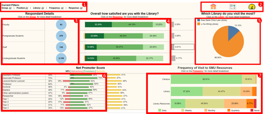
Dashboard: Satisfaction Analysis
- Multiple filters can be applied at the same time!
| Bubble | Purpose | Description |
|---|---|---|
| 1 | Status board | Its purpose is to display all the filters applied so that users can make immediate reference to what the visuals are displaying. |
| 2 | Navigation bar | Allow users to switch between dashboards for different analysis. |
| 3 | Interactive chart with filtering functions | By clicking on the fields within the table, the dashboard will change to visual of the selected User group. |
| 4 | Interactive chart with filtering functions | By clicking on the fields within the table, the dashboard will change to visual of the selected Reponse within the respective User group . |
| 5 | Interactive chart with filtering functions | By clicking on the fields within the table, the dashboard will change to visual of the selected Library. |
| 6 | Interactive chart with filtering functions | By clicking on the fields within the table, the dashboard will change to visual of the selected NPS role (Dectractor/Promoter) in Position. |
| 7 | Interactive chart with filtering functions | By clicking on the fields within the table, the dashboard will change to visual of the selected Frequency. |
Analysis & Insights
Using the dashboard as a platform for investigation and analysis, we wish to help the SMU library managements to find out service satisfaction across the different user groups.
Undergraduate Students
Undergraduate students formed the largest user respondent group in the 2018 SMU Library service survey (81.52%). Among this group of library users, LKS library is the most patronized library.
Insights & Discovery 1:

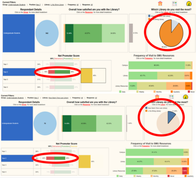
Based on our visual dashboard, we can see that from Year 1 students to Year 4 students, there's a decreasing trend in the visits to the SMU libraries and an increasing trend in usage of library resources such as online articles, databases, ebooks. This can help our Library managements to adjust and better utilize their resources while planning for library development. Also, there is a spike in Year 2's detractors and a decrease in the number of Promoters. Upon digging further, we realised that the main unhappiness comes from undergraduate students that visited the SMU law library.
Insights & Discovery 2:
Among the undergraduate students who visit the Law library the most, students from Law school has the highest level of dissatisfaction and will go around the bad mouth of the library.
Insights & Discovery 3:
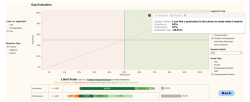
From the dashboard above, out of the 4 service categories the SMU library provides, 3 of the categories failed to meet the expectation. The facilities and equipment have the greatest service gap which SMU library needs to work on while the students are satisfied with the Service and Delivery SMU library offers.
The main reason why undergraduate students are feeling inadequate performance is due to the overcrowding library space. This finding proposes that our library need to enforce in the seat hogging policy to ensure the students can find seats for their group project.
Interestingly, the SMU Library provides plenty of computers for the students but the importance of having computers in the library is relatively low (SMU student will have their laptop most of the time). This then suggests that the library can better utilize the space by reducing the number of computers to provide more space for group work as the students set higher importance in having space over the computers.
In addition, due to the overcrowding issue in library space, the response from the undergraduate student for quiet ambient is alarming.
Insights & Discovery 4:
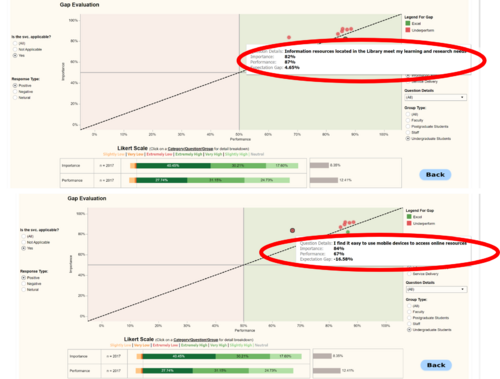
For Information Resources, Undergraduate students are very satisfied with the resources located within the library to meet their learning needs. However, there are serval complaints regarding online information resources when the student wishes to access the resources outside of the library (virtually). The mobile version of library resources performed poorly (-16.58% in performance gap). Most, if not all, of the services in red circles are related to online resources. This finding suggests that our library need to slow down the effort in bringing in more physical resources to the library and allocate more resources into developing the e-library (online) environment.
Postgraduate Students
Faculty
Staff
Reference
In the completion of the analysis, the following references have been extremely useful:

