IS428 AY2019-20T2 Assign GUO LINGXING
Contents
Problem & Motivation
SMU Libraries conduct a comprehensive survey in which faculty, students and staff have the opportunity to rate various aspects of SMU library's services. The survey provides SMU libraries with input to help enhance existing services and to anticipate emerging needs of SMU faculty, students and staff. However, despite all the efforts in developing the surveys, the past reports were too primitive and difficult to gather high-level insights. Hence a more interactive dashboard visualisation is needed to help the management to understand how well the library has been serving the SMU community.
We will be using visual analytics approach to reveal the level of services provided by SMU libraries as perceived by:
- the undergraduate students,
- the postgraduate students,
- the faculty,
- the staff.
Dataset Analysis & Transformation Process
This section will elaborate on the dataset analysis and transformation process for each dataset in order to prepare the data for import and analysis on interactive visualization. There's one excel file provided which contains 2 sheets:
- Sheet1: SMU
- Sheet2: Legend
SMU sheet contains all the data that were recorded in 2018. Legend Sheet contains all the legends for all the values in each column in the SMU sheet.
Generally, we can breakdown the dataset into 2 broad categories, Respondent Characteristic categories, Question categories. For Respondent Characteristic we have:
- Campus
- StudyArea
- Position
- Response ID
For Question categories, we can further break it down into 4 different categories:
- Importance and Performance Question*, which consists of 4 categories (5 for performance):
- Communication
- Service Delivery
- Facilities and Equipment
- Information Resources
- Overall Satisfaction (Only applicable to performance)
- Frequency of the Library Resource Usage Question*, which contains questions that query the respondents the number of usage/access towards library resources.
- Is the service applicable to the surveyee (NA) Question *, which questions the respondents if the services in importance/performance are applicable to them.
- Net Promoter Score (NPS) Question
Fixing the "Fat and short" Data table problem
The datasheet (SMU) is challenging to interpret for both human eyes and machine to process. Therefore, we need to preprocess and massage the data before we design and visual.
Issue: Dataset is "fat and short", in other words, not machine friendly. As the raw data have not been processed the two broad categories, respondent characteristics and question category, are not properly segregated and this will confuse the analytics tools. Therefore, the records are difficult for the machine to process and for us to form proper visuals. Hence we need to slim it down to "tall and long" so that we can do proper calculations which tableau.
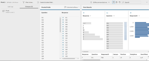
Solution: Pivot and Pivot. Since we need certain fields to help us to identify our records, we will not touch the respondent characteristics fields and keep it as it is for now. However, we need to do some processing with the question categories using Tableau Prep Builder.
- Upload the data into Tableau Prep Builder, remove fields that we will not be working on.
- Pivot the columns that belong to the 3 question categories we have identified earlier (Question category with *).
- We will pivot the fields that fall under Importance and Performance (inclusive of p27).
- Create a new step in tableau prep for the remaining question categories, except NPS question as it only has a single field. (Single fields are not required to pivot.)
- Save the flow and output the processed result and the data will be ready for tableau!
Further data cleaning
In the previous step, we have done the basic processing and in order for us to work on our data visuals, we need to identify and filter out only relevant records. To achieve this we need to establish the relationship between the features, create necessary calculated fields
Issue: Dimensions are in the raw form and has no much meaning/relationship. More high-level dimensions are needed.
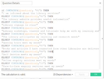
Solution: Make use of calculated fields to create high-level dimensions and group relevant data records for better manipulations.
- Generate labels (alias) for the dimensions using calculated fields to create label (meaning) for the data.
- Use Calculated fields to form relationship between data.
- Repeat these steps until we are able to establish a hierarchy of the relationship among the data we identified in section 1 (Question categories)
- Once all the necessary dimension is established, we will need to filter data that is not within our concerns before we develop our visual dashboards. We can make use of the filters and sets combination to achieve this so that certain records are nulls after our previous steps.
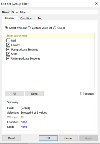
- For instance, create Set to define the values of interest. For example, we create a calculated field to categorise the respondents from positions (e.g.Year 1 student) into group category (e.g. Undergraduate Student), this we create a NULL label for those positions that did not get categorize such records are the ones we will want to eliminate from our future calculations.
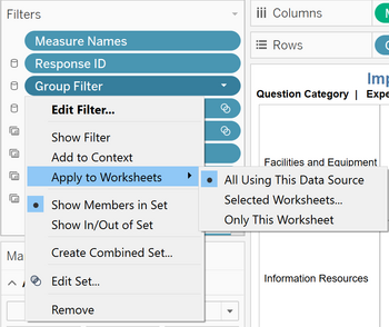
- Once we create a set, we can place the set into filters and ensure that the filter is applied to all worksheets using the data source. This will help us to ensure our calculation consistency throughout all of our dashboards.
- Repeat the previous steps for all the necessary dimensions that we want to keep constant in our dashboards, we can also make use of the apply to selected worksheets option if we wish to keep constant records for certain worksheets/dashboard only.
Interactive Visualization
The interactive visualization can be accessed here: https://public.tableau.com/profile/lingxing7291#!/vizhome/SMUSurveyDashboard2018/HomePage?publish=yes
| Technique | Purpose | Steps |
|---|---|---|
| Example | Example | Example |
| Example | Example | Example |
| Example | Example | Example |


