IS428 AY2019-20T2 Assign NG JUN HONG
Contents
Background
Every two years, SMU Libraries conduct a comprehensive survey in which faculty, students and staff have the opportunity to rate various aspects of SMU library's services. The survey provides SMU libraries with input to help enhance existing services and to anticipate emerging needs of SMU faculty, students and staff.
Objectives
With massive respondents' feedback obtain from the surveys. I am task to use visual analytics approach to reveal the levels of services provided by SMU libraries as perceived by the undergraduate students, postgraduate students, the faculty and the staff.
Summarising Data Set & Planning for Visualisation
| Dashboard | Purpose | Variables Require | Measurement |
|---|---|---|---|
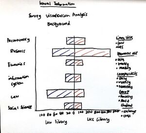
This will be the home dashboard of the visualisation, to summarise the general data of the survey. This include:
|
|||
Visualisation Building Process
|
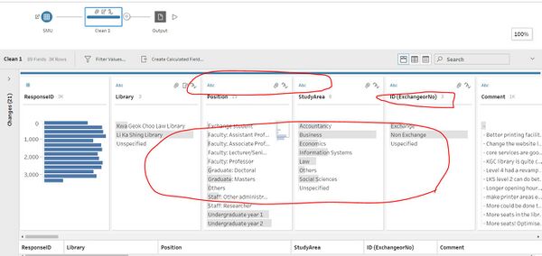
Data Preparation in Tableau Prep Builder | |
|
Data Preparation in Tableau Prep Builder
|
The interactive visualization can be accessed here:https://public.tableau.com/profile/lim.kim.yong#!/vizhome/VA_Assignment3_Final6/Home_Page
Overview Dashboard
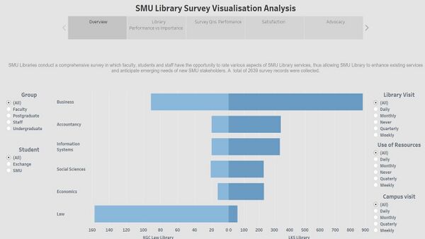
Overview dashboard.This dashboard depicts a pyramid chart with Kwa Geok Choo Law and Li Ka Shing Libraries. It indicates the no. of respondents with interactivities from group, library visit, use of resources, campus visit and student. Overview page allow user to examine the no. of respondents from KGC Law and LKS libraries with the mentioned interactivities.
Library Performance vs Importance
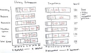
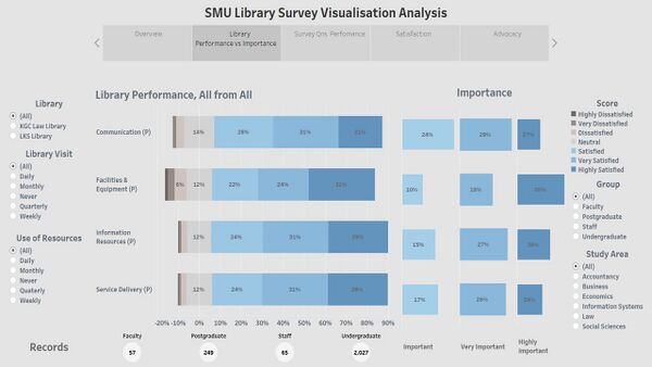
Library Performance vs Importance dashboard. This dashboard shows a divergent chart (Library Performance) as the main visualisation on how well the library performed in 4 of the areas – Communication, Facilities & Equipment, Information Resources and Service Delivery. The score metrics were replaced into 1 - Highly Dissatisfied, 2 – Very Dissatisfied, 3- Dissatisfied, 4 – Neutral, 5 – Satisfied, 6 – Very Satisfied, 7 – Highly Satisfied. Then an indication (Importance) shows percentage of respondents’ thoughts about the importance of the areas, by 5 – important, 6 – very important, 7 –highly important, matching the colour schemes of percentage responds in satisfied, very satisfied and highly satisfied. Lastly, another indication (records) defined the no. of respondents who answered the questions on each of the area. In conclusions, group, study area, library, library visit, use of resources filtering will be use in all dashboards as main indicators to identify patterns and anomalies. The creativity of this dashboard allows user to compare library performance in the 4 areas against respondents’ thoughts of how important each of the area is.
Survey Qns Performance
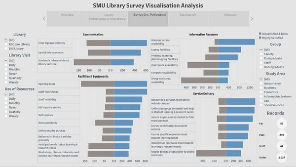
Survey Qns Performance dashboard. This dashboard shows 4 pyramid charts of each library performance areas – communication, facilities & equipment, information resources and service delivery. Moreover, it consists of all questions asked and responds. The responds are categorised into highly satisfied against dissatisfied & more (dissatisfied, very dissatisfied and highly dissatisfied). This dashboard aid user to identify specific areas to improve and maintain based on the 4 broader areas. Only highly satisfied score was measure and compare as that is what every business, in this case the library’s goal. Vice versa, to convert dissatisfaction segment to satisfaction.
Satisfaction
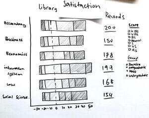
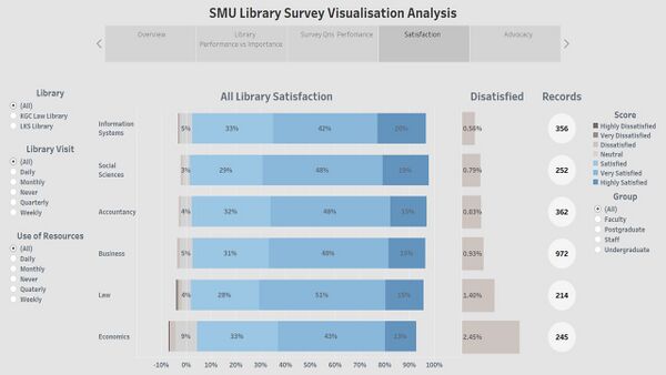
Satisfaction dashboard. This dashboard shows a divergent chart of respondents’ overall satisfaction by study areas with their respective records.
Advocacy
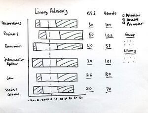
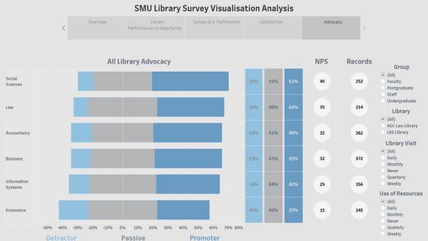
Advocacy dashboard.This dashboard presents a divergent chart of respondents’ library advocacy by study areas with their respective net promoter scores and records.
Undergraduate
| S/N | screen shot | Insight and Significance |
|---|---|---|
| picture | description | |
| picture | description | |
| picture | description |
