IS428 AY2019-20T2 Assign NG JUN HONG
Contents
Background
Every two years, SMU Libraries conduct a comprehensive survey in which faculty, students and staff have the opportunity to rate various aspects of SMU library's services. The survey provides SMU libraries with input to help enhance existing services and to anticipate emerging needs of SMU faculty, students and staff.
Objectives
With massive respondents' feedback obtain from the surveys. I am task to use visual analytics approach to reveal the levels of services provided by SMU libraries as perceived by the undergraduate students, postgraduate students, the faculty and the staff.
Summarising Data & Planning for Visualisation
| Dashboard | Purpose | Variables Require | Measurement |
|---|---|---|---|
This will be the home dashboard of the visualisation, to summarise the general data of the survey. This include:
|
|||
Visualisation Building Process
|
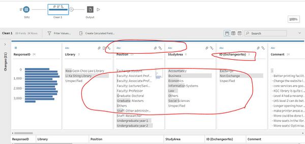
Data Preparation in Tableau Prep Builder | |
|
Data Preparation in Tableau Prep Builder
|
The interactive visualization can be accessed here:https://public.tableau.com/profile/lim.kim.yong#!/vizhome/VA_Assignment3_Final6/Home_Page
Overview Dashboard
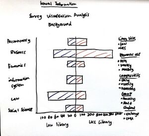
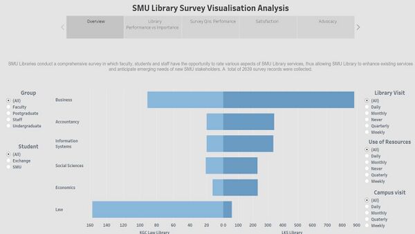
Overview dashboard.This dashboard depicts a pyramid chart with Kwa Geok Choo Law and Li Ka Shing Libraries. It indicates the no. of respondents with interactivities from group, library visit, use of resources, campus visit and student. Overview page allow user to examine the no. of respondents from KGC Law and LKS libraries with the mentioned interactivities.
Library Performance vs Importance
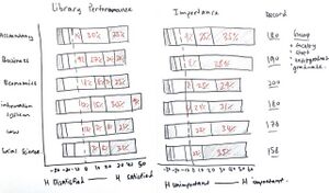
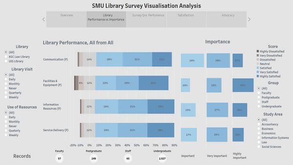
Library Performance vs Importance dashboard. This dashboard shows a divergent chart (Library Performance) as the main visualisation on how well the library performed in 4 of the areas – Communication, Facilities & Equipment, Information Resources and Service Delivery. The score metrics were replaced into 1 - Highly Dissatisfied, 2 – Very Dissatisfied, 3- Dissatisfied, 4 – Neutral, 5 – Satisfied, 6 – Very Satisfied, 7 – Highly Satisfied. Then an indication (Importance) shows percentage of respondents’ thoughts about the importance of the areas, by 5 – important, 6 – very important, 7 –highly important, matching the colour schemes of percentage responds in satisfied, very satisfied and highly satisfied. Lastly, another indication (records) defined the no. of respondents who answered the questions on each of the area. In conclusions, group, study area, library, library visit, use of resources filtering will be use in all dashboards as main indicators to identify patterns and anomalies. The creativity of this dashboard allows user to compare library performance in the 4 areas against respondents’ thoughts of how important each of the area is.
Survey Qns Performance
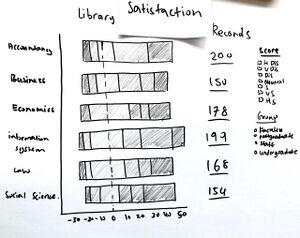
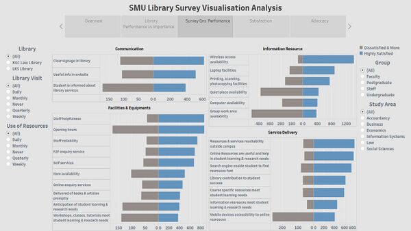
Survey Qns Performance dashboard. This dashboard shows 4 pyramid charts of each library performance areas – communication, facilities & equipment, information resources and service delivery. Moreover, it consists of all questions asked and responds. The responds are categorised into highly satisfied against dissatisfied & more (dissatisfied, very dissatisfied and highly dissatisfied). This dashboard aid user to identify specific areas to improve and maintain based on the 4 broader areas. Only highly satisfied score was measure and compare as that is what every business, in this case the library’s goal. Vice versa, to convert dissatisfaction segment to satisfaction.
Exhaust Fan Dashboard
The following shows the Exhaust Fan dashboard:
Chemical Dashboard
The following shows the Exhaust Fan dashboard:
Now that we have created all the necessary dashboard, we are ready to use it as a platform to conduct our exploration and analysis.
Findings from survey
| S/N | Interesting Pattern | Significance |
|---|---|---|
| On floor 1 and 2, the bathroom exhaust fan is turn on continuously throughout the whole day. However, on floor 3, the bathroom exhaust fan power is only consuming power between 7am to 10pm. | Through this pattern, we can see that floor 1 & floor 2 does not comply with the energy efficiency standards. Knowing that energy are non-renewable resources and will eventually run out. Adopting best practices to conserve energy not only helps to conserve resources but also translates into cost savings. | |
| In general, most energy usages were consumed within the corridor areas throughout all floors. | This is exceptionally bad for the company as the corridor spaces do not contribute greatly to employee's productive or efficiency. Furthermore, not only does it contributes to energy wastages, it causes the company to incur unnecessary costs. Therefore, management should come out with policies to curb such issue. | |
| The server room at Floor 3, Zone 9 has been constantly using a huge amount of energy. | It is not surprising that server room usually consumed the largest amount of equipment power.Management should know such situation and make necessary energy efficiency measures so that resources would be deployed properly. |
