Difference between revisions of "Group11 proposal V2"
| Line 191: | Line 191: | ||
<div style="font-size: 15px; padding-top: 15px; padding-bottom: 30px; padding-left: 15px; padding-right: 15px;"> | <div style="font-size: 15px; padding-top: 15px; padding-bottom: 30px; padding-left: 15px; padding-right: 15px;"> | ||
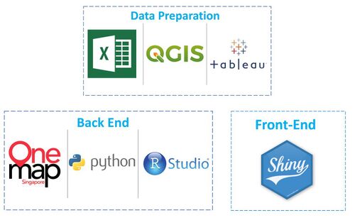
[[File:Technologies.jpg|frameless|500px|center|Our Current Timeline]] | [[File:Technologies.jpg|frameless|500px|center|Our Current Timeline]] | ||
| − | |||
| − | |||
| − | |||
| − | |||
| − | |||
| − | |||
| − | |||
| − | |||
| − | |||
| − | |||
| − | |||
| − | |||
| − | |||
| − | |||
| − | |||
| − | |||
| − | |||
| − | |||
| − | |||
| − | |||
| − | |||
| − | |||
| − | |||
| − | |||
| − | |||
| − | |||
| − | |||
</div> | </div> | ||
Revision as of 14:18, 27 March 2020
Contents
Problem
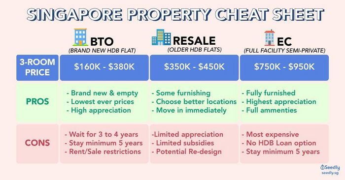
The above is an example of information online in helping Singaporeans decide the type of house they could choose from. In the context of this project, Resale HDBs is the focal point of our project. Choosing a resale HDB has never been easy as there are many factors to consider such as location, HDB type, number of remaining lease years, resale value, etc. On top of that, thousands of Resale HDBs transactions are happening each month, making it almost impossible for an owner to get a view of every transaction. Therefore, the majority of buyers and/or sellers have to consult property agents for their services.
However, there are times where the service of a property agent may not be satisfactory to the buyer and/or seller. It is still advisable for the buyer and/or seller to have a better understanding of the resale market before making an informed decision. In most cases, people tend to rely on multiple platforms to help them in understanding and predicting the market trend. On that note, our team would like to know whether the information provided to them is truly insightful or usable. Thus, WeHouse comes into play to provide greater insights for people to better understand the HDB resale market which can provide better aid in making more informed decisions.
Motivation
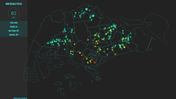
Given the abundance of information available on the internet in terms of resale prices, there are online resources provided to map out HDB locations and prices. However, such visualisations tend to be overwhelming due to vast data and non-specialised focus on visualisations. Throughout the course, we have learned how to discern between a good and bad visualised graph. This has allowed us to decide the usefulness of the charts displayed on various platforms. Therefore, instead of leaving people unsettled about the kind of housing choice to make, we are here to aid with our proposed visualisations! Coupled with the hands-on in-class sessions, we are able to reinforce what we learnt to play and explore re-organisation of the data to present an interactive dashboard, specifically pertaining to HDB dwellings, to empower users to make better-informed choices of their HDB location.
Objectives
In this project, we aim to deliver a focused and compact visualisation to allow Singaporeans to be well-informed of the average HDBs resale prices around their desired location.
- Overall changes in the flat prices over time for each subzone by estates.
- Price differences for each estate and subzone depending on the remaining lease of the flat.
- Find out which month sells at the highest and lowest resale price and transactions
- Specifically identify the most expensive street within each town area
Data Set(s) Used
Background Survey
| Example | Takeaways |
|---|---|
|
|
|
|
|
|
|
|
|
|
|
|
List of References
| No. | Reference Link |
|---|---|
|
1 |
Source: https://www.hdb.gov.sg/cs/infoweb/residential/buying-a-flat/resale/resale-statistics |
|
2. |
|
|
3. |
Source: https://www.srx.com.sg/heat-map |
|
4. |
Proposed Storyboard
| Dashboards | Rationale |
|---|---|
Dashboard 1:
|
|
|
Dashboard 2:
|
|
|
Dashboard 3:
|
|
Technologies Used
Team Milestones
Comments
| No. | Name | Comments |
|---|---|---|
|
1 |
Name |
Insert Comment Here |
|
2. |
Name |
Insert Comment Here |
|
3. |
Name |
Insert Comment Here |


