Difference between revisions of "Data Preparation"
| Line 7: | Line 7: | ||
=== Data Cleaning === | === Data Cleaning === | ||
| − | |||
{| class="wikitable" | {| class="wikitable" | ||
|- | |- | ||
| Line 13: | Line 12: | ||
|- | |- | ||
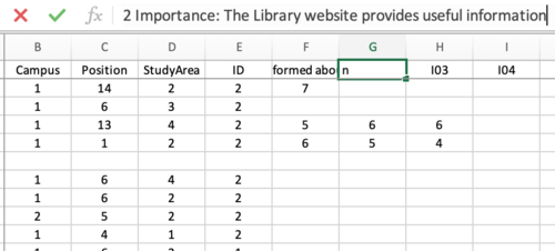
| The first data cleaning step is to clarify some of the questions because they are listed as codified letters and numbers. To do that, I hard coded the ID and written questions into the question’s tabs. This makes interpreting the visualization easier because the viewer can easily see what question and responses they are looking at when we see the different visualizations. || | | The first data cleaning step is to clarify some of the questions because they are listed as codified letters and numbers. To do that, I hard coded the ID and written questions into the question’s tabs. This makes interpreting the visualization easier because the viewer can easily see what question and responses they are looking at when we see the different visualizations. || | ||
| − | [[File:Screen Shot 2020-03-21 at 3.42.01 PM.png| | + | [[File:Screen Shot 2020-03-21 at 3.42.01 PM.png|500px|frameless|center]] |
|- | |- | ||
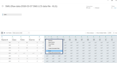
| − | | Next, to create the new visualization is to pivot the data so that the data is visualized by questions and not individual; response IDs. Doing this allows Tableau to interpret the data to showcase the survey results in the most meaningful way. To do this, we highlight the questions in Tableau and right click and select pivot so that the data is underneath one column. || [[File:Screen Shot 2020-03-21 at 3.49.41 PM.png| | + | | Next, to create the new visualization is to pivot the data so that the data is visualized by questions and not individual; response IDs. Doing this allows Tableau to interpret the data to showcase the survey results in the most meaningful way. To do this, we highlight the questions in Tableau and right click and select pivot so that the data is underneath one column. || [[File:Screen Shot 2020-03-21 at 3.49.41 PM.png|500px|frameless|center]] |
|- | |- | ||
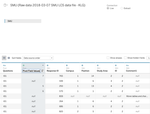
| Tableau names the new column with all of the questions "Pivot Field Names". To better represent what the actual column is showcasing, double click on the column header and rename it to "Pivot Field Values". || | | Tableau names the new column with all of the questions "Pivot Field Names". To better represent what the actual column is showcasing, double click on the column header and rename it to "Pivot Field Values". || | ||
| − | [[File:Screen Shot 2020-03-21 at 3.52.16 PM.png| | + | [[File:Screen Shot 2020-03-21 at 3.52.16 PM.png|500px|frameless|center]] |
|- | |- | ||
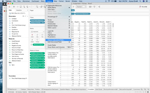
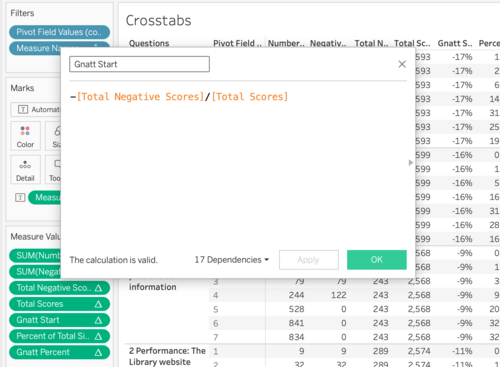
| Next, in order to create the visualizations and more specifically a stacked bar chart, a series of calculated fields need to be created in Tableau. To do this, click analysis and create calculated field. Then fill in the following titles and equations to build out the equations necessary to create a stacked bar chart in Tableau. | | Next, in order to create the visualizations and more specifically a stacked bar chart, a series of calculated fields need to be created in Tableau. To do this, click analysis and create calculated field. Then fill in the following titles and equations to build out the equations necessary to create a stacked bar chart in Tableau. | ||
| Line 30: | Line 29: | ||
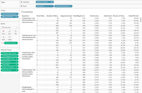
Then create a cross tab sheet in Tableau to ensure that the calculations are being done correctly. A correct cross tab is highlighted in the screenshots. | Then create a cross tab sheet in Tableau to ensure that the calculations are being done correctly. A correct cross tab is highlighted in the screenshots. | ||
|| | || | ||
| − | [[File:Screen Shot 2020-03-21 at 4.03.48 PM.png| | + | [[File:Screen Shot 2020-03-21 at 4.03.48 PM.png|500px|frameless|center]], [[File:Screen Shot 2020-03-21 at 4.04.25 PM.png|500px|frameless|center]], |
| − | [[File:Screen Shot 2020-03-21 at 4.04.53 PM.png| | + | [[File:Screen Shot 2020-03-21 at 4.04.53 PM.png|500px|frameless|center]] |
|} | |} | ||
= | = | ||
Latest revision as of 23:23, 22 March 2020
Information Gathering & Data Transformation
Before the new analysis and visualization could take place, the data that was provided had to be deeply looked at to determine how it would need to be organized to complete the new visualization. In the zip file that was provided to us, there were three separate files which include a raw data file, a comments file, and a PDF with the libraries initial report and data visualizations. For the purpose of this assignment and the new visualizations, the data that was to be used was the raw data file. This section will discuss how information from the raw data file was looked at and transformed to create to create the new visualizations.
Data
The data that was provided to us was given as an excel file. It comprised of two separate sheets. The first being “SMU” while comprised of the actual responses. The data is organized via the individual response ID and the answers that that responded filled out. It is noted that it was not required to finish the entire survey and therefore there are response IDs where not every question is filled out. The answers that were recorded for a question are on a Likert scale. The data was recorded via a number. For most questions it was on a 1-7 scale with 1 being the lowest and 7 being the highest. Additionally, the data given had a “Legend” tab. This linked back the question ID with the actually written question that responds saw when filling out the survey. These were paired with the Likert Scale meanings. For example, importance questions had a 1 meaning Low (Importance) whereas a Performance question had 1 meaning Low (Performance). These differences will be important to note as we compare responses in the new analysis.
Data Cleaning
| Cleaning | Screenshot |
|---|---|
| The first data cleaning step is to clarify some of the questions because they are listed as codified letters and numbers. To do that, I hard coded the ID and written questions into the question’s tabs. This makes interpreting the visualization easier because the viewer can easily see what question and responses they are looking at when we see the different visualizations. | |
| Next, to create the new visualization is to pivot the data so that the data is visualized by questions and not individual; response IDs. Doing this allows Tableau to interpret the data to showcase the survey results in the most meaningful way. To do this, we highlight the questions in Tableau and right click and select pivot so that the data is underneath one column. | |
| Tableau names the new column with all of the questions "Pivot Field Names". To better represent what the actual column is showcasing, double click on the column header and rename it to "Pivot Field Values". | |
Next, in order to create the visualizations and more specifically a stacked bar chart, a series of calculated fields need to be created in Tableau. To do this, click analysis and create calculated field. Then fill in the following titles and equations to build out the equations necessary to create a stacked bar chart in Tableau.
Then create a cross tab sheet in Tableau to ensure that the calculations are being done correctly. A correct cross tab is highlighted in the screenshots. |
, , |
=
