Difference between revisions of "IS428 AY2019-20T2 Assign NEO TEE YONG"
Tyneo.2018 (talk | contribs) |
Tyneo.2018 (talk | contribs) |
||
| (2 intermediate revisions by the same user not shown) | |||
| Line 144: | Line 144: | ||
[[File:Ss7.png|600px|frameless|center]] | [[File:Ss7.png|600px|frameless|center]] | ||
| − | <br>'''Library Importance vs Performance dashboard.''' This dashboard shows a divergent chart | + | <br>'''Library Importance vs Performance dashboard.''' This dashboard shows a divergent chart as the main visualisation of both important and performance of each different aspect. The interactive of the filter button allows users to narrow the search to get the information easily.<br> |
===Summary=== | ===Summary=== | ||
| Line 177: | Line 177: | ||
[[File:Ss10.png|600px|frameless|center]] | [[File:Ss10.png|600px|frameless|center]] | ||
|| | || | ||
| − | + | Among all the assessment item, availability of group work space was graded the lowest in term of performance. This could be an area that need to be improve or find out the reasons behind it. | |
|- | |- | ||
| Line 184: | Line 184: | ||
[[File:Ss11.png|600px|frameless|center]] | [[File:Ss11.png|600px|frameless|center]] | ||
|| | || | ||
| − | + | Among all the assessment item, availability of computer was graded the lowest in term of important. Libraries can consider removing it to cut expense or find others used for the computer. | |
|- | |- | ||
| Line 192: | Line 192: | ||
[[File:Ss12.png|600px|frameless|center]] | [[File:Ss12.png|600px|frameless|center]] | ||
|| | || | ||
| − | + | In the stacked column chart, respondents from information systems and econonmics have a higher percent of dissatisfactory. Library could find reach out to these study area to assisted them more or to understand their needs in order to cater for them. | |
| + | |- | ||
| + | |||
| + | |- | ||
| + | | <center>'''5'''</center> | ||
| + | || | ||
| + | [[File:Ss13.png|600px|frameless|center]] | ||
| + | || | ||
| + | In the correlation chart, we ca see that although respondents might be satisfied with the library services, there are some not willing to recommend it to others. This may because either the space not enough or they are more willing to spend their time alone in the libraries without any disturbance. | ||
|- | |- | ||
Latest revision as of 00:15, 16 March 2020
Contents
Background
Every two years, SMU Libraries conduct a comprehensive survey in which faculty, students and staff have the opportunity to rate various aspects of SMU library's services. The survey provides SMU libraries with input to help enhance existing services and to anticipate emerging needs of SMU faculty, students and staff.
Objectives
With the feedback obtain from the survey, I am tasked to utilize visual analytics approach to reveal the level of services provided by SMU libraries as perceived by:
- the undergraduate students,
- the postgraduate students,
- the faculty,
- the staff.
Summarising Data Set & Planning for Visualisation
The Dataset being used in this visualisation is from SMU Library: 2018 Survey Results. Can be found here
| Dashboard | Purpose | Variable Require | Measurement |
|---|---|---|---|
This will be the home dashboard of the visualisation which summarise the entire processed data. It is interactive as viewer able to toggle filtering simply by selecting the field. This include:
|
|||
|
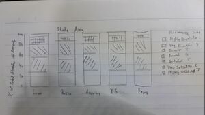
Hand-drawn visualisation
Overview
Chart1:
Chart2:
Importance vs Performance
For performance and important (chart 3&4):
Summary
Chart 5:
Chart 6:
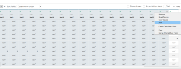
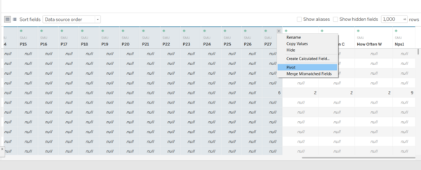
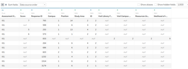
Data preparation
|
Data Preparation: Hiding
| |
|
Data Preparation: Pivot
| |
|
Data Preparation: Renaming
| |
|
Edit Alias for fields
| |
|
New calculated field and set
|
The interactive visualization can be accessed here:https://public.tableau.com/profile/neo.tee.yong#!/vizhome/assignment3_15842852167560/LibrarySurvery2018
Overview Dashboard
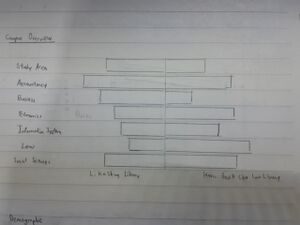
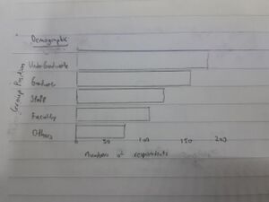
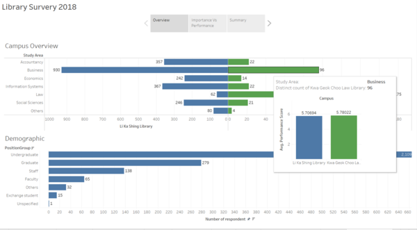
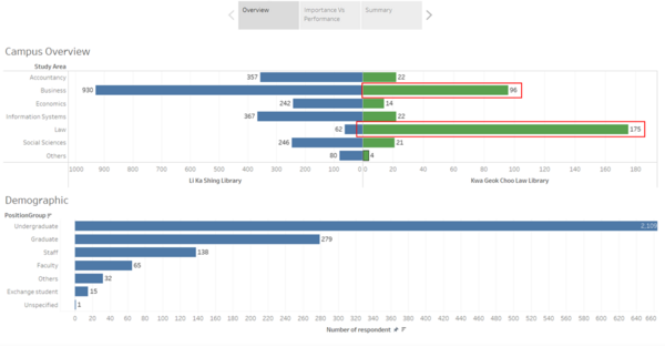
Overview dashboard.This dashboard depicts a pyramid chart with Kwa Geok Choo Law and Li Ka Shing Libraries with the number of respondents in each study area. It also shows the demographic of the respondents. The interactivity allows user to examine the no. of respondents from KGC Law and LKS libraries in each study area and also in demographic of people in each study area
Library Importance vs Performance
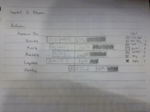
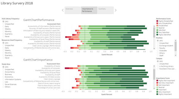
Library Importance vs Performance dashboard. This dashboard shows a divergent chart as the main visualisation of both important and performance of each different aspect. The interactive of the filter button allows users to narrow the search to get the information easily.
Summary
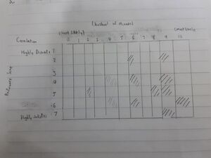
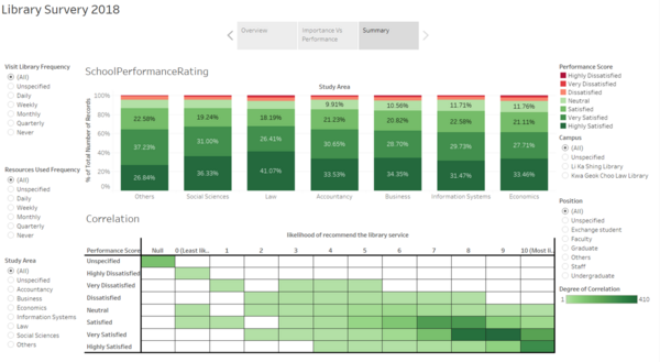
Summary dashboard. This dashboard shows a stacked bar graph of each study area rating the performance of the libraries. It also have a Correlation matrix table that allows users to see the degree of correlation between the rating given to the performance against the likelihood of them recommending to others. The interactive of the filter button allows users to narrow the search to get the information easily.
Insights
| S/N | screen shot | Insight and Significance |
|---|---|---|
| Overview Based on the pyramid chart, we can learnt that there is high respondents from business and law that go to Kwa Geok Choo Library as compared to other study area. We also can see that there afew repondents from law will go Li Ka Shing Library. This could because that Kwa Geok Choo Library is nearer to their study area and respondents preferred to go nearer libraries than travelling to a further library | ||
|
Among all the assessment item, availability of group work space was graded the lowest in term of performance. This could be an area that need to be improve or find out the reasons behind it. | ||
|
Among all the assessment item, availability of computer was graded the lowest in term of important. Libraries can consider removing it to cut expense or find others used for the computer. | ||
|
In the stacked column chart, respondents from information systems and econonmics have a higher percent of dissatisfactory. Library could find reach out to these study area to assisted them more or to understand their needs in order to cater for them. | ||
|
In the correlation chart, we ca see that although respondents might be satisfied with the library services, there are some not willing to recommend it to others. This may because either the space not enough or they are more willing to spend their time alone in the libraries without any disturbance. |
Reference
<ref>https://www.datarevelations.com/resources/visualizing-net-promoter-score-data/<ref>
<ref>https://www.datarevelations.com/resources/rethinkingdivergent/<ref>
<ref>https://www.datarevelations.com/resources/got-likert-data-neutrals/<ref>
<ref>https://blog.hubspot.com/service/how-to-calculate-nps<ref>
<ref>https://www.udemy.com/course/tableau10-advanced/<ref>
Prof week 6 class exercise on divergent chart
