Difference between revisions of "Group03 proposal Version 2"
| (20 intermediate revisions by 2 users not shown) | |||
| Line 6: | Line 6: | ||
<div style="width:100%; text-align:center;"> | <div style="width:100%; text-align:center;"> | ||
{|style="background-color:#fbd242; color:#fff; padding: 10 0 10 0;" width="100%" cellspacing="0" cellpadding="0" valign="top" border="0" | | {|style="background-color:#fbd242; color:#fff; padding: 10 0 10 0;" width="100%" cellspacing="0" cellpadding="0" valign="top" border="0" | | ||
| − | |||
| − | |||
| − | |||
| style="background:none;" width="1%" | | | style="background:none;" width="1%" | | ||
| style="padding:0.2em; font-size:100%; background-color:#fff069; border-bottom:0px solid #3D9DD7; text-align:center; color:#100c08" width="10%" | | | style="padding:0.2em; font-size:100%; background-color:#fff069; border-bottom:0px solid #3D9DD7; text-align:center; color:#100c08" width="10%" | | ||
| Line 46: | Line 43: | ||
Our team aims to build user-friendly dashboards that highlight the most interesting aspects of the active developers in Stack Overflow. This will allow any interested users to get a quick overview of the essential results of this annual survey without the need to tediously scroll through a long list of static visualizations. Additionally, through various useful interactive filters, users can customize their explorations and gain more meaningful insights that suit their needs. | Our team aims to build user-friendly dashboards that highlight the most interesting aspects of the active developers in Stack Overflow. This will allow any interested users to get a quick overview of the essential results of this annual survey without the need to tediously scroll through a long list of static visualizations. Additionally, through various useful interactive filters, users can customize their explorations and gain more meaningful insights that suit their needs. | ||
| − | In order to help us expedite the building of these interactive visualizations, our team has decided to use R which gives us access to a wide variety of libraries and tools for data preprocessing and building | + | In order to help us expedite the building of these interactive visualizations, our team has decided to use R which gives us access to a wide variety of libraries and tools for data preprocessing and building user-friendly dashboards. |
<br/> | <br/> | ||
<br/> | <br/> | ||
| Line 82: | Line 79: | ||
| | | | ||
* Gender | * Gender | ||
| + | * Country | ||
* Ethnicity | * Ethnicity | ||
* Profession | * Profession | ||
| Line 109: | Line 107: | ||
| style="text-align:center;" | Categorical | | style="text-align:center;" | Categorical | ||
| | | | ||
| + | * Developer Type | ||
* Work structure, work challenges, working remotely | * Work structure, work challenges, working remotely | ||
* Code review | * Code review | ||
| Line 122: | Line 121: | ||
==<div style="background:#fbd242; padding: 15px; font-weight: bold; line-height: 0.3em; letter-spacing:0.5em;font-size:20px"><font face="Century Gothic"><center>BACKGROUND SURVEY</center></font></div>== | ==<div style="background:#fbd242; padding: 15px; font-weight: bold; line-height: 0.3em; letter-spacing:0.5em;font-size:20px"><font face="Century Gothic"><center>BACKGROUND SURVEY</center></font></div>== | ||
<br/> | <br/> | ||
| + | As mentioned previously, the official Stack Overflow website provides a series of visualizations for every survey question and we found that there is a lack of comprehensive and interactive visualizations. We have pick out a few visualizations that we can learn from and improved upon, which are shown and explained in the table below. | ||
| + | |||
| + | The link to the visualization from the official Stack Overflow website is https://insights.stackoverflow.com/survey/2019. | ||
| + | |||
{| class="wikitable" | {| class="wikitable" | ||
!| Reference of Other Visualization | !| Reference of Other Visualization | ||
!| Learning Points | !| Learning Points | ||
|- | |- | ||
| − | |||
| | | | ||
| − | This | + | [[File:RespondentGeographic.png|500px|frameless|center]] |
| + | | | ||
| + | This proportional symbol map shows the distribution of the number of survey respondents by country. | ||
* Pros: | * Pros: | ||
| − | ** | + | ** This visualization is effective in showing where most respondents are from on the map. |
| + | ** Good use of color and opacity so that points that overlap each other can still be seen. | ||
* Cons: | * Cons: | ||
| − | ** There | + | ** A Choropleth Map would have provided a better visualization and easier comparison across countries. |
| + | There can be more charts plotted together with the map to provide a overview on the background of the survey respondents. | ||
|- | |- | ||
| − | | [[File: | + | | [[File:Technologies connected.png|500px|frameless|center]] |
| | | | ||
| − | This | + | This visualization shows which technologies are highly correlated with each other. This will provide a good over view on how the different technologies are clustered together in the ecosystems. |
* Pros: | * Pros: | ||
| − | ** This dashboard is pretty comprehensive. | + | ** This dashboard is pretty comprehensive and provide a good information to the users. For example, a user that just started learning python and would like to explore frameworks can find out which framework are commonly used with it. |
* Cons: | * Cons: | ||
| − | ** The | + | ** The chart is non interactive. The users might only be interested to find out how certain technologies type are correlated to each other instead of all of them. |
|- | |- | ||
| − | | [[File: | + | | [[File:Salary against experience.png|500px|frameless|center]] |
| | | | ||
| − | This | + | This scatter plot shows the median salary against average coding experience for the different developer type. |
* Pros: | * Pros: | ||
| − | ** The visualization shows a good | + | ** The visualization shows a good comparison for the different developer type. User can easily compare which developer type of similar average years of coding have higher salary. |
* Cons: | * Cons: | ||
| − | ** | + | ** This visualization is also static and does not have tooltip. This can make dots that are really small unclear, for example SRE. It is difficult to find out how many respondents are working as SRE developer. |
|- | |- | ||
| − | | [[File: | + | | [[File:Loved and dreaded.png|500px|frameless|center]] |
| | | | ||
| − | This | + | This bar chat rank the programming language that is loved, dreaded and desired to learn by the survey respondents. |
* Pros: | * Pros: | ||
| − | ** This is a good visualization | + | ** This is a good visualization to show which programming language are popular among developers whom uses stack overflow. This would be useful for users whom are interested to pick up programming language to learn. |
* Cons: | * Cons: | ||
| − | ** | + | ** The three bar charts are displayed under different tabs, this can be difficult to compare across. It would be better if the charts can be in the same dashboard for easy comparison on which technologies are loved and dreaded. |
|} | |} | ||
<br/> | <br/> | ||
| − | |||
| − | |||
<br/> | <br/> | ||
| Line 182: | Line 186: | ||
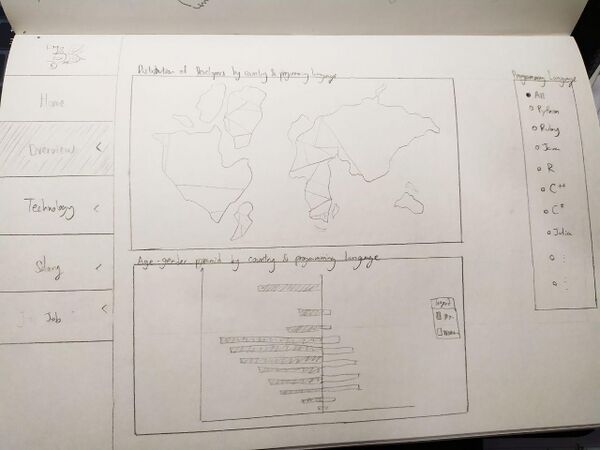
* Top graph shows a interactive geographical map that allows user to choose which country to focus on. | * Top graph shows a interactive geographical map that allows user to choose which country to focus on. | ||
* Bottom graph is a age-gender pyramid that will change according to the country selected/Language selected. Default will show the demographic of the entire survey. | * Bottom graph is a age-gender pyramid that will change according to the country selected/Language selected. Default will show the demographic of the entire survey. | ||
| − | * Right chart will show bar chart show the | + | * Right chart will show bar chart show the number of developers for each languages. It will change according to selected country selected as well. |
** Clicking on a dot or country on the map applies a filter that will update the other 2 charts based on the selected country | ** Clicking on a dot or country on the map applies a filter that will update the other 2 charts based on the selected country | ||
** Hovering over a country on the map shows a tooltip that describes the number of developers. Same thing for the bar charts. | ** Hovering over a country on the map shows a tooltip that describes the number of developers. Same thing for the bar charts. | ||
| + | *The filter on the right would allow users to filter the charts by programming language. | ||
*Tools/R Libraries used: ggplot2 | *Tools/R Libraries used: ggplot2 | ||
*Data fields: Country, Gender, | *Data fields: Country, Gender, | ||
| Line 195: | Line 200: | ||
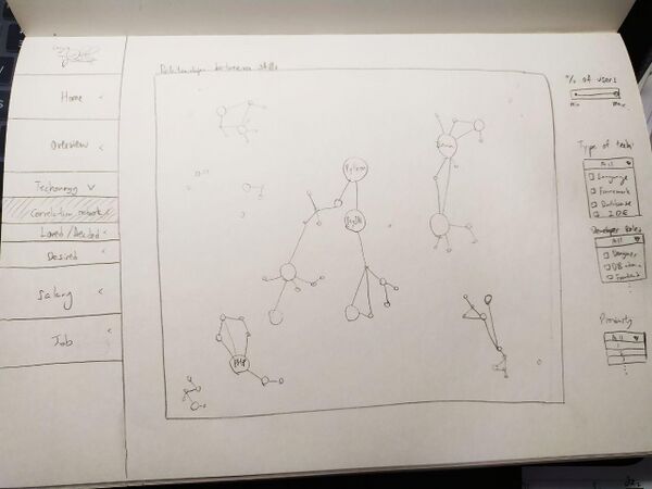
*This network chart not only allows users to see what are the technologies that Stack Overflow developers know, but also other related technologies. | *This network chart not only allows users to see what are the technologies that Stack Overflow developers know, but also other related technologies. | ||
*Through the cluster and edges, users can see what are the common technologies that may be complementary to each other. | *Through the cluster and edges, users can see what are the common technologies that may be complementary to each other. | ||
| − | The filters on the right would | + | *The filters on the right would allow users to explore the different technology types: Languages(Default), Platforms, Databases, Web Frameworks, MiscTech |
*Tools/R Libraries used: ggplot2 | *Tools/R Libraries used: ggplot2 | ||
*Data fields: LanguagesWorkedWith | *Data fields: LanguagesWorkedWith | ||
| Line 204: | Line 209: | ||
</center> | </center> | ||
|| | || | ||
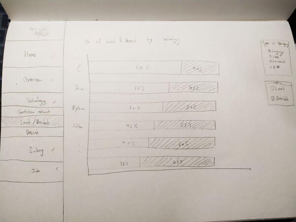
| − | * This percentage bar chart will allow the users to know what are the technologies | + | * This percentage bar chart will allow the users to know what are the technologies loved or not by the Stack Overflow respondents. |
* The filters on the right allow users to explore the different technology types. It will also allow users to filter according to the most dreaded or loved technologies. | * The filters on the right allow users to explore the different technology types. It will also allow users to filter according to the most dreaded or loved technologies. | ||
*Tools/R libraries used: Plotly | *Tools/R libraries used: Plotly | ||
| Line 224: | Line 229: | ||
</center> | </center> | ||
|| | || | ||
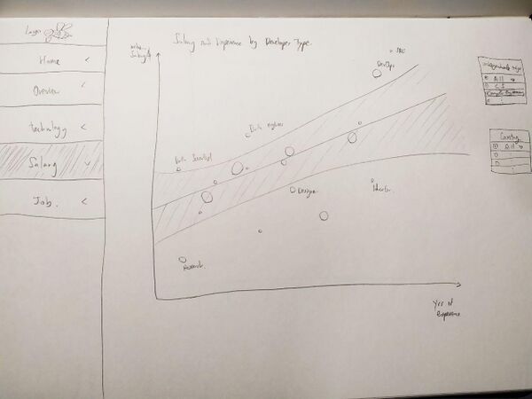
| − | + | * This scatter plot show the median salary against the average years of coding experience for the different Developer Type. The linear regression line aim to help users understand which developer jobs are higher paying and on average how many years of coding experience does developers in that job type have. | |
| − | *Tools/R Libraries used: ggplot2 | + | * The filters on the right allow users to filter according to Country and Undergraduate Major for a more customizable exploration to gain more specific insights. |
| − | *Data fields: | + | *Tools/R Libraries used: ggplot2, plotly |
| + | *Data fields: Devtype, Salary, YearsCode, YearsCodePro, UndergradMajor, Country | ||
|- | |- | ||
| <center> | | <center> | ||
| Line 243: | Line 249: | ||
</center> | </center> | ||
|| | || | ||
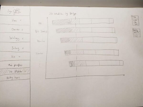
| − | * This divergent bar chart aims to show viewers which developers have higher job satisfaction based on the | + | * This divergent bar chart aims to show viewers which developers have higher job satisfaction based on the developer's job type. |
* This is done using a divergent stacked bar chart, which is good for comparing between different categories for Likert data. The count of records in each category is displayed on the right of the chart | * This is done using a divergent stacked bar chart, which is good for comparing between different categories for Likert data. The count of records in each category is displayed on the right of the chart | ||
| − | + | ** Users can set the reference line for the divergent stacked bar chart to control how the middle point on the chart. | |
| − | + | *Tools/R Libraries used: ggplot2, likert | |
| − | ** Users can | + | *Data fields: DevType, JobSat, Gender, Country |
| − | *Tools/R Libraries used: ggplot2 | ||
| − | *Data fields: JobSat, Gender, Country | ||
|- | |- | ||
| <center> | | <center> | ||
Latest revision as of 21:42, 12 April 2020
Version 2
|
<--- Go Back to Project Groups
Contents
PROBLEM & MOTIVATION
Stack Overflow is arguably the biggest online community for developers all around the world. Each year, Stack Overflow field a survey with questions ranging from developers’ favorite technologies to their job preferences. This is done to allow Stack Overflow to better understand its active users. For 2019, nearly 90,000 developers participated in this 20-minute survey. Although the official Stack Overflow website provides a series of visualizations for every survey question, we found that there is a lack of comprehensive and interactive visualizations. After much deliberation, our team has narrowed down to three main aspects that we think are the most interesting and useful to the general users: Technology, Salary, and Job.
Our team aims to build user-friendly dashboards that highlight the most interesting aspects of the active developers in Stack Overflow. This will allow any interested users to get a quick overview of the essential results of this annual survey without the need to tediously scroll through a long list of static visualizations. Additionally, through various useful interactive filters, users can customize their explorations and gain more meaningful insights that suit their needs.
In order to help us expedite the building of these interactive visualizations, our team has decided to use R which gives us access to a wide variety of libraries and tools for data preprocessing and building user-friendly dashboards.
OBJECTIVE
For our project, we will be focusing on 3 main objectives. It is as follows:
- Gain overall insights on developers demographics (the Stack Overflow community)
- Get to know what are the most popular/relevant technologies(e.g. languages and platforms) used by the Stack OverFlow developers.
- Gain insights on working hours, Job Satisfaction and job factors for Stack OverFlow developers.
SELECTED DATASET
We chose the StackOverflow Developer Survey 2019 dataset (at https://www.kaggle.com/mchirico/stack-overflow-developer-survey-results-2019), as StackOverflow is currently the largest online developer community. The dataset provided is freely accessible, and analysis of this dataset would provide a glimpse about the overall developer community.
The dataset contains 88,883 survey responses, with each row corresponding to one respondent, and each of the 85 different columns corresponding to the survey questions. Below is a quick summary about the data provided and their attributes, categorized by each of our 3 main objectives as mentioned above.
| Data Attributes | Data Provided | |
|---|---|---|
| Background | Likert |
|
| Numerical, Discrete |
| |
| Categorical |
| |
| Binary |
| |
| Job prospects | Likert |
|
| Numerical, Continuous |
| |
| Numerical, Discrete |
| |
| Categorical |
| |
| Skills | Categorical |
|
BACKGROUND SURVEY
As mentioned previously, the official Stack Overflow website provides a series of visualizations for every survey question and we found that there is a lack of comprehensive and interactive visualizations. We have pick out a few visualizations that we can learn from and improved upon, which are shown and explained in the table below.
The link to the visualization from the official Stack Overflow website is https://insights.stackoverflow.com/survey/2019.
| Reference of Other Visualization | Learning Points |
|---|---|
|
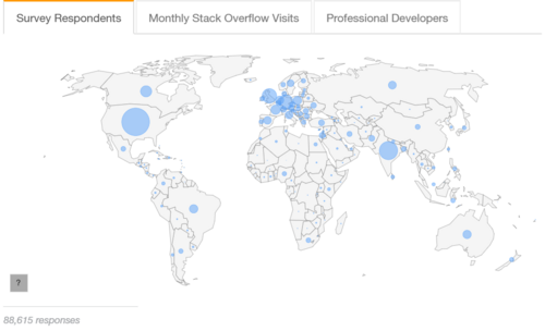
This proportional symbol map shows the distribution of the number of survey respondents by country.
There can be more charts plotted together with the map to provide a overview on the background of the survey respondents. | |
|
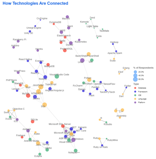
This visualization shows which technologies are highly correlated with each other. This will provide a good over view on how the different technologies are clustered together in the ecosystems.
| |
|
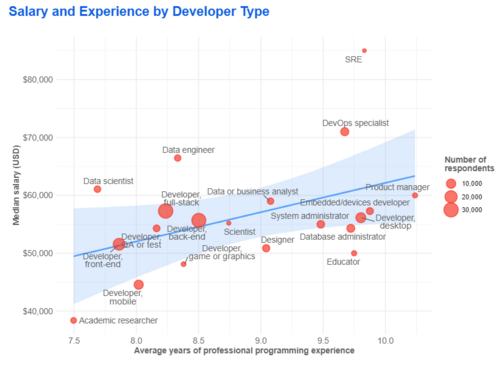
This scatter plot shows the median salary against average coding experience for the different developer type.
| |
|
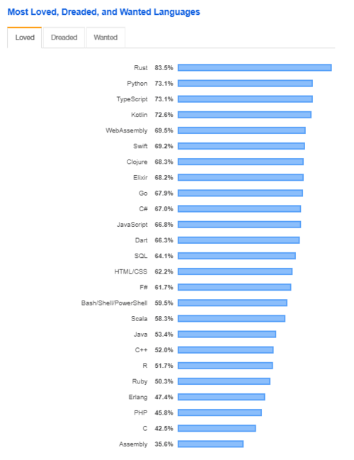
This bar chat rank the programming language that is loved, dreaded and desired to learn by the survey respondents.
|
PROPOSED STORYBOARD
| Storyboard | Insights / Comments |
|---|---|
Title: OVERVIEW OF DEVELOPER DEMOGRAPHICS |
|
Title: ANALYSIS OF DEVELOPER'S TECHNOLOGY |
|
Title: ANALYSIS OF DEVELOPER'S LOVED/NOT LOVED TECH |
|
Title: ANALYSIS OF DEVELOPER'S DESIRED TECH |
|
Title: ANALYSIS OF DEVELOPER'S SALARY |
|
Title: ANALYSIS OF DEVELOPER'S JOB FACTORS |
|
Title: ANALYSIS OF DEVELOPER'S JOB SATISFACTION |
|
Title: ANALYSIS OF DEVELOPER'S WORK HOURS |
|
TECHNICAL CHALLENGES
| Challenges | Mitigation Plan |
|---|---|
|
|
|
|
PROJECT TIMELINE
COMMENTS
Feel free to leave us some comments on where we can improve!
| No. | Name | Date | Comments |
|---|---|---|---|
| 1. | Insert your name here | Insert date here | Insert comment here |
| 2. | Insert your name here | Insert date here | Insert comment here |
| 3. | Insert your name here | Insert date here | Insert comment here |

