Difference between revisions of "Policy And Planning Proposal 3"
| (5 intermediate revisions by 3 users not shown) | |||
| Line 46: | Line 46: | ||
<br> | <br> | ||
<br> | <br> | ||
| − | With Singapore’s growing population and limited resources, she | + | With Singapore’s growing population and limited resources, she has to oversee several developing social trends to enjoy consistent prosperity and harmony. These social trends encompass growing income inequality, low birth rates and equal opportunities for education across planning areas. In this fashion, we strive to use visual analytics to help uncover some of the cracks in and opportunities in Singapore’s social demographic to assist the public and decision makers to build a holistic Singapore Together. This is well in line with the government’s effort of making [https://www.smartnation.sg/resources/open-data socially relevant data public] to encourage innovation and discovery. |
<br> | <br> | ||
<br> | <br> | ||
| Line 53: | Line 53: | ||
<br> | <br> | ||
<br> | <br> | ||
| − | With the government's strong support and push for open source innovation, we felt that this is a key area that we could utilise our skills in bringing value to society through informing the public and assisting decision makers with planning. Furthermore, with the government's push towards a smart nation, there are increasing data sets available with reasonably high | + | With the government's strong support and push for open source innovation, we felt that this is a key area that we could utilise our skills in bringing value to society through informing the public and assisting decision makers with planning. Furthermore, with the government's push towards a smart nation, there are increasing data sets available with reasonably high dimension that can allow us to get insights if visualised properly. In particular, there is a good amount of population data from Singstat.gov.sg that we have used for this project.The key objectives we strive to achieve in this project consists of providing insights for in two main dimensions - Time series analysis of Resident Distribution & Deeper social demographic analysis using Population Census data. |
| − | |||
<br/> | <br/> | ||
| Line 161: | Line 160: | ||
'''Area for Improvement: ''' | '''Area for Improvement: ''' | ||
* The selection has the animation of highlighted areas instead of lines. The user could get wrong information as they might be misled by the proportion of the offset area. | * The selection has the animation of highlighted areas instead of lines. The user could get wrong information as they might be misled by the proportion of the offset area. | ||
| − | |||
| − | |||
| − | |||
| − | |||
| − | |||
| − | |||
| − | |||
| − | |||
| − | |||
| − | |||
| − | |||
| − | |||
| − | |||
| − | |||
| − | |||
| − | |||
| − | |||
| − | |||
| − | |||
| − | |||
<br> | <br> | ||
|- | |- | ||
| Line 349: | Line 328: | ||
<!-- BRAINSTORMING SESSIONS --> | <!-- BRAINSTORMING SESSIONS --> | ||
| + | |||
==<div style="background:#D4AC0D; padding: 15px; font-weight: bold; line-height: 0.3em; letter-spacing:0.5em;font-size:20px"><font color=#fff face="Century Gothic"><center>BRAINSTORMING SESSIONS</center></font></div>== | ==<div style="background:#D4AC0D; padding: 15px; font-weight: bold; line-height: 0.3em; letter-spacing:0.5em;font-size:20px"><font color=#fff face="Century Gothic"><center>BRAINSTORMING SESSIONS</center></font></div>== | ||
<br/> | <br/> | ||
| Line 467: | Line 447: | ||
|| | || | ||
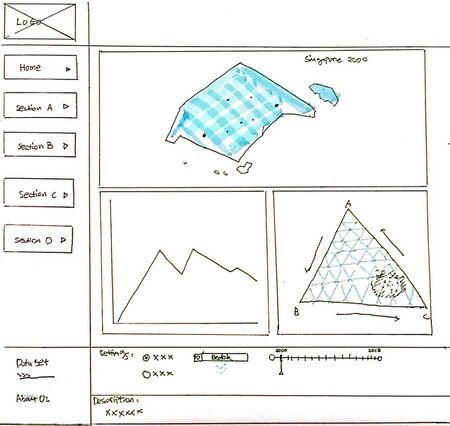
| − | * This is the overall layout used to contain and organized the above-shown | + | * This is the overall layout used to contain and organized the above-shown dashboard |
| − | * The selection buttons are used to switched views among the dashboards for different themed information | + | * The selection buttons are used to switched views among the dashboards for different themed information, section A/B/C is the place holder of the dashboard name. It will be updated according to the story flow of which will be revised later. |
* The charts have been organized into the groups. Descriptions and setting panels can be found at the bottom of the page. | * The charts have been organized into the groups. Descriptions and setting panels can be found at the bottom of the page. | ||
| + | * With all the interactive design which the team has proposed here, it allowed the user to input and navigate the dashboards for displaying or grouping the information into their wanted dimensions. It provides better flexibility and efficiency of use. The user would be able to find the hidden pattern among the dataset which could not be discovered from the simple overview charts or summary statistics. | ||
|} | |} | ||
</center> | </center> | ||
Latest revision as of 20:35, 12 April 2020
Contents
PROBLEM & MOTIVATION
Problem Background:
With Singapore’s growing population and limited resources, she has to oversee several developing social trends to enjoy consistent prosperity and harmony. These social trends encompass growing income inequality, low birth rates and equal opportunities for education across planning areas. In this fashion, we strive to use visual analytics to help uncover some of the cracks in and opportunities in Singapore’s social demographic to assist the public and decision makers to build a holistic Singapore Together. This is well in line with the government’s effort of making socially relevant data public to encourage innovation and discovery.
Motivation:
With the government's strong support and push for open source innovation, we felt that this is a key area that we could utilise our skills in bringing value to society through informing the public and assisting decision makers with planning. Furthermore, with the government's push towards a smart nation, there are increasing data sets available with reasonably high dimension that can allow us to get insights if visualised properly. In particular, there is a good amount of population data from Singstat.gov.sg that we have used for this project.The key objectives we strive to achieve in this project consists of providing insights for in two main dimensions - Time series analysis of Resident Distribution & Deeper social demographic analysis using Population Census data.
PROJECT OBJECTIVES
The key objectives we strive to achieve in this project consists of providing insights for in two main dimensions - Time series analysis of Resident Distribution & Deeper social demographic analysis using Population Census data.
For each of these areas we have targeted to achieve the following:
Time series analysis of Resident Distribution:
- Provide an animated map view of Resident distribution for resident data (2011-2019)
- Provide complementary charts that give more specific views to observe trends over time series
- Provide interactive charts to allow users to set up simple filters and click into specific residential areas for futher analysis.
- Provide chart views with multiple dimentions to allow for richer analysis (i.e. Ternary charts, Network charts)
Deeper social demographic analysis using Population Census data:
- Provide high level trend charts that map different social demographics and sentiments (2000, 2005, 2010, 2015)
- Provide interactive charts with relevant filters and customizable views to allow users to uncover deeper insights
- Provide chart views with multiple dimentions to allow for richer analysis (i.e. Ternary charts, Network charts)
We hope that by providing such charts, we will assist users to discover deeper insights in order to spur on more creative planning and policy making.
SELECTED DATABASE
Upon reviewing the first proposal, we recognised that our data sets were collected accross different studies - namely a time series annual collection of resident data by subzone; Population census study done every 5 years; other supplementary data surveys for healthcare and fertility rates.
As these data sets followed different standards and were build using different samples, it would not be accurate to join them by similar features to perform cross analysis. As such, we reviewed the problem statement and decided to narrow down our data sets to only the "Residential Time series data (2011-2019)", and "Population Census data (2000,2005,2010,2015)"
These data sets will support the two main sets of dashboards to provide analysis for granular time series resident data, and higher dimentional population demographic data using the Population census data set.
| Dataset/Source | Data Attributes | Rationale Of Usage |
|---|---|---|
(2011 - 2019, June) |
|
This dataset covers a good time series from 2000-2019 and the breakdown by subzone/planning area allows it to serve as the base platform to integrating with other population data sets that are grouped by subzone/planning area as well. From here, we can also get a good view of Singapore’s residential distribution by gender and age group that might give us a few initial findings that help for further investigation with the help of complimentary data sets. |
(2000, 2005, 2010, 2015) |
Contains the following attributes by Planning Area:
|
This data adds a very rich level of dimensionality on top of the residential data as mentioned above. However, it only covers limited points in time and so we intend to use this data separately for more deep time static analysis. Also, as this data is very rich, we hope that it can further serve as a bridge to more abstract but complementary data. |
BACKGROUND SURVEY
To begin, we explored current charts that were used to visualise the key areas that we defined to explore (e.g. inequality, urban planning, geo-plots).
This is a summary of the more interesting visualisations we found:
| Reference of Other Interactive Visualization | Learning Point |
|---|---|
Title: Income distribution by country over the years
|
Learning Points:
|
Title: Ternary point chart
|
Learning Points:
|
Title: Bricks Map |
Learning Points:
|
Title: Bar charts with Facets
|
Learning Points:
|
Title: Circular Network Diagram
|
Learning Points:
|
BRAINSTORMING SESSIONS
From our initial survey above, we have internalised some of the models and these are some of the ideas we came up with in our Brainstorming sessions:
1. Income Distribution By Subzone Planning Areas

The above listed chart or its modified variation will be used to describe the income distribution by the planning area or subzone.
These are the respective features of the chart:
- X-Axis: % of the population group
- Y-Axis income group
- User can use the a drop down list to check the different years’ income distribution
- The data will be formed into line chart histogram
- A Singapore average income and world poverty / average lines as the reference to help the user to understand the corresponding planning zone income position among world or entire Singapore
- The small map will show the the related region of the selected planning area.
2. Horizontal Network Diagram to view relationships between different dimentions

The above listed chart or its modified variation will be used to describe the redistribution for 2 or more metrics (E.g. Income/housing type).
The User can use drop down selector to change the parameters for the chart. This would help him to find the pattern of the different parameters.
Eg Did the enough HDB flat have been prepared for low income people?
3. Rank Change Chart

This chart helps to show rank changes and progression especially within a smaller set of data, i.e. census data 2000,2010,2015.
It would help users get a quick idea of how different planning areas or subzones fared in different social demographic categories.
This would then allow users to pinpoint specific cases that are surprising/desirable/undesirable and then proceed to do the necessary precise investigation from there.
4. Bricks Map With Simplified Social Demographics

This will serve as the core geo-plot for our users to keep in touch with the geographic nature of analysing Singapore.
With the help of different legends and simplified demographic classes, we will be able to give the user the relevant
time series data for them to better appreciate the context and usefulness of the other charts.
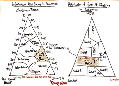
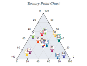
5. Ternary Chart

Using a ternary chart, we could create visualisation based on 3 dependent variables thus, enabling users to have a quick overview of the distribution in all 3 dimensions.
The diagram shows 2 ternary charts with subzones being the main analysis and the 3 variables of the respective chart are the age group (0-19, 20-39, 40 above) and
types of dwellings (HDB, Condo, Landed). Hence, users are able to hover in the subzones to view the distributions of age group and type of dwellings.
This brings a new dynamic way of exploration to identify the similarities or distinct differences between subzones.
The ternary chart will be lines of subzones points as we draw it with geographic subzones to better illustrate our brainstorming
PROPOSED STORYBOARD (PAPER PROTOTYPE)
Below is the proposed story board for our project:
| Storyboard | Insights / Comments |
|---|---|
Title: DASHBOARD 1 - Time Series Ternary Analysis view |
|
Title: DASHBOARD 2 - Time Series Network Diagram and Bar Chart View |
|
Title: DASHBOARD 3 - Population Census Global View |
|
Title: DASHBOARD 4 - Population Census 5 yearly trend analysis view |
|
Title: Overall layout - The design for the UI |
|
TECHNOLOGY USED
These are the current technologies we have shortlisted that might be useful for the respective steps of the project,
we will be using the most feasible of these options or adding on others if necessary:
CHALLENGES, RISK ASSESMENT AND MITIGATION
| Challenges | Mitigation Plan |
|---|---|
|
|
|
|
|
|
PROPOSED TIMELINE
This timeline shows the breakdown of tasks leading up to the project milestones. This timeline shows the progress as of 1 Mar 2020.
COMMENTS AND FEEDBACK
Feel free to leave us some comments so that we can improve!
| No. | Name | Date | Comments |
|---|---|---|---|
| 1. | Insert your name here | Insert date here | Insert comment here |
| 2. | Insert your name here | Insert date here | Insert comment here |
| 3. | Insert your name here | Insert date here | Insert comment here |


