Difference between revisions of "Group06 proposal"
| Line 43: | Line 43: | ||
==<div style="background:#CECCCC; padding: 10px; font-weight: bold; font-size:20px"><font color=#0F110C face="Century Gothic">Objectives</font></div>== | ==<div style="background:#CECCCC; padding: 10px; font-weight: bold; font-size:20px"><font color=#0F110C face="Century Gothic">Objectives</font></div>== | ||
| − | <b>Target Group: </b> | + | <b>Target Group: </b> Post-Secondary individuals <br><br> |
| − | With abundance of data and the lack of insights, our team would create dashboards to enable | + | With abundance of data and the lack of insights, our team would create dashboards to enable post-secondary individuals to answer the following questions: |
<ul> | <ul> | ||
| − | <li> | + | <li> What are the enrolment rates of the different institutions? Are they increasing or decreasing? </li> |
| − | + | <li> How much are the Singapore government spending on education throughout the years? </li> | |
| − | <li> How much | + | <li> Which degree pays most? </li> |
| − | <li> Which | + | <li> What are the employment rates for the various courses? </li> |
| − | <li> | ||
</ul> | </ul> | ||
Revision as of 03:07, 12 April 2020
|
Growth Signal |
|
|
|
|
Contents
Problem & Motivation
Problem
In Singapore, education is one of the sectors that is heavily invested by the state besides defence and health. As years progress, more data are accumulated and made available to the public by various government institutions such as Singapore Department of Statistics and data.gov. Despite the abundance of data, it is often not easy for someone fresh out of post-secondary education to plan for further studies in an efficient and thorough manner due to decentralisation and lack of visualisation (data are in raw/unstructured/tabular form).
Motivation
Enrolling in higher education such as polytechnics, especially universities is becoming a commonplace in Singapore. Not only does it prepare the next generation for the future (individual level), the country as a whole can significantly benefit as a result of a highly-educated population. This interactive visualisation will serve as a platform for post-secondary individuals to analyse the changing landscape and trends of higher education where they can uncover interesting insights and make well-informed decisions to ensure a sustainable future.
Objectives
Target Group: Post-Secondary individuals
With abundance of data and the lack of insights, our team would create dashboards to enable post-secondary individuals to answer the following questions:
- What are the enrolment rates of the different institutions? Are they increasing or decreasing?
- How much are the Singapore government spending on education throughout the years?
- Which degree pays most?
- What are the employment rates for the various courses?
Dataset
| Data/Source | Variables/Description | Rationale & Methodology |
|---|---|---|
|
Google Analytics Data from Client's Account (1 Jul 2016 to 1 Mar 2020) |
|
This is a clickstream dataset which provides strategic data from all traffic sources.
|
Background Survey
| Research | Learning points | Improvement |
|---|---|---|
|
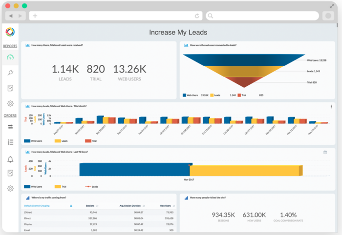
Example of sales funnel (top right) on the to show conversion of Users to Leads and Trial. Can be broken down into timeline as well. The sales funnel would give an accurate idea of how many percentage of users are really interested in the advertisement or those that actually manage to secure leads. However, diagrams in 3D can be misleading due to overlaps and is not very neat. How many leads in the last 90 days or this month can be combined. |
Can add Interaction for across a time period. Funnel can be broken down into more categories such as number of potential leads, marketing leads, sales leads, deals etc. Can give top 5 sources of traffic | |
|
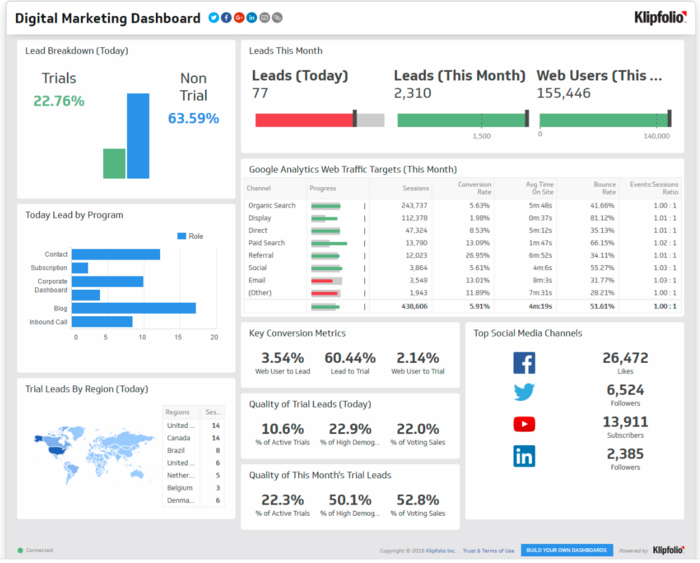
Another dashboard example provided by kilpfolio. Useful example to show metrics such as quality of leads and conversion metrics, leads by region and top few social media channels. It can be animated or add a scale to show changes across timing However, leads by region is too small. Google web analytics Web traffic targets is not labeled and just shows the bar. Can change to label with highlight of red and green (based on whether the progress is negative or positive) |
Perhaps can show the top 5 areas instead and table can be replaced by a bar graph. Key conversion metrics and quality of leads can be replaced with line graph to show changes over time. |
References
- 6 Steps to Creating a Better Marketing Dashboard
- Klipfolio - Digital Marketing Dashboard
- 100 Tasks
- Web Analytics 2.0 by Avinash Kaushik
Technical Challenges
| Challenge | Description | Mitigation Plan |
|---|---|---|
| Unfamiliarity with Tools | Most of the team members are not too familiar with R and R Shiny. |
|
| Lack of Marketing Domain Expertise | There may be gaps in terms of marketing jargons and concepts we are unaware of or fail to pick up in such a short time span. |
|
| Data Quality & Integrity | As Google Analytics uses clickstream data, there exist a possibility of bot traffic registering as data points. Much time is also needed to clean the data before feeding it into the visualisation. |
|
Storyboard
| Dashboards | Description |
|---|---|
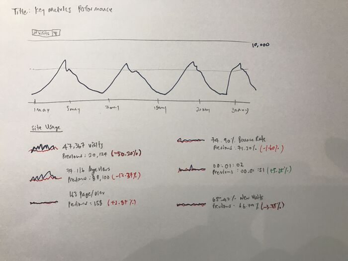
Dashboard 1: Key Metrics Performance |
|
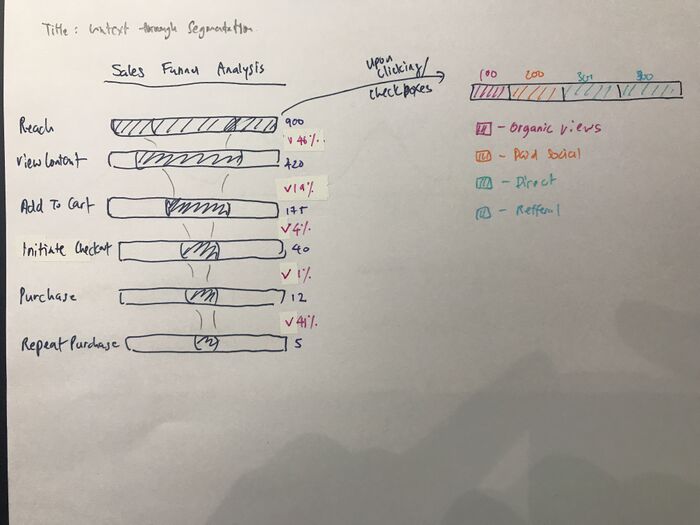
Dashboard 2: Sales Funnel Analysis with Segementation |
|
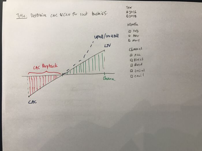
Dashboard 3: Customer Acquisition Cost vs Customer Lifetime Value |
The last dashboard would be the show the cornerstone of all businesses. Would their business survive in the long run? Are they spending too much to acquire a customer? How long would it take for their customer acquisition cost to break even? Some calculation for context:
|
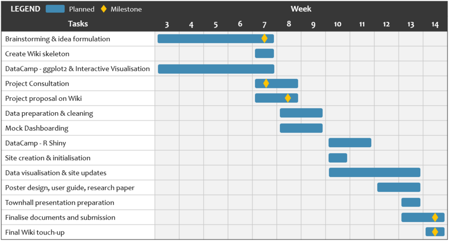
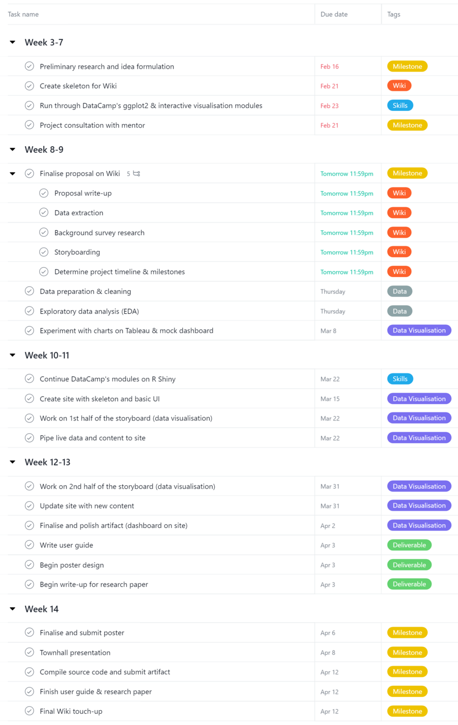
Project Timeline & Milestones
Comments
| Name | Date | Comments |
|---|---|---|
| (Name) | (Date) | (Comment) |
| (Name) | (Date) | (Comment) |
| (Name) | (Date) | (Comment) |
