Difference between revisions of "IS428 AY2019-20T2 Assign LU ZHIMAO"
Jump to navigation
Jump to search
| Line 85: | Line 85: | ||
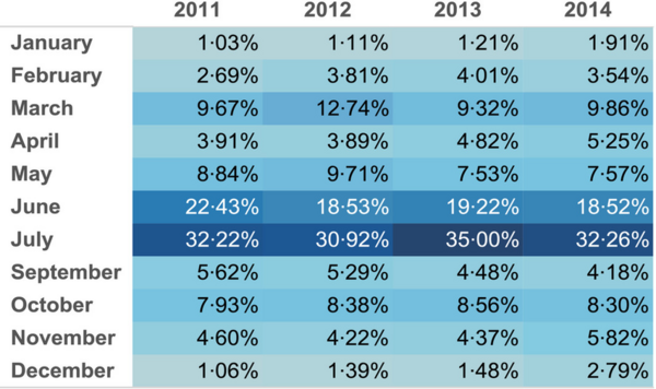
[[File:Highlight-table-demonstrating-the-percentage-of-total-student-numbers-visiting-Chester.png|600px|thumb|center|Example of Highlight Table | [[File:Highlight-table-demonstrating-the-percentage-of-total-student-numbers-visiting-Chester.png|600px|thumb|center|Example of Highlight Table | ||
Source:https://www.researchgate.net/profile/Andrew_Moss5/publication/293195352/figure/fig2/AS:329962755248141@1455680659656/Highlight-table-demonstrating-the-percentage-of-total-student-numbers-visiting-Chester.png]] | Source:https://www.researchgate.net/profile/Andrew_Moss5/publication/293195352/figure/fig2/AS:329962755248141@1455680659656/Highlight-table-demonstrating-the-percentage-of-total-student-numbers-visiting-Chester.png]] | ||
| + | |- | ||
| + | | <span style="color:red">Treemap</span> | ||
| + | | | ||
| + | | | ||
| + | [[File:Treemap.png|600px|thumb|center|Example of Treemap | ||
| + | Source:https://datavizcatalogue.com/methods/images/top_images/treemap.png]] | ||
|} | |} | ||
Revision as of 01:40, 17 March 2020
Contents
Project Motivation
Every two years, SMU Libraries conducts a comprehensive survey in which faculty, students and staff have the opportunity to rate various aspects of our services. The survey provides SMU Libraries with input to help enhance existing services and to anticipate emerging needs of SMU faculty, students and staff.
Project Objectives
Data Preparation
Data Cleaning
| Graph Type | Reasoning | Picture |
|---|---|---|
| Likert Scale | ||
| KPI Performance Chart | ||
| Vertical Bar Chart | ||
| Horizontal Bar Chart | ||
| Population Pyramid Chart | ||
| Highlight Table |
Selection of Graphs used in Data Visualization
| Graph Type | Reasoning | Picture |
|---|---|---|
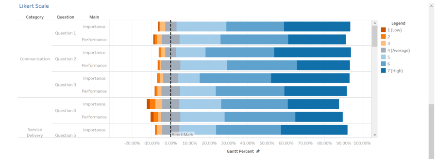
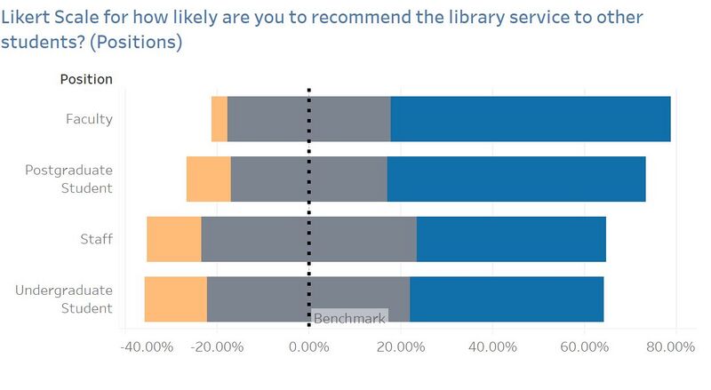
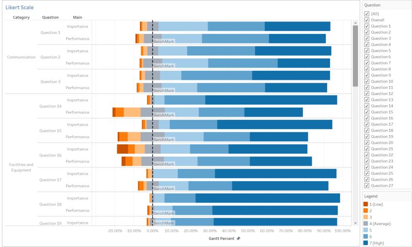
| Likert Scale | They are one of the most reliable ways to measure opinions, perceptions and Behaviours. It is used to an analysis survey question that uses a 5 or 7-point scale, in our Survey Data it uses 7-point scale and it referred to as a satisfaction scale, that ranges from Low (represented by 1) to High 7 (represented by 7). | |
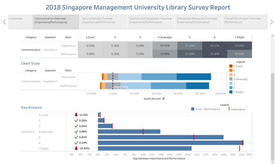
| KPI Performance Chart | The KPI chart is used to, at a quick glance, give information about the current performance of the library. KPIs can be used to track the performance of the library against importance. They can provide a management tool for gaining insight and decision making. For our library survey data analysis is to identify the gaps between the importance and performance and in this case, both indicators are set by the survey responders. By looking at the gap we are able to identify if the library services currently under user's expectation or achieved user's expectation. |
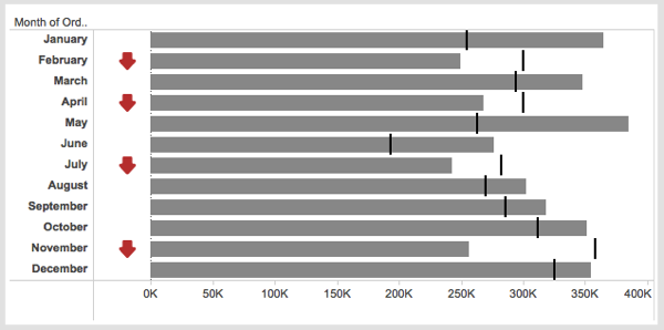 Example of KPI Performance Chart Source:https://lh3.googleusercontent.com/-c8CKjPabp1g/V3FJWKo3KLI/AAAAAAAAyog/B8nHUvLW8tA/Screen-Shot-2016-06-27-at-4.31.26-pm.png?imgmax=9999 |
| Vertical Bar Chart | Use vertical column charts to display ordinal variables. For Net Promoter Score, it arranges ordinal categories from left to right so readers can view the sequence accordingly. | |
| Horizontal Bar Chart | Use horizontal bar charts to display nominal variables like Question ID. It allows arranging Question ID in a list from top to bottom and in a horizontal manner. |
 Example of Horizontal Bar Chart Source:https://peltiertech.com/images/2010-12/TextLabel2007Bar08.png |
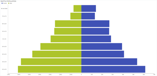
| Population Pyramid Chart | For Population Pyramid chart, breaks down SMU population into positions such as Undergraduate, Postgraduate, Staff and Faculty. For this assignment, you'll find the left side of the pyramid graphing the LKS population and the right side of the pyramid displaying the KGC population. | |
| Highlight Table | ||
| Treemap |
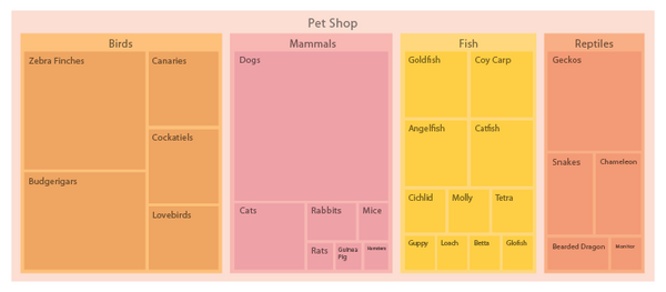 Example of Treemap Source:https://datavizcatalogue.com/methods/images/top_images/treemap.png |
Survey DashBoard Overview Information
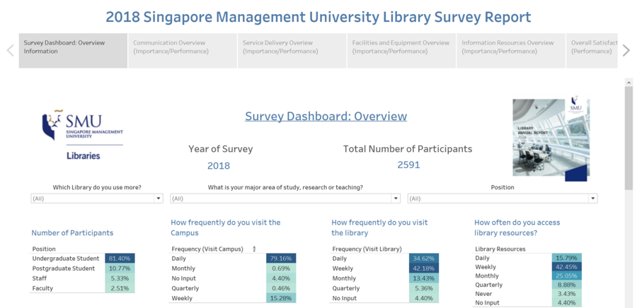
DashBoard Overview
DashBoard Summary
| Picture Number | Description & Analysis |
|---|---|
| 1 |
|
| 2 |
|
| 3 |
|
Introduction for Gap Analysis
Gap Analysis Explanation
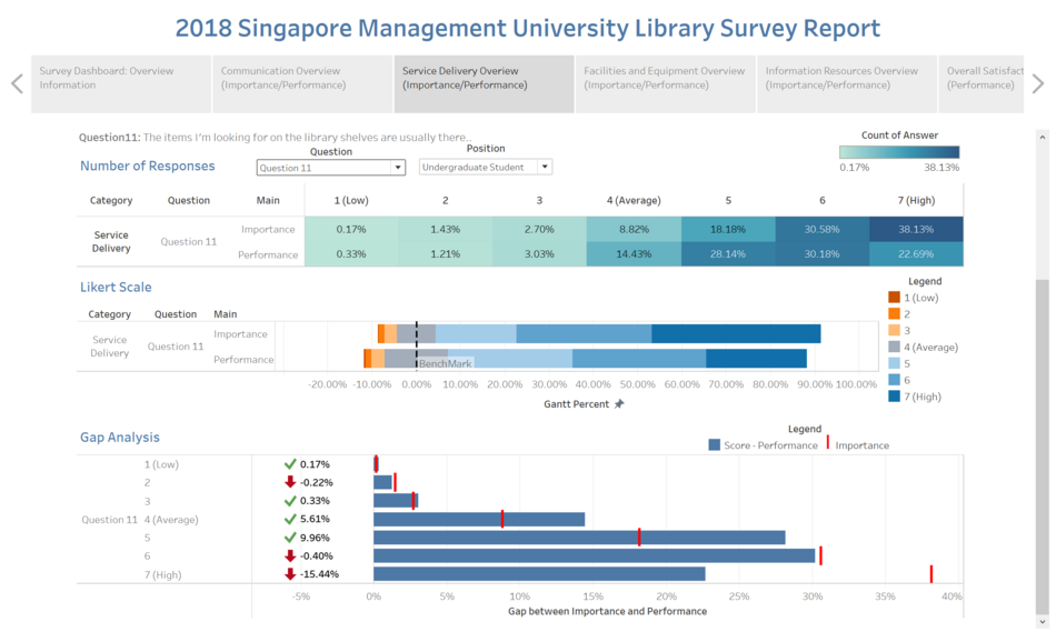
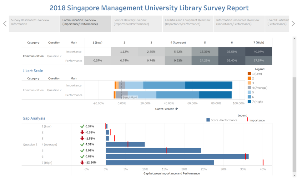
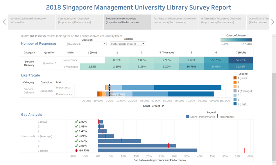
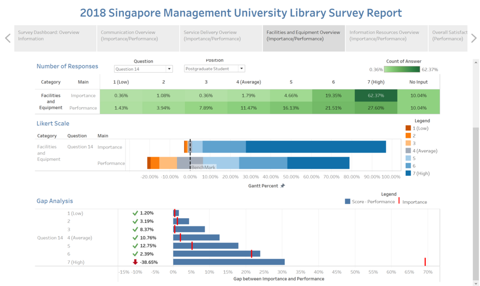
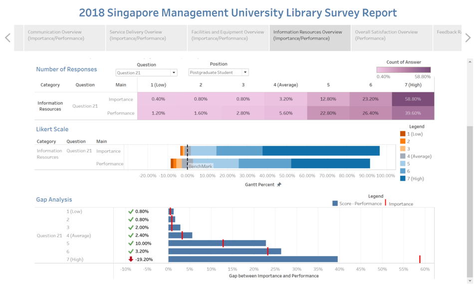
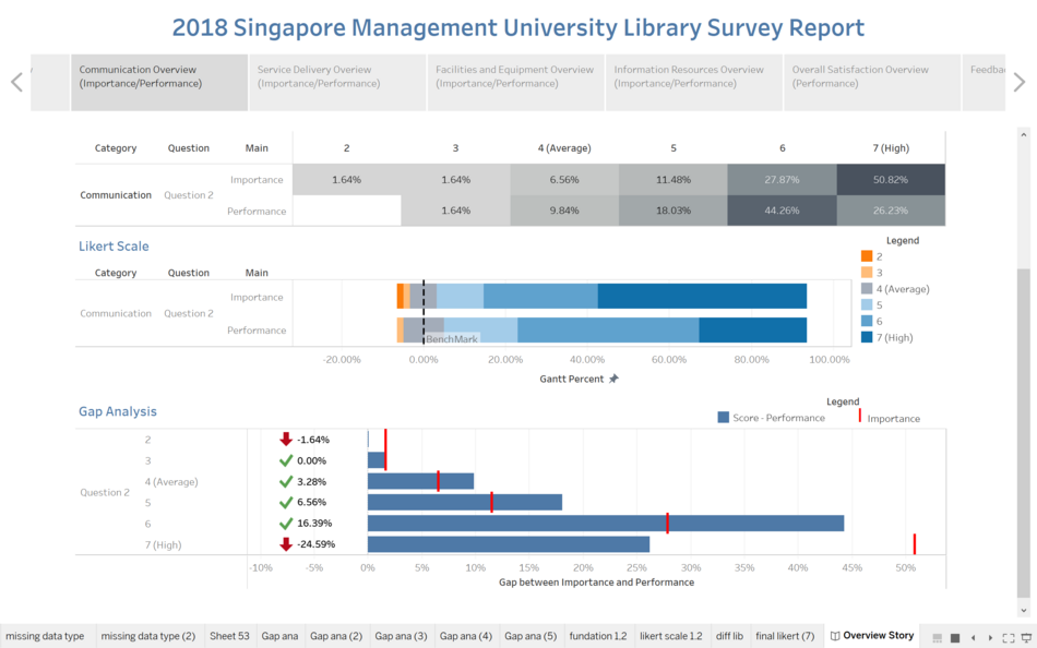
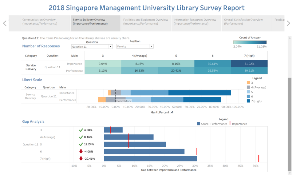
- The highlight table shows the percentage breakdown of rating for both importance and performance for each group – Undergraduate, Postgraduate, Staff and Faculty.
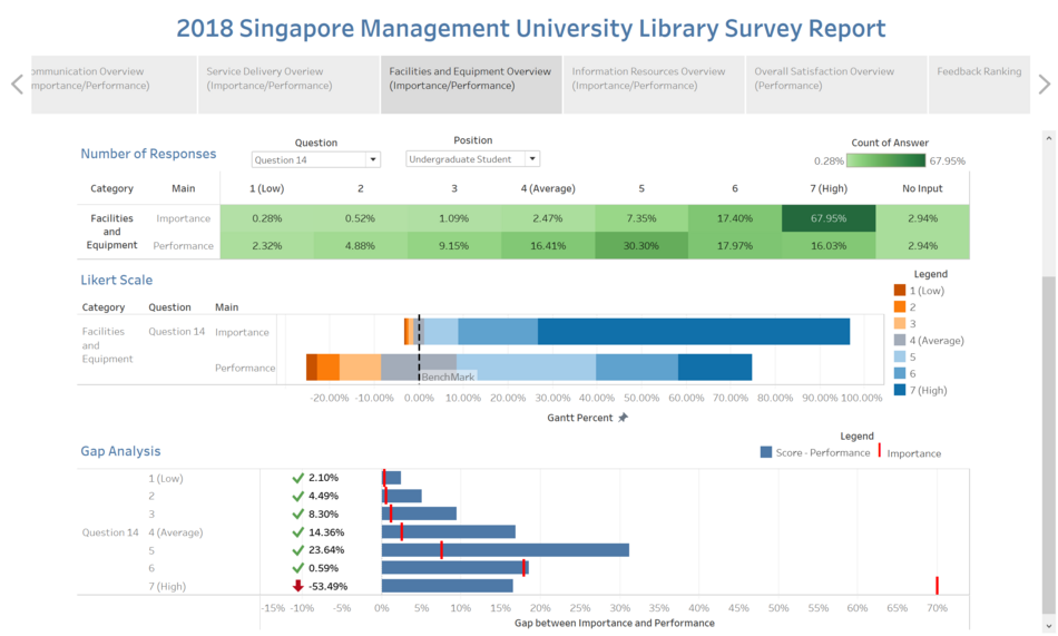
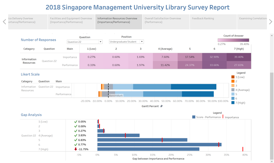
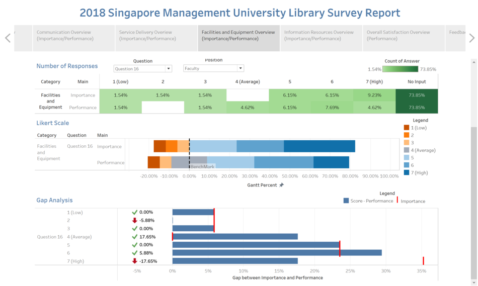
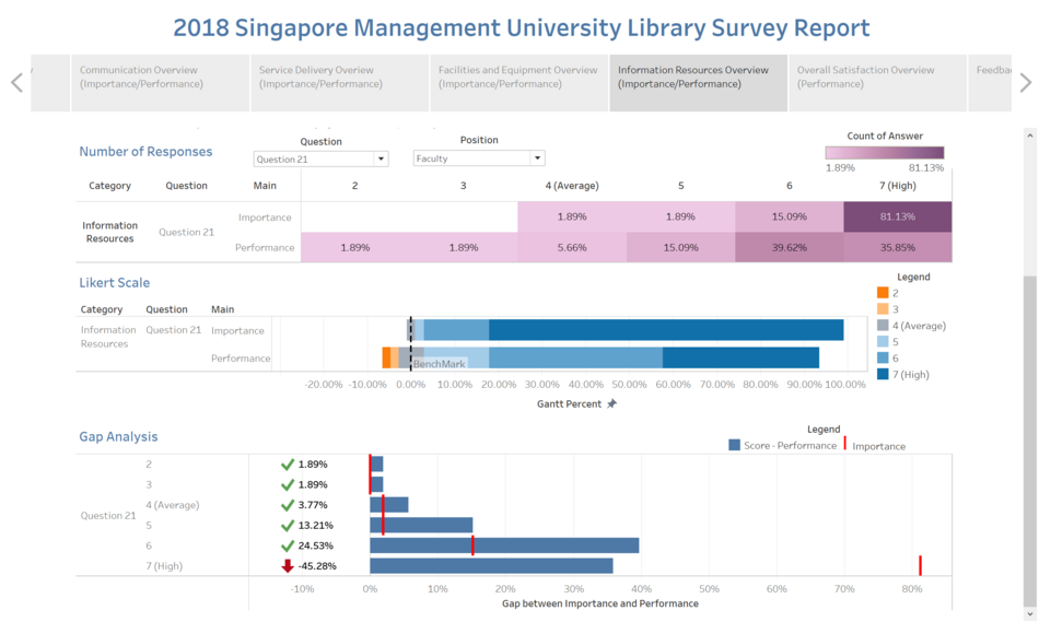
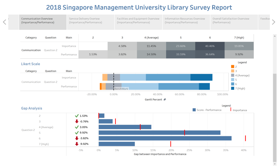
- Conducting a gap analysis where we take the Performance minus the Importance to find the gap between the importance of the question to them and compare it to how the library performs.
- Since Importance is defined as how important it is to that individual and performance is defined as how well the library is performing in that area.
- We will take the difference between these two, to measure how well the library is performing when compared to the level of importance held to them.
- If the gap analysis turns out positive, it means that performance has exceeded importance. If it turns out negative, it means that performance has not met the same ranking as importance. And this is one key aspect the library should look at when improving their services.
- I will be picking out 1 major change in each group for each category – Undergraduate, Postgraduate, Staff and Faculty and the rest can be viewed on Tableau Public.
Undergraduate Student
Gap Analysis
| Picture Number | Description & Analysis |
|---|---|
| 1 | Category: Communication
|
| 2 | Category: Service Delivery
|
| 3 | Facilities and Equipment
|
| 4 | Information Resource
|
Examining Correlation
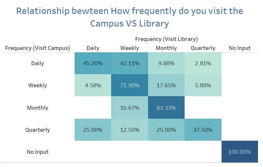
- Using a highlight table to examine the correlation between library visits and campus visits, we can see the percentage breakdown of the student’s frequency.
- The table shows that although 25% indicated that they visit the school campus quarterly while also visiting the library daily.
- From the data shown, we can reach to a conclusion that it is likely impossible for a student to be visiting the campus quarterly and yet at the same time visiting the library daily. Hence, there might be a problem in the choices given to the students which led to this data given.
- So overall, this data is not accurate due to misinterpretation of the questions hence, this data cannot be used completely and the mistake only surfaced when the data is visualized.
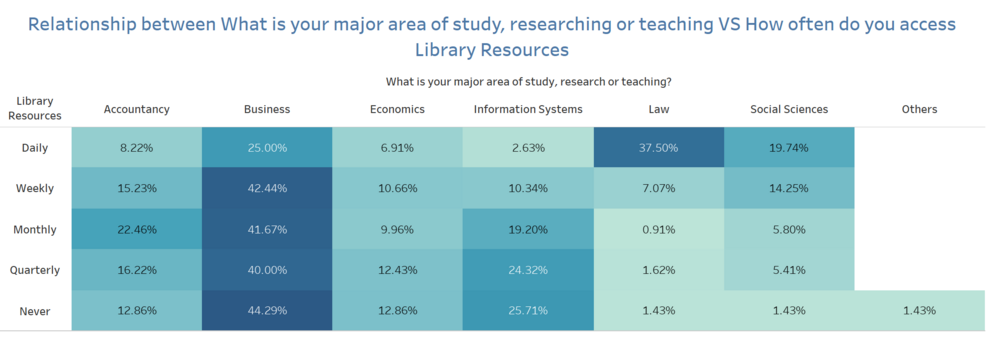
Library Frequency Visits
- It can be seen from the breakdown of the library visits by undergraduates would be that majority of Business students patronize the library more than other schools. And the highest visits would be the weekly visits of business students across all schools at 42.44%.
Trend of Missing Data
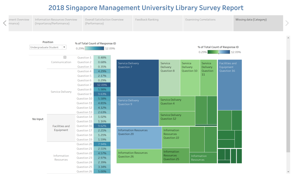
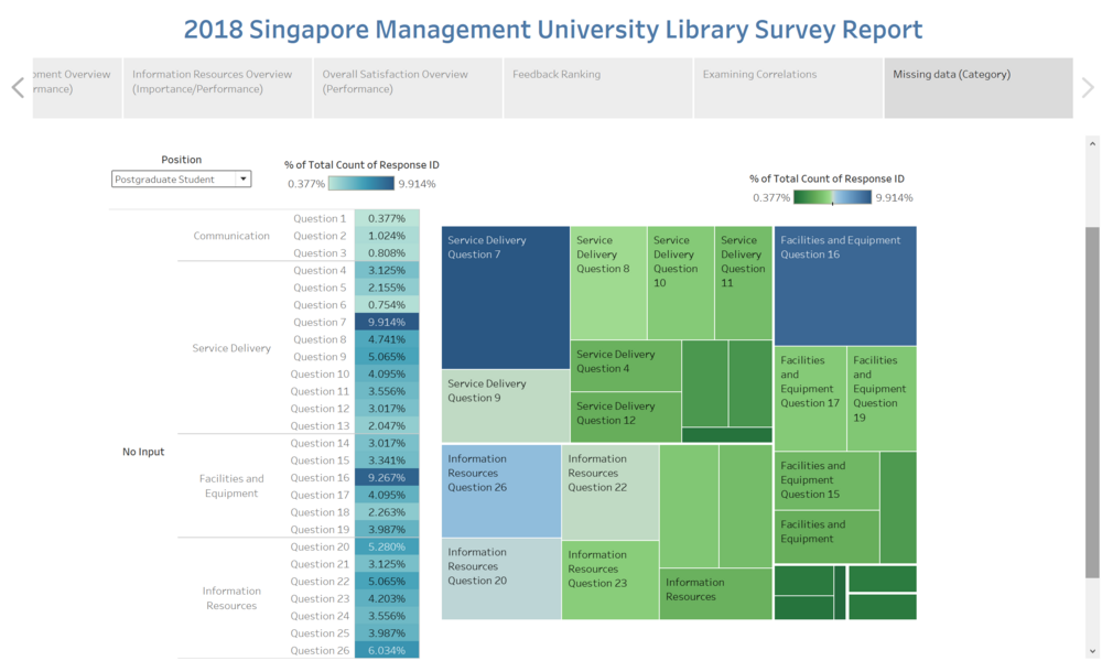
- It is evident that under “Service Delivery”, the majority of Undergraduate students did not answer some of the questions in that section as compared to the rest. This is especially so for question 7 and question 9 where 12.09% and 9.63% did not answer the question.
- The questions that are generally left unanswered can be seen as irrelevant to the students as they probably never used that “service” or they do not require the library to provide them with such services.
Postgraduate Student
Gap Analysis
| Picture Number | Description & Analysis |
|---|---|
| 1 | Category: Communication
|
| 2 | Category: Service Delivery
|
| 3 | Facilities and Equipment
|
| 4 | Information Resource
|
Library Frequency Visits
- It can be seen that Postgraduates students that visit the library largely constitutes of business students. And the frequency of their visits is usually quarterly, at its highest of 64.71%.
- Whereas the percentage of visits, as well as the frequency of visits, is significantly lower for the other schools.
- The number of business students patronizing the library is almost double to triple the amount compared to other schools.
Trend of Missing Data
- Question 7 and Question 16 are seen to have the highest percentage of seeing no answers provided and again, this can be due to the nature of services or facilities which satisfies the needs of the target group.
- In the case of Postgraduates, it is evident that certain questions do not apply to them.
- For example, Question 16 is about “a computer is available when I need one”. This usually does not apply to Postgraduates as the majority would have had their own.
Faculty
Gap Analysis
| Picture Number | Description & Analysis |
|---|---|
| 1 | Category: Communication
|
| 2 | Category: Service Delivery
|
| 3 | Facilities and Equipment
|
| 4 | Information Resource
|
Library Frequency Visits
- From the data shown, we can see that the number of visits is evenly spread between 3 schools, namely; Accounting, Business and Economics.
- However, it can be seen that it is a consistent value of between 26%-29%.
- Law and Social Sciences do not even have the data for monthly, quarterly visits to the library, with the majority being daily and weekly.
Trend of Missing Data
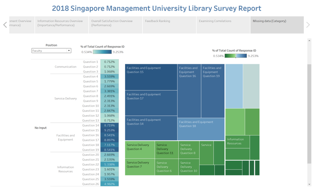
- The high number of “no answers” is evidently flagged out under the “Facilities and Equipment ranging from 7-9%.
- With the second-highest coming from the category “Information Resources”, the highest at 5.34%.
- This shows that there is a large number of people under the Faculty category that did not answer these questions.
- As we can see those questions fall under “Facilities and Equipment” are generally asking about printing, photocopying facilities or can you find a quiet place for group project or study. As we know all the faculty member are able to get printing or photocopy facilities either from their own office or send for mass printing, which means that in most of the time they do not require such services. Not only that, but all the faculty members do also own an individual office to do their research or preparing for teaching material. Therefore, they do not require a place in the library.
Staff
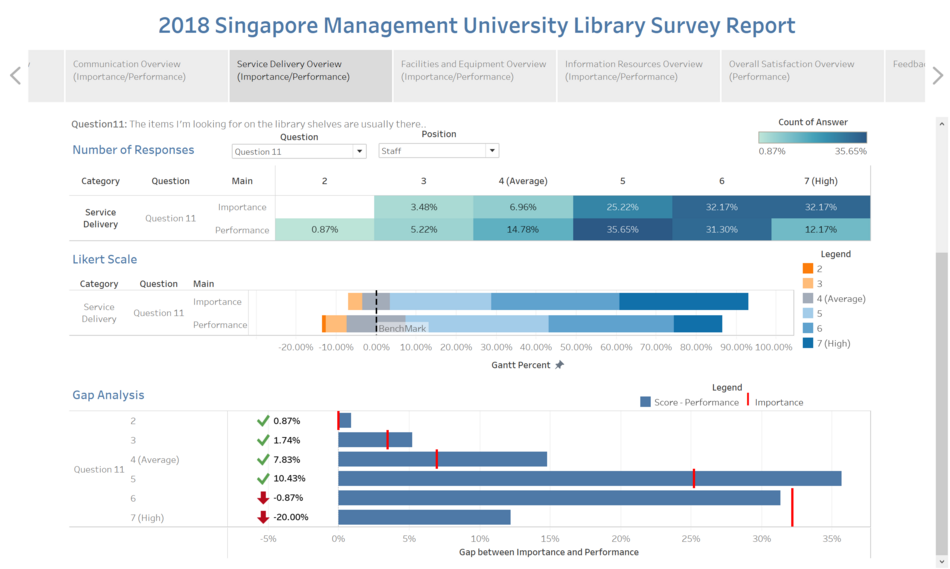
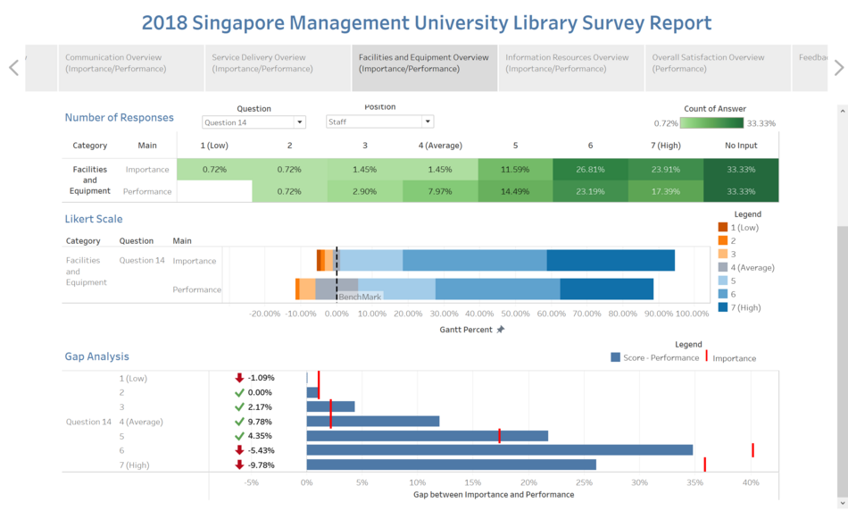
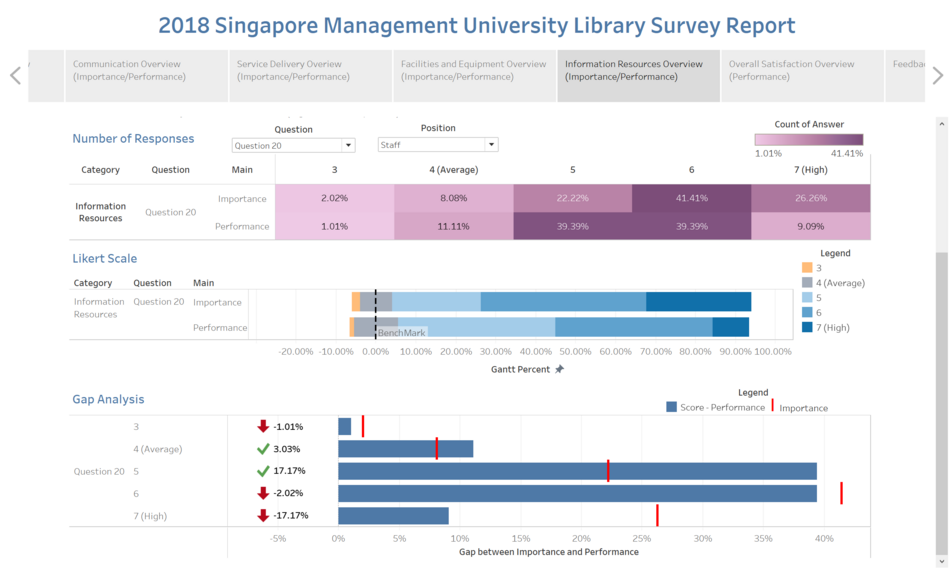
Gap Analysis
| Picture Number | Description & Analysis |
|---|---|
| 1 | Category: Communication
|
| 2 | Category: Service Delivery
|
| 3 | Facilities and Equipment
|
| 4 | Information Resource
|
Data Reference
- IS428 Visual Analytics for Business Intelligence week 1 to week 9 Lecture Notes
- Tableau Public
- DataCamp
- https://www.youtube.com/watch?v=OUTi12VtXpU
- https://www.youtube.com/watch?v=JodWmiIxl2c


