Difference between revisions of "IS428 AY2019-20T2 Assign LU ZHIMAO"
Jump to navigation
Jump to search
| Line 50: | Line 50: | ||
=<div style="margin-top: 10px;font-family: Arial;font-weight:bold;text-align:center;font-size:18px; border: 5px solid #00000000; border-radius:8px;text-align:center; background-color: #ffef8e; color: black; padding: 2px"><span style="font-size:24px;"></span>'''Survey DashBoard Overview Information'''</div>= | =<div style="margin-top: 10px;font-family: Arial;font-weight:bold;text-align:center;font-size:18px; border: 5px solid #00000000; border-radius:8px;text-align:center; background-color: #ffef8e; color: black; padding: 2px"><span style="font-size:24px;"></span>'''Survey DashBoard Overview Information'''</div>= | ||
| − | ==''' | + | =='''DashBoard Summary'''== |
{| class="wikitable" | {| class="wikitable" | ||
|- | |- | ||
Revision as of 21:52, 16 March 2020
Contents
Project Motivation
Project Objectives
Data Preparation
Every two years, SMU Libraries conducts a comprehensive survey in which faculty, students and staff have the opportunity to rate various aspects of our services. The survey provides SMU Libraries with input to help enhance existing services and to anticipate emerging needs of SMU faculty, students and staff.
In 2018, the library survey was conducted in February.
Selection of Graphs used in Data Visualization
| Graph Type | Reasoning | Picture |
|---|---|---|
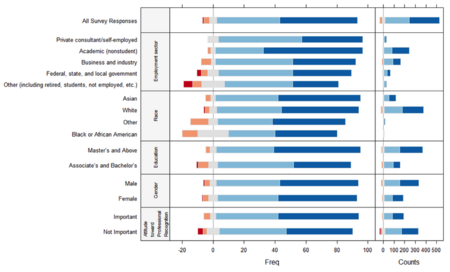
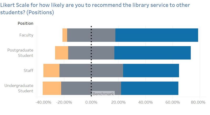
| Likert Scale | They are one of the most reliable ways to measure opinions, perceptions and Behaviours. It is used to an analysis survey question that uses a 5 or 7-point scale, in our Survey Data it uses 7-point scale and it referred to as a satisfaction scale, that ranges from Low (represented by 1) to High 7 (represented by 7). | |
| KPI Performance Chart | The KPI chart is used to, at a quick glance, give information about the current performance of the library. KPIs can be used to track the performance of the library against importance. They can provide a management tool for gaining insight and decision making. For our library survey data analysis is to identify the gaps between the importance and performance and in this case, both indicators are set by the survey responders. By looking at the gap we are able to identify if the library services currently under user's expectation or achieved user's expectation. |
 Example of KPI Performance Chart Source:https://lh3.googleusercontent.com/-c8CKjPabp1g/V3FJWKo3KLI/AAAAAAAAyog/B8nHUvLW8tA/Screen-Shot-2016-06-27-at-4.31.26-pm.png?imgmax=9999 |
| Vertical Bar Chart | Use vertical column charts to display ordinal variables. For Net Promoter Score, it arranges ordinal categories from left to right so readers can view the sequence accordingly. | |
| Horizontal Bar Chart | Use horizontal bar charts to display nominal variables like Question ID. It allows arranging Question ID in a list from top to bottom and in a horizontal manner. |
 Example of Horizontal Bar Chart Source:https://peltiertech.com/images/2010-12/TextLabel2007Bar08.png |
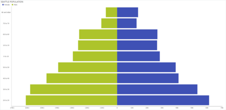
| Population Pyramid Chart | For Population Pyramid chart, breaks down SMU population into positions such as Undergraduate, Postgraduate, Staff and Faculty. For this assignment, you'll find the left side of the pyramid graphing the LKS population and the right side of the pyramid displaying the KGC population. |
Survey DashBoard Overview Information
DashBoard Summary
| Picture Number | Description & Analysis |
|---|---|
| 1 |
|
| 2 |
|
| 3 | row 3 cell 2 |
| 4 | row 4 cell 2 |
Gap Analysis Explanation
Summary
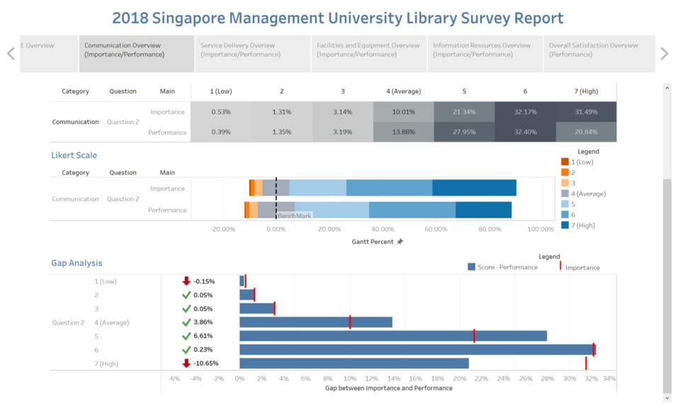
- The highlight table shows the percentage breakdown of rating for both importance and performance for each group – Undergraduate, Postgraduate, Staff and Faculty.
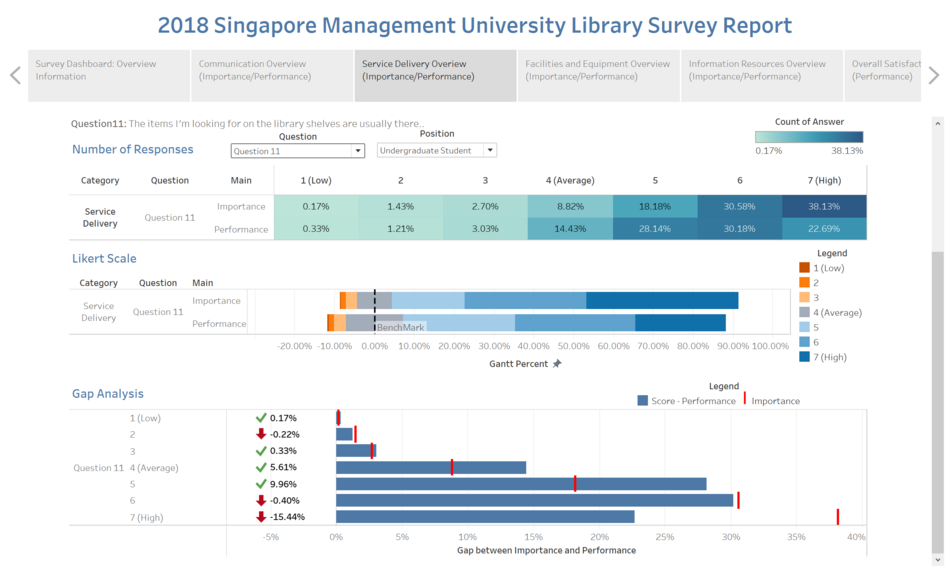
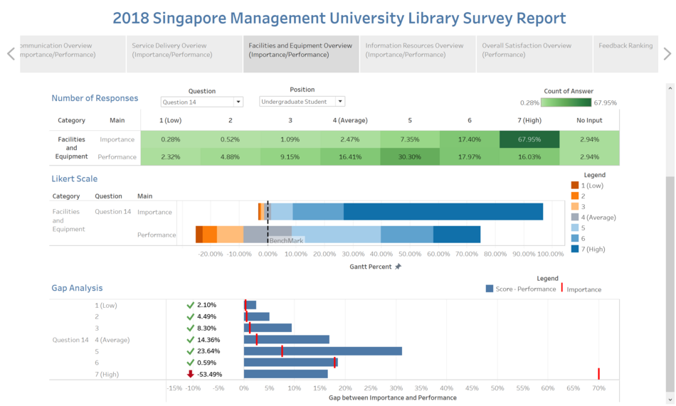
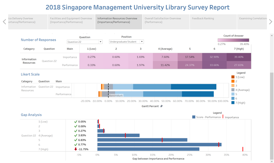
- Conducting a gap analysis where we take the Performance minus the Importance to find the gap between the importance of the question to them and compare it to how the library performs.
- Since Importance is defined as how important it is to that individual and performance is defined as how well the library is performing in that area.
- We will take the difference between these two, to measure how well the library is performing when compared to the level of importance held to them.
- If the gap analysis turns out positive, it means that performance has exceeded importance. If it turns out negative, it means that performance has not met the same ranking as importance. And this is one key aspect the library should look at when improving their services.
- I will be picking out 1 major change in each group for each category – Undergraduate, Postgraduate, Staff and Faculty and the rest can be viewed on Tableau Public.
Undergraduate
Gap Analysis
| Picture Number | Description & Analysis |
|---|---|
| 1 | Category: Communication
|
| 2 | Category: Service Delivery
|
| 3 | Facilities and Equipment
|
| 4 | Information Resource
|
Postgraduate
| Picture Number | Description & Analysis |
|---|---|
| 1 | |
| 2 | |
| 3 | |
| 4 | |
| 5 | |
| 6 | |
| 7 |
Faculty
| Picture Number | Description & Analysis |
|---|---|
| 1 | |
| 2 | |
| 3 | |
| 4 | |
| 5 | |
| 6 | |
| 7 |
Staff
| Picture Number | Description & Analysis |
|---|---|
| 1 | |
| 2 | |
| 3 | |
| 4 | |
| 5 | |
| 6 | |
| 7 |
