Difference between revisions of "IS428 AY2019-20T2 Assign PEH ANQI"
| Line 90: | Line 90: | ||
===Respondent Demographics=== | ===Respondent Demographics=== | ||
| − | [[File:PAQ Respondent Demographics.png| | + | [[File:PAQ Respondent Demographics 2.png|400px|thumb|center]] |
===Overall Satisfactory Level=== | ===Overall Satisfactory Level=== | ||
Revision as of 19:36, 15 March 2020
Overview
Singapore Management University have two libraries, the Li Ka Shing Library and the Kwa Geok Choo Law Library. Every two years, the libraries would conduct a comprehensive survey in which faculty, students and staff have the opportunity to rate various aspects of SMU library's services. The survey provides SMU libraries with inputs to help enhance existing services and to anticipate emerging needs of SMU faculty, students and staff.
The past survey reports were mainly made-up of pages of tables, which are very difficult to comprehend. Hence, the task is to create interactive data visualisation to transform these tables into visual representation that allow SMU libraries to gain useful insights, and reveal the level of services provided by SMU libraries as perceived by the following stakeholders:
- Faculty
- Undergraduate students
- Postgraduate students
- Staff
Data Preparation
About the Data
The 2018 library survey data is used for this assignment. Two excel data was provided, Raw data 2018-03-07 SMU LCS data file - KLG.xlsx and the 2018-02-16 SMU Library Survey Comments MAC.xls. The 2018-02-16 SMU Library Survey Comments MAC.xls file consist of comments provided by each respondents which is also available in the Raw data 2018-03-07 SMU LCS data file - KLG.xlsx file. Hence, I will be using only the Raw data 2018-03-07 SMU LCS data file - KLG.xlsx file.
A total of 2639 responds was collected from the 2018 Survey. However 1 respondent, ID 833, only answered 4 questions out of a total of 87 and did not provide any information on the respondent position, campus and study area. Hence respondent 833's input will be omitted from the visualization.
The dataset contained of 88 columns. 7 of them provide basic information of the respondents, their position, Studyarea, frequency of them visiting the library, etc. 2 of them are on respondents satisfaction level and likelihood of recommending the library to others. 78 of them are likert scale questions where respondents have to rank different services provided by the library by importance of the services and how well the library perform in providing these services. Lastly, 1 of them is a free text containing additional comments from the respondents.
Data cleaning in excel
| 1. Remove respondent 833 |
Respondent with responseID 833 is removed as identification attributes are blank (Campus, Position, StudyArea), the respondent also only answered 4 out of the 88 questions. Hence I decided to omitted this respondent from the visualization. | |
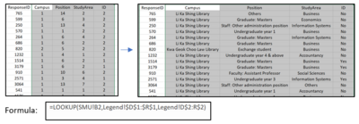
| 2. Replace column Campus, Position, StudyArea and ID's numerical value |
The values in the excel file are represented by numerical values, making it difficult to interpret the data without referring to the legend. Hence, I used the “LOOKUP” function in excel to get the values for Campus, Position, StudyArea and ID field by referring to the legend worksheet. | |
| 3. Replace column name for likert scale questions |
The column name for the likert scale questions on importance and performance is represented by a code. Eg: I01, P01, NA01, etc. This makes it difficult to know what each column represents. Hence, I used the "HLOOKUP" function in excel to get the column code with column name by referring to the legend worksheet. | |
| 4. Pre-processing Comments |
The column name for the likert scale questions on importance and performance is represented by a code. Eg: I01, P01, NA01, etc. This makes it difficult to know what each column represents. Hence, I used the "HLOOKUP" function in excel to get the column code with column name by referring to the legend worksheet. |
Data cleaning using Python for comments
Comments provided by the respondents are free text which is difficult to work with in tableau. In order to provide a overview on main concerns that that the respondents have, I have decided to pre-process the comments using Python NLTK package to remove commonly used words and punctuation in the comments and build a word cloud in tableau to show the dominant words mentioned.
I removed the comment column in the excel file and placed it in another excel file containing the comments, respondent ID and position. Using Python, I conducted stop words removal and lemmatization.
Step 1. Remove empty rows
There is quite a number of rows with empty comments, therefore I started by removing empty rows in the dataset.
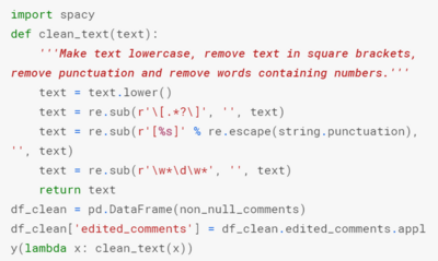
Step 2. Convert text to lowercase and remove punctuation
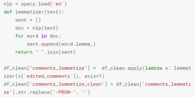
Step 3. lemmatizing
As different people have different way of typing and depending on the sentence structure, often words like "happily" and "happiness" both have the same root word which is "happy". Since they both have the same meaning and belong to the same root word, I would like them to be counted together when plotting the word cloud.
Lemmatizing is one of the methods to convert words back to its root word. Hence I did lemmatization for each word in the comments.
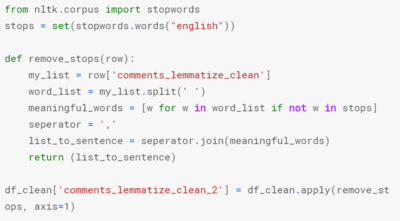
Step 4. Stop words removal
Stop words are words commonly used in a sentence such as "I", "You", "Are". These words are commonly mentioned but have no meaning to them. Hence, I will be removing these words.
Below is a sample of how the comment change during the different steps of text processing.
After the pre-processing, I export the data back to a excel file and used the "Text to column" function to split the sentence in a column to one word in one column
Data Preparation in Tableau
After the pre-processing the data, I uploaded both excel files to Tableau. Columns with likert scale questions on importance and performance are not in the right format for Tableau to process them. It has to be change to a column with the questions and a column with the ratings instead. Therefore, I pivoted the columns with the questions.
Visualization
The dashboard created can be found here: https://public.tableau.com/profile/peh.anqi#!/vizhome/IS428_Assignment_PehAnqi/Home
A home page is used to provide readers with information on what the visualization is about and buttons for them to navigate into the different dashboards.


