Difference between revisions of "IS428 AY2019-20T2 Assign KANG HUI YUN"
(→Excel) |
(→Excel) |
||
| Line 39: | Line 39: | ||
|- | |- | ||
| style="padding-top: 10px; padding-bottom: 10px;" | [[File:KANG HUI YUN-data Excel 2.png|700px|center]] | | style="padding-top: 10px; padding-bottom: 10px;" | [[File:KANG HUI YUN-data Excel 2.png|700px|center]] | ||
| − | | style="padding-left: 15px; padding-right: 15px;" | If the record contains at least 1 invalid question (i.e FALSE appears at least once in the range of isValid1 to isValid26), we will mark the record ultimately as "Invalid" in a new column called Validity. Else, it shall be "Valid". This is achieved by using formula '''=IF(COUNTIF(CL2:DK2,FALSE) >= 1, "Invalid", "Valid")''' for cell DL2. | + | | style="padding-left: 15px; padding-right: 15px;" | <p>If the record contains at least 1 invalid question (i.e FALSE appears at least once in the range of isValid1 to isValid26), we will mark the record ultimately as "Invalid" in a new column called Validity. Else, it shall be "Valid".</p> <p>This is achieved by using formula '''=IF(COUNTIF(CL2:DK2,FALSE) >= 1, "Invalid", "Valid")''' for cell DL2.</p> |
|- | |- | ||
| style="padding-top: 10px; padding-bottom: 10px;" | [[File:KANG HUI YUN-data Excel 3.png|700px|center]] <br> [[File:KANG HUI YUN-data Excel 4.png|700px|center]] | | style="padding-top: 10px; padding-bottom: 10px;" | [[File:KANG HUI YUN-data Excel 3.png|700px|center]] <br> [[File:KANG HUI YUN-data Excel 4.png|700px|center]] | ||
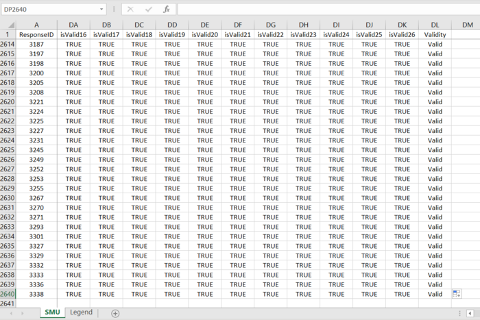
| − | | style="padding-left: 15px; padding-right: 15px;" | <p>After doing so, we will perform autofill again, this time for the entire dataset (i.e. remaining records) by double-clicking on the bottom-right corner as shown in the first screenshot. '''Note: Ensure that the range isValid1 to Validity is selected first.'''</p> <p>If done properly, we shall get a similar output shown by the second screenshot. We can see that the cells are filled until the last record.</p> | + | | style="padding-left: 15px; padding-right: 15px;" | <p>After doing so, we will perform autofill again, this time for the entire dataset (i.e. remaining records) by double-clicking on the bottom-right corner as shown in the first screenshot.</p> <p>'''Note: Ensure that the range isValid1 to Validity is selected first.'''</p> <p>If done properly, we shall get a similar output shown by the second screenshot. We can see that the cells are filled until the last record.</p> |
|- | |- | ||
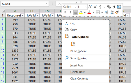
| style="padding-top: 10px; padding-bottom: 10px;" | [[File:KANG HUI YUN-data Excel 5.png|700px|center]] | | style="padding-top: 10px; padding-bottom: 10px;" | [[File:KANG HUI YUN-data Excel 5.png|700px|center]] | ||
Revision as of 19:10, 13 March 2020
Contents
Overview
Background
In the interests of faculty, students and staff of Singapore Management University (SMU), an all-encompassing survey is conducted by SMU Libraries every 2 years to learn about their perception of the libraries (namely Li Ka Shing Library and Kwa Geok Choo Law Library), with particular focus on the importance and satisfaction level of different library-related services. This piece of information serves as a valuable input for the department to calibrate the standards of the facilities by identifying areas where users are underserved and those that exceed expectations but are relatively less important.
Objective & Tasks
After closure of the survey, a Library Survey Report is generated for consumption. However, this traditional method of analysis comprising huge number of tables and ineffective charts can be frustrating and difficult for users to grasp. Hence, the objective here is to make use of existing tools and technologies to develop an interactive visualisation of the survey data (Feb 2018), such that it is intuitive, easy to comprehend and telling at the same time. By cutting down on the report's "verbosity", the people in charge can save time deciphering trends and underlying patterns of the data with high degree of conciseness and accuracy.
The primary task is to reveal the level of services provided by the 2 SMU libraries as perceived by the following four groups: the undergraduates, postgraduates, faculty and staff. This mainly includes the concept of the Importance-Performance (or Importance-Satisfaction) rating as well as the Net Promoter Score (NPS).
Survey Data
About the Data
The data for the 2018 Library Survey Report consists of:
- 2639 records (rows)
- 89 fields (columns), which includes
- A new column for ResponseID (unique to each respondent)
- All other 88 columns related to the original survey questions
The survey is predominantly made up of importance and performance rating (26 such questions, represented by 78 fields in the dataset). The 78 fields are spread across 3 main categories: importance, performance and N/A (hence 26x3, giving us 78). Respondents who picked 'N/A' for the question need not select a rating for both importance and performance. Prior to these questions, there are 4 basic background and demographic questions that are all non-quantitative. Also, there are 3 questions on the frequency (of visits and access), 2 rating scales on overall satisfaction and likelihood of recommendation, and one textual input for comments and suggestions. For the most part, the survey questions are based on Likert scale (questions with suffixes between 1-27 except those with NA prefix; and out of the 27, 26 are the previously mentioned Importance-Performance rating questions). Worthy of mention is yet another rating scale—the Net Promoter Score (NPS), which, when calculated can tell us the overall (net) satisfaction/loyalty of library users.
Data Cleaning & Preparation
Before jumping into data visualisation, it is important to make sure the data is clean, rightfully organised and structured. This will facilitate the visual development using tools such as Tableau, allowing for categorisation and sorting. In the cleaning process, we shall engage in steps such as removal and/or creation of new fields, field renaming, and pivoting. Finally, we will piece up the bit-sized information into a single dataset via merging (e.g. join/union). Ultimately, we would like our data structure to be thin and tall (i.e. less columns, more rows) so we can analyse certain dimensions easily as we wish.
Initially, I have used Tableau Prep to clean the data. However, I quickly switched to using R (on RStudio) mainly because certain steps are tedious when performed in Tableau Prep—it requires a lot of manual work, especially repetitive clicking and entering of values. Writing a single R script is much cleaner, significantly faster and less prone to undesired changes which can be made through accidental interactions within the interface of Tableau Prep. Nonetheless, I have successfully created the same dataset using both methods.
Excel
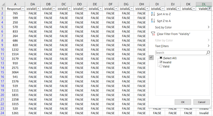
As mentioned previously, if the respondent selects N/A for a given question (which is represented as 1 in dataset under column NAxx), he/she will not be able to select an option for both Importance and Performance for the same question. Similarly, if N/A is not selected, it logically follows that he/she must select a choice for both Importance and Performance. However, there are records in the dataset that violate this rule. For example, the record where ResponseID is 765 has empty cells for both I02 and P02. Yet, NA2 is not filled with 1 when it should be.
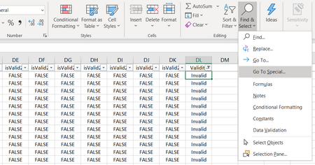
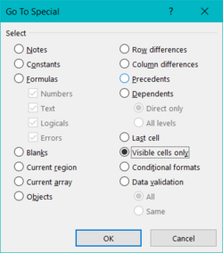
To simplify the data cleaning process later, we will fix this issue by removing such records in Excel first.
Tableau Prep Flow
R and RStudio
| Step | Screenshot | Rationale & Description |
|---|---|---|
| 1) Import Libraries | ||
| 2) Import XLSX | ||
| 3) Remove Fields | ||
| 4) Rename Field Names | ||
| 5) Recode Field Values | ||
| 6) Pivot Data | ||
| 7) Merge Subsets | ||
| 8) Create New Field | ||
| 9) Reorder Field | ||
| 10) Export Data |


