Difference between revisions of "Group06 proposal"
m (→Dataset) |
|||
| Line 50: | Line 50: | ||
==<div style="background:#CECCCC; padding: 10px; font-weight: bold; font-size:20px"><font color=#0F110C face="Century Gothic">Dataset</font></div>== | ==<div style="background:#CECCCC; padding: 10px; font-weight: bold; font-size:20px"><font color=#0F110C face="Century Gothic">Dataset</font></div>== | ||
| − | |||
<center> | <center> | ||
{| class="wikitable" width="100%" | {| class="wikitable" width="100%" | ||
Revision as of 00:21, 2 March 2020
|
Growth Signal |
|
|
|
|
Contents
Problem & Motivation
Rapid advancement of technology over the past few decades have brought forth many opportunities and convenience to mankind. In the world of businesses, especially marketing, it is extremely important to use various numbers and metrics to quantify and evaluate the standpoint of the company. This is made possible with the discovery of big data, analytics, AI/ML and the likes of data visualisation.
"If you can't measure it, you can't manage it." — Peter Drucker
In this era, many companies in the marketing department rely on platforms such as Google Analytics to track their businesses. However, problem arises when they advertise across multiple channels, such as Facebook, Instagram, email, and possibilities are endless. Decentralisation is one problem. Ironically, although Google Analytics houses large amount of data, oftentimes they do not provide useful and actionable insights relevant to the company. Hence, users are overloaded with the wide variety of data available that are reflected by a vast number of charts of which some can be complex and nugatory (i.e. chartjunks). To save time (sieving through chartjunks) and boost marketer's productivity, we aim to develop a data visualisation dashboard that serves as a one-stop solution where users can derive knowledge and uncover insights required to judge the company's success, and whether they are on the right track. This will thus help them drill down to the root causes and take necessary actions.
Objectives
Target Group: eCommerce Business Owners or Digital Marketing Exectives
With abundance of data and the lack of insights, our team would create dashboards to enable eCommerce Business Owners or Digital Marketing Executives to answer the following questions:
- How is my digital business performing compared to previous period?
- Are customers stuck at a particular buying stage in their customer journey?
- How much sales are attributed to my marketing efforts?
- Which channels most profitable?
- Where should i optimise my marketing spend today?
Dataset
| Data/Source | Variables/Description | Rationale & Methodology |
|---|---|---|
|
Google Analytics Data from Client's Account (1 Jul 2016 to 1 Mar 2020) |
|
This is a clickstream dataset which provides strategic data from all traffic sources.
|
Background Survey
| Research | Learning points | Improvement |
|---|---|---|
|
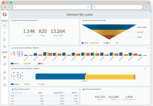
Example of sales funnel (top right) on the to show conversion of Users to Leads and Trial. Can be broken down into timeline as well. The sales funnel would give an accurate idea of how many percentage of users are really interested in the advertisement or those that actually manage to secure leads. However, diagrams in 3D can be misleading due to overlaps and is not very neat. How many leads in the last 90 days or this month can be combined. |
Can add Interaction for across a time period. Funnel can be broken down into more categories such as number of potential leads, marketing leads, sales leads, deals etc. Can give top 5 sources of traffic | |
|
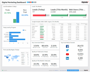
Another dashboard example provided by kilpfolio. Useful example to show metrics such as quality of leads and conversion metrics, leads by region and top few social media channels. It can be animated or add a scale to show changes across timing However, leads by region is too small. Google web analytics Web traffic targets is not labeled and just shows the bar. Can change to label with highlight of red and green (based on whether the progress is negative or positive) |
Perhaps can show the top 5 areas instead and table can be replaced by a bar graph. Key conversion metrics and quality of leads can be replaced with line graph to show changes over time. |
References
- 6 Steps to Creating a Better Marketing Dashboard
- Klipfolio - Digital Marketing Dashboard
- 100 Tasks
- Web Analytics 2.0 by Avinash Kaushik
Technical Challenges
| Challenge | Description | Mitigation Plan |
|---|---|---|
| Unfamiliarity with Tools | Most of the team members are not too familiar with R and R Shiny. |
|
| Lack of Marketing Domain Expertise | There may be gaps in terms of marketing jargons and concepts we are unaware of or fail to pick up in such a short time span. |
|
| Data Quality & Integrity | As Google Analytics uses clickstream data, there exist a possibility of bot traffic registering as data points. Much time is also needed to clean the data before feeding it into the visualisation. |
|
Storyboard
| Dashboards | Description |
|---|---|
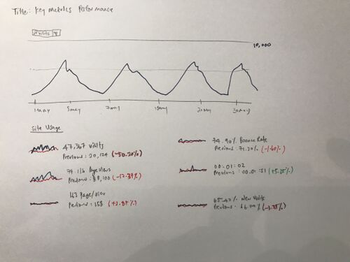
Dashboard 1: Key Metrics Performance |
|
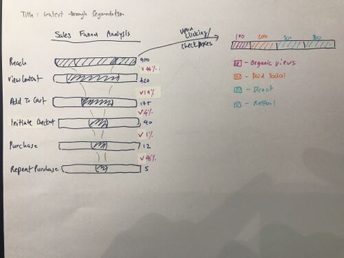
Dashboard 2: Sales Funnel Analysis with Segementation |
|
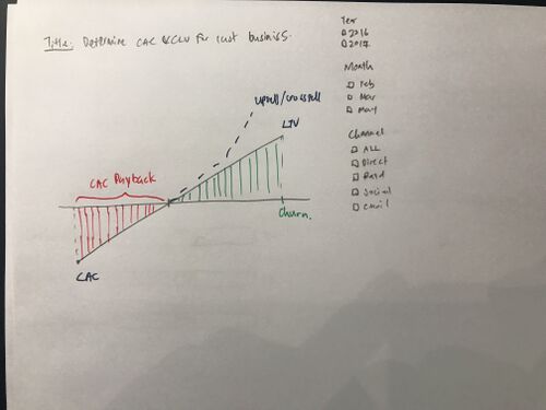
Dashboard 3: Customer Acquisition Cost vs Customer Lifetime Value |
The last dashboard would be the show the cornerstone of all businesses. Would their business survive in the long run? Are they spending too much to acquire a customer? How long would it take for their customer acquisition cost to break even? Some calculation for context:
|
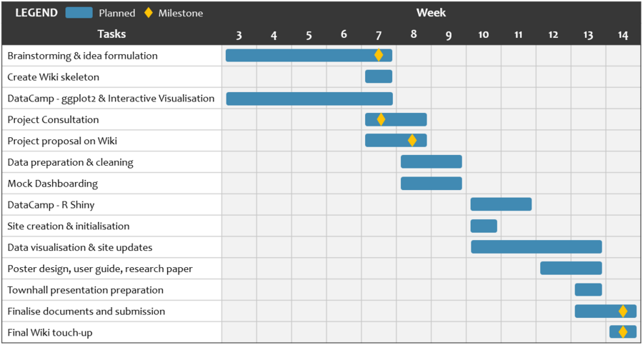
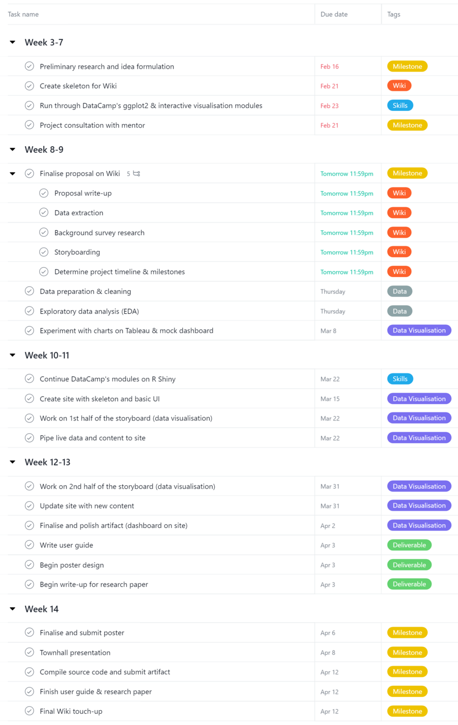
Project Timeline & Milestones
Comments
| Name | Date | Comments |
|---|---|---|
| (Name) | (Date) | (Comment) |
| (Name) | (Date) | (Comment) |
| (Name) | (Date) | (Comment) |
