Difference between revisions of "Group02 proposal"
Lxguo.2017 (talk | contribs) |
Lxguo.2017 (talk | contribs) |
||
| Line 228: | Line 228: | ||
! style="background: #899db3;color:#fbfcfd;| Dashboards !!style="background: #899db3;color:#fbfcfd;| Description | ! style="background: #899db3;color:#fbfcfd;| Dashboards !!style="background: #899db3;color:#fbfcfd;| Description | ||
|- | |- | ||
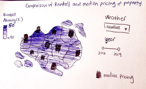
| − | | <center><br/> ''' Dashboard 1: Qualitative Thematic Map | + | | <center><br/> ''' Dashboard 1: Qualitative Thematic Map of Singapore property''' |
[[File:VA1.jpg|500px|frameless|center]] | [[File:VA1.jpg|500px|frameless|center]] | ||
</center> | </center> | ||
| Line 249: | Line 249: | ||
* <b>Weather</b> | * <b>Weather</b> | ||
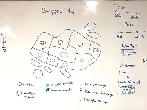
: When the postal area/zone’s selected weather is above the median of Singapore’s data over the selected year, the chart will reflect a circle face shape. However, if the postal area/zone’s selected weather falls in the median or is lower than the median of Singapore’s data over the selected year, the chart will reflect a circle face shape with devil horns. | : When the postal area/zone’s selected weather is above the median of Singapore’s data over the selected year, the chart will reflect a circle face shape. However, if the postal area/zone’s selected weather falls in the median or is lower than the median of Singapore’s data over the selected year, the chart will reflect a circle face shape with devil horns. | ||
| − | * Pricing | + | * <b>Pricing</b> |
: When the postal area/zones have houses with pricing over the selected year that meets the requirements of the user based on his/her filter, the chart will reflect a smiling face. However, if the postal area/zones have houses with pricing over the selected year that is lower than the requirements of the user based on his/her filter, the chart will reflect a blank face. Lastly, if the postal area/zones have houses with pricing over the selected year that is more than the requirements of the user based on his/her filter, the chart will reflect a sad face. | : When the postal area/zones have houses with pricing over the selected year that meets the requirements of the user based on his/her filter, the chart will reflect a smiling face. However, if the postal area/zones have houses with pricing over the selected year that is lower than the requirements of the user based on his/her filter, the chart will reflect a blank face. Lastly, if the postal area/zones have houses with pricing over the selected year that is more than the requirements of the user based on his/her filter, the chart will reflect a sad face. | ||
| − | *Amenities | + | * <b>Amenities</b> |
: When the postal area/zone’s number of amenities in the selected year meets the requirements of the user based on the filter, the chart will reflect the faces to be shown in green colour. However, if the postal area/zone’s number of amenities does not meet the requirements of the user, the chart will reflect the faces in blue colour. | : When the postal area/zone’s number of amenities in the selected year meets the requirements of the user based on the filter, the chart will reflect the faces to be shown in green colour. However, if the postal area/zone’s number of amenities does not meet the requirements of the user, the chart will reflect the faces in blue colour. | ||
Revision as of 18:15, 29 February 2020
Contents
PROBLEM & MOTIVATION
Problem
When it comes to purchasing or renting a property, there are many factors that go into a buyer’s consideration before he makes the final decision. The primary concern for buyers is the pricing of the property [1]. However, our group identified that there are also secondary concerns such as the weather and the amenities available that do influence the buyer’s final decision to purchase the property. There are limited tools available to help property buyers to identify areas that suit their needs/preferences best. The current tools that are available are only optimal to suit one category of concern, but fails when we try to use more categories to make our visualization.
For example, different people have different preferences for the weather. Some may prefer sunny weather while others prefer it to rain all the time. Currently, we are able to find weather information, and property prices information, but not both at the same time.
Motivation
Through our visualization, the group hopes to assist users to be able to easily visualize a home of his dreams in different aspects beyond mere prices. Our visualisation will incorporate data from property prices, weather and amenities to identify the accessibility of the area and help our users to justify the real value of the property. With our visualisation dashboard, users will be able to identify properties that they truly desire.
OBJECTIVES
We aim to provide an interactive visualization dashboard to assist property seekers with identifying the housing area that best suits their needs with visualization information such as:
- Insights on the weather (which consists of the Rainfall Precipitation, Temperature and Wind speed) of each postal area.
- Insights on the available amenities within the proximity of the selected geo boundary.
- Insights on the distribution of commercial and residential prices for each postal area over the past few years.
Target Group:
- Property buyers with weather preferences
- Commerical buyers who wants to open a shop
DATASET
The Data Sets we will be using for our analysis and for our application is listed below:
| Data/Source | Variables/Description | Rationale Of Usage |
|---|---|---|
|
Temperature and Rainfall Data |
|
This dataset covers a good time series of Singapore's weather from 2012 to 2019 across different weather categories. Our team wish to spot the trend or pattern of Singapore's climate in every town if possible. |
|
Amenities Location Data |
|
The data set will be used to anchor the amenities available for the selected property in a specified range |
|
Commercial Data and Residential Data (https://spring-ura-gov-sg.libproxy.smu.edu.sg/lad/ore/property_market/index.cfm) |
|
This dataset covers a good time series from 2012 to 2019 and the breakdown by subzone/planning area and postal code to visualize in a map. These transaction data will be used together with the weather data to explore potential relationships. We will also use the amenities data to identify the accessibility of the property to help our users to justify if the property worth its price. |
BACKGROUND SURVEY OF RELATED WORK
Below are a few visualizations and charts we considered making for our projects.
| Visual Considerations | Insights / Comments |
|---|---|
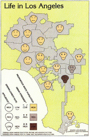
Title: Qualitative Thematic Map Source: https://mapdesign.icaci.org/2014/12/mapcarte-353365-life-in-los-angeles-by-eugene-turner-1977/ |
Change Pros:
|
Title: |
|
Title: |
|
Title: |
|
KEY TECHNICAL CHALLENGES & MITIGATION
| No. | Challenge | Description | Mitigation Plan |
|---|---|---|---|
| Software Challenge | Unfamiliarity of visualisation tools such as R, R Shiny, Tableau. |
| |
| Programming Challenge | Inexperince with data cleaning and transformation using R |
| |
| Workload Constraint | Time and Workload Constrains |
| |
| Dataset Complexity |
Our have different data from multiple sources in multiple different formats, hence we foresee a huge challenge in standardizing the data
|
|
STORYBOARD
| Dashboards | Description |
|---|---|
Dashboard 1: Qualitative Thematic Map of Singapore property |
Our group plans to do an interactive Qualitative Thematic Map which reflects different faces based on the year, price, weather, amenities filters adjusted by the users. This chart will show the data at a high level for users to identify which area meets their needs in a glance. Users can also view the map based on the postal area or zone. Filters used includes:
With this chart, users will be able to identify and shortlist the area(s) that meets their requirements the best.
|
Dashboard 2 |
|
Dashboard 3 |
|
Dashboard 4: |
|
MILESTONES
COMMENTS
| No. | Name | Date | Comments |
|---|---|---|---|
| 1. | (Name) | (Date) | (Comment) |
| 2. | (Name) | (Date) | (Comment) |
| 3. | (Name) | (Date) | (Comment) |
