SMT201 AY2019-20T1 EX1 Darren Tan Yong Heng
Part 1 : Thematic Maps
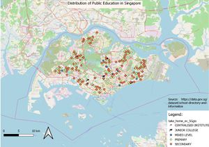
Distribution of Public Education Institution in Singapore by School Types
I utilize open maps so that it is easier for the reader to interpret where the institution is located at. The five respective institutions are represented using different colors to ensure that the user will be able to distinguish the differences easily. Junior colleges and centralized institutes are represented using a square academic hat to further differentiate tertiary education and primary/secondary schools.
Hierarchy of Road Network System in Singapore
I used a neutral brown color for the coastal outline, this is to prevent the background color from overpowering the rest of the colors assigned to the routes. To categorize the route I referred to a guide found on https://www.ura.gov.sg/-/media/Corporate/Resources/Publications/Streets-and-Building-Names/SBNB_handbook_streets.pdf?la=en which dictates whether a route should be listed as expressway/major/minor road. Once the road type is identified, I categorize them using different colors. Contrasting colors are selected which ensures that the map reader will be able to differentiate the various route easily.
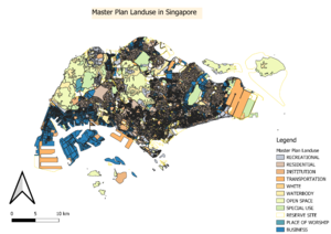
2014 Master Plan Landuse
I categorized "LU_DESC" into 11 major categories. For instance, agricultural, beach area, park, sports & recreation are similar in nature and hence I grouped them as recreation. I then choose a spectrum of colors which will help distinguish the different areas more easily. Due to the great variety of colors used, it is essential to choose colors which will not only help differentiate the various areas but also do not have too huge of a contrast which may make the map difficult to read.
Part 2 : Choropleth maps
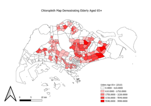
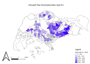
Aged population (+65) in 2010 and 2018
The choropleth map shows that in the eastern part of Singapore, there are more elderly aged 65 and above. The darker the shade of the color, the higher the density of the study of interest, likewise a lighter shade represents a lower density. To derive the variable, I perform a summation, adding all the attributes of those aged 65 and above.
Based on the choropleth map depicting elderly aged 65 and above, the pattern resembles closely to the observation in 2010, whereby the majority of the elderly are living in the eastern part of Singapore.


