SMT201 AY2019-20T1 EX1 Charmine Foo Zhi Min
Part 1: Thematic Mapping
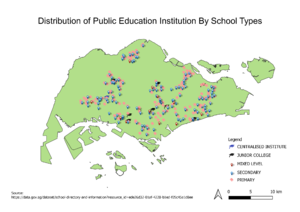
Distribution of Public Education Institution by School Types
Using Point Symbols to map individual discrete dots as SVG existing at single spots or locations, the viewer is able to quickly identify where each school type (Centralised Institutes, Junior Colleges, Secondary, Primary) is located on the map.
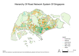
Road Network System Hierarchy of Singapore
Using Line Symbols to represent linear features, roads are catergorised according to 5 Road Classes (1. Expressway, 2. Highway, 3. Major Road (Avenue, Boulevard, Way), 4. Minor Road (Drive, Road, Street), 5. Local Access (Walk, Lane, Link)) using reference from Remember Singapore
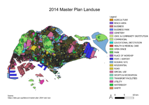
2014 Master Plan Landuse Singapore
Using Categorised Symbology, land uses are categorised according to their land use type, for example, 'Hotel' is categorised under 'Commercial' so that the map will be clear and concise for the viewer to understand.
Part 2: Choropleth Mapping
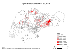
Aged Population (+65) In 2010
Using Graduated Symbology and Pretty Breaks for my mode, the data was divided into equal size classes, with the darkest hue representing the greatest number in the data set and the lightest hue representing the smallest number. With reference to both the Aged Population (+65) In 2010 map and the Aged Population (+65) In 2018 map, there has been a significant increase in the number of Aged Population over the years as the area shaded area gets larger.
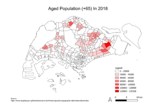
Aged Population (+65) In 2018
Using Graduated Symbology and Pretty Breaks for my mode, the data was divided into equal size classes, with the darkest hue representing the greatest number in the data set and the lightest hue representing the smallest number. With reference to both the Aged Population (+65) In 2010 map and the Aged Population (+65) In 2018 map, there has been a significant increase in the number of Aged Population over the years as the area shaded area gets larger.
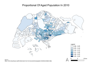
Proportional Of Aged Population In 2010
Using Graduated Symbology and Pretty Breaks for my mode, the data was divided into equal size classes, with the darkest hue representing the greatest number in the data set and the lightest hue representing the smallest number. Even though there has been a significant increase in the number of Aged Population, the proportion of Aged Population with respect to the Total Singapore Population has decreased over the years.
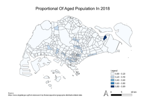
Proportional Of Aged Population In 2018
Using Graduated Symbology and Pretty Breaks for my mode, the data was divided into equal size classes, with the darkest hue representing the greatest number in the data set and the lightest hue representing the smallest number. Even though there has been a significant increase in the number of Aged Population, the proportion of Aged Population with respect to the Total Singapore Population has decreased over the years.
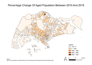
Percentage Change Of Aged Population Between 2010 And 2018
Using Graduated Symbology and Pretty Breaks for my mode, the data was divided into equal size classes, with the darkest hue representing the greatest number in the data set and the lightest hue representing the smallest number. Using the calculation method of (Total Aged Population in 2018 - Total Aged Population in 2010 / Total Population in 2010 * 100%), Sembawang has the highest percentage change between 2010 and 2018 as its region has the darkest hue on the map
