SMT201 AY2019-20G2 Ex1 LokYingChengSheryee
Contents
Part 1: Thematic mapping
Description
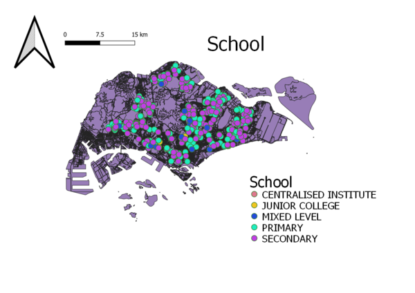
The map shows the distribution of public education institution categorized by Primary, Secondary, Mixed level, Junior College and centralized institution.
As there could be many public institutions at a single location, the method of using points symbol is able to better visualize and shows the different categorizes. The use of different color is also able to distinctively shows what each color represents.
Description
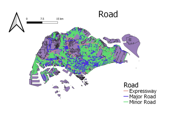
The map shows the road network system in Singapore; Expressway, major road and minor road.
By using lines to better display the road network path and also, the color to easily distinguish the different type of road network system. This is to allow efficient and clearer map reading for the user.
Description
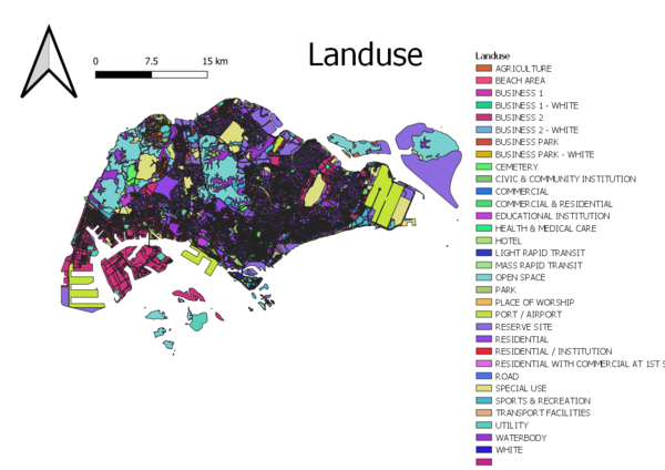
This map shows the differentiation of plan for landuse by using colors. As there are many types of landuse, the color allows the map reader to identify easier on which color represents what type of landuse. It also allows the user to identify if a specific area is of a particular type of landuse
Part 2: Choropleth mapping
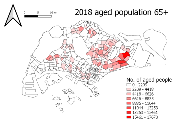
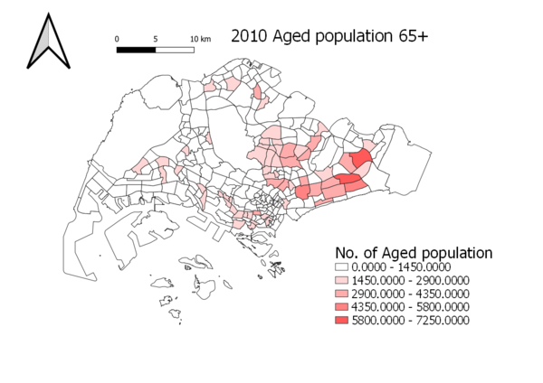
The two main categories are classified as Young (Below 65 years of age) and Aged (Equal or above 65 years of age). Area shading was used to represent the ratio data as it shows a clearer distinct difference in the number of aged population in both 2010 and 2018. In order to deal with missing data, null values were being formatted and replaced as '0'.
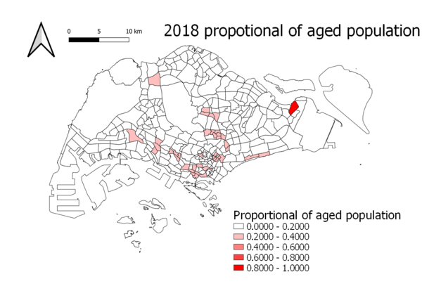
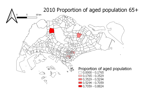
For proportion data, i have duplicated the first two maps; 2018 and 2010 population, and then calculated by using no. of aged population in the respective year / total no. of population of that respective year.
